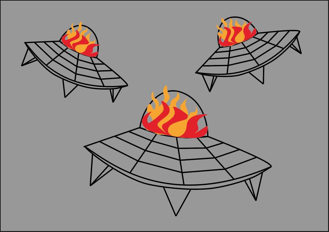
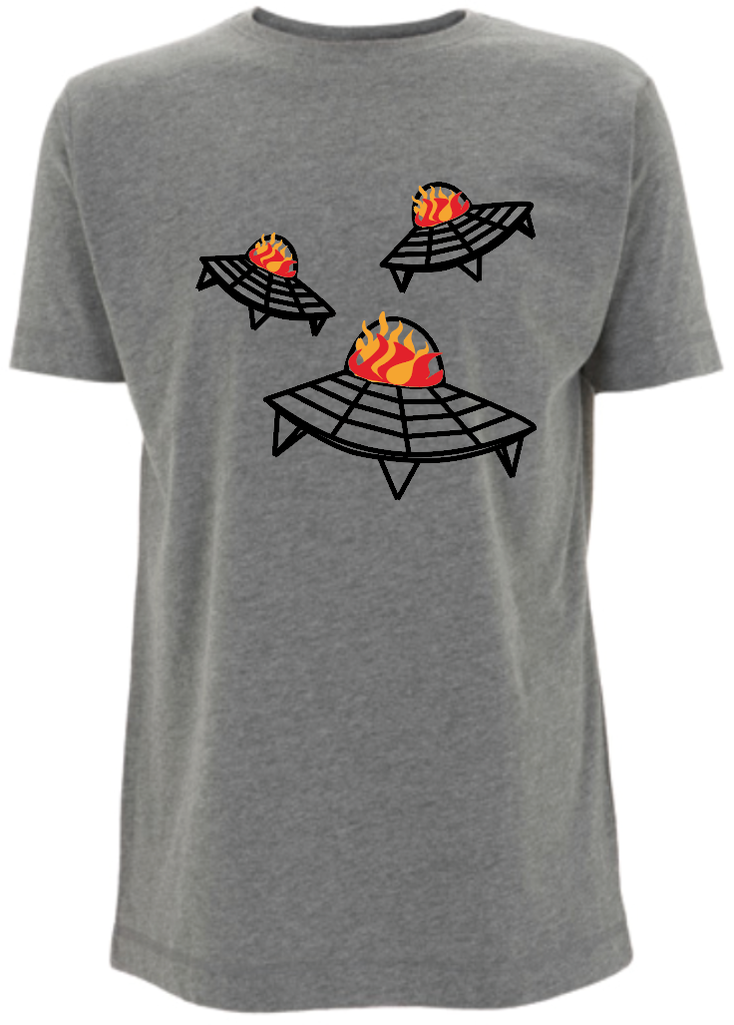
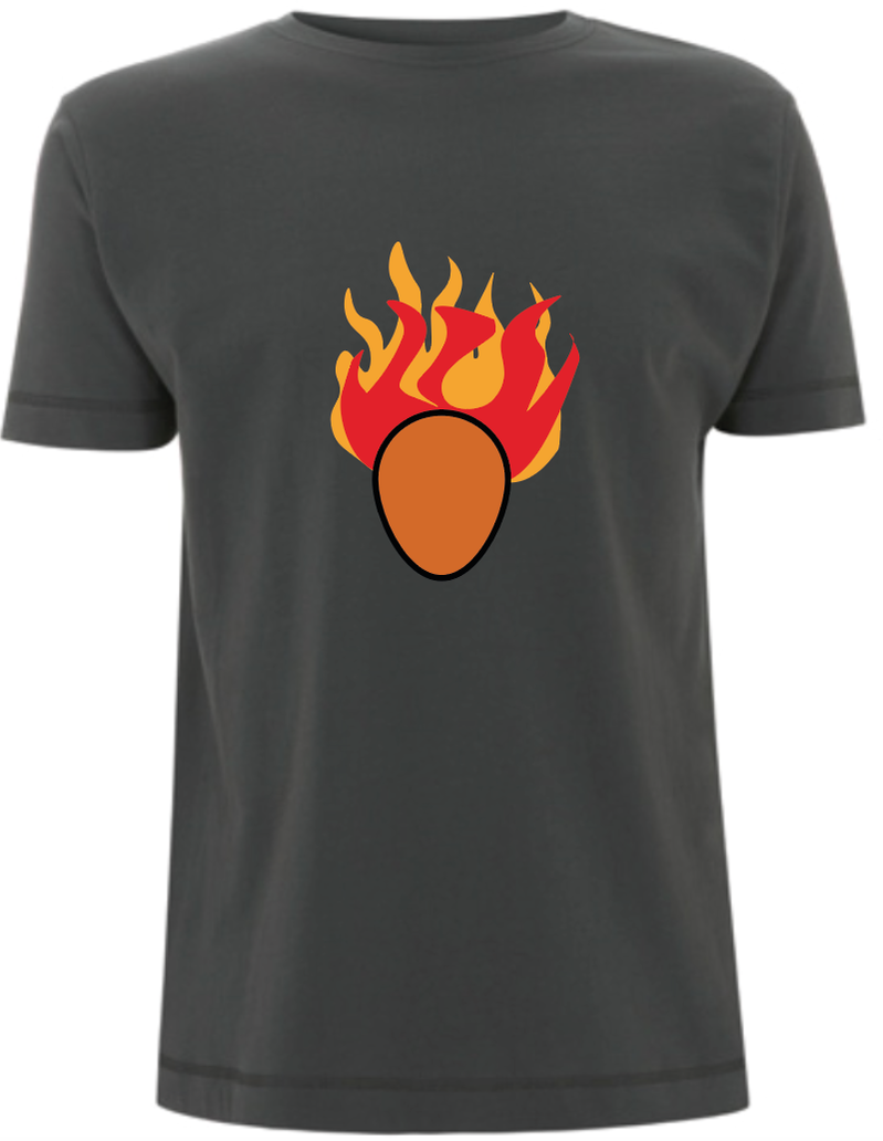
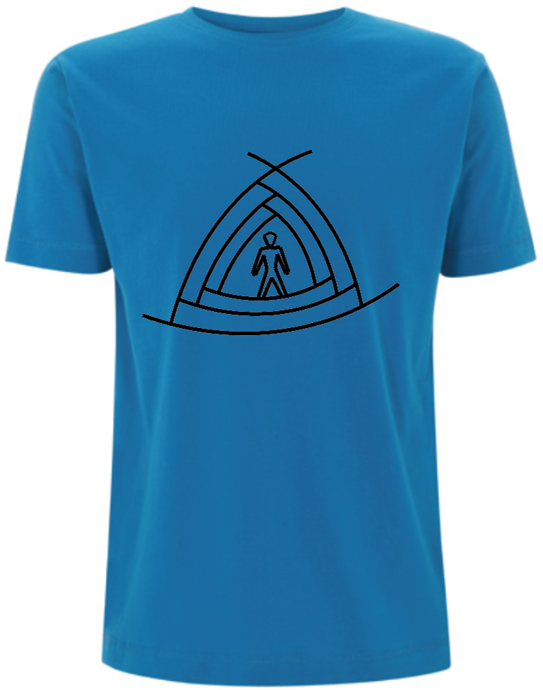
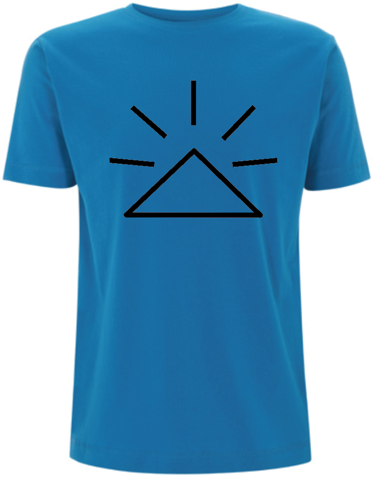
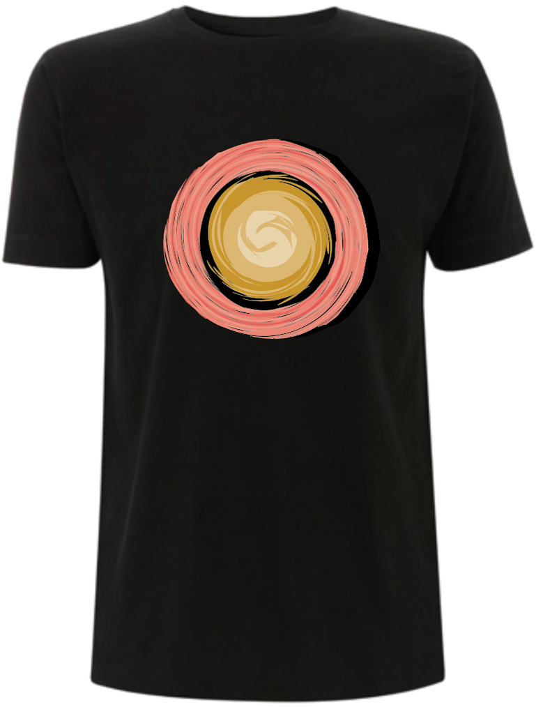
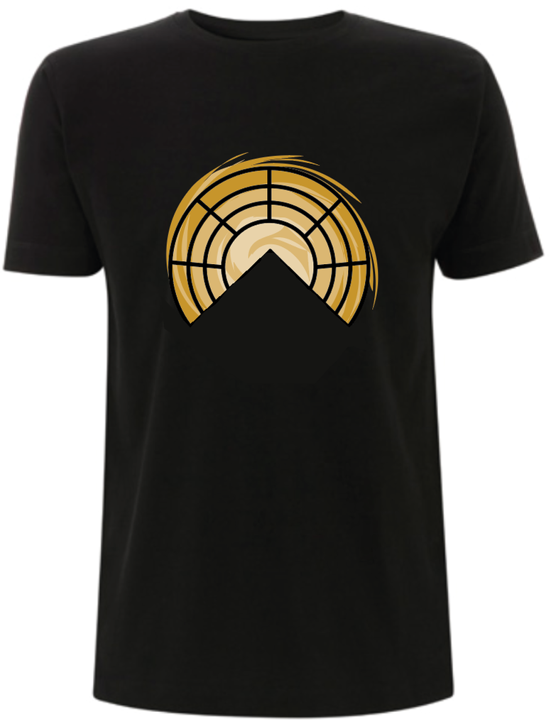
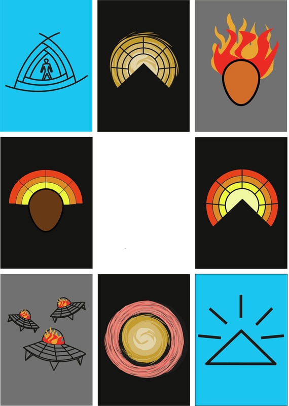
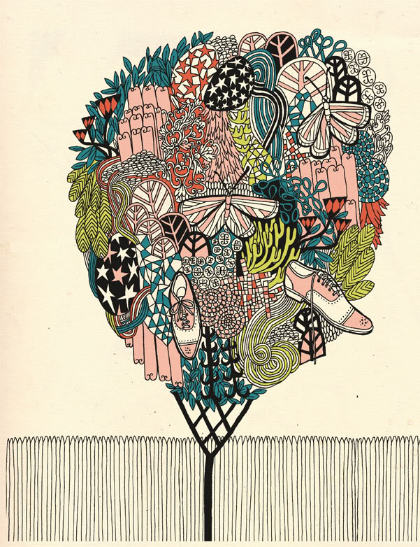
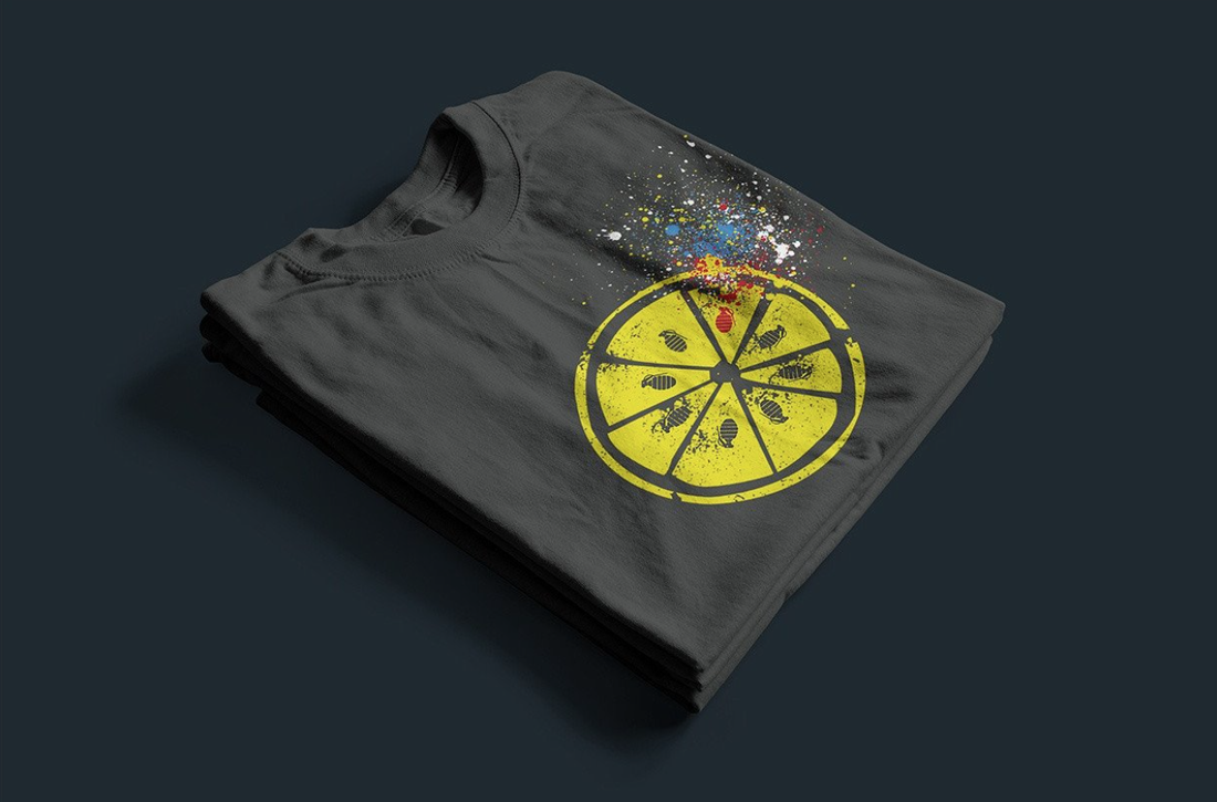
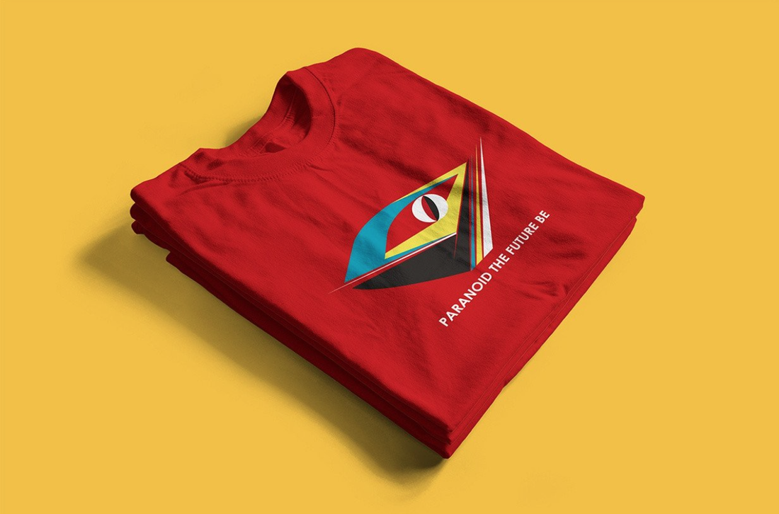
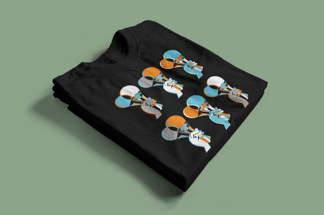
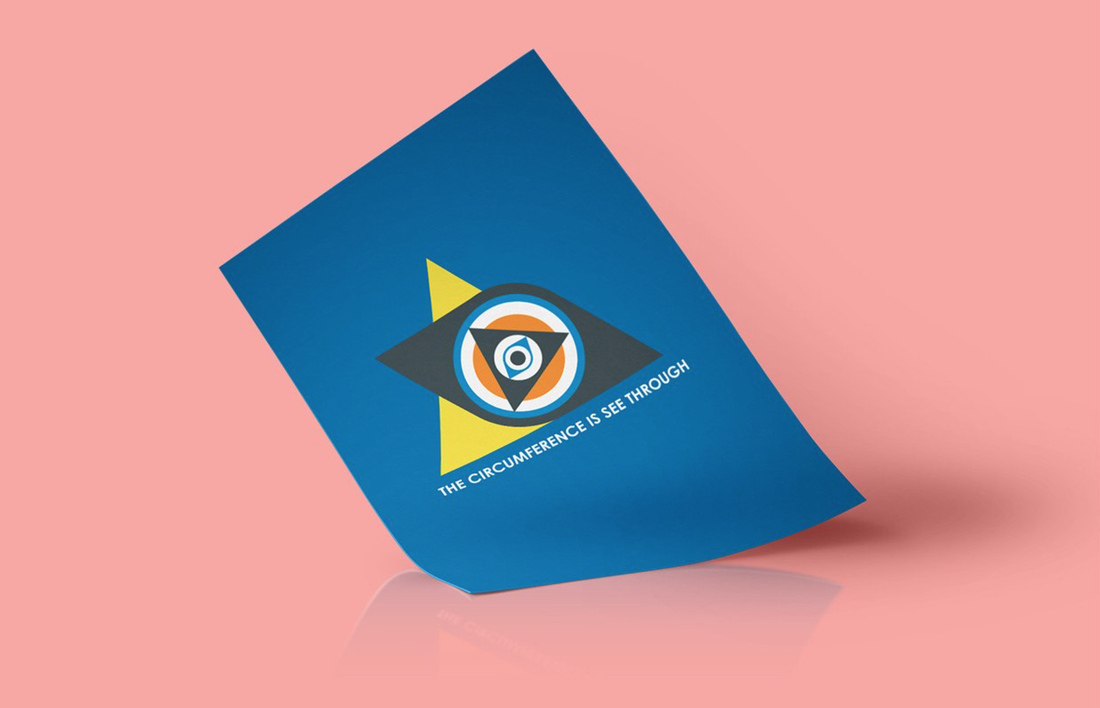
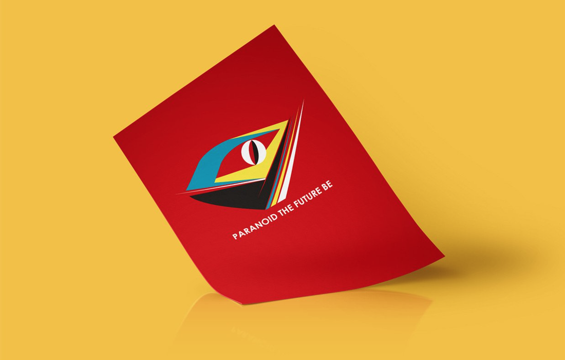
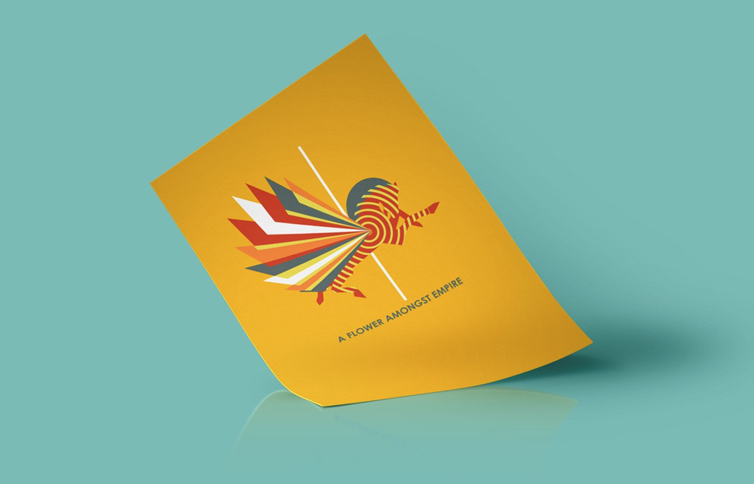
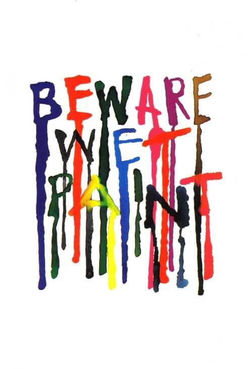
Below are some of the designs that I made for this project that didn't make the final cut:
0 Comments
 In order to be able to represent this festival I wanted to find some reviews from people that have actually attended it. Below are some of the reviews that I found useful.
'The experience itself is like no other; very eye opening, and very revealing. The people are the best part. Everyone shows so much kindness and love! And at the end of the week-long event, everyone helps clean (what little there is left to clean, due to Burning Man's "leave no trace" policy). It's amazing! Definitely glad I got to check this one off my bucket list. With any luck, I'll be returning!' - Shaurica C, Denver 'You really can't review Burning Man. Just know that it's all about love. Loving others fully with no judgement and being loved in return for exactly who you are. Just say yes and we'll see you in the dust.' - Malcolm S, Los Angeles 'Burning Man is a celebration. It is a celebration of life and beauty, sights and sound, art and music, independence and interdependence. Burning Man is an outlet. It is an outlet for your emotions, creativity, individuality, and deepest desires. Burning Man is a mindset. It breeds counterculture, promotes the concept of "gifting," and encompasses the idea of live and let live. Burning Man is a festival of the masses, yet it's not for everyone. It takes a certain type of person to truly enjoy Burning Man. Your experience will be greatly enhanced through thorough research, having an open mind, grounded expectations, and possessing a deep and intimate understanding of yourself. Burning Man is the American dream. It allows you to shed your layers, take off your mask, and become who you are - who you've always wanted to be. Yet at the same time, Burning Man is wholly un-American. It is rooted in the idea of decommodification - that everything around us is priceless, unlike a commodity that can be bought or traded for. Ultimately, Burning Man can be everything, or nothing at all. It is entirely what you make of it. To me, Burning Man was an affirmation. It affirmed that life is, can be, and has always been beautiful. It affirmed that with the right mindset, one can accomplish anything. It affirmed that as individuals, we can be powerful; but as a collective, we can be unstoppable.' - Peter Y, Brooklyn Music is used to enhance the experience of the viewer, such as in films. It is even used in everyday life. For example in shops music is used to elevate peoples moods which encourages them to shop for longer and spend more money, it also increases customer experience to improve the chance of repeat custom. Another is exercising, people tend to listen to upbeat music when exercising because it increases their motivation and pushes them to do better. Music is used almost everywhere, so it's not surprising that people draw inspiration from it. Architecture:
Illustrations / Paintings:
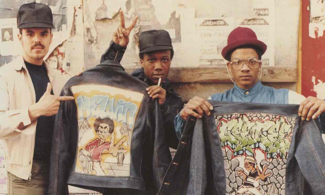
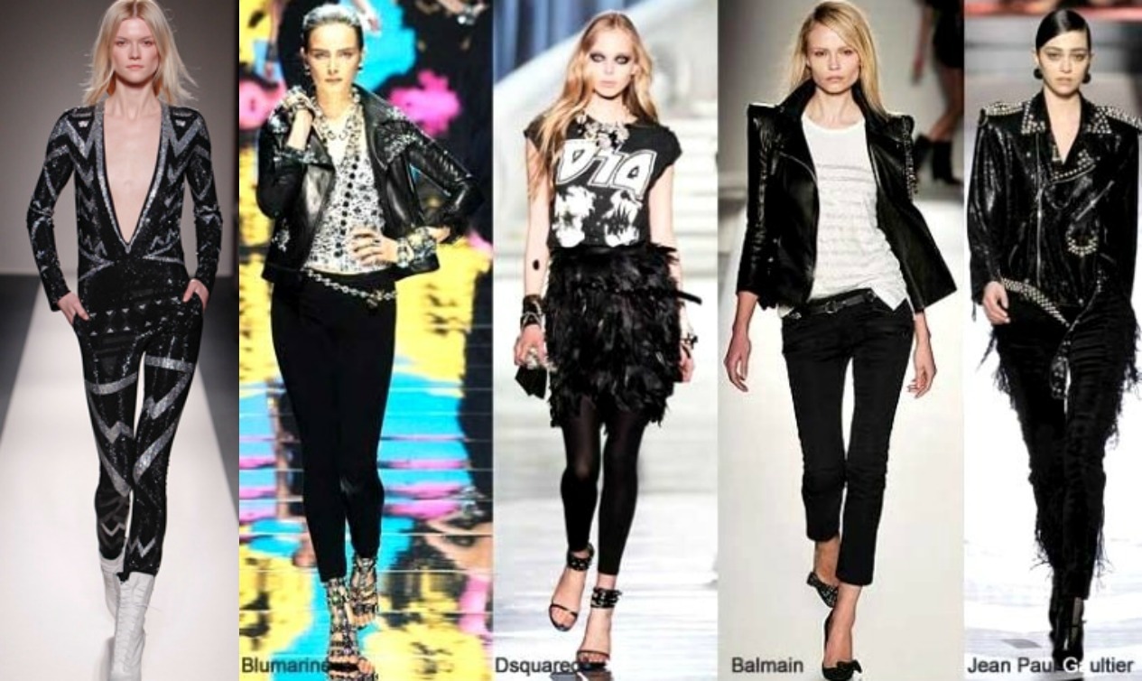
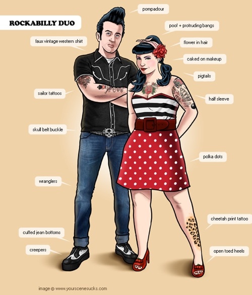
Fashion:
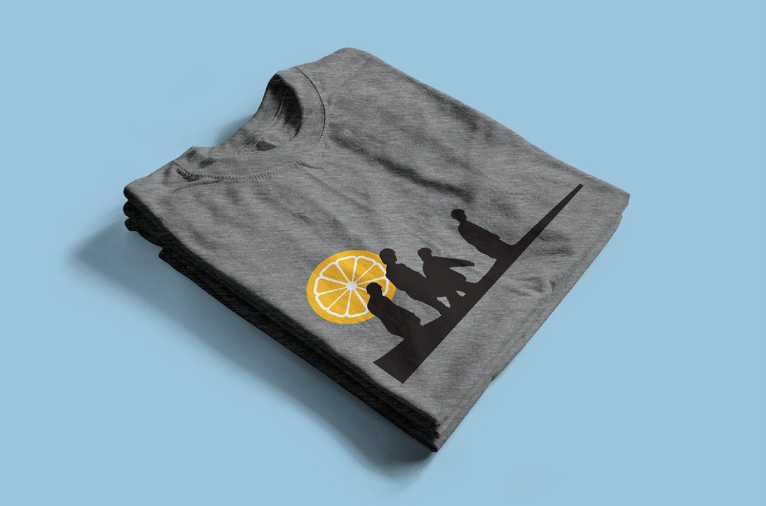
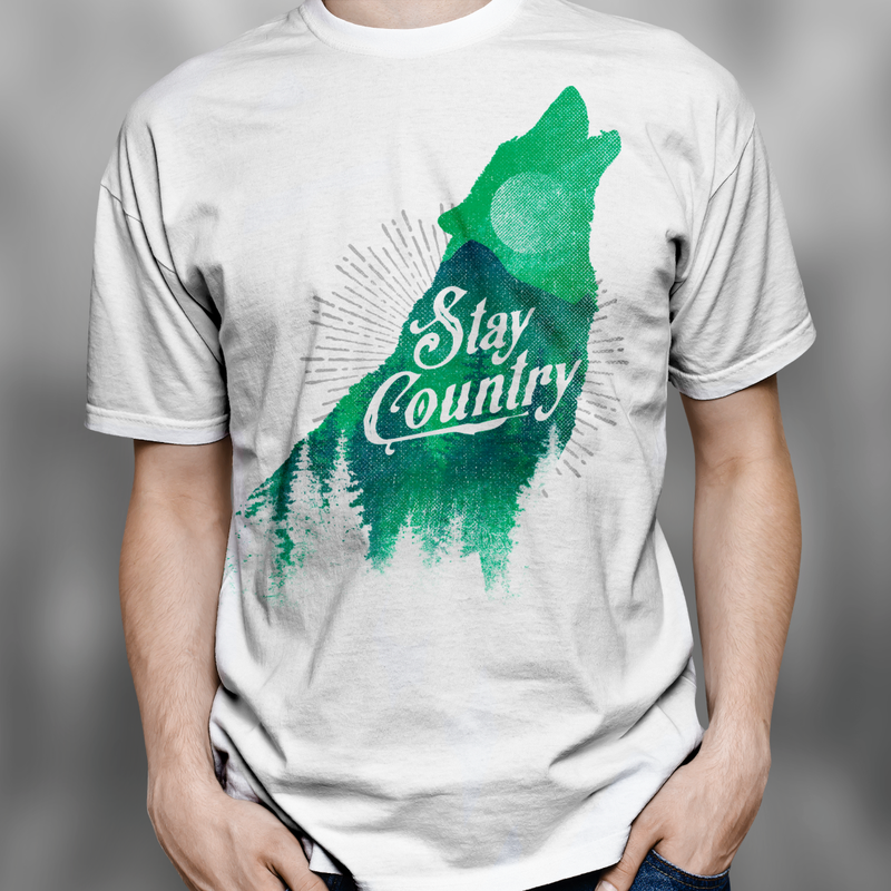
Colour Is Sound is a clothing brand that creates original t-shirt designs inspired by music. The imagery used within their designs hint at different bands and artists without giving out too much information. Therefore the relation to the band is subtle and only fans will understand the reference. It is this subtlety that makes the designs appealing.
All of their designs are silk-screen printed which limits the number of colours that can be used within each design. This is why the colour of the t-shirt is often incorporated into the design. By doing this it also helps to tie in the design to the t-shirt, making it sit more comfortably. Wall art is also available, featuring the same designs as the t-shirts. These come in either A1 or A2 size and are limited edition with only 150 prints being made. All of which are hand numbered and signed.
The style of the designs that are sold by this company are simplistic and a lot of them include various geometric shapes. The colours used compliment each other and all of the designs are free flowing and not confined within a box. I think that this helps the designs sit well on the t-shirts and makes them more appealing to the audience.
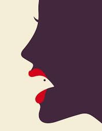
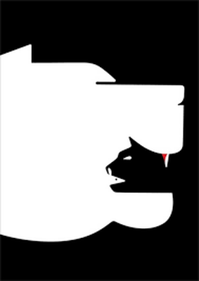
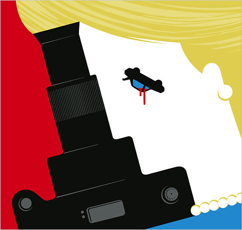
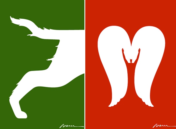
Noma Bar: A graphic designer from Israel that is most famous for his portraits. His work heavily features the use of juxtaposition and his simplistic approach to each illustration makes his designs more effective. I like that he is not afraid to use bold colours and no matter what objects he places together they seem to work seamlessly. Below are some of his designs that I particularly like. The use go juxtapositions is not something that I feel will work particularly well within this particular project but is nonetheless a great source of inspiration.
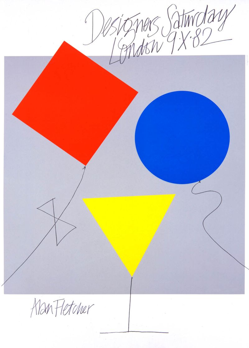
Alan Fletcher: Another designer who makes use of bright colours and simplistic designs. One of the things that stands out to me about his work is that it is quite playful and experimental, something which makes the outcomes seem more significant. In relation to this project I wanted to incorporate some of Fletchers techniques when making my designs, by experimenting with Illustrator and seeing where the project takes me, as opposed to having a rough idea of which direction I want the project to take.
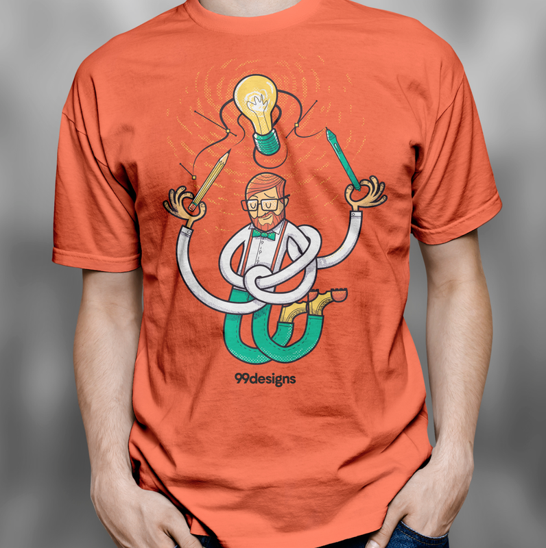
Alvin Lustig: Alvin's designs are simplistic and a lot of them include geometric shapes, something which I would like to base my final designs on. A lot of his designs were created for book covers and are abstract. I like that within his designs there are some that are simple like the Amerika book cover and some that are more complex and detailed like the cover for In the American Grain. It is not always obvious when first looking at his designs what they are supposed to be or represent, which is why I think his designs are successful. 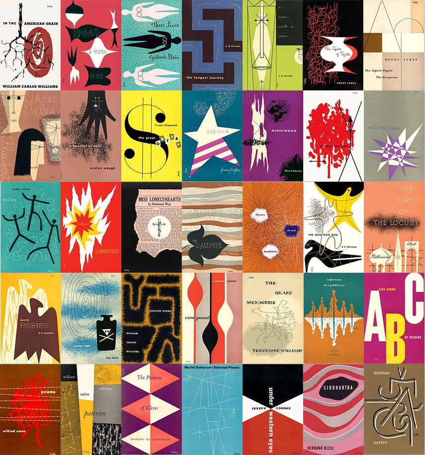 I decided to look into t-shirt design and find out what the do's and don't were. I came across an article on Creative Blog that outlines some tips for creating a design. I also read an article on 99 Designs that explained the key things to consider when designing a t-shirt, including the use of colours and scale. Some designers who have created simple yet inspiring t-shirt designs include Dudeowl (Ifan Rofiyandi) with his monochrome design that includes the use of white space to create typography. I like the simplicity of his designs and the style he has used is something which I feel could compliment this brief well. Another designer I found was Asael Varas. His creations differ from that of Dudeowl in that he uses a wide range of colours. His approach to creating designs is illustrative and type is integrated well within his designs. 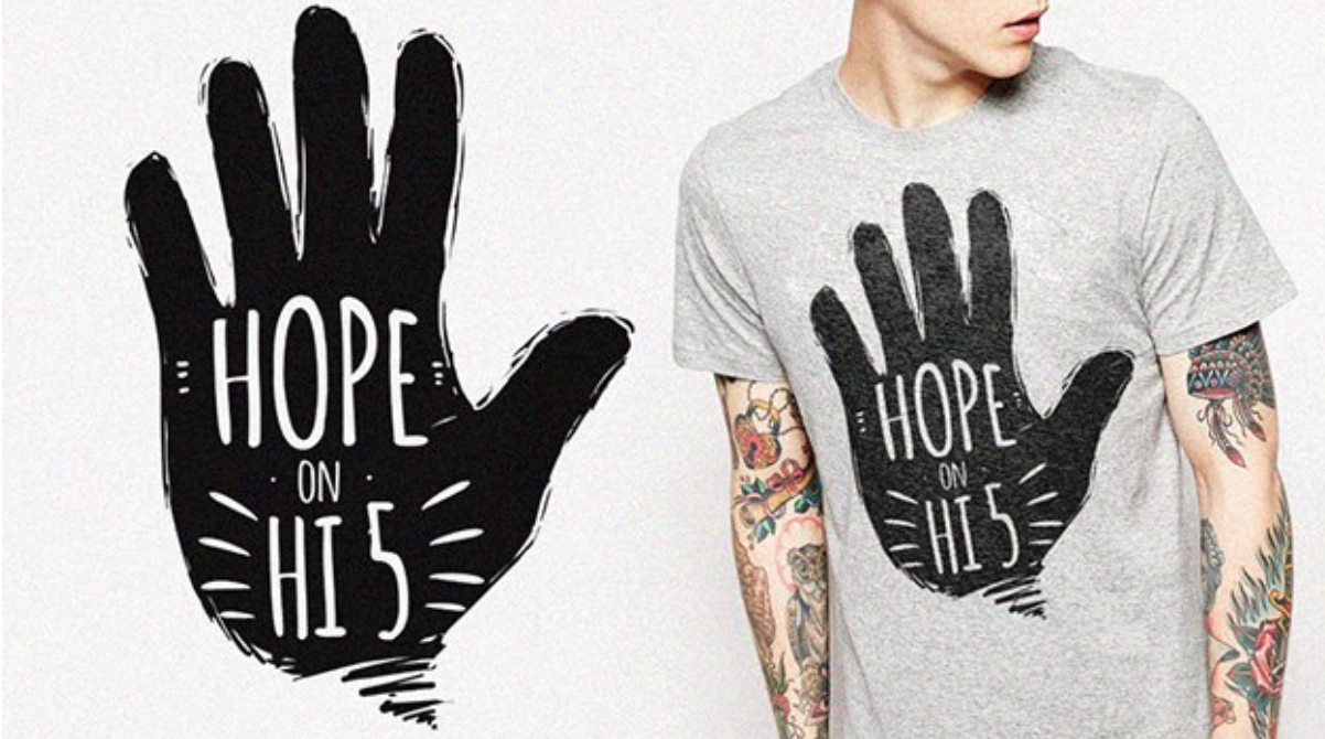 
A pattern which I have noticed within the shirts is that the designs that work the best and are the most popular are the ones that have designs which are not confined within a square. The look of the image being free within the space is one that is quite popular within t-shirt design.
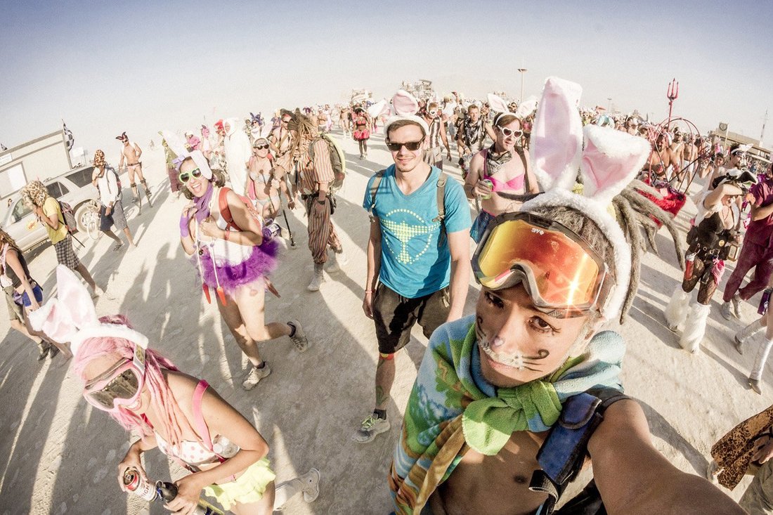
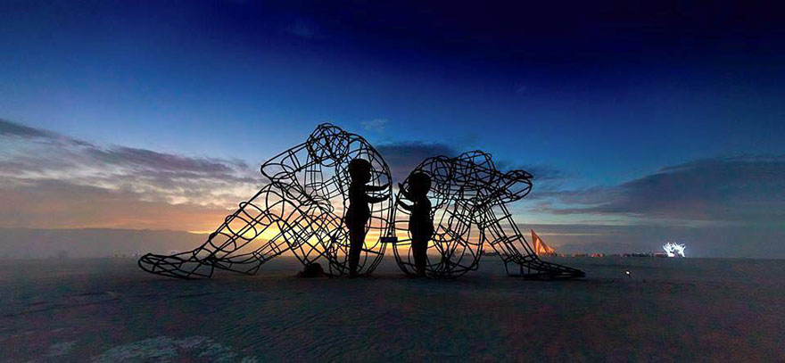
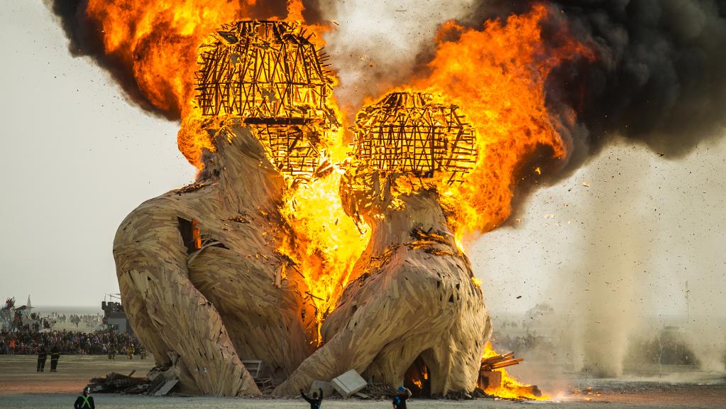
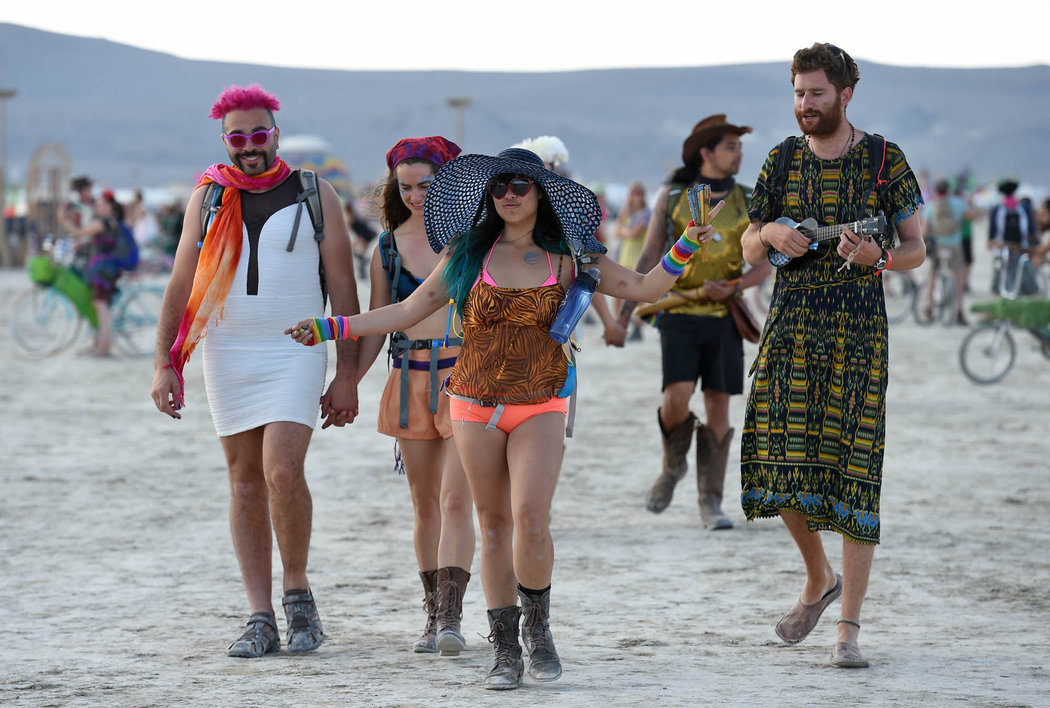
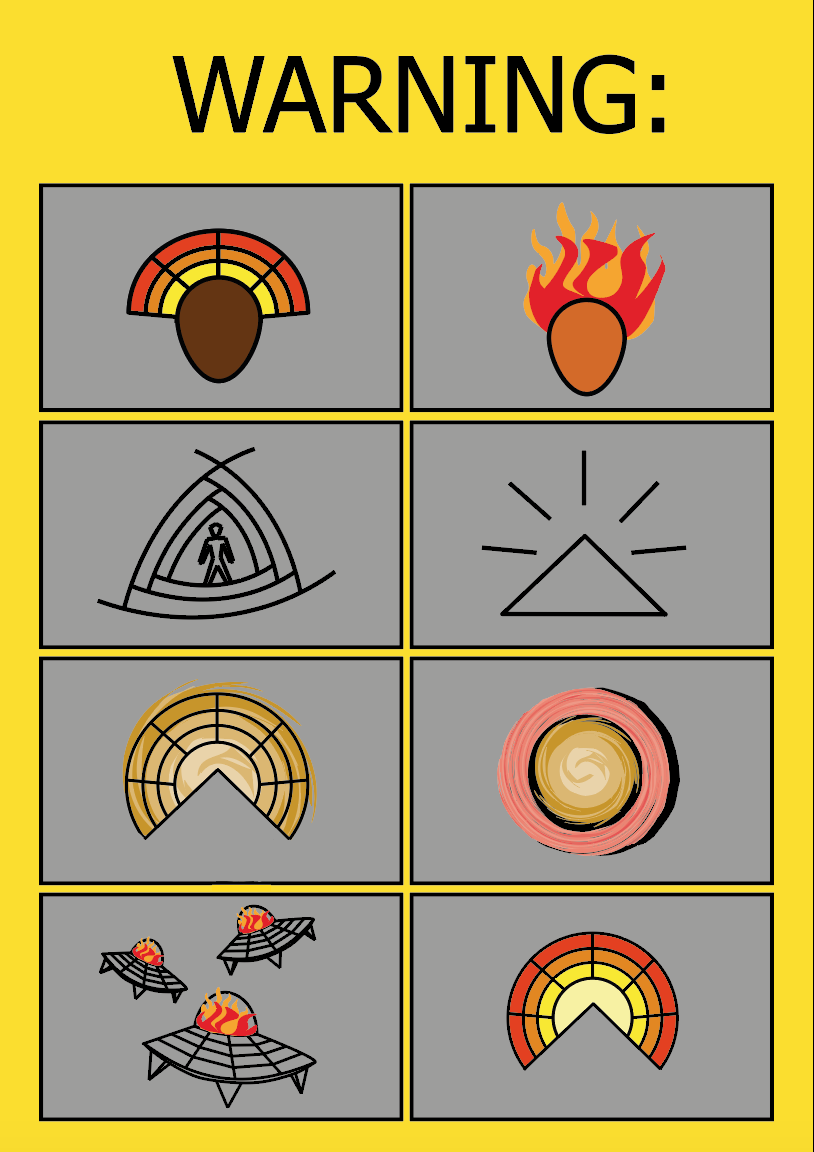
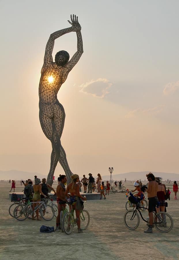
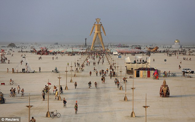
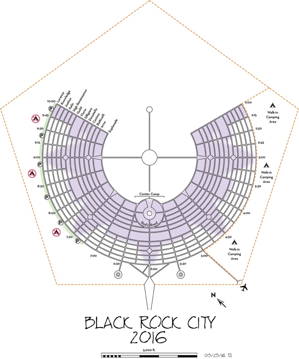
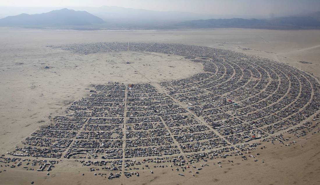
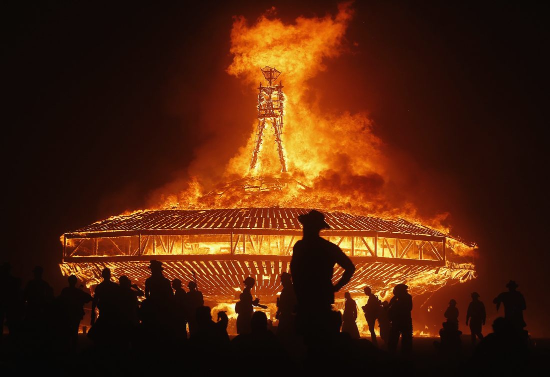
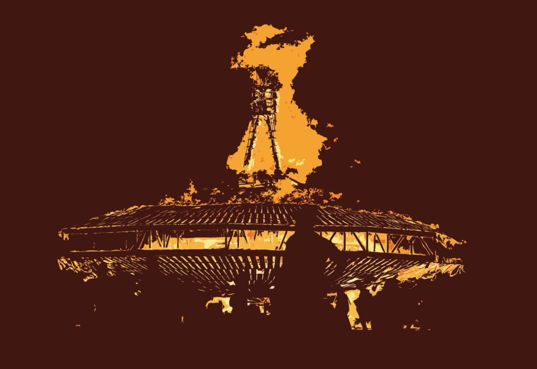
I wanted to create a design that represented this festival in the simplest way possible. I decided to look into Alchemy symbols as they show the elements in their most simplest from. One of the reasons I decided to explore this area was because fire is such a big part of this festival and I wanted to incorporate it into my design without using the obvious flames drawing. 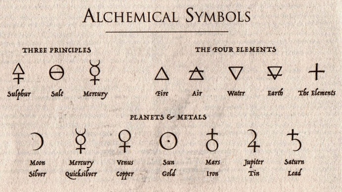 James Wickham is a designer who created a series of 10 geometric symbols inspired by the ten principles of the Burning Man Festival, shown below. I feel that each of these symbols relates back to the festival in a hidden way. Not everyone who looks at this designs will know that they were created with the festival in mind. This is something that I hope to achieve with my t-shirt design. 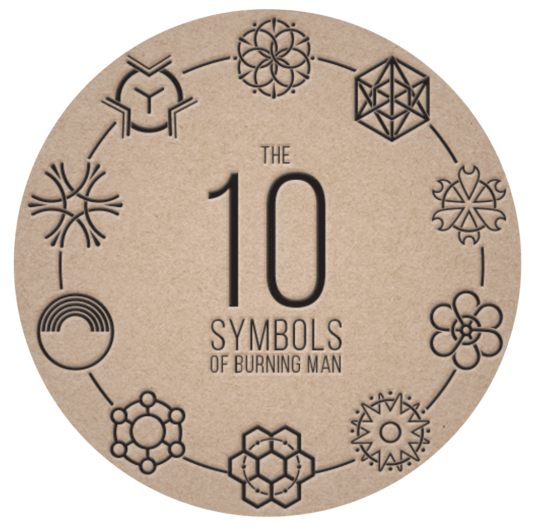 This event takes place annually in the Black Rock Desert, Nevada. It promotes spirituality and offers an experience separate from that of the technology and distractions of everyday life. The website for this event is burning with information regarding everything you could possibly want to know about the festival. It even includes a survival guide for those that will be attending, outlining all of the rules as well as giving general information about the event. Below are some images from previous years:
   One aspect of this festival that I found quite intriguing was the shape of the layout. It is arranged in a way that reminds me of a spaceship, this is supposedly so that it can be seen from space.
After being given a brief to create a t-shirt design for Colour Is sound, I wanted to find out a bit more information about the company. By looking at their website I was able to find out a bit more about the style of design that they use and what the company is all about.
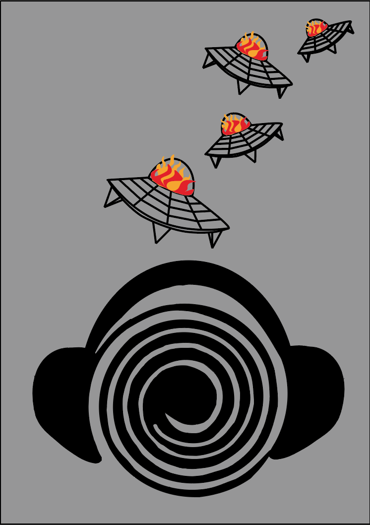
The next step was to decide what theme I was going to choose. The options given to use were bands such as The Ramones, Television, Blondie and Suicide or festivals including Glastonbury, Sonar and The Burning Man festival. After researching into all of these topics I decided to go with the Burning man festival. 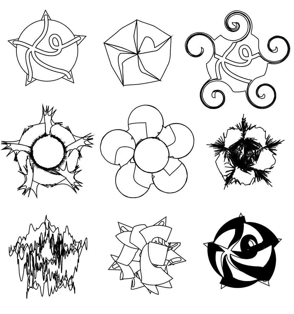 The above images are trials using some of the tools on Illustrator. By tying them out I was able to see what effects I could achieve using this programme. In order below are the effects that I used on each one.
Using what I had learnt from my experiments I wanted to try and recreate some of the initial sketches that I had come up with for this project. 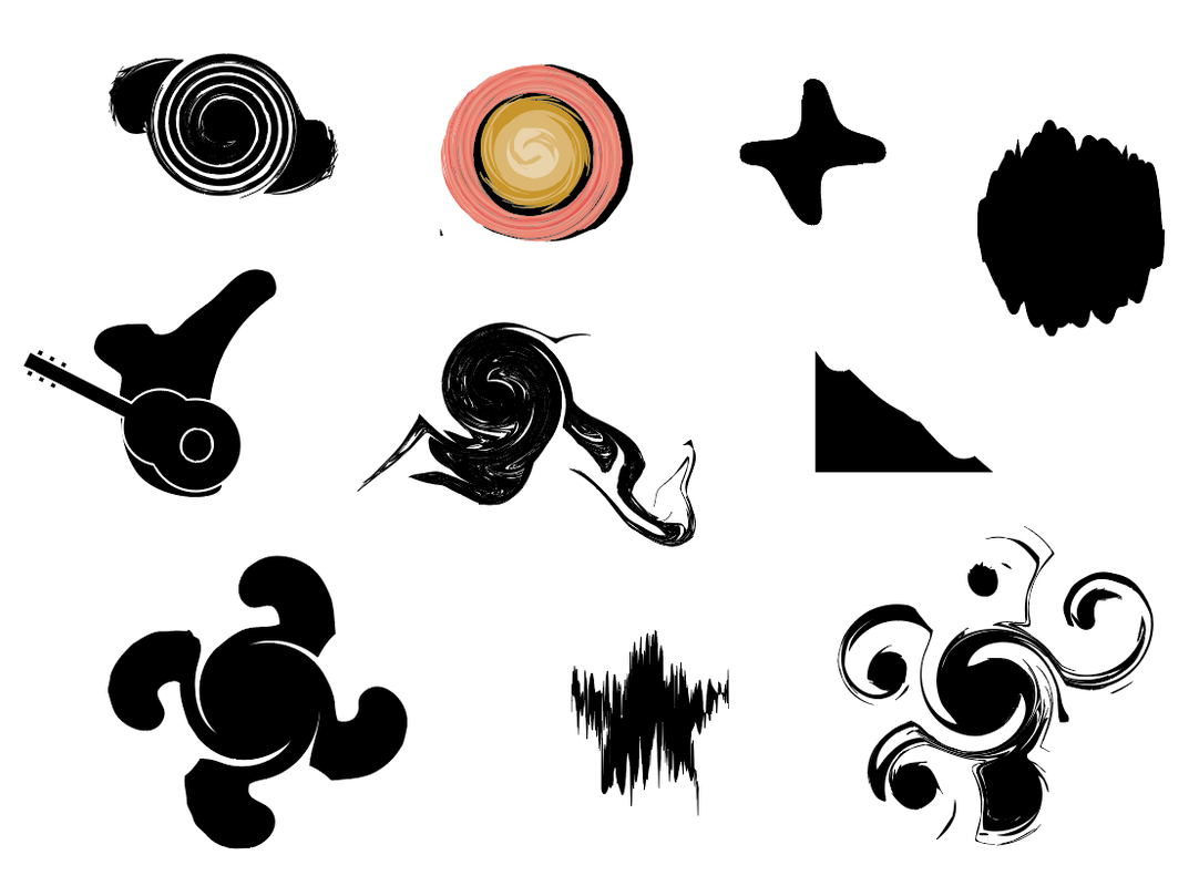 I then wanted to see how images could be altered so that they no longer look like photographs. To do this I used both photographs taken at the Burning Man Festival and some of my own photographs.
 Semiotics is defined as the study of shapes and symbols and the use and interpretation of them. This project began with a brief introduction into this topic. It was one that is applied to every piece of design, whether that be consciously or unconsciously. Below is an image from The Daily Telegraph that sums up semiotics at their most basic level. It explains that a sign is anything that conveys a message, a signifier is the thing that gives the meaning and the signified is what's evoked in the mind (mental concept). 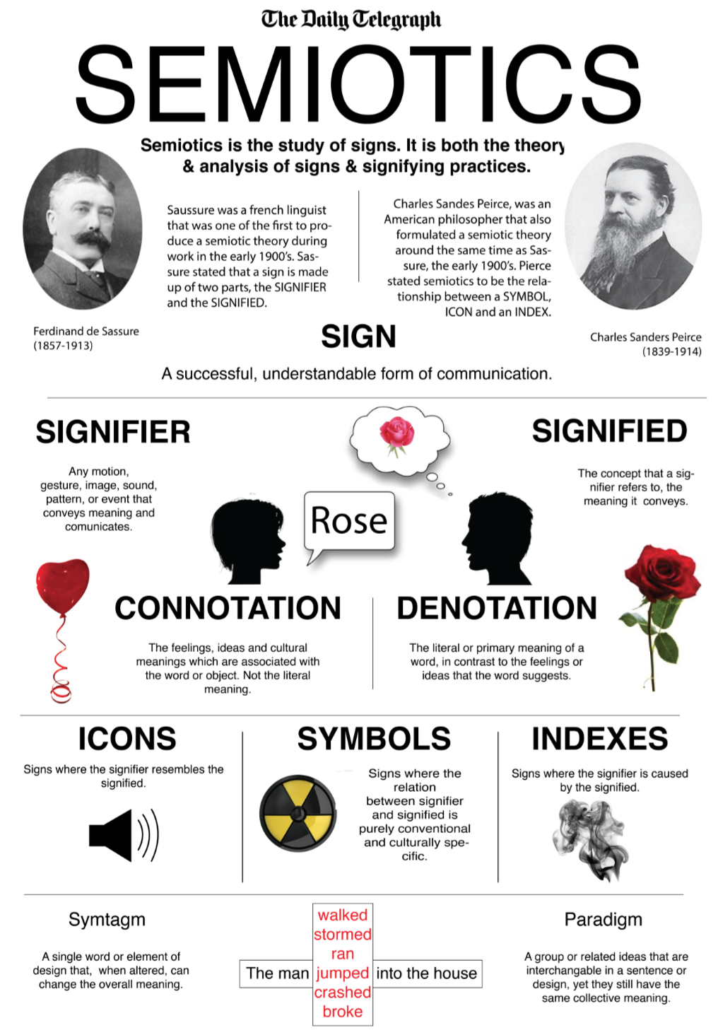 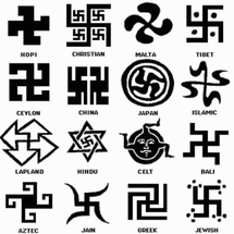 In this lecture I learnt about the 'Journey of a Message':
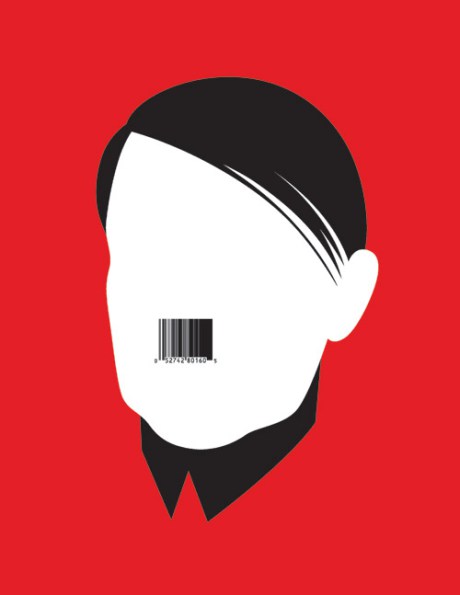
Wanting to look further into this subject I came across a couple of interesting TED Talks. The first was about the use of Digital Semiotics by Oscar Bastiaens, where he talks about how we are becoming increasingly dependent on signs. The second is called The Signs of Our Times: Semiotics in 2016 and Beyond by Michael Mills. It touches on the signs used within the past and how their meaning can change over time. One example he used was the Swastika and how it has been used in many cultures for centuries but its meaning changed due to its use by the Nazi's. To help myself better understand this topic I decided to find some examples found in everyday life. Gatwick airport is a great example of the use of semiotics, with thousands of people passing through everyday they need to use semiotics to prevent confusion and congestion (especially when not all of it's visitors will speak the same language). Some of the articles that I came across explained both why it is so important to have signs within an airport and some different examples of these semiotics.
Semiotics is the study of signs and symbols and their use and interpretation. It looks at the way in which we interpret different shapes in certain ways. For example when you see a triangle it is interpreted as a masculine and stable shape, that is generally quite hard to touch. This is because of its pointed edges and large base (this would be a different story if the triangle was placed on its point). Whereas when you look at a circle it is considered to be soft and more feminine due to its lack of edges. Below is an image that sums up semiotics quite nicely. 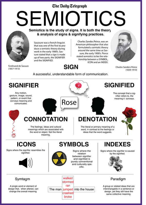 Culture can also influence the way in which we interpret signs. For example the images of a man and woman that you typically find on a public toilet. We have been brought up in a culture that has assigned a certain meaning to those images. Another example is traffic lights. We know that when we see red it means stop and when we see green it means go. This meaning has been attached by our ancestors. Everyday we are constantly decoding signs, and designers can use certain signs to get a message across within their design very easily and efficiently. |
AuthorWrite something about yourself. No need to be fancy, just an overview. ArchivesCategories |
 RSS Feed
