|
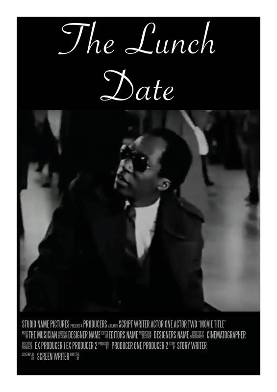
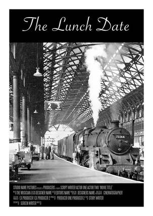
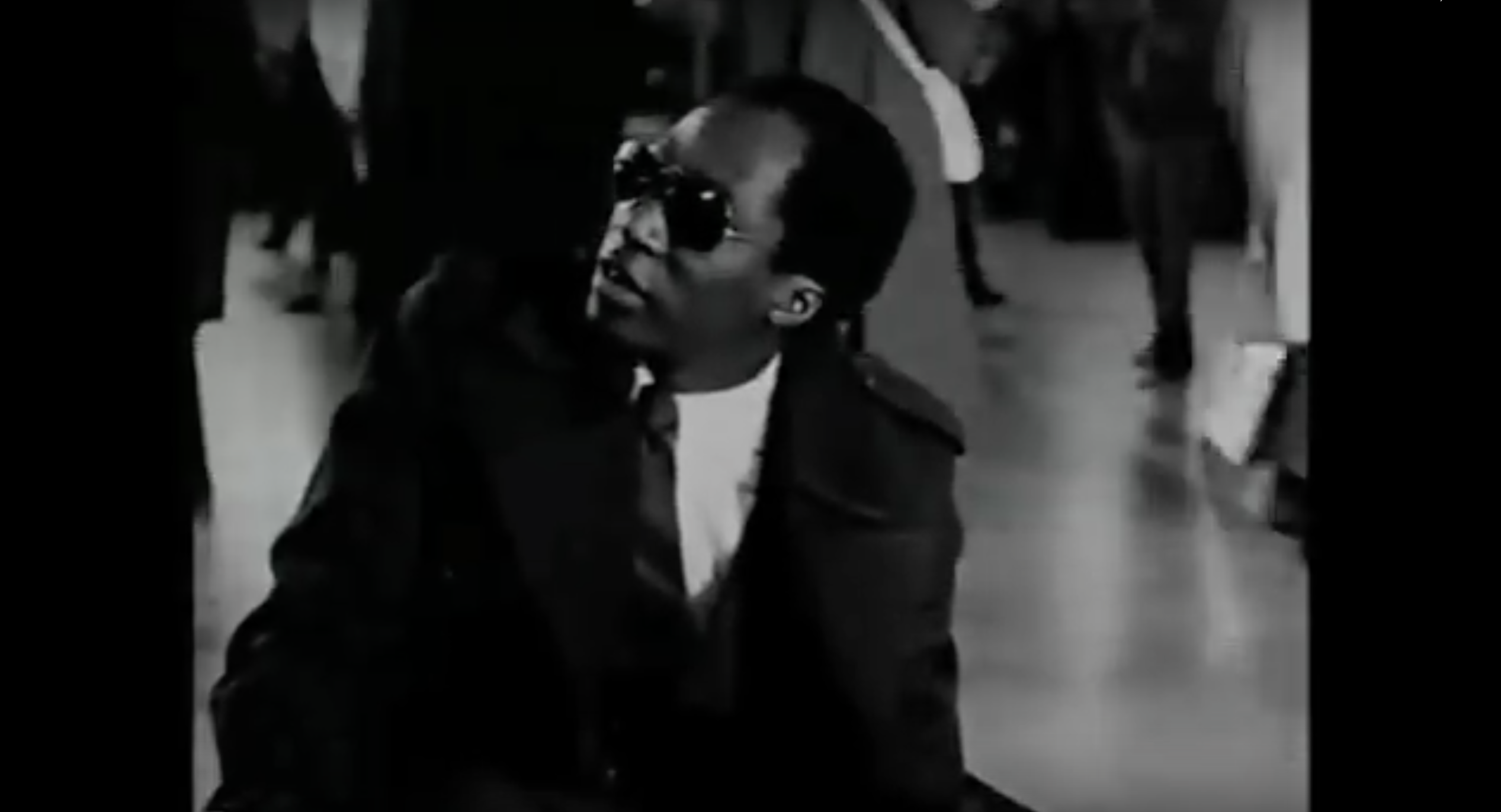
For my final design I decided to use a clip from the film that I feel illustrates the message that The Lunch Date is trying to convey. One of the biggest problems I had was with the video quality. The original film has a low resolution so to try and make it look good was difficult. To try and overcome this I put the clip into Premiere and tried adding various effects to see which would work best. I then took the clip and put it into Indesign where I had already compiled the rest go the poster. Originally I had the video going right to the edges of the poster but later decided that By having a thin black strip either side of the video, I was able to make the poster feel more whole. I also debated about where to cut the video (if I should cut out the ending of her standing up). I made two versions of this poster, one where the clip was cut and one where it was not. By doing this I was able to see which one was more fitting. In the end I went with the longer clip as it enables a glimpse into the setting of the film and shows her about to snatch her things back off of the man. 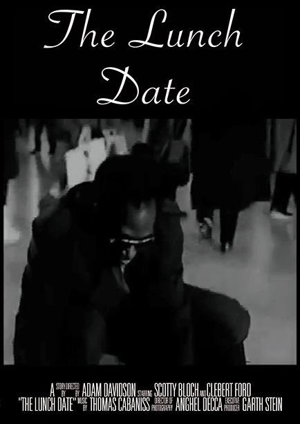
0 Comments
Creating a billing block is something that I have never done before, and was not really sure how to go about it. I began by researching what information should be included and in what order. One of the ways in which I did this was by looking up existing film posters. I also read an article by Ben Schott that gives a breakdown of all aspects of a billing block. I found this really useful as it explained in more detail exactly what needed to be included. I also needed to find out which fonts were typically used for this aspect of a poster. I found out that this was a font called Universal Accreditation.   The next step was to find out all of the information that would make up the block. I was able to find The Lunch Date on IMDB which gave me most of the necessary information (such as the director, writer, cinematographer and actors).
My Billing Block:
During this project I wanted to look at different styles, in particular that of Saul Bass and Paul Rand. Both of whom have created very simplistic yet effective posters. One of the things that I like about their work is that they use collage and all of their pieces have a very childlike and playful feel to them. Below are some example of their work. Saul Bass:
 Paul Rand: 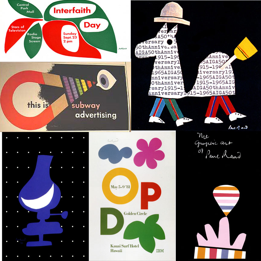 I wanted to try making a poster in the style of these artists. I had already created some still posters so I wanted to try making an animated poster. To do this I took a picture of a train, cut it out and created a gif in photoshop. I think that the gif works well because it shows one of the main aspects of the film (that she had missed her train). However it does not show that the main message of this film is about racism and discrimination. When making this poster I initially just had the train moving across the screen. But when looking back at it I thought that it looked too plain and there was too much blank space. To overcome this problem I decided to add in the steam. 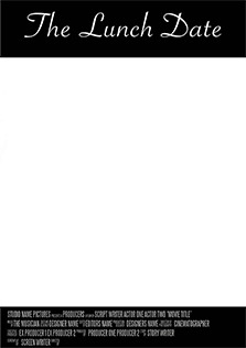
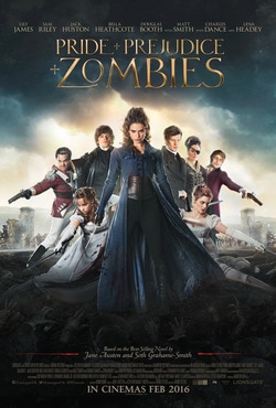
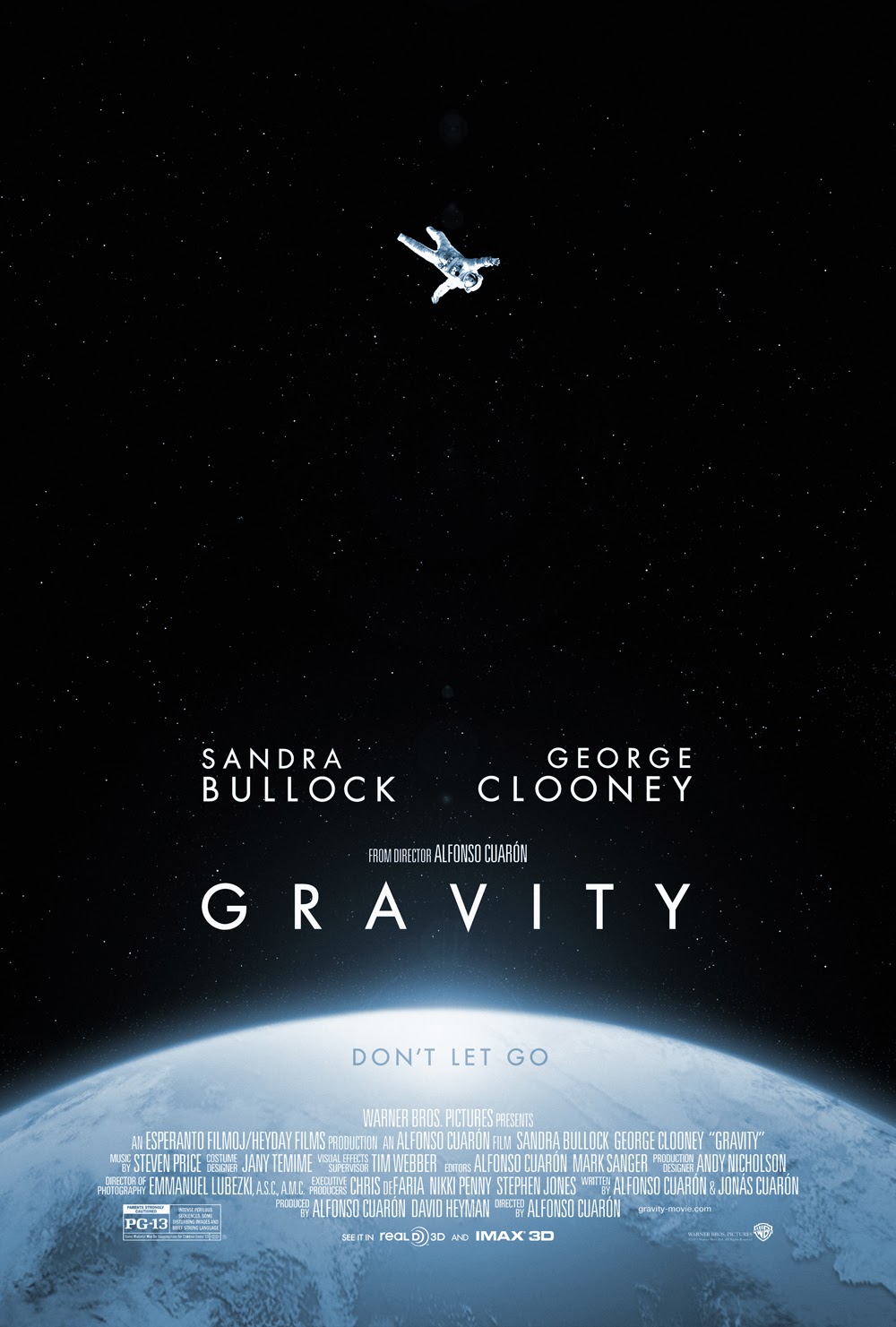
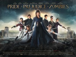
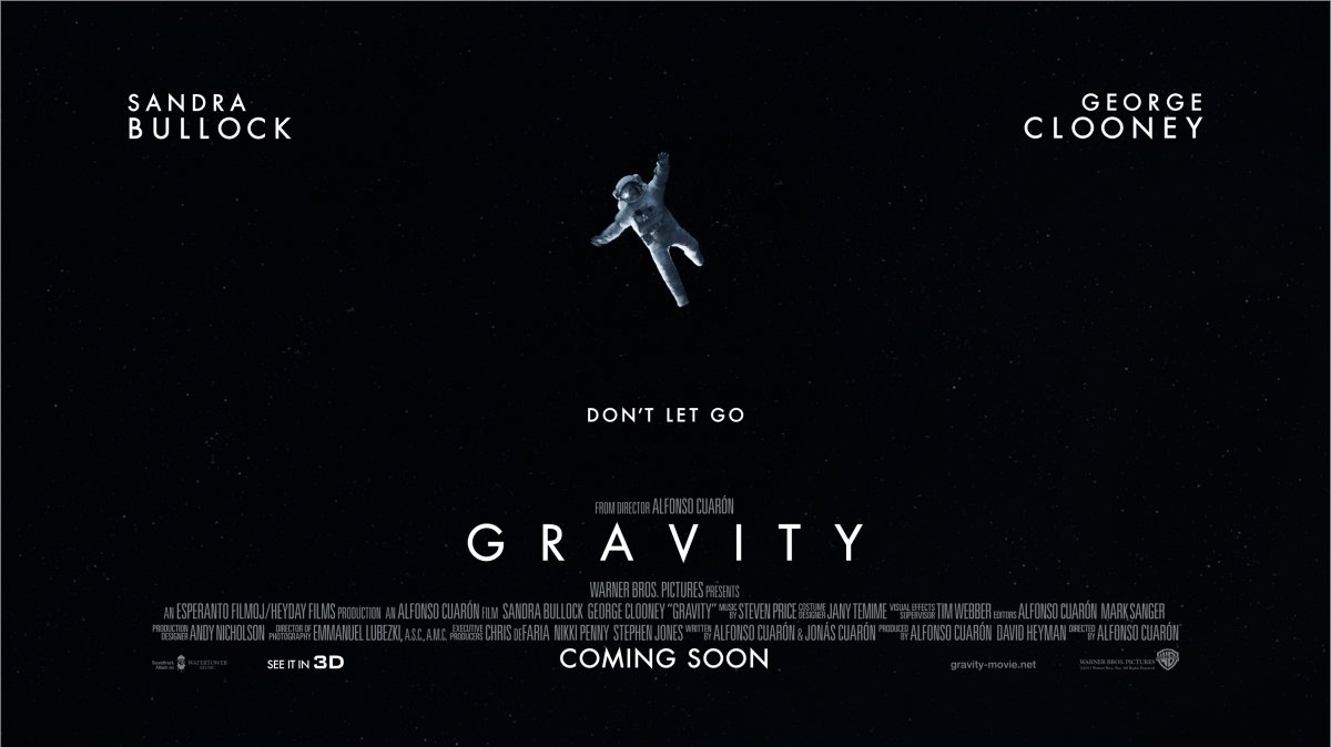
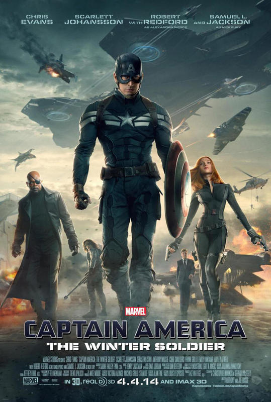
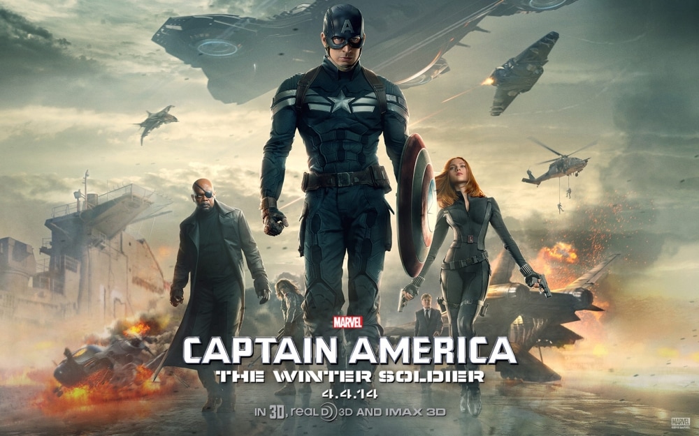
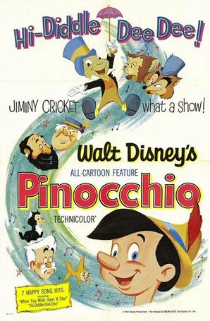
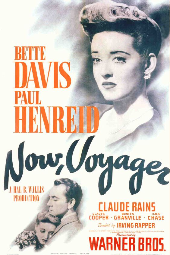
Almost all of the film posters that I have seen advertising films have been portrait. I wanted to explore the idea of using a landscape poster. Looking into some popular films I soon realised that they have both a landscape and portrait poster. With the main difference being the landscape poster having little information on and focusing primarily on the image used. In certain designs such as the 'Captain America' and 'Pride + Prejudice + Zombies' poster the image appears to have much more from to breathe on the page, and I feel the film titles are not as prominent as that of the portrait posters. However on the landscape 'Gravity' poster the image has been simplified, with the earth and stars being removed. I feel this is because on the portrait poster, just having the astronaut would make the poster seem really plain and non-eyecatching. The simplistic image works better on the landscape poster because they were able to move the cast names to fill some of the side space.
Below are some of the test posters that I created. By doing this I was able to work out what the best layout for my final poster would be.
After talking to my peers and tutors I realised that although the above posters give a hint at the subject matter of the film they don't really illustrate what the film is all about.
 'A packet of biscuits' is an urban legend about a man who had some time to kill before his flight home so he decided to buy some of his favourite biscuits. He sat down on a bench and took his coat off ready to read his paper and noticed a woman who had come to sit next to him. He soon realised that she was reaching over and taking the biscuits from the bench. Not wanting to directly confront the woman he reached over and took a biscuit to confirm that they were his. The lady gave him a strange look but continued to eat the biscuits. In his anger he snatched the last biscuit and got up to throw away the rubbish. It was only when he stood up to put his coat back on that he realised his biscuits were under his coat the whole time.
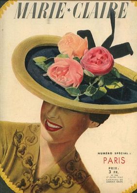
This legend is significant to my project because The Lunch Date was derived from it. With the film being set in the 1940's I felt that it would be best if I used a typeface that was popular in that period. To do this I looked at different forma of media such as magazines, film posters and pieces of art from that decade.
From my research I have found that the typography used included a lot of block capitals and bold text, but at the same time there was also a lot of fluent cursive. The subject matter of the piece of design defiantly had an impact on the font used and often multiple typefaces were used within a piece. I wanted to try and recreate some of the fonts that I had seen to allow me to think more in depth about which font would be ideal for the movie poster. Below are some of my trials. 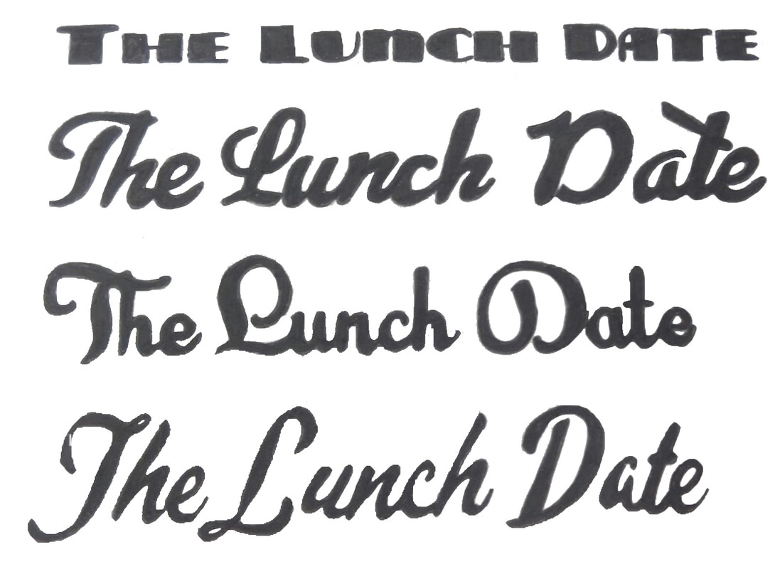 The main theme of this short theme is segregation and discrimination. I wanted to look further into this topic and came across a song by Billie Holiday about lynching. The song was based on a poem originally written by Abel Abel Meeropol to expose racism within america. I feel that this poem illustrates just what people, particually in America had to go through. Although The Lunch Date was created in 1989 it touches on the segregation that was experienced in the 1930's and 40's. Some of the way I feel that the film did this are listed below:
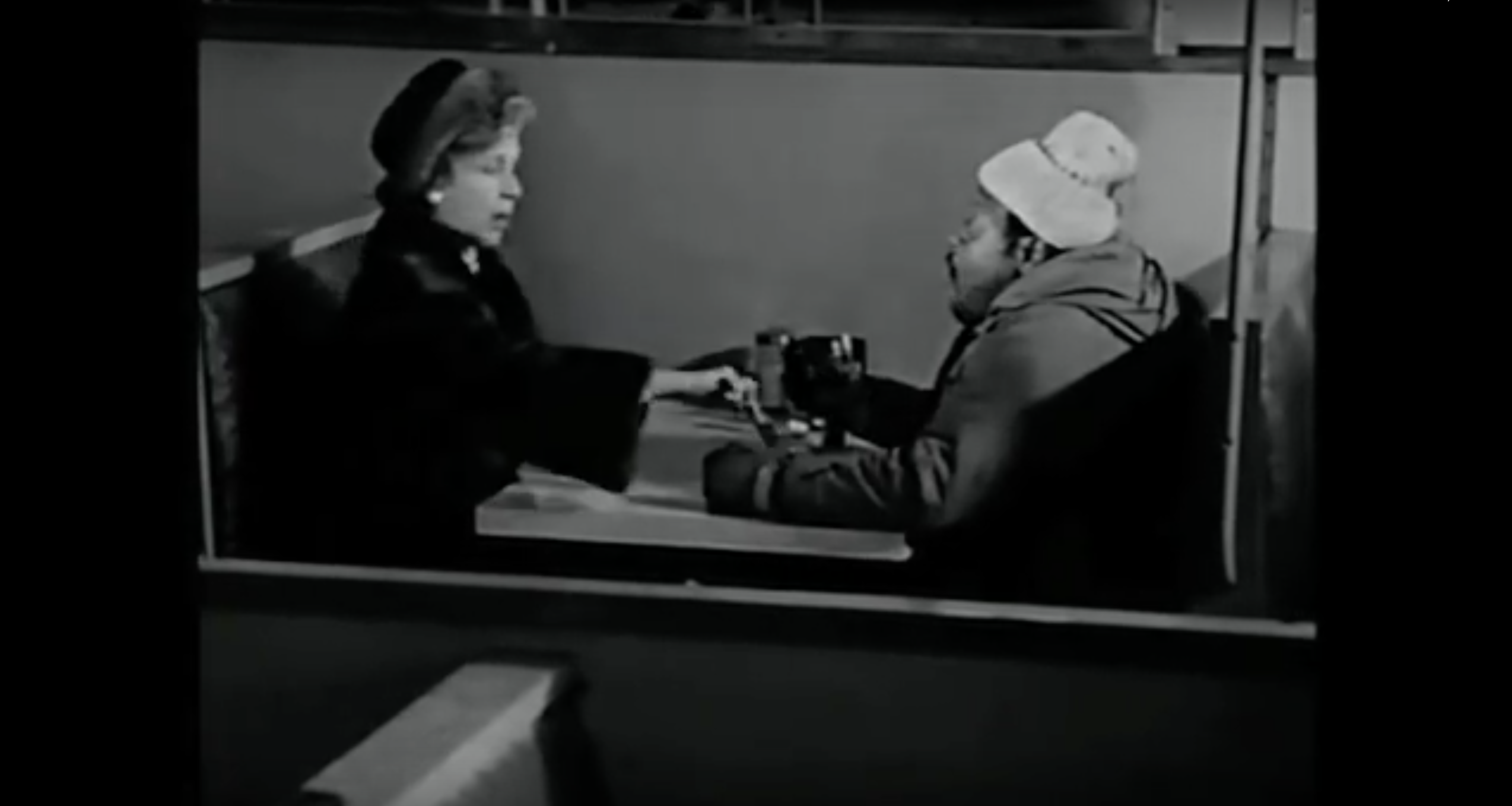
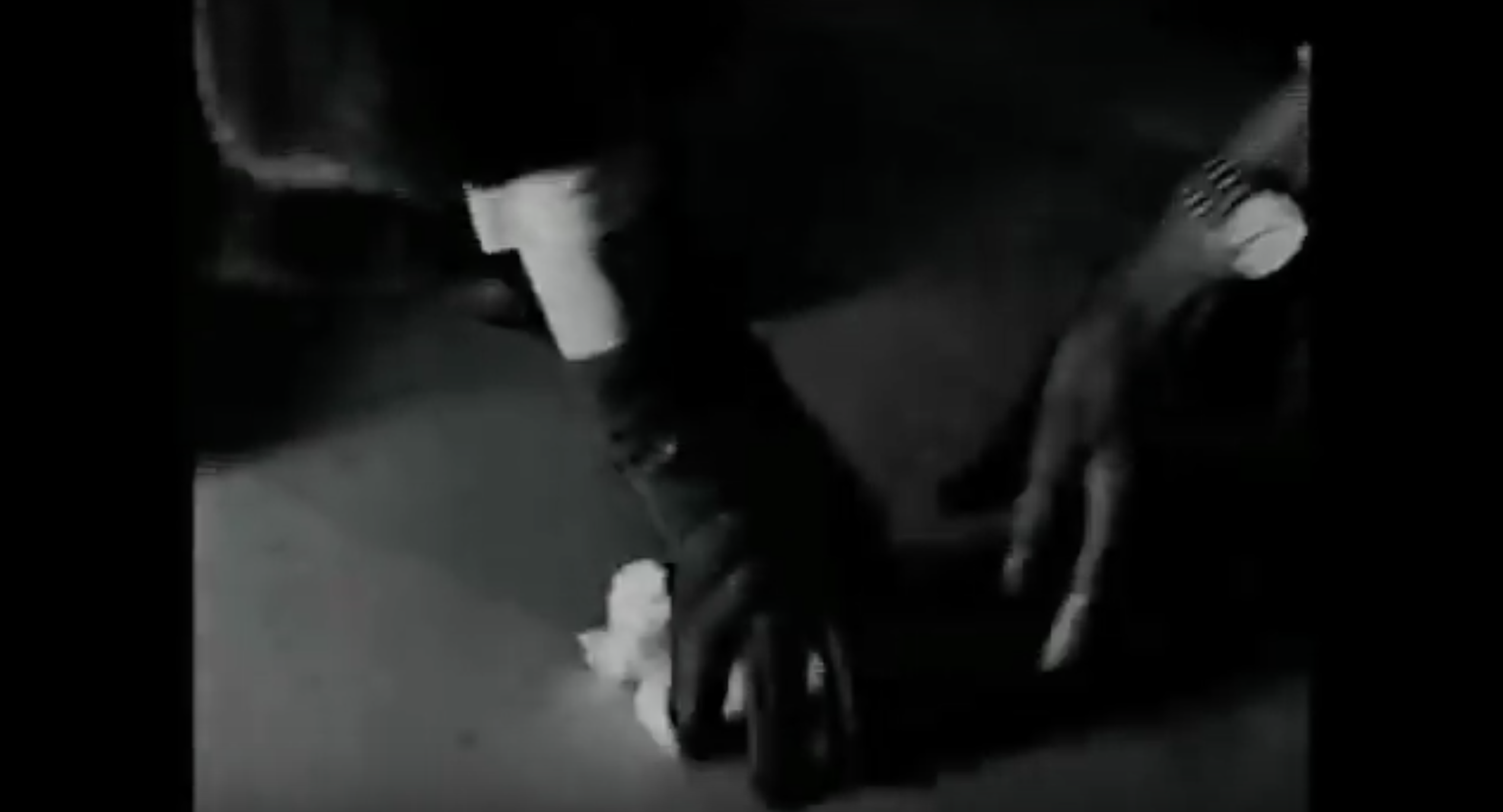
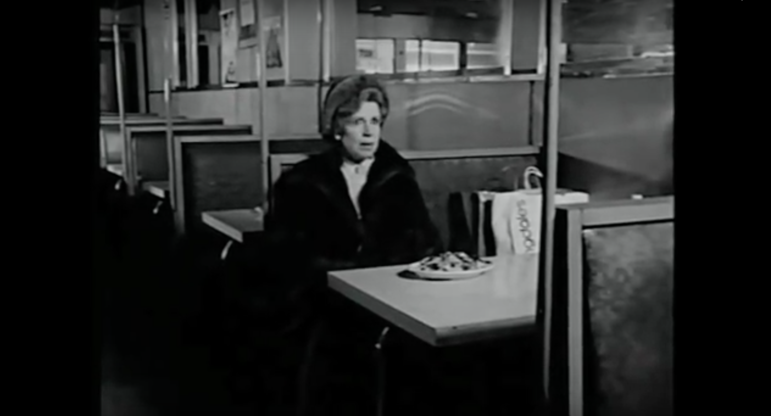
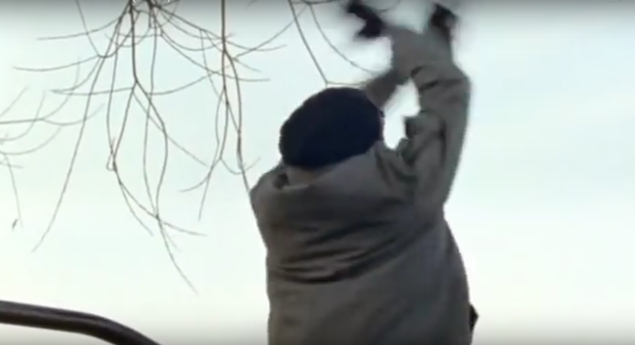
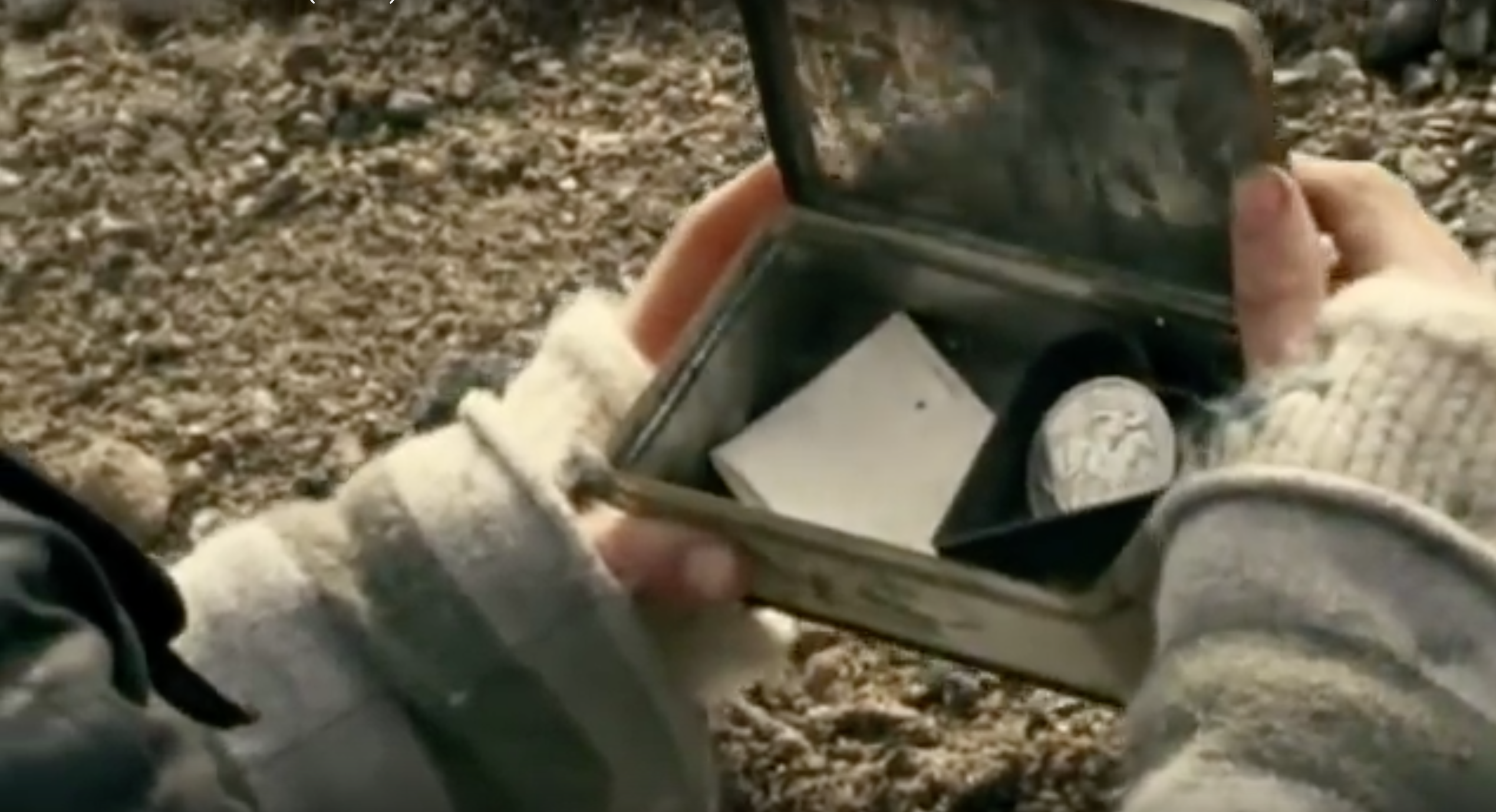
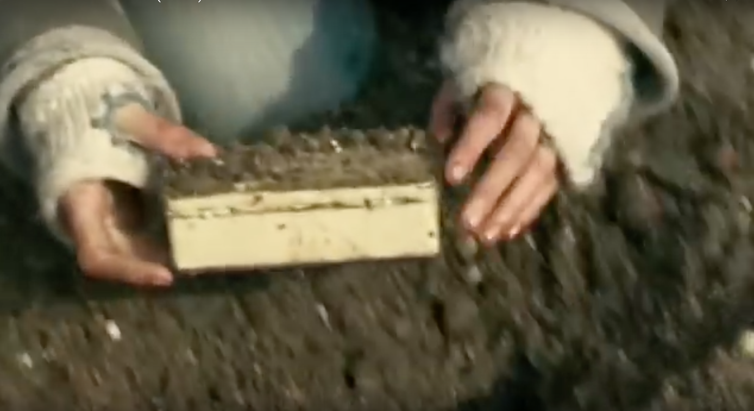
For each of the 6 short films that I have to choose from I have taken some screenshots of what I feel illustrate key plots or sum up the film nicely. Below are those screenshots. The Lunch Date:
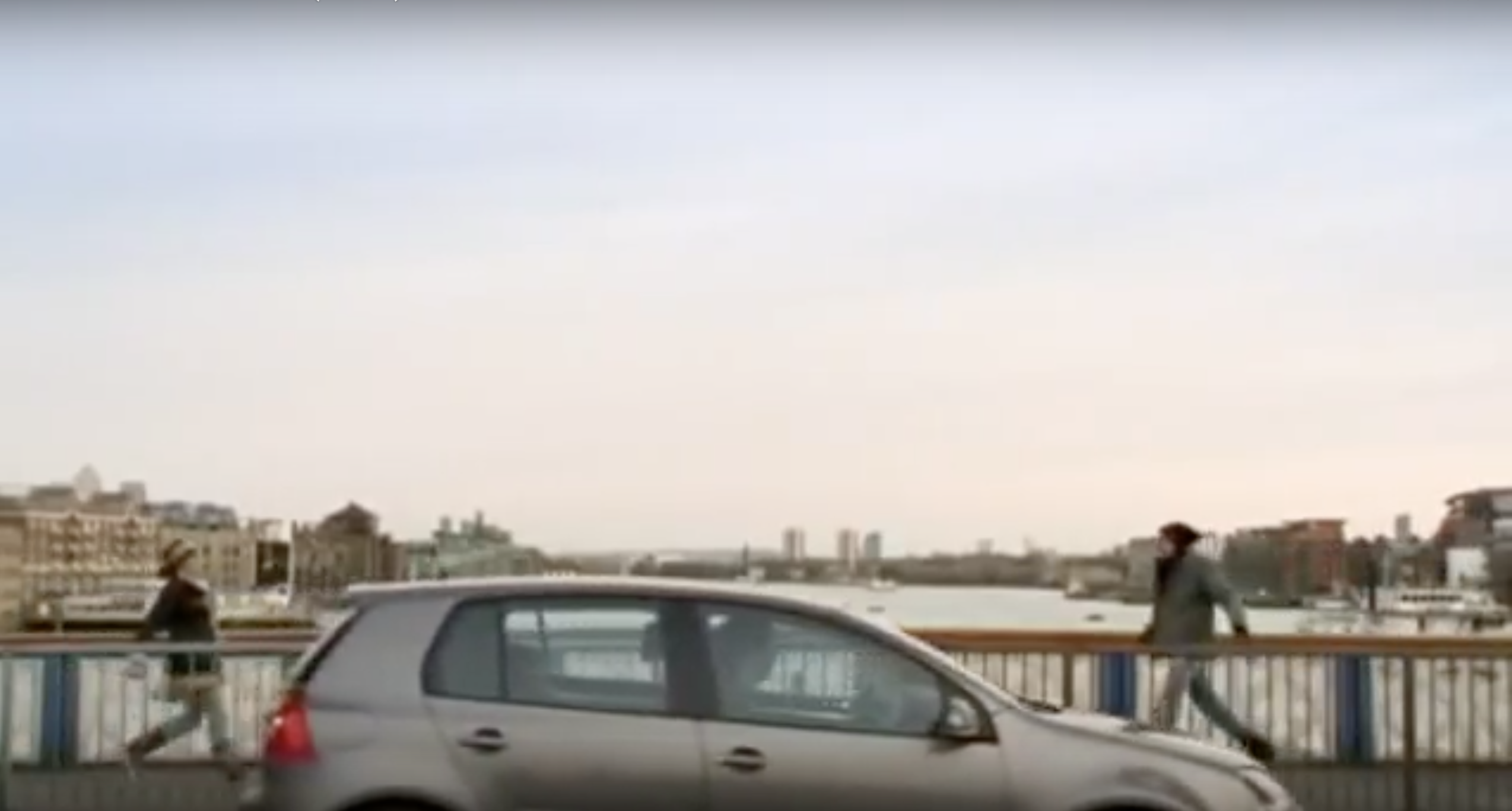
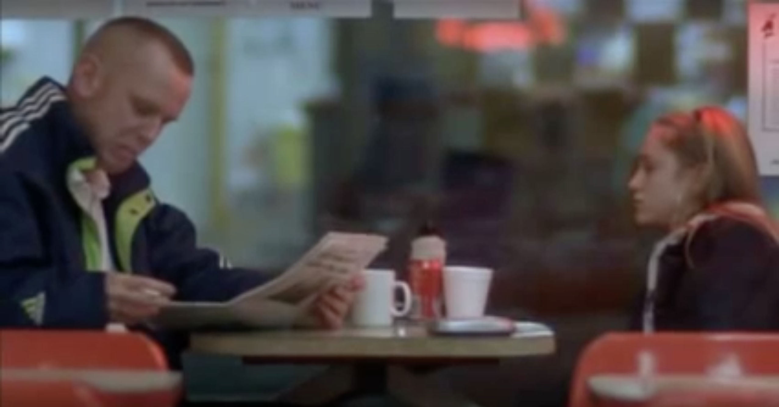
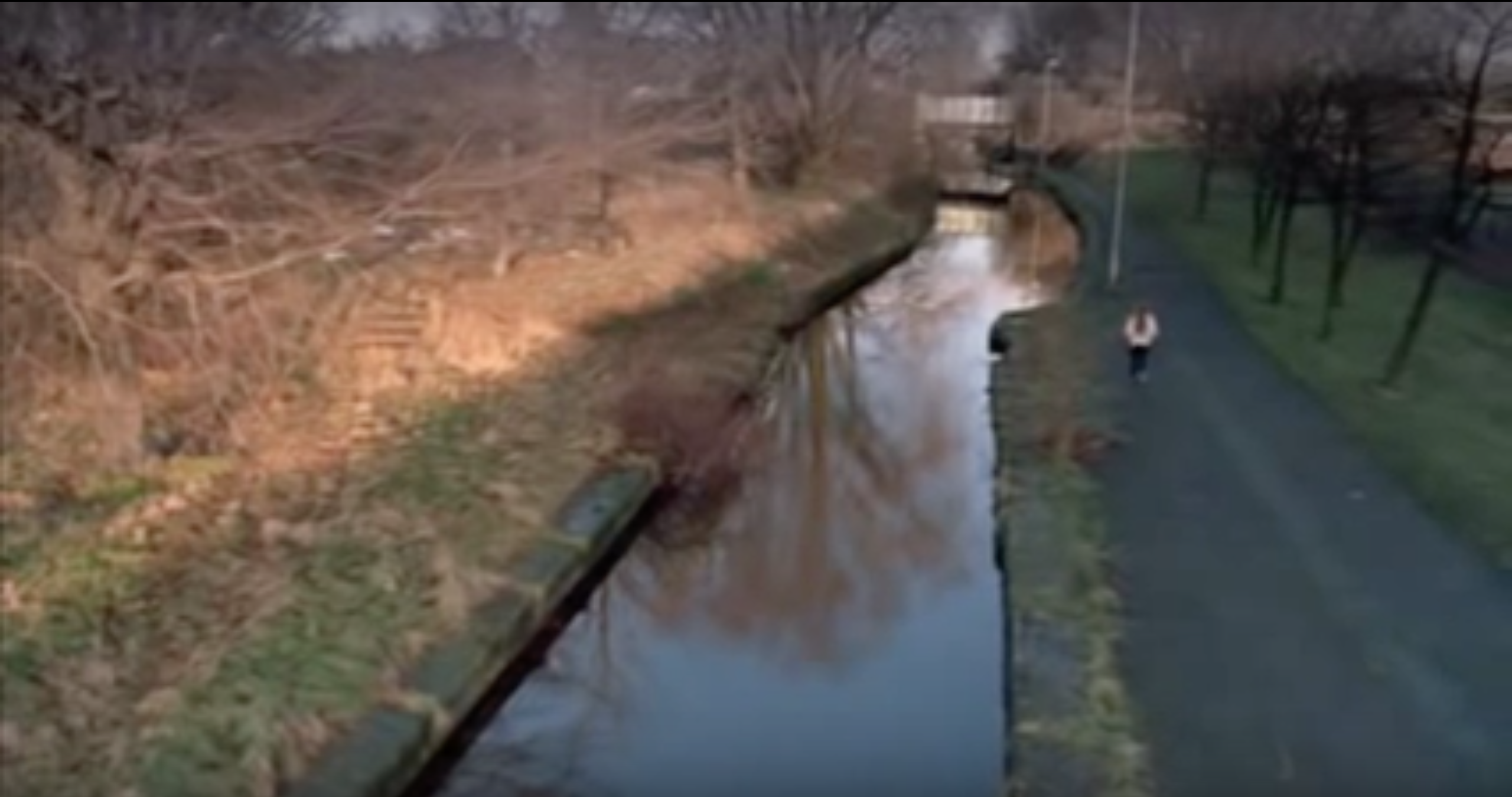
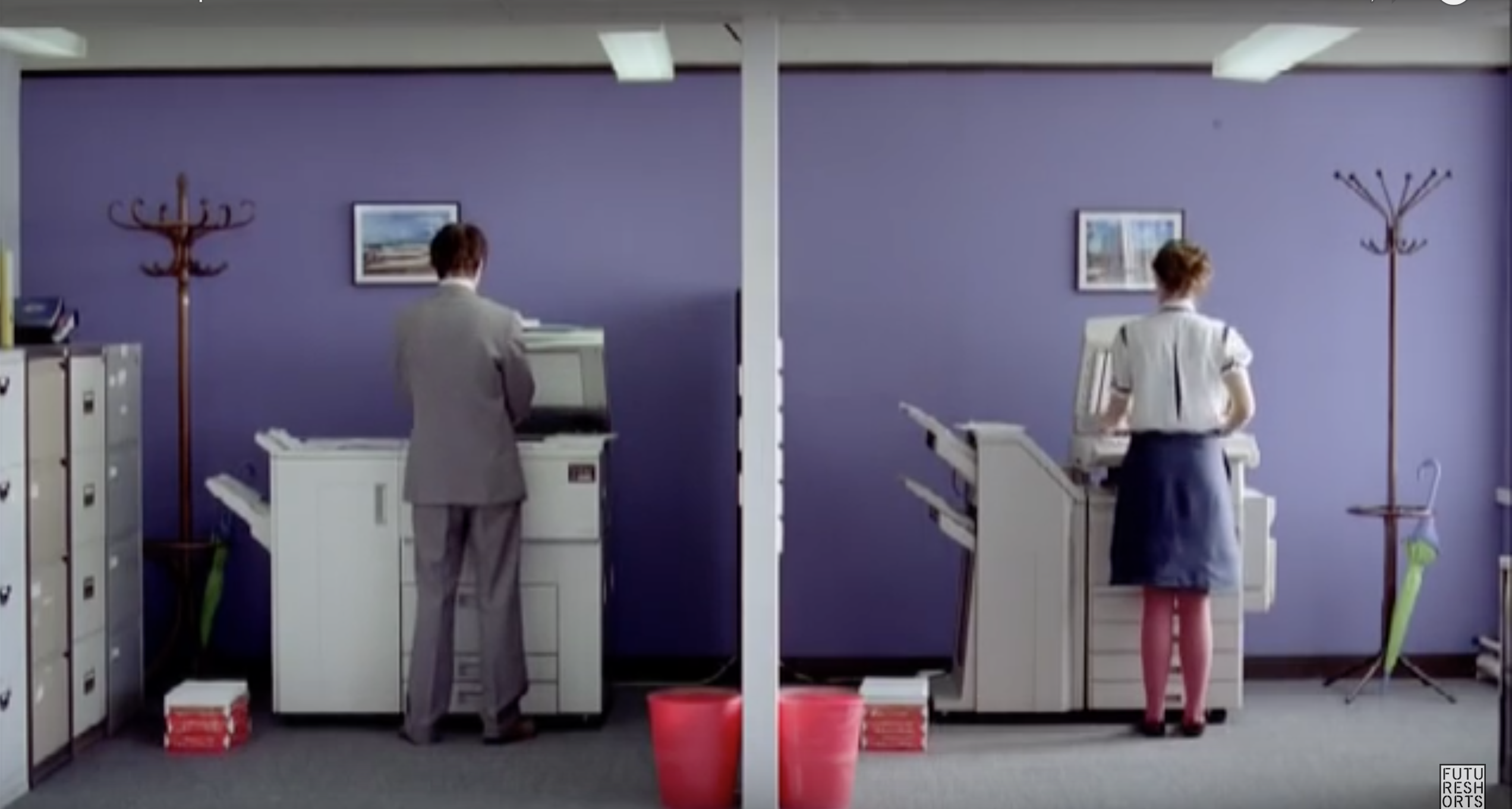
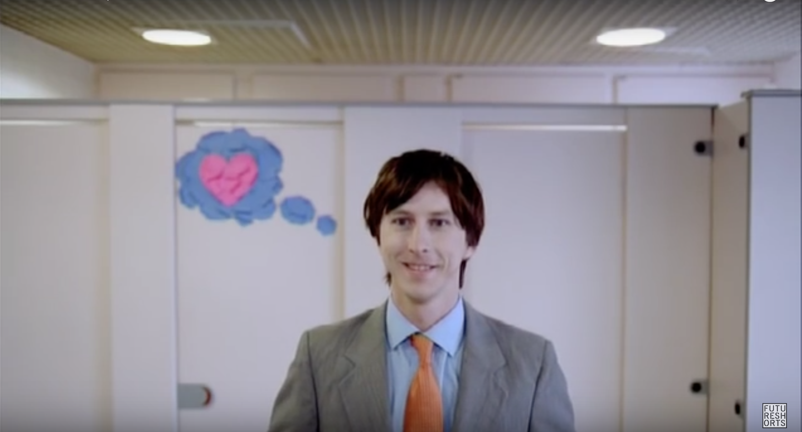
Within this film there is a strong reference to racism and prejudice. One of the main things that this film shows is that things are not always as they seem. The man who appeared to be a thief turns out to be very giving and generous. This film was set in the 1940's where prejudice was rife. I particularly like that there is a moment within the film when the audience knows about the generosity of the man but the main character is oblivious. From the screen shots that I have taken the one which I feel sums up the film is the last one. Just the way in which the you can tell that the individuals involved are of different skin colours but they are doing the same action, shows to me that they are both human. The Beachcombers:
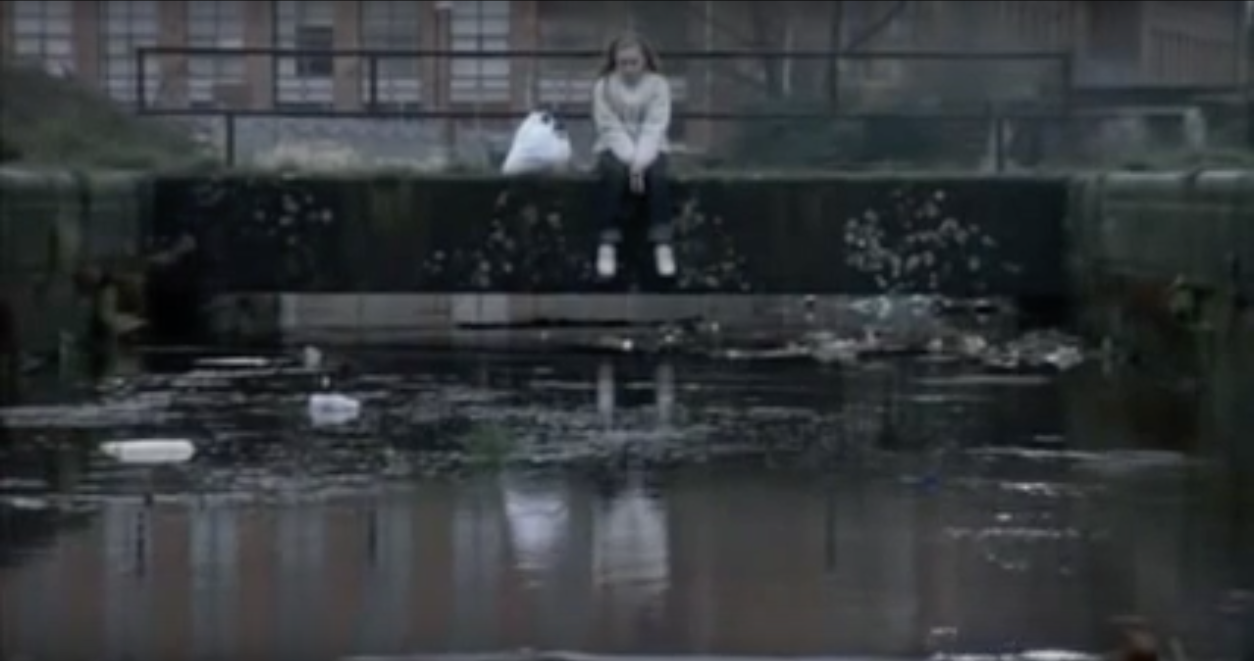
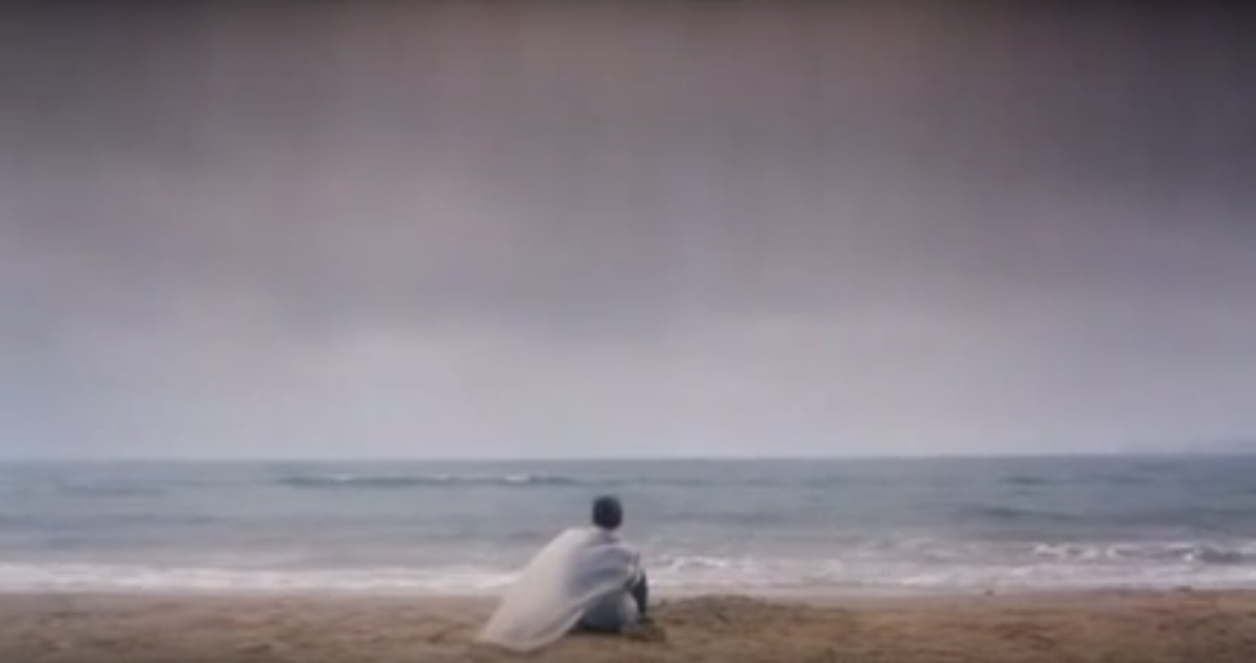
This short film shows a love story between two people who have the same passion towards beach combing. It is obvious that the setting for this film is London in the winter. I think that the atmosphere that is created within the film is something that could be interesting to drawn upon within the poster. About a Girl:
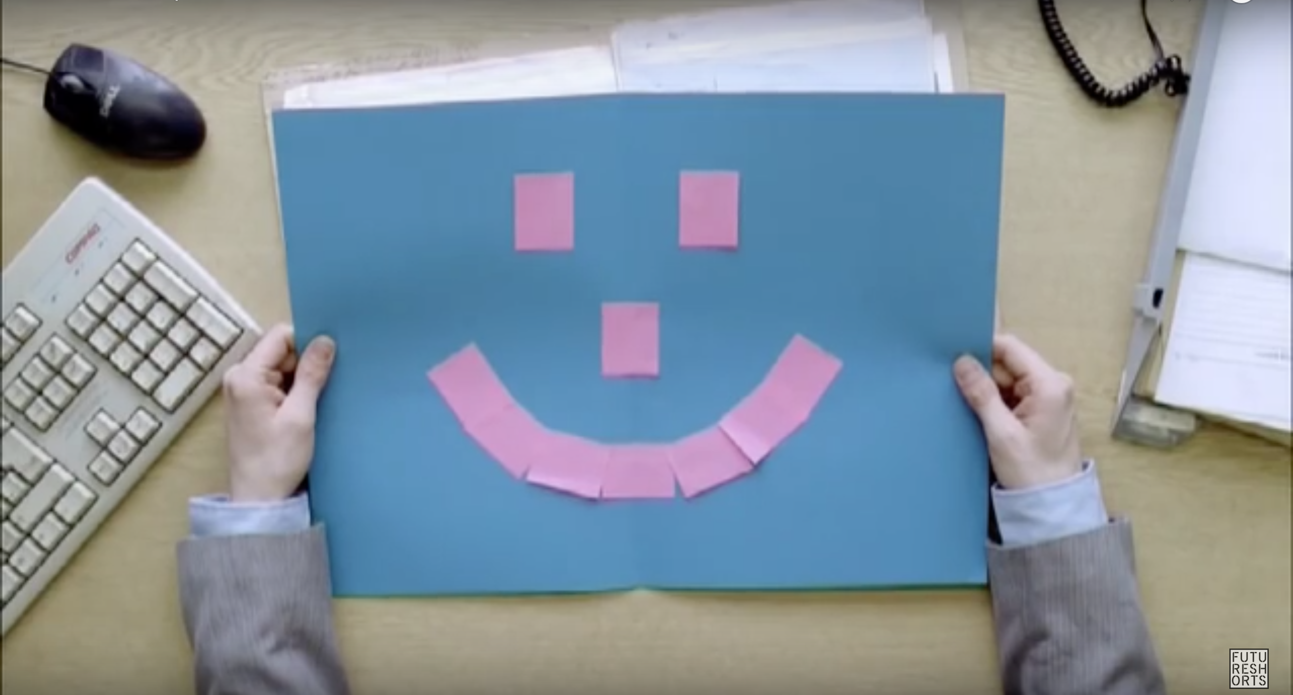
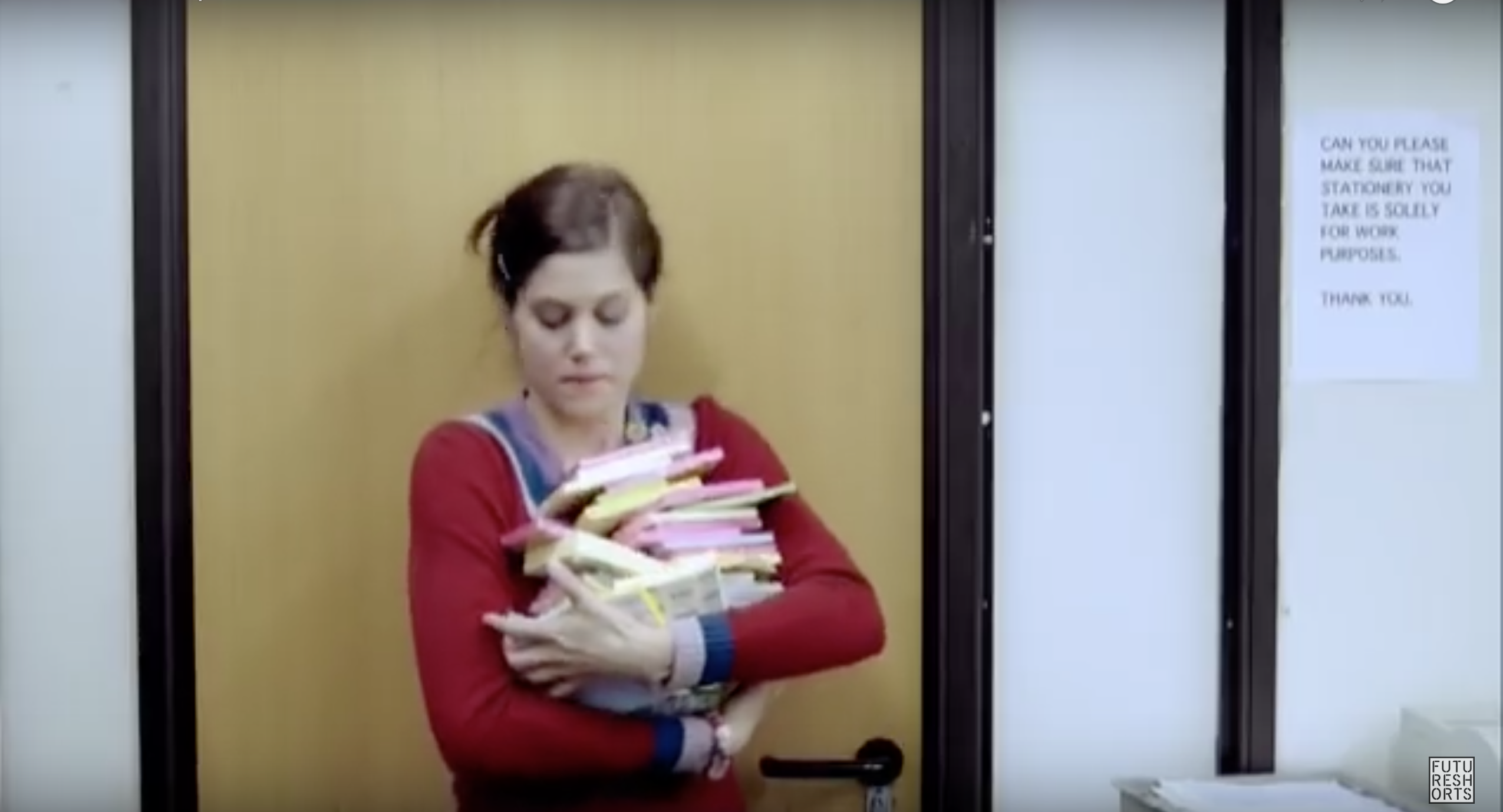
One of the main themes of this film is that the girl has no-one to talk to and feels neglected. This could be an interesting idea to play with when creating the film poster. Looking into colour theory could be a aspect which could really make this poster come to life. One of the important things is that if I were to choose this film to create a poster for I would not want to give away too much information about the plot. This could be quite a difficult task. Post-it-love:
This is a really playful film and if I were to do a poster for it I would experiment with this idea. The screen shots that I have taken from this film do not give the plot away. This was a deliberate choice because movie posters are designed to tell a bit about what is going to happen within a film without giving away too much of the storyline. I do Air:
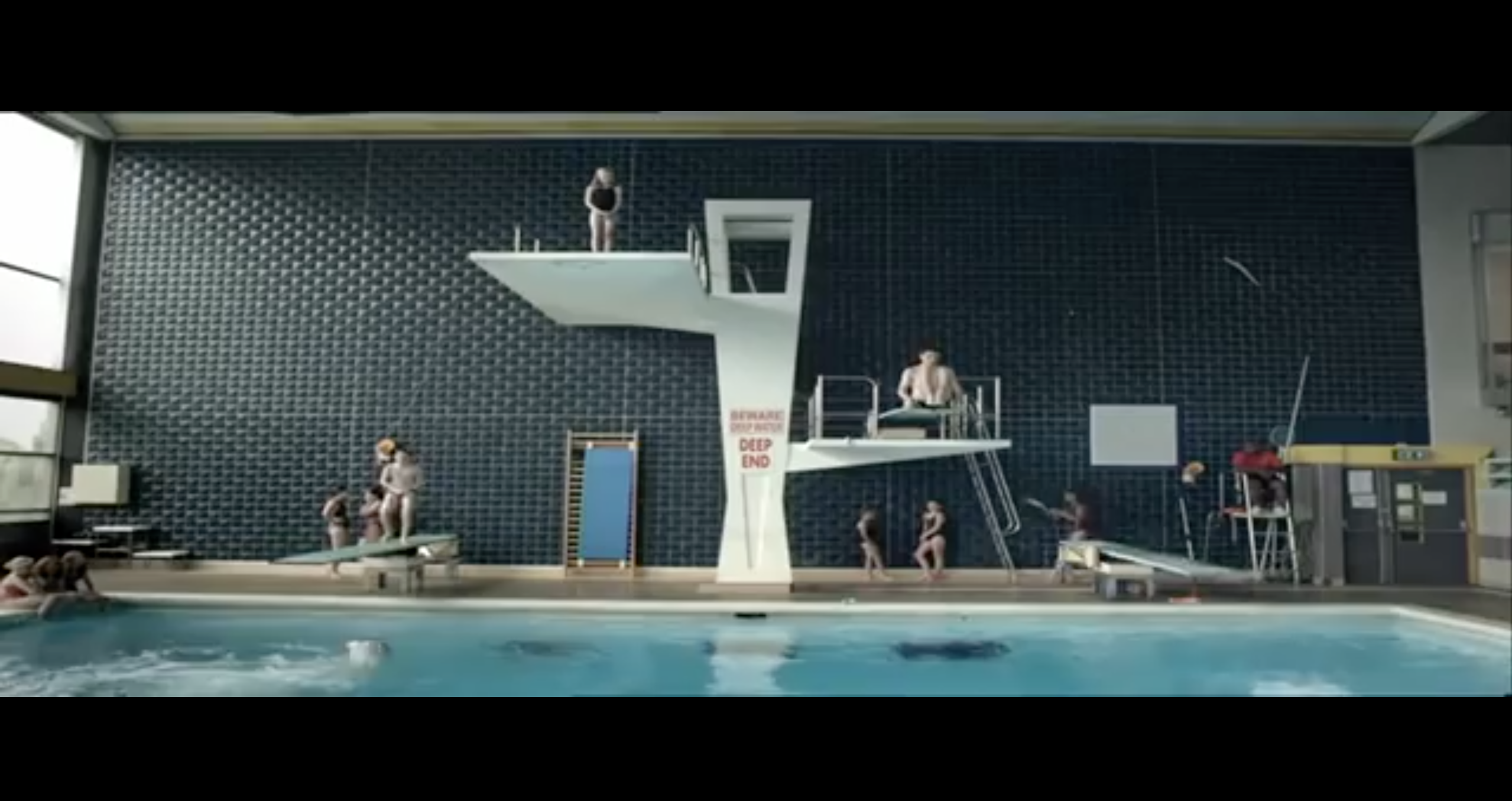
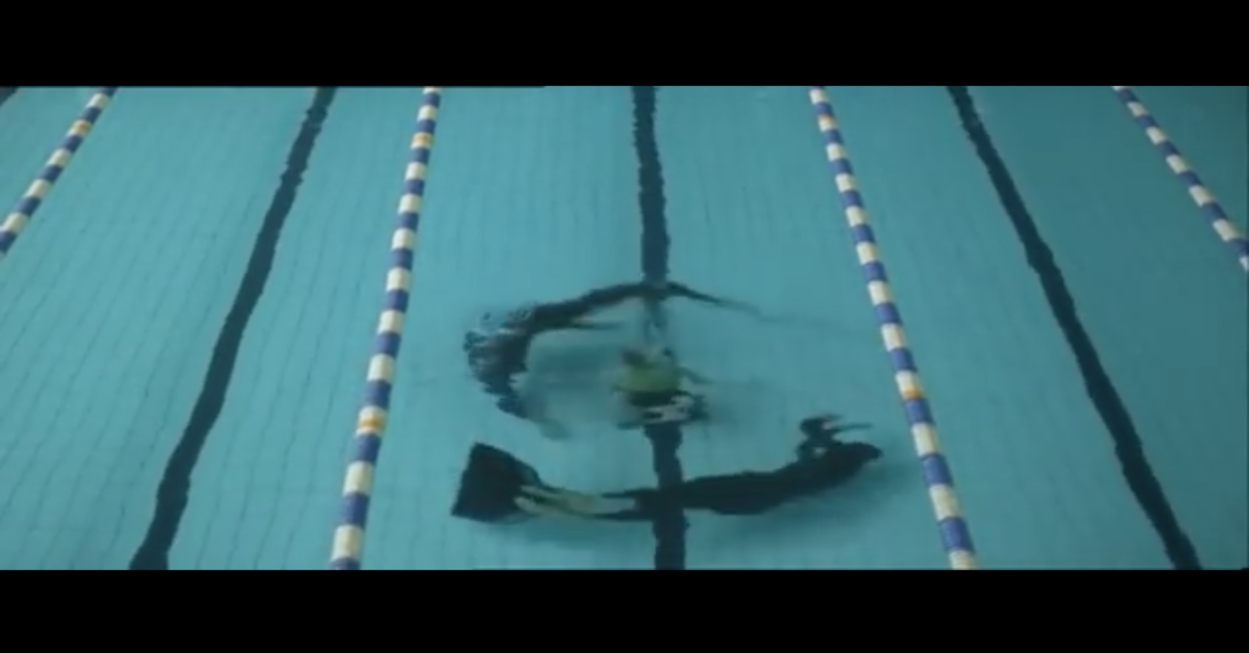
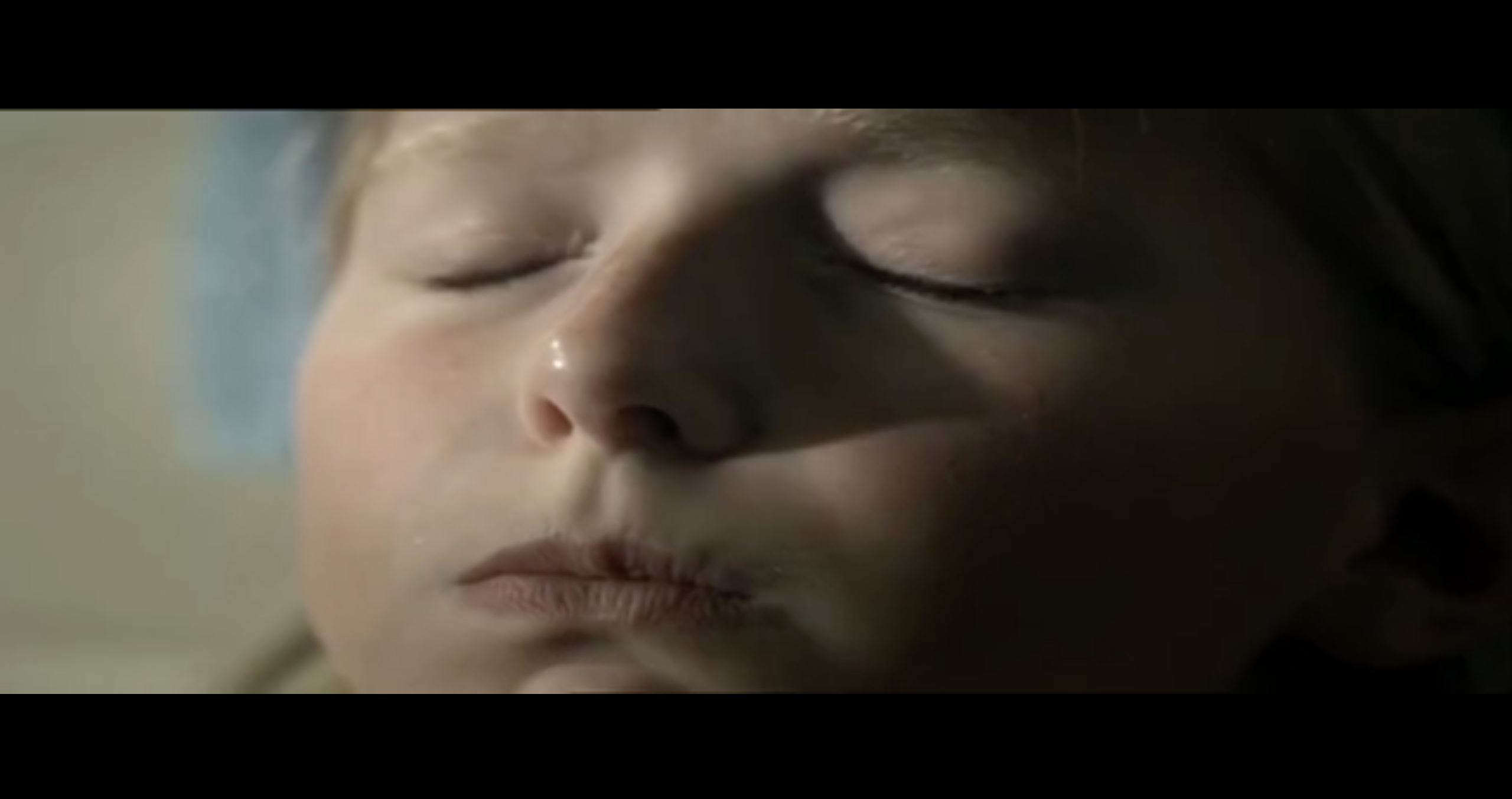
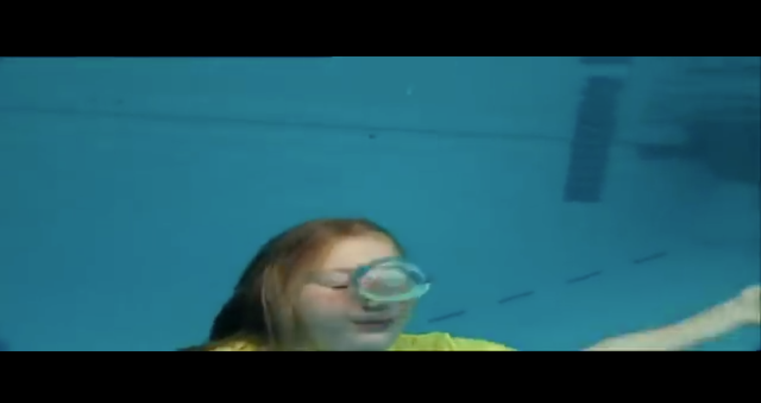
When watching this film it seemed to me that the girl suffered with some form of anxiety, and the only way for her to calm herself down was to hold her breath (as a way to silence her fears). Sound is used within this film to portray emotion and is something that I feel could be used within the animated movie poster to enhance it. The idea of using the water from a swimming pool to create the movement within this poster is an idea which I feel could be played with. Eight:
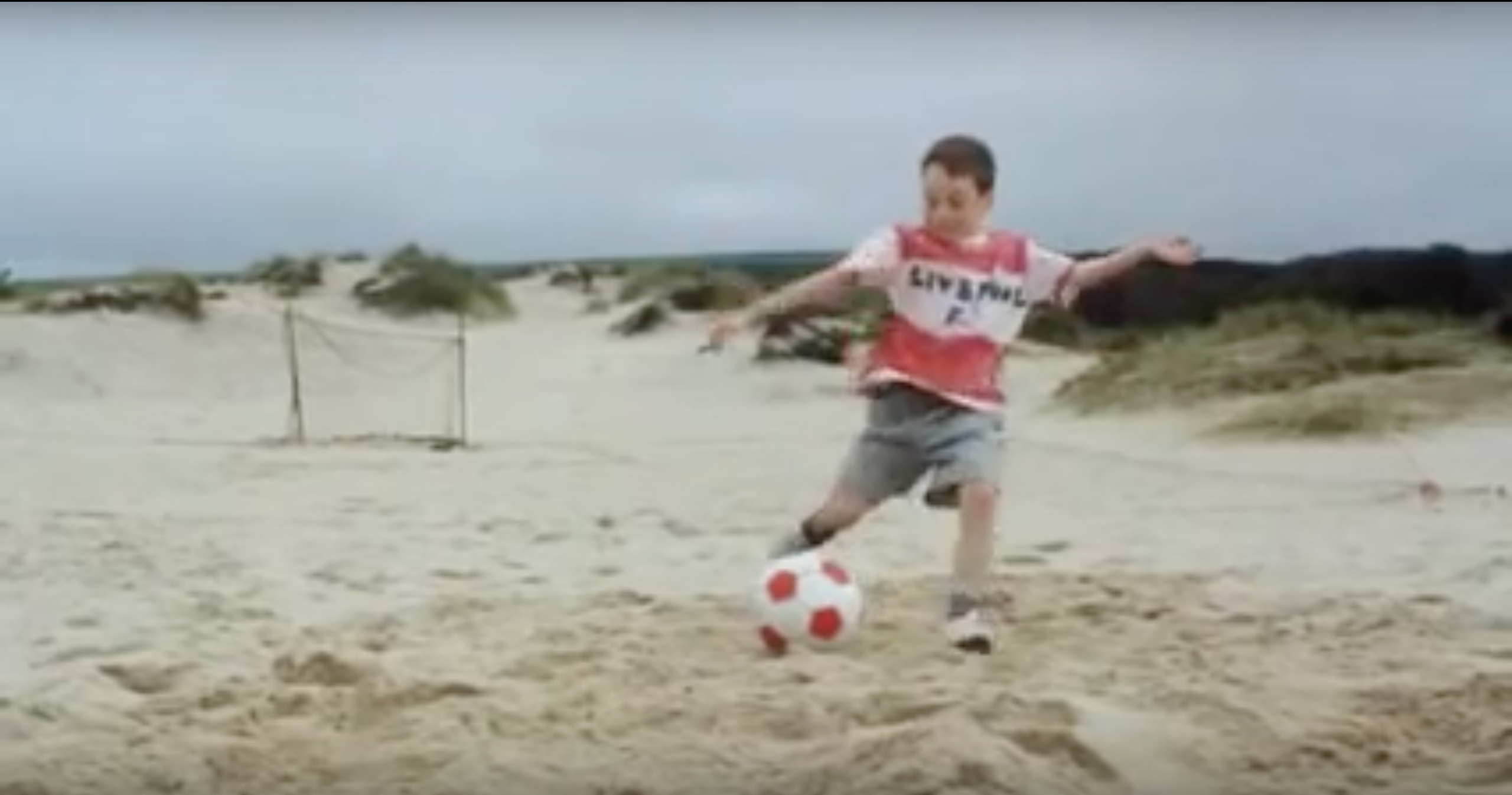
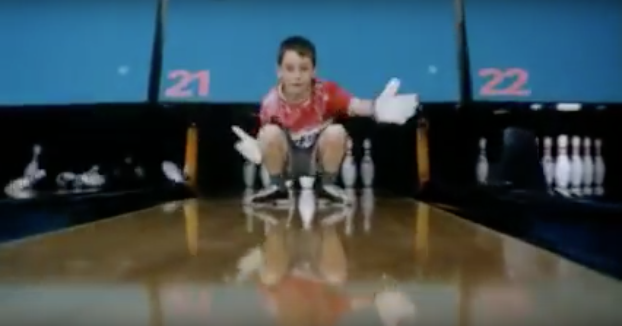
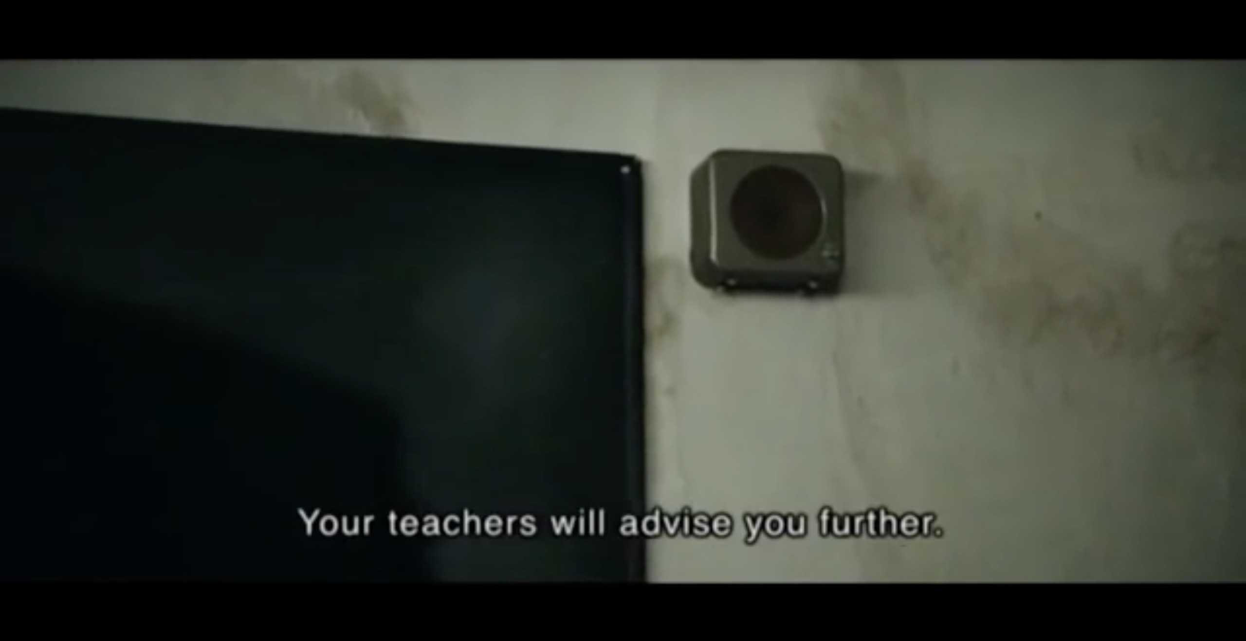
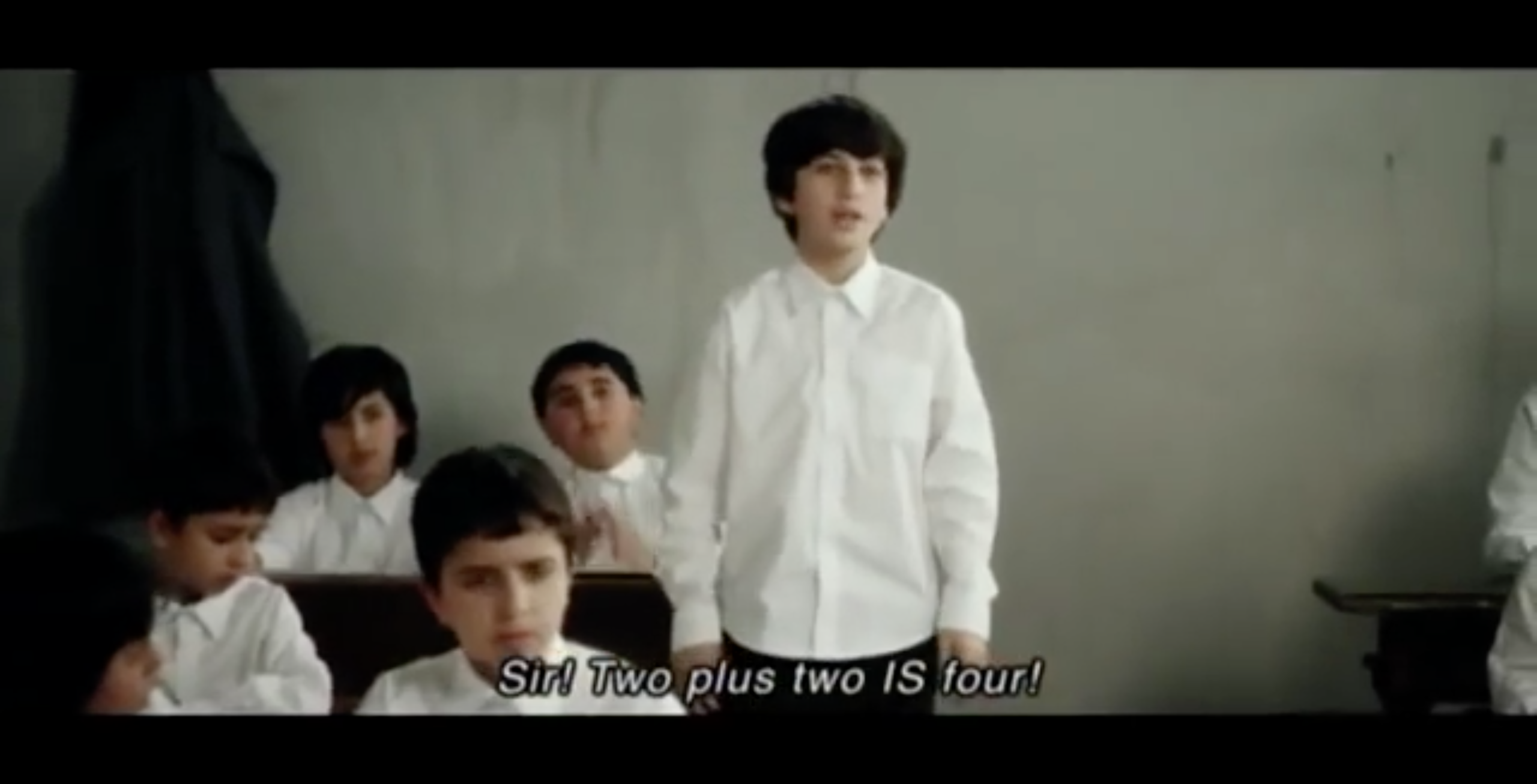
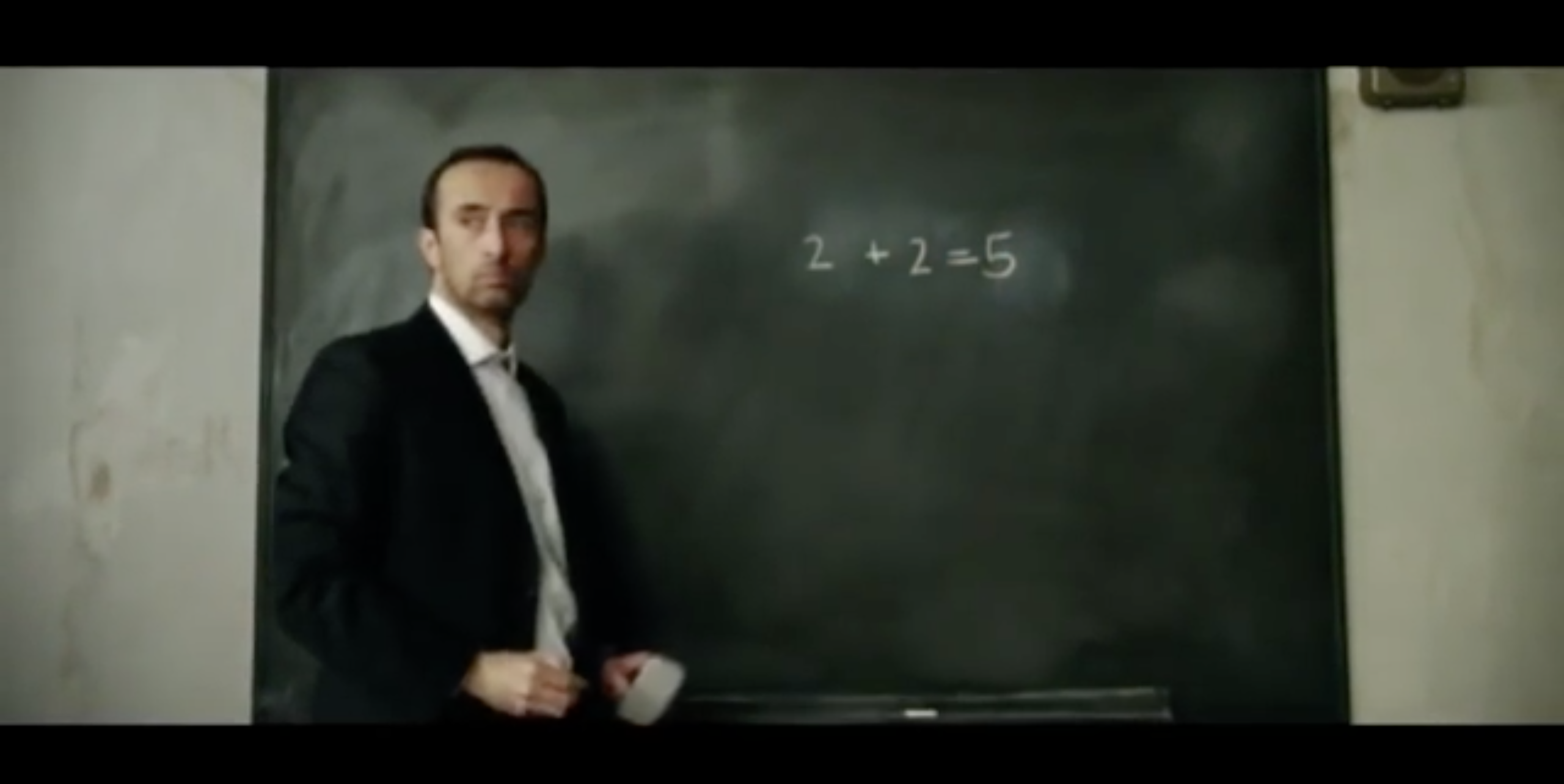
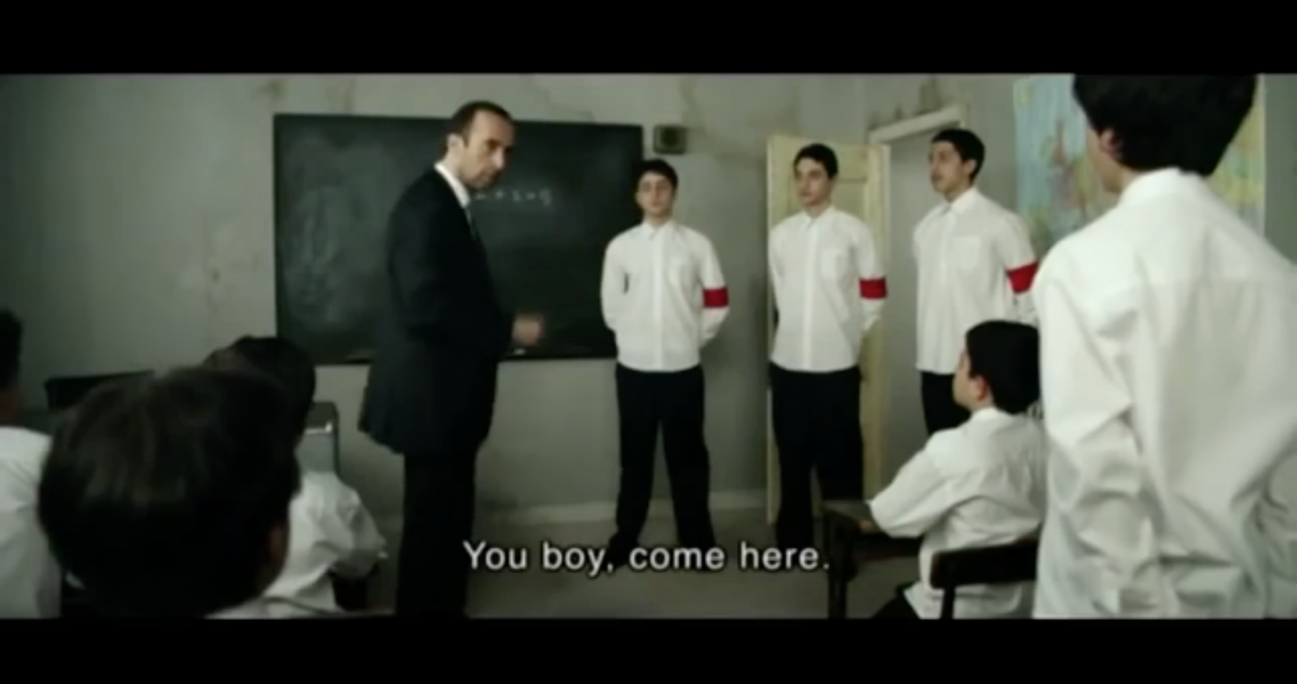
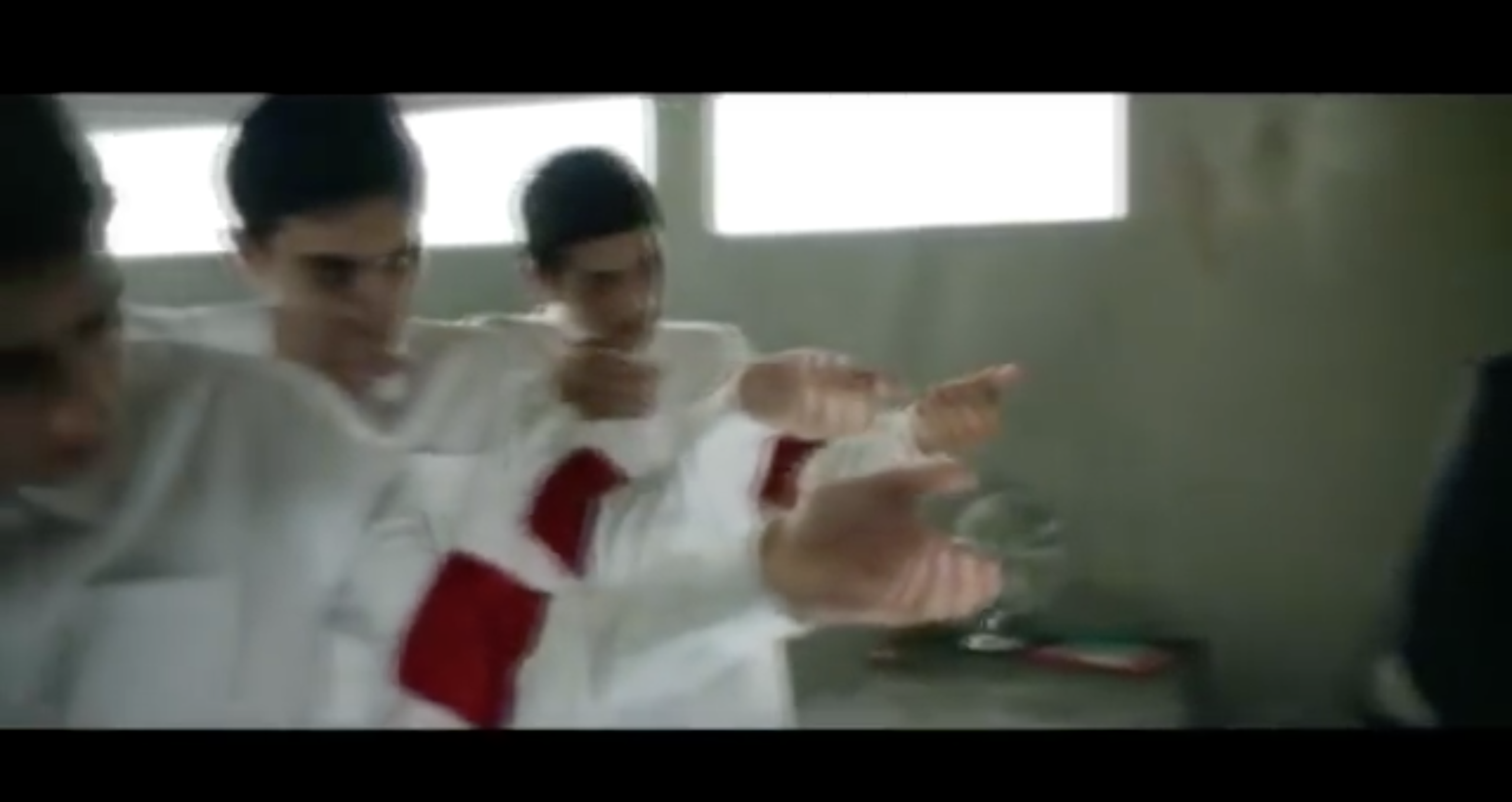
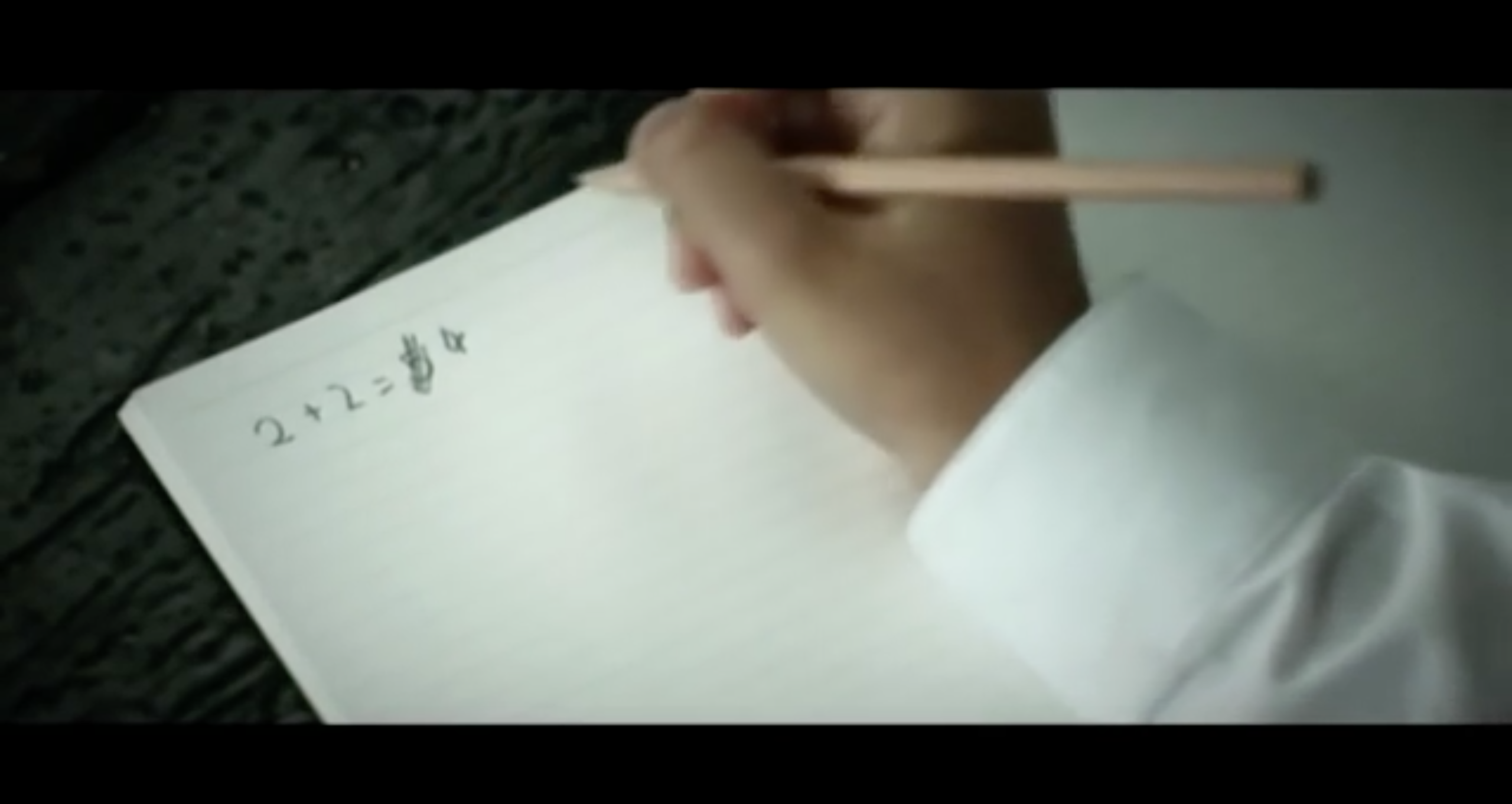
This film makes reference to the Hillsborough disaster. It could be an interesting film to play with as there are many aspects that can be pulled out of it for a potential movie poster, with the most obvious being the football aspect. It could be interesting to illustrate how the boy feels isolated because his dad passed away in the Hillsborough disaster and his mum doesn’t want him to be involved with football because of it. The reason that I have taken screenshots of the scenes above is because all of them represent the film nicely and I think that they could all be adapted into a poster or inspire possible posters for this film. 2+2=5:
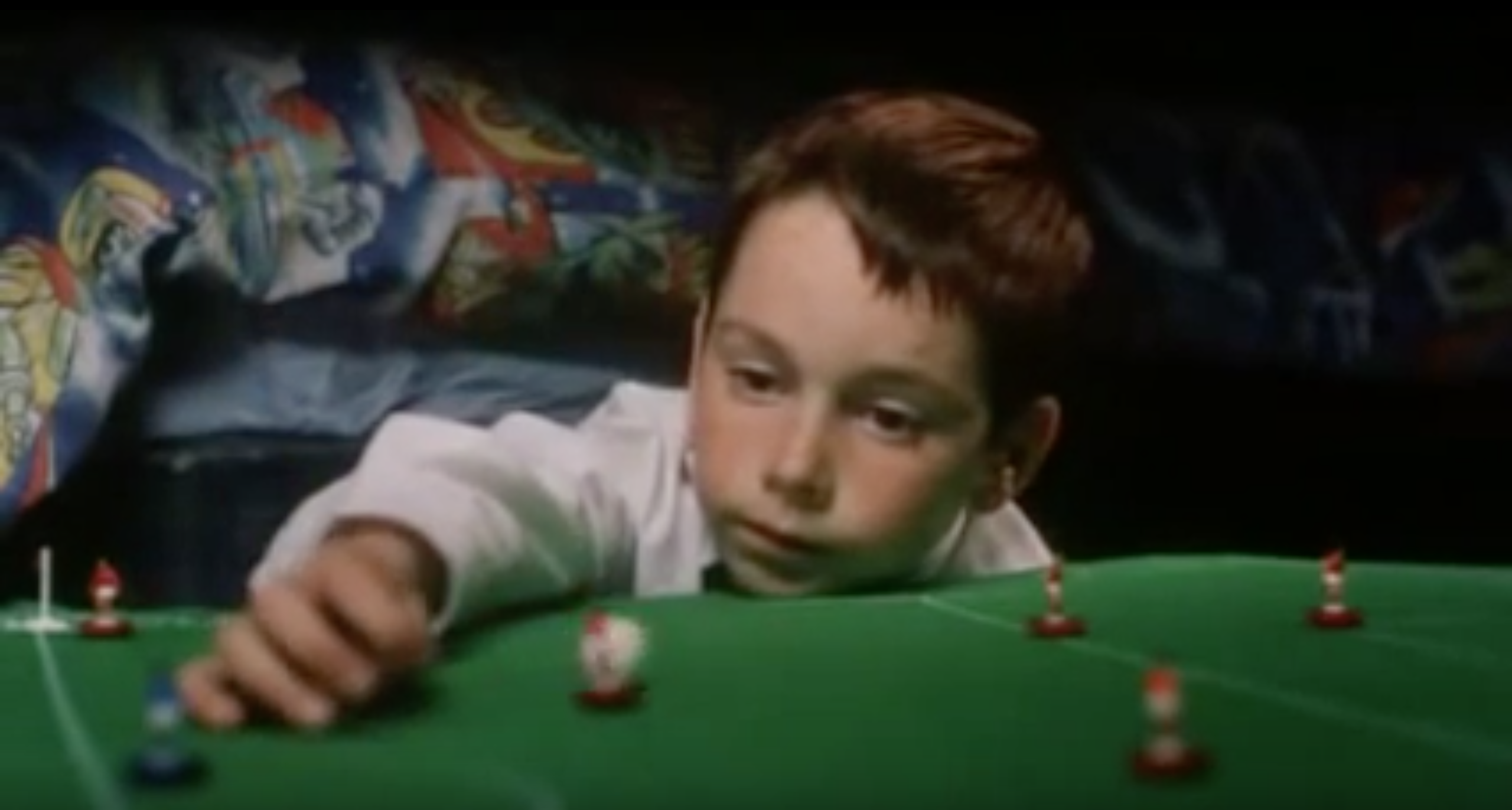
The narrative within this film reminds me of Nazi Germany, especially when the three older students become a part of the film with the red bands that they wear on their upper arm. Some of the key aspects that I picked up on include the chalk on the blackboard and that fear is being used to control the boys, especially with the shocking twist ending! I feel like the message this film is trying to convey is how easy it is to control a group of people, especially when you use fear. Something else that I got from this film was that you should stand up for what is right, even though it may not be the easiest thing to do.Trying to convey the film without giving away the ending is something that I think will not be an easy task.
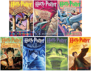
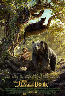
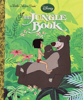
To start off this project I Decided to look into movie posters that have already been animated by various designers. I found a designer called Pablo Eyre who has animated the posters of some of the posters from well-known films. Below are some examples of his work, both of which I feel add something to the posters. Buzzfeed have an article dedicated to animated movie posters, some of which I think are better than others but all are good and successful in their own way.   I started to look at film posters and how they differ from book covers. To get a comparison I looked specifically at books that have been made into films and vice versa.
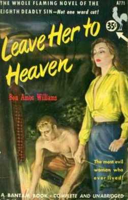
One of the main difference between these posters is that the Book covers are more illustrative and the film posters are a lot darker and focus on different points within the storyline. The idea of the book cover feeling more personal and using brighter colours is also true of the Jungle book cover and poster.
|
Archives
February 2017
Categories |
 RSS Feed
