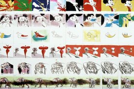
Parasol MediaA motion graphics company that does a lot of work with making logos move. I like their work because of the strong transitions between scenes and the way they flow seamlessly. This is something which I aim to achieve within my own work. All of the screenshots below were taken from the video 'Fourteen' which is a showreel of some of their most successful logo work.
Olly MossAn artist that is most famous for his work in reinventing movie posters, using screen printing. His work particularly appeals to me because of how striking and bold the images are (due to the colour palettes used) as well as the playful approach that he seems to take.
Owen GlidersleeveAn illustrator and set designer that uses cut out pieces of card collaged together to make stunning pieces of artwork. I love how clean his designs are and the complementary use of colour.
0 Comments
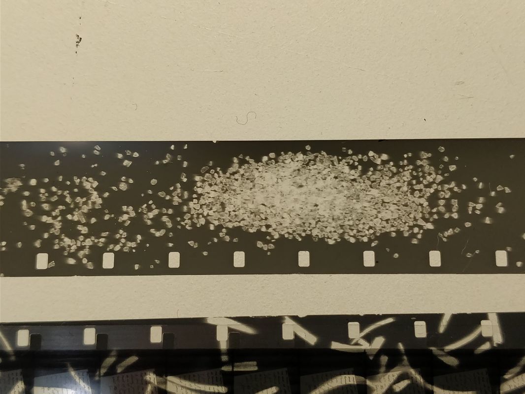
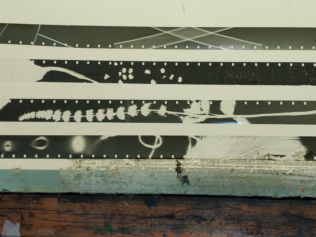
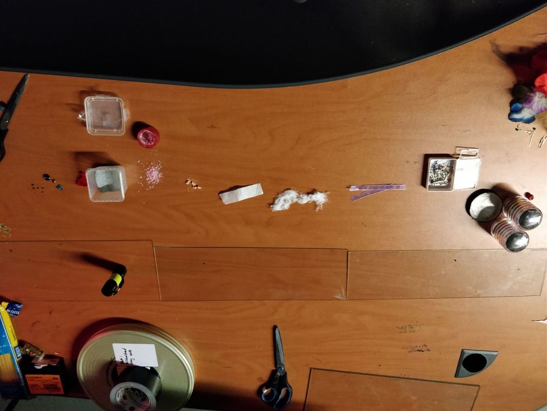
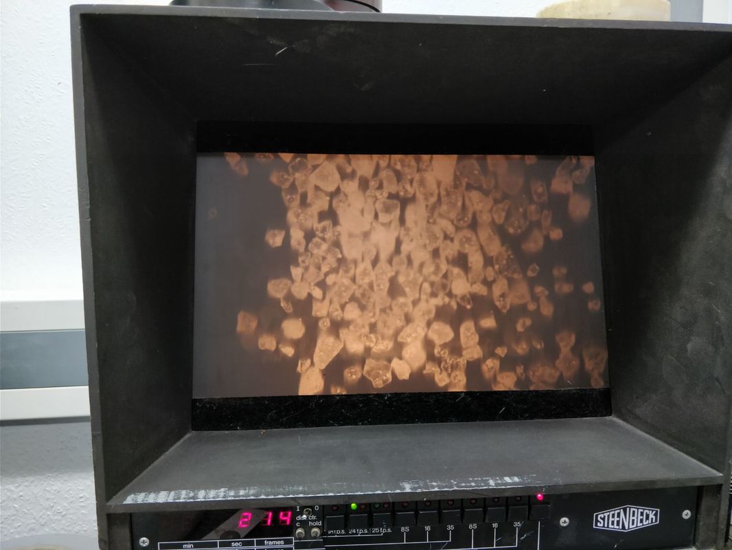
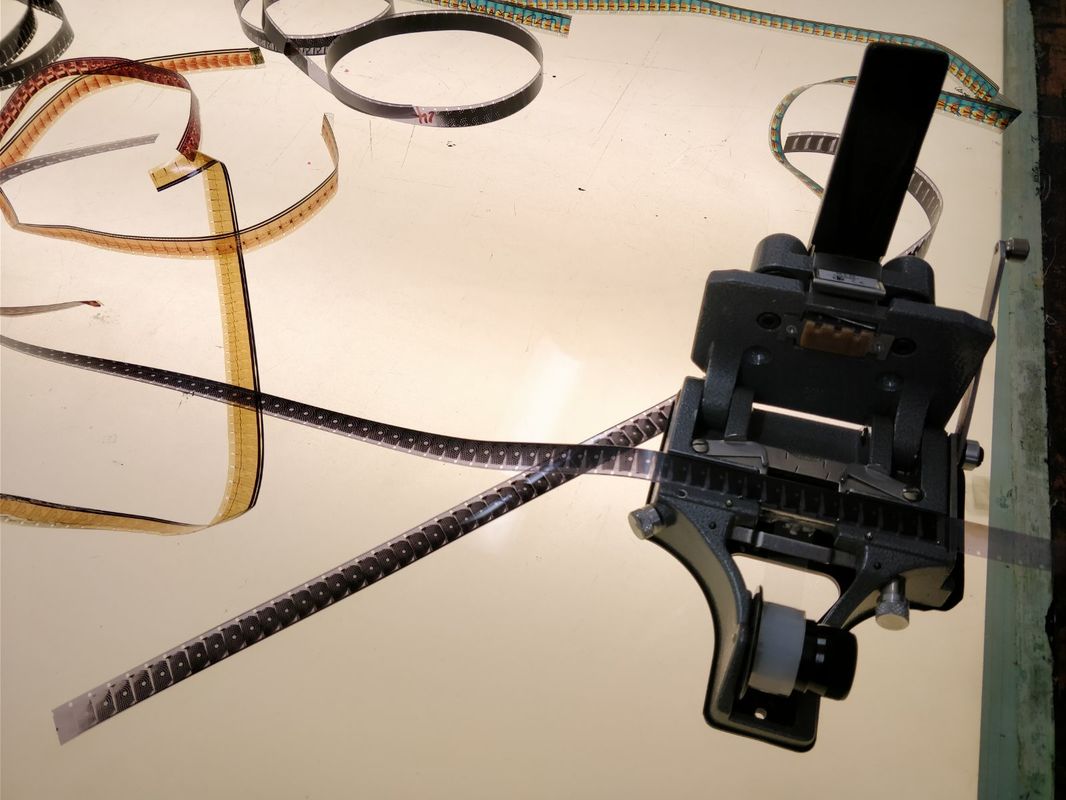
We were given the opportunity to take part in a photogram workshop in London. We would be making images on a strip of film by placing things on top of it in a darkened room and exposing the film to light. The objects block the light leaving marks and images on the film strip. 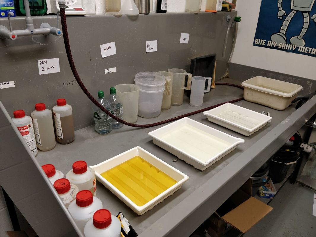
I then used some found footage (by Nick Nenov) and spliced it into my film.
I enjoyed this workshop and it was a great opportunity for me to learn how to do something that I have never tried before. Overall I think it went well and would defiantly lie to try something like this again in the future.
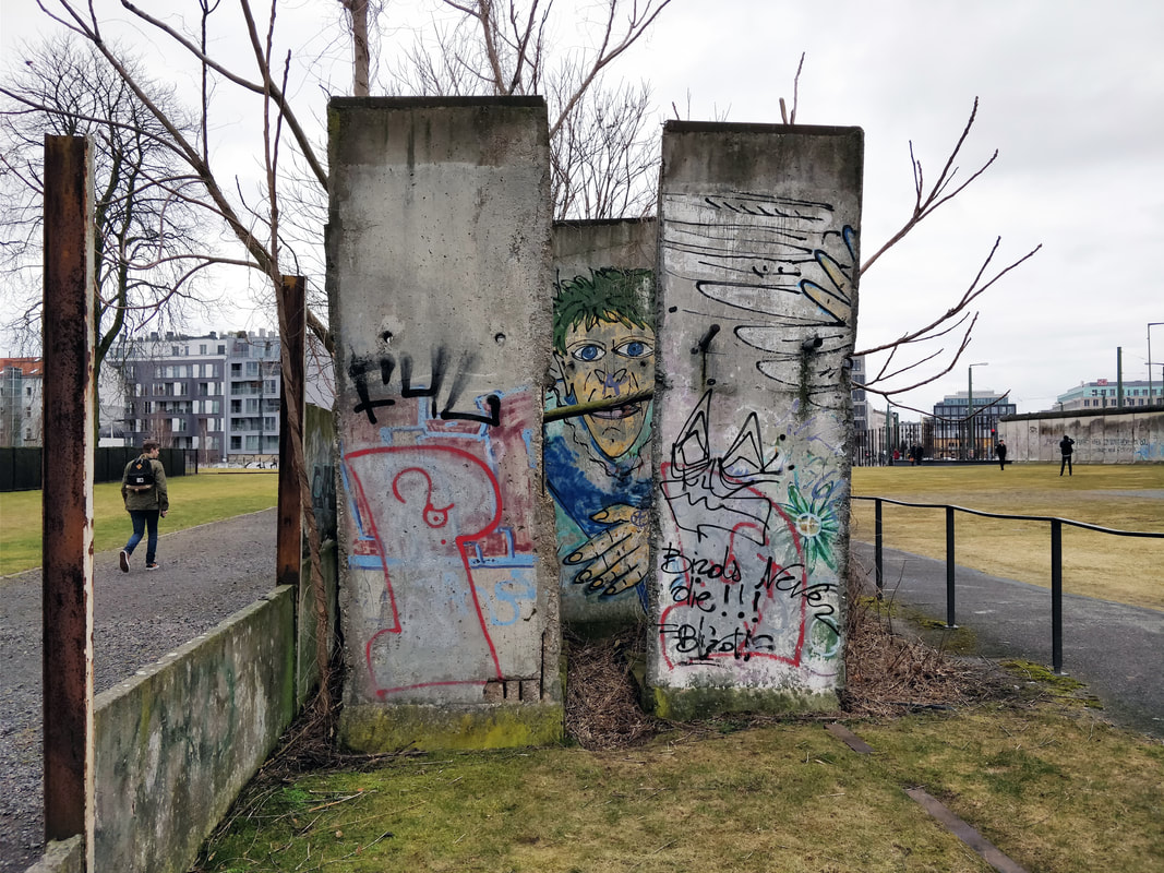
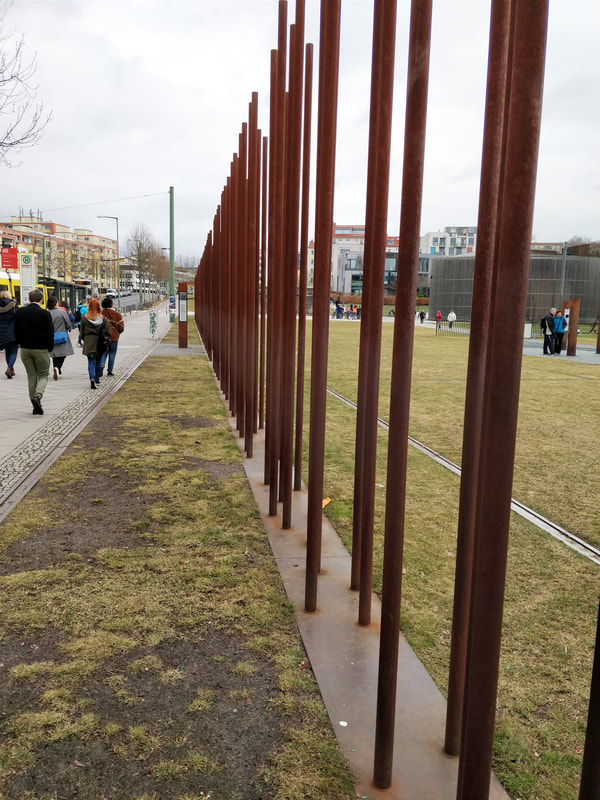
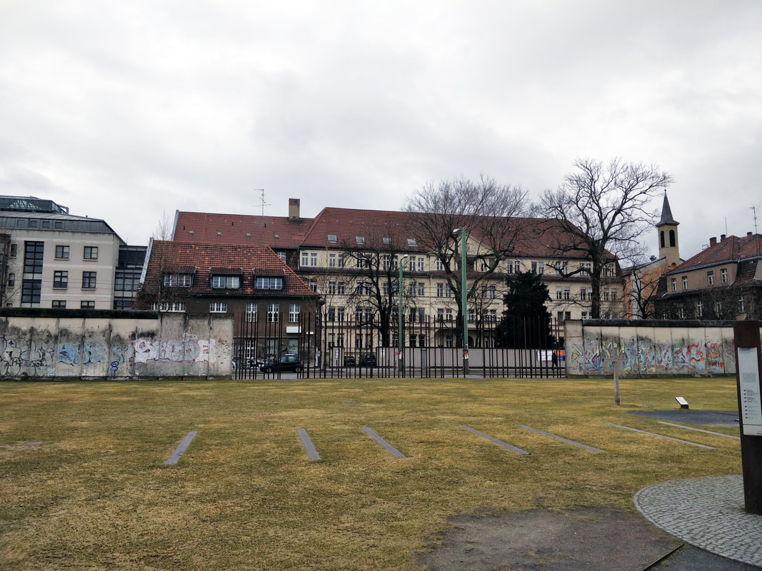
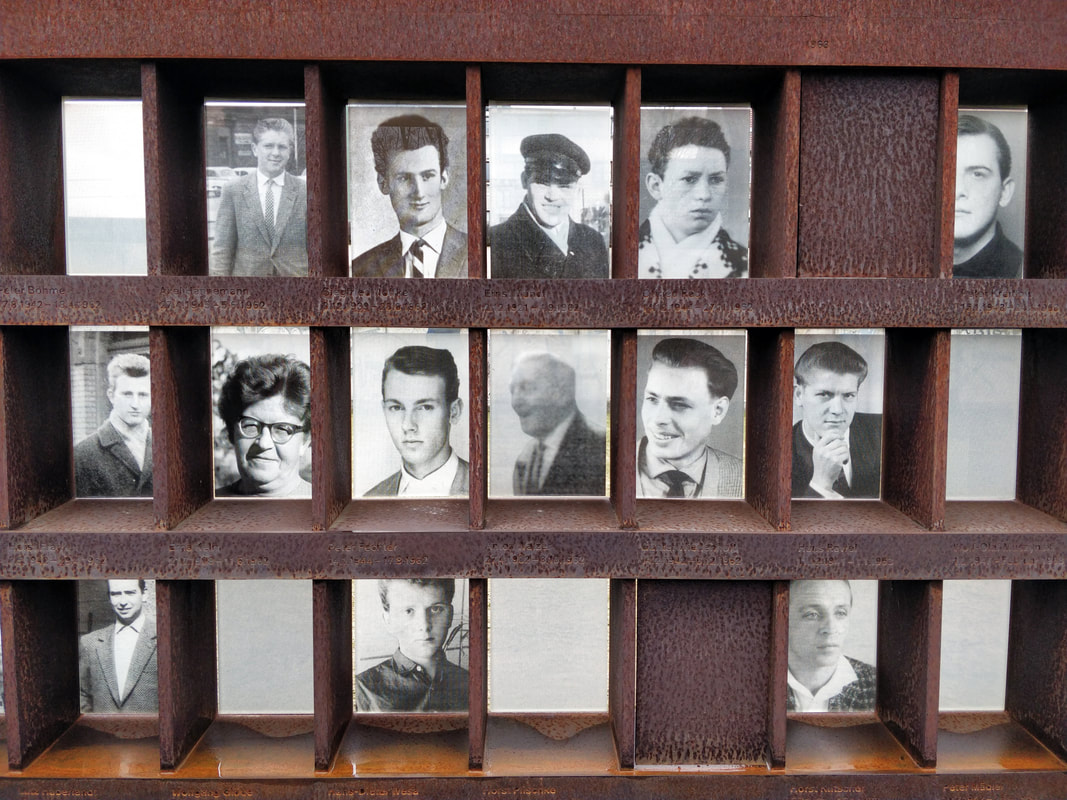
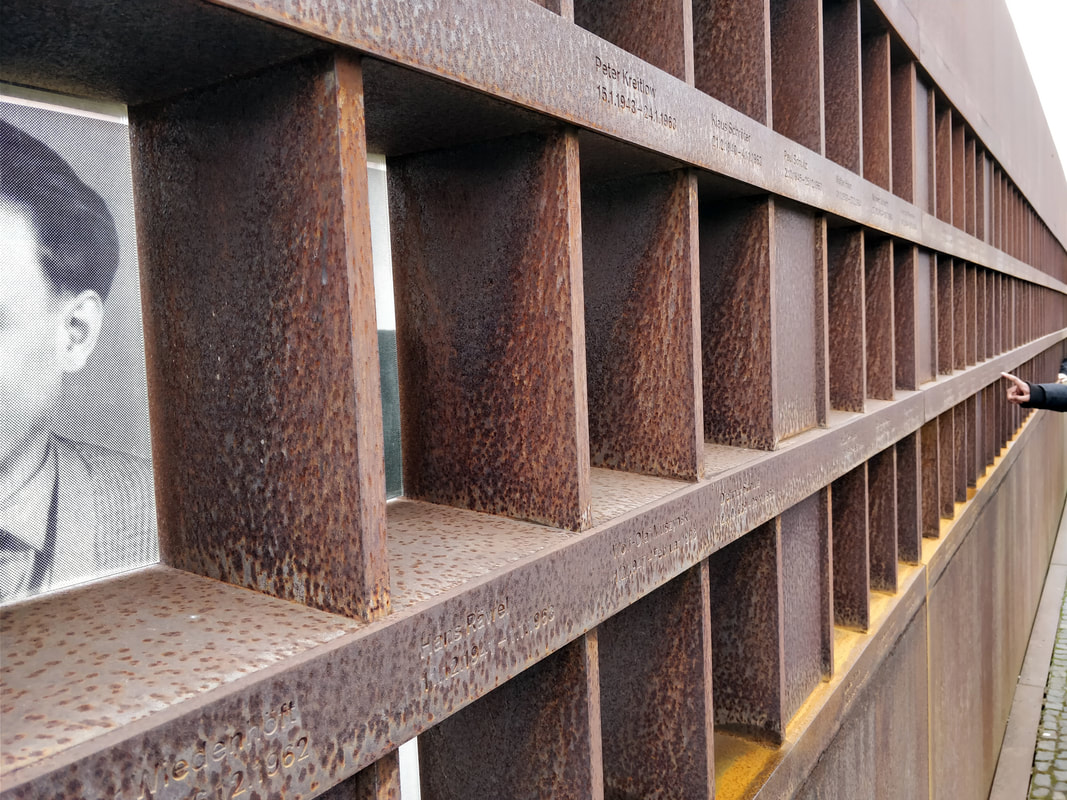
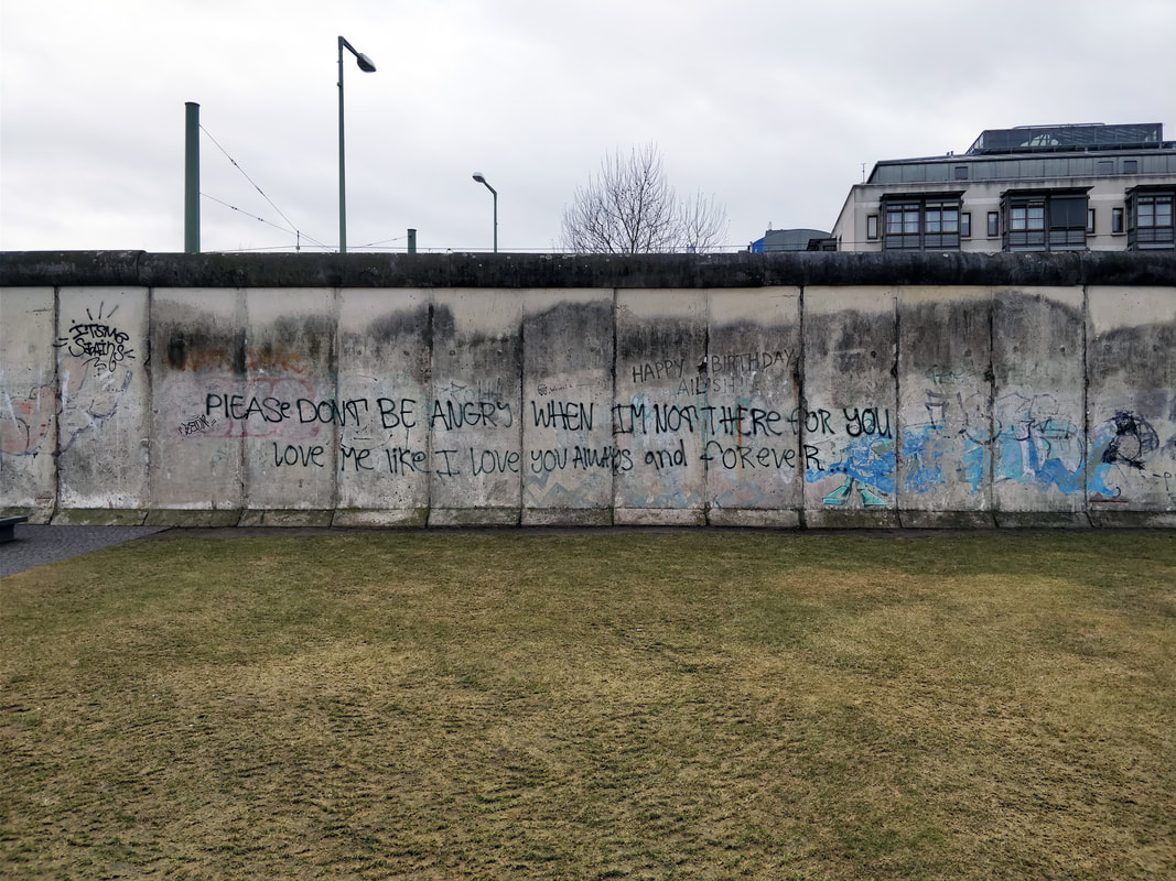
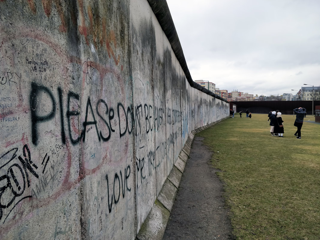
We were given the opportunity to go to Berlin on a study trip to see various galleries and have talks by designers / illustrators. Some of which are below. The Berlin WallWe went to visit the Berlin Wall, which separated Western Berlin and Eastern Germany from 1961until 1989. It was interesting to see all of the graffiti and artwork that now covers the remains, especially as the majority of it gives a positive message. Tina BerningWe then visited the studio of Tina Berning, where she talked to us about the history of the area, her techniques and workflow, pricing and showed us some of her inspiration along with the drawing that came from that inspiration. Whilst she was talking I took some notes about what she said.
Patrick ThomasWe also visited the studio of Patrick Thomas, where he gave a talk on his career development and how it is important to find a way to simplify messages to get them across more easily. He also talked about how he set up his studio, making sure that there was enough room for print making. One thing that he mentioned that I thought was interesting was that Abby Road Studios commissioned him to create some designs after seeing a personal project his Instagram.  Jack SachsFor the third talk we were visited by Jack Sachs. He spoke about his career development and what it's like to be a young creative living in Berlin (how it is a creative and welcoming environment compared to London which is competitive and industry focused). He also mentioned about how important it is to have your own website and domain name as it makes it easier for clients to find you and how you shouldn't work from home as it is more motivating to work from an office or somewhere separate to where you live. Following along these line he mentioned how it is easy to work 24, 7 but it is important to have a break and time away from your work to allow you to be more creative. The final thing that Jack talked about was not to be afraid of emailing clients / agencies / studios that you want to work for as even if they don't need you now, they may contact you back at some point in the future.
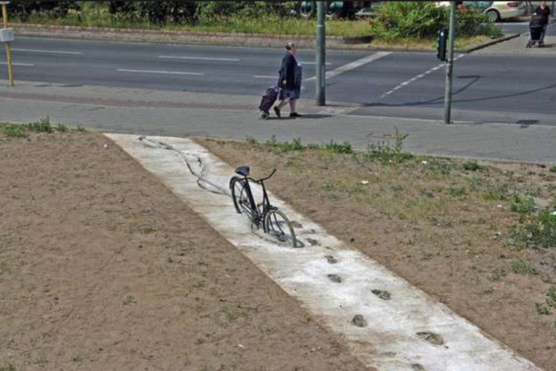
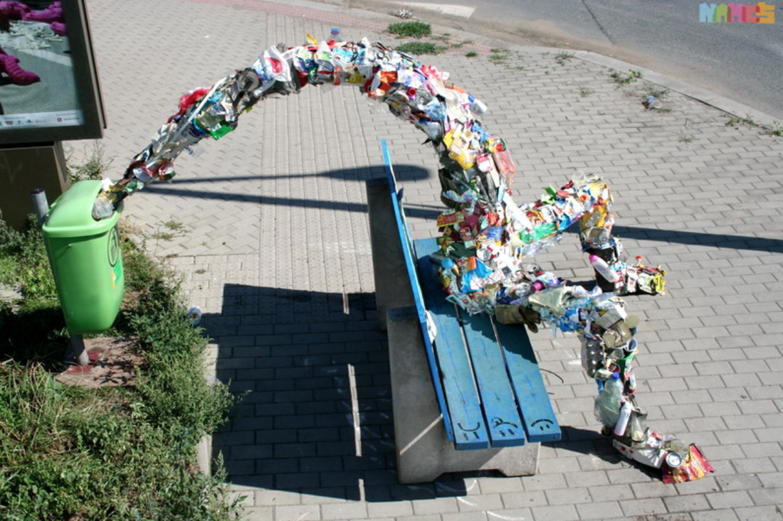
Urban Nation GalleryThis was one of the galleries that we visited on this trip that I found the most interesting. It showcased a range of urban art and digitally made designs.
Brad DowneyBrad Downey is an Urban Artist who incorporates existing situations into designs. Some examples of which are below. I think his designs work well and make positive statements about society and the way we take things for granted.
Waltz BinaireHe talked about technology as a reflection of humanities desires and ego and how AI is learning and how it will be able to make art in the future. He also mention Narcis, an Ai machine that attempts to recognise itself.
Secret 7" is a competition where you submit record sleeve designs for a selection of songs and the best ones get auctioned off for charity. The idea behind it is that you don't know who designed the sleeve so you could be getting a design from a famous artist. I wanted to enter this competition especially since I enjoyed the workshop we had just had with Chris Aaron. I then began listening to the songs. Whilst listening to them I created some designs on Illustrator. I wanted to take an experimental approach, and for my designs to be as closely related to the music as possible, so I went straight into designing.
I have not uploaded the album cover that I have submitted to the competition, as they asked not to post them anywhere. However I will add in the design when the competition has finished.
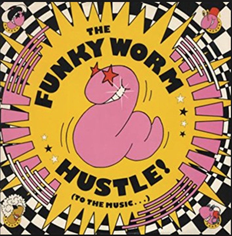
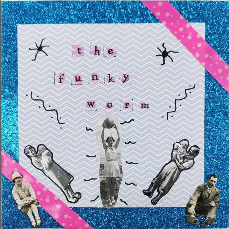
We were visited by Chris Aaron who came in to do a workshop with us about creating record scenes for 7" singles. We were asked to bring in our own records which we would then listen to and design a cover for based on the music. The single that I chose to use was 'The Funky Worm'. When I heard the name of the single and then listened to it, it sounded like the name of a dance. Using this I created an album cover that could reflect what that dance might be. Below is the original cover and the one that I created.
We then went round and gave feedback on each others designs. The feedback that I received was that the colours worked well together and the way the people form an arc was nice. I think that this was a good exercise to do and will be useful when designing a record sleeve for secret 7".
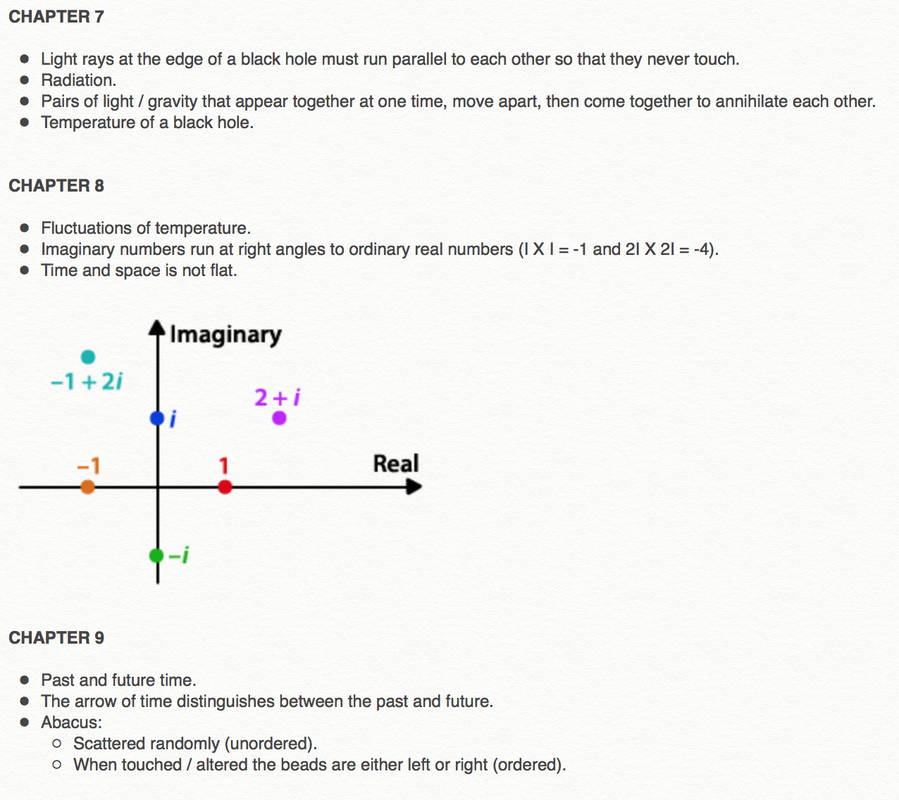
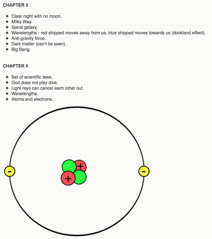
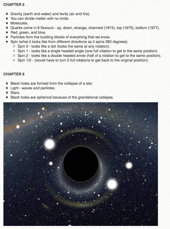
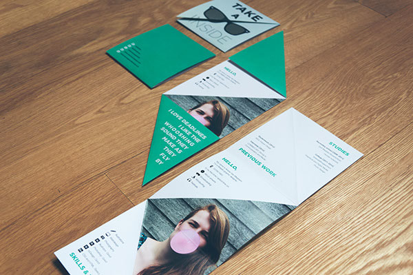
Being presented with the opportunity to design a book cover for Penguin’s Student competition was exciting and something that I wanted to get stuck into. As I had never designed a book cover before I wanted to research into what works and doesn’t work for these covers. I found a great article on 99 Designs that goes through the things that a successful book cover encompasses. Once I had chosen which book I was going to design a cover for I decided to read it to enable me to gain a better understanding of the content / subject. Whilst doing this I took out key points that could potentially be used within a design. Below are those notes. 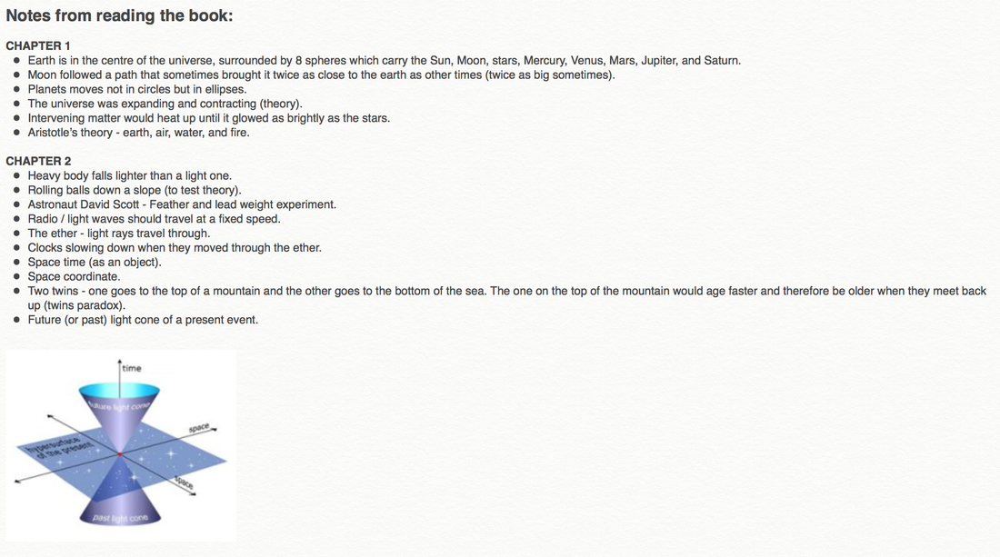
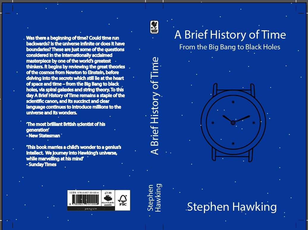
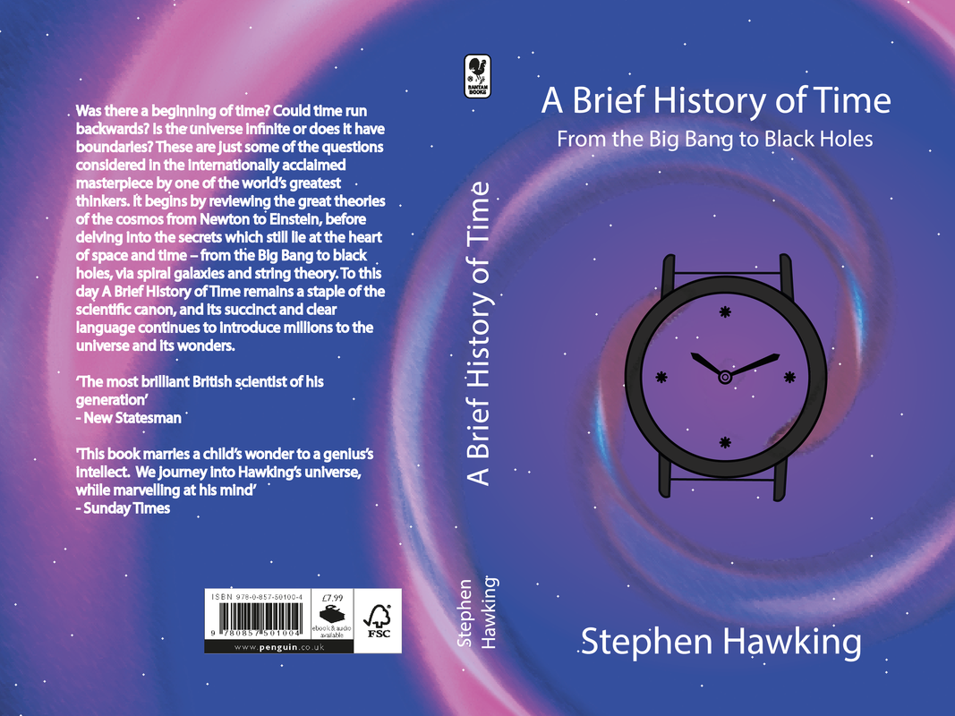
   I then moved onto creating some initial ideas (some of which I made digitally).
I then took one of my initial ideas and developed it further.
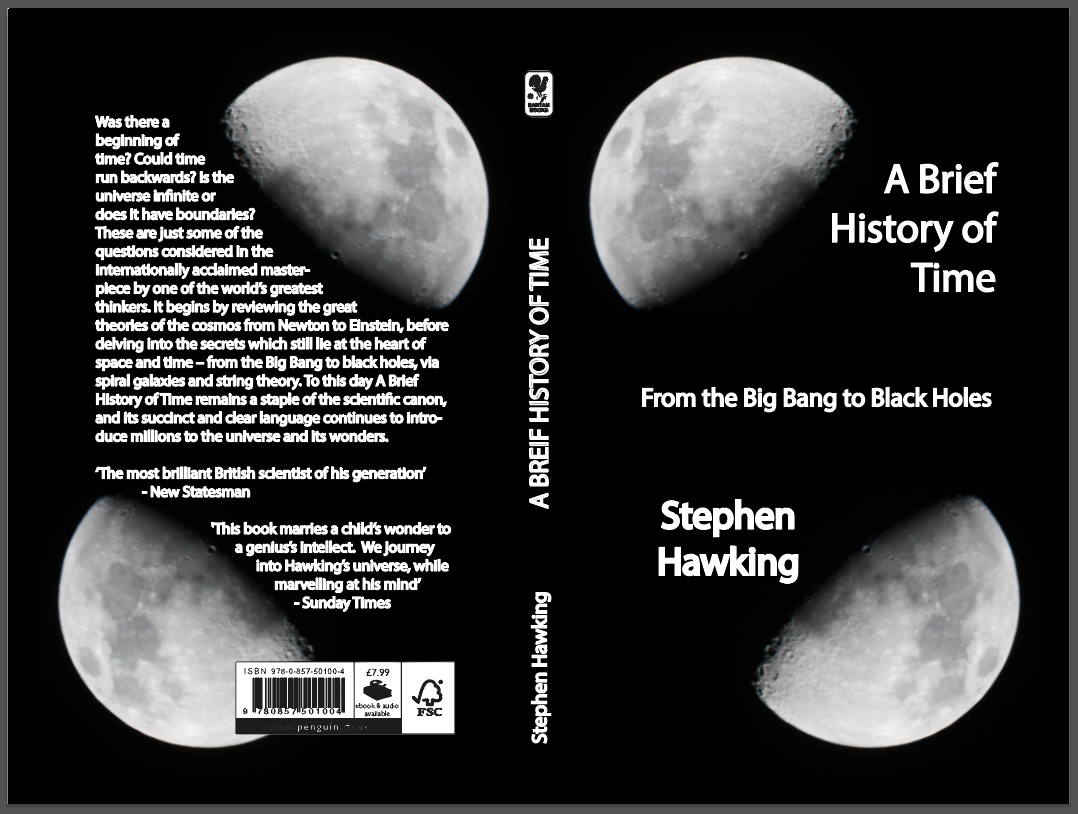
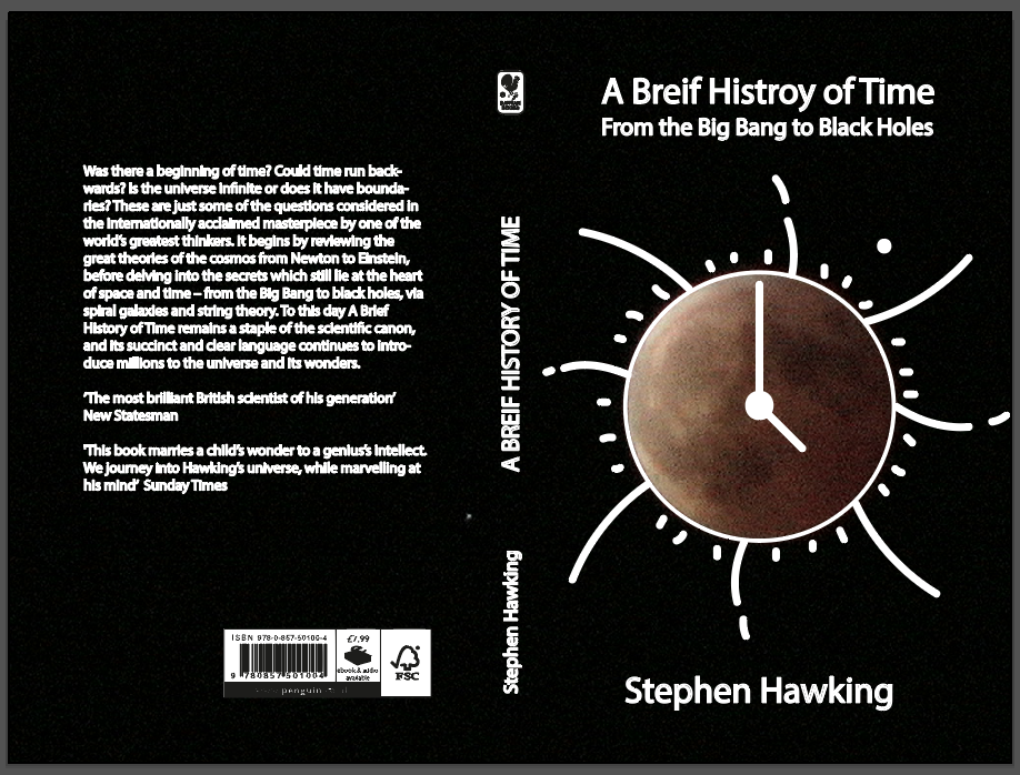
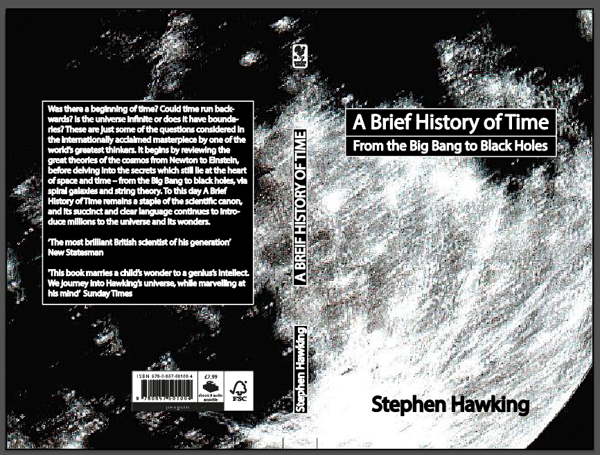
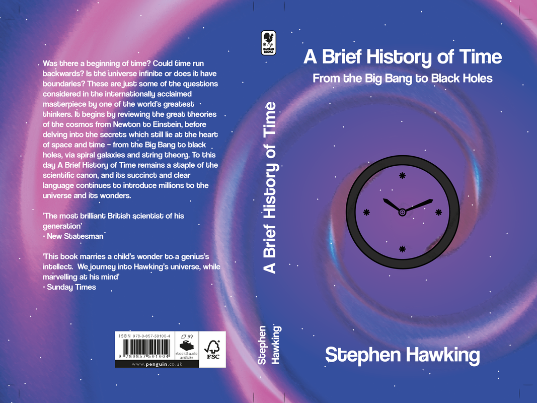 The design that I submitted is the one on the bottom. I think that this design encompasses the them of the book (exploring the universe and galaxies). The spiral was made using lens flares in photoshop and was then imported into illustrator where I added colour and resized it to fit into the rest of the design. The bright colours make this design interesting to look at. Initially I did try it without the spiral but I felt it look a bit dull and uninteresting so added it back in.
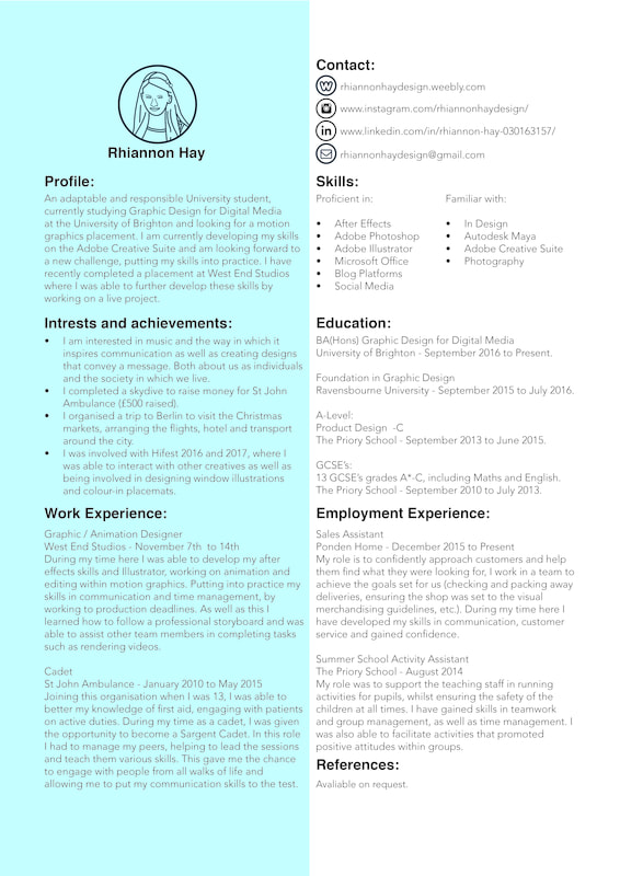
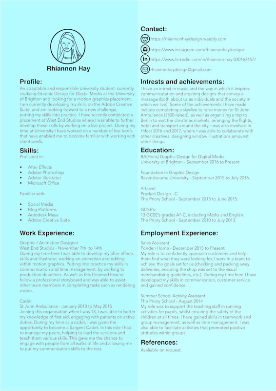
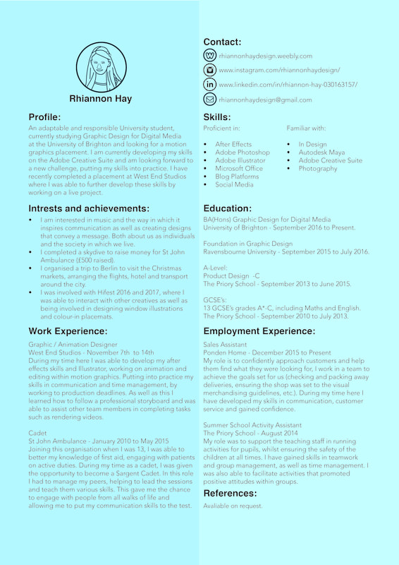
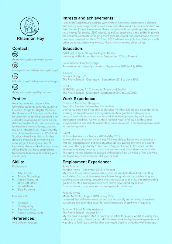
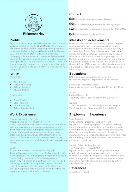
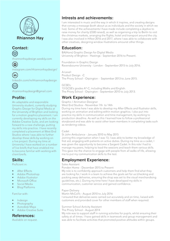
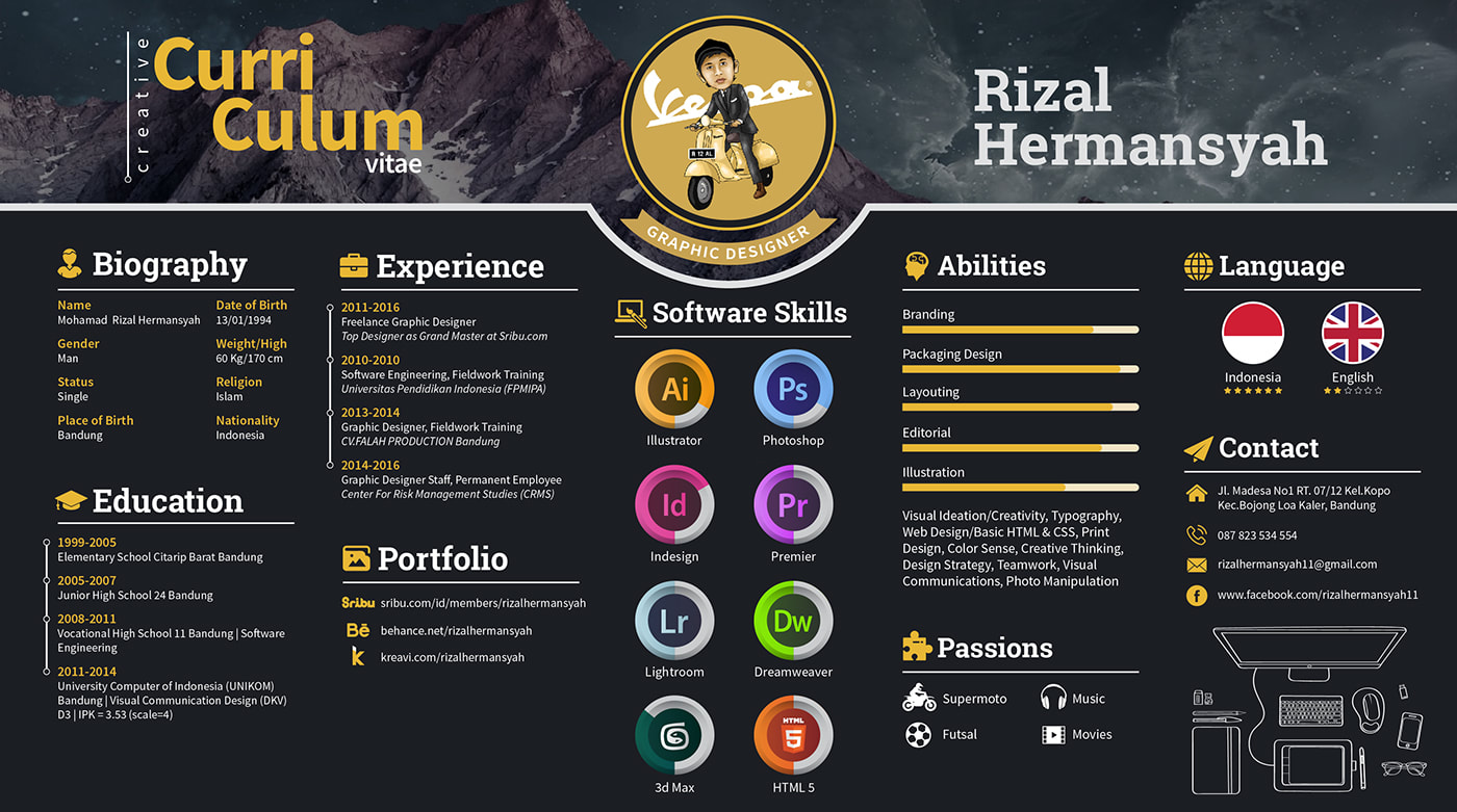
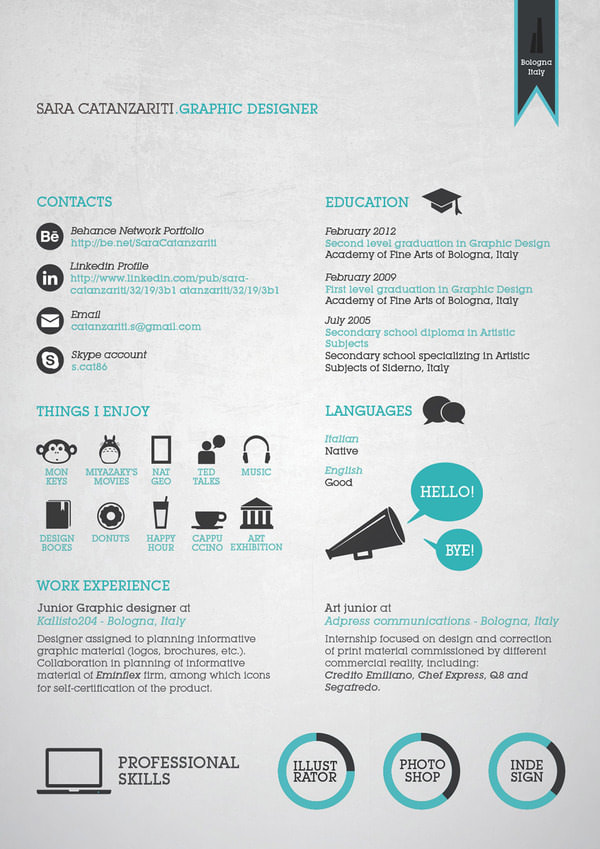
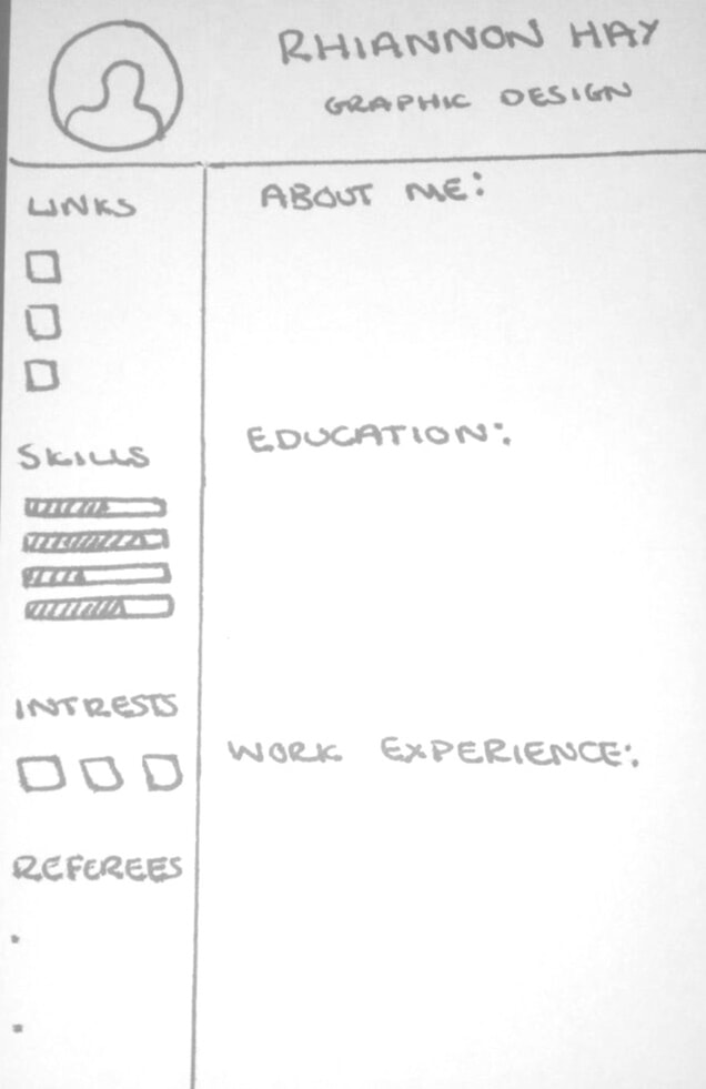
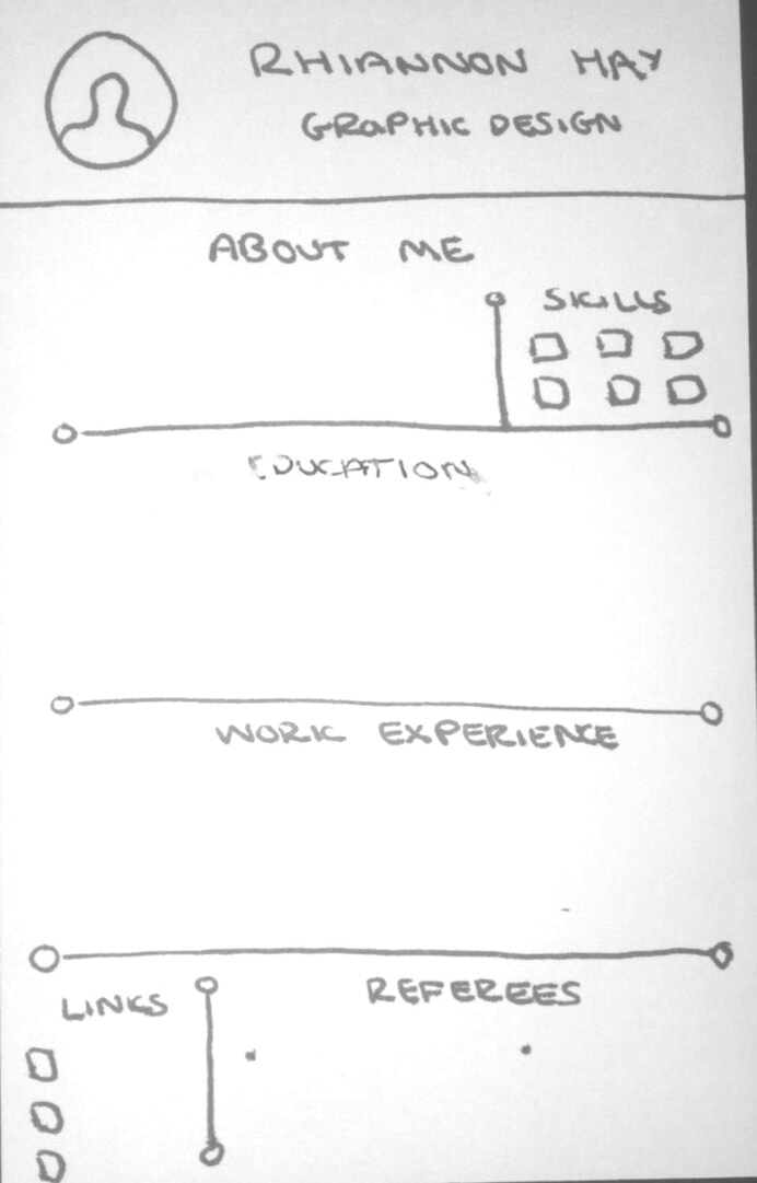
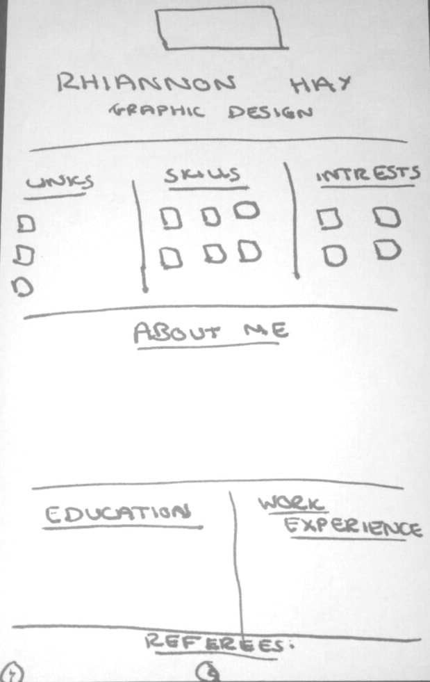
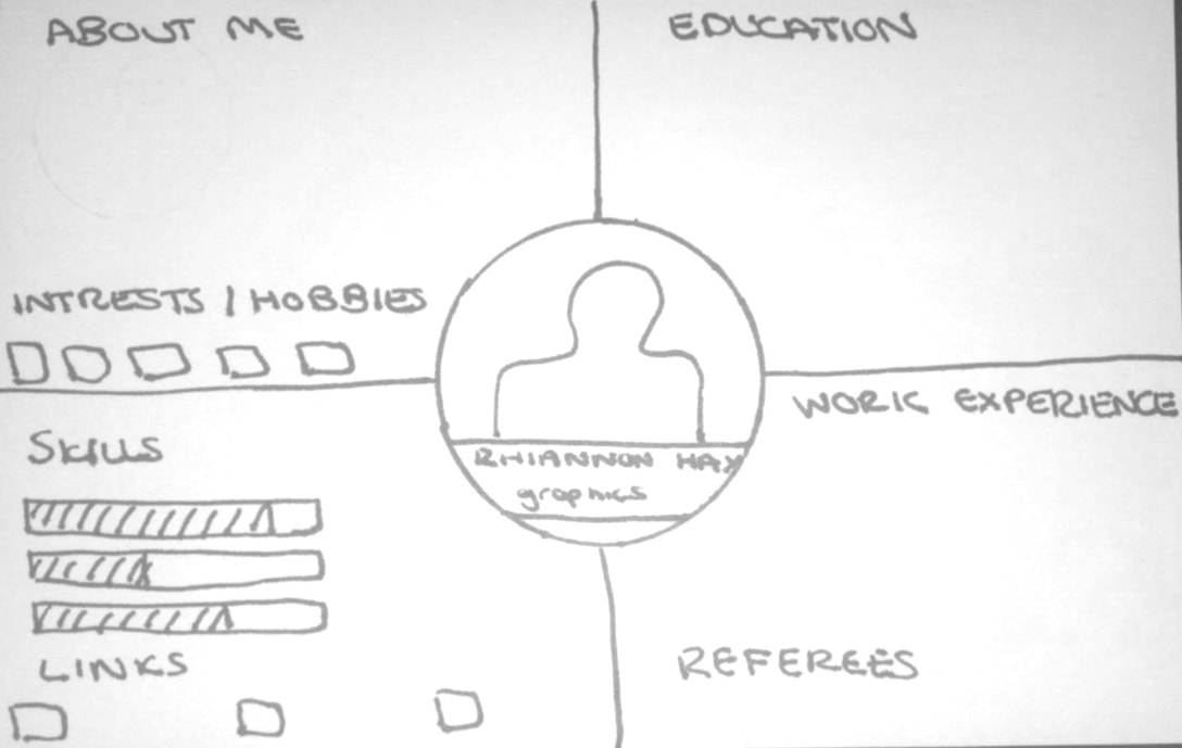
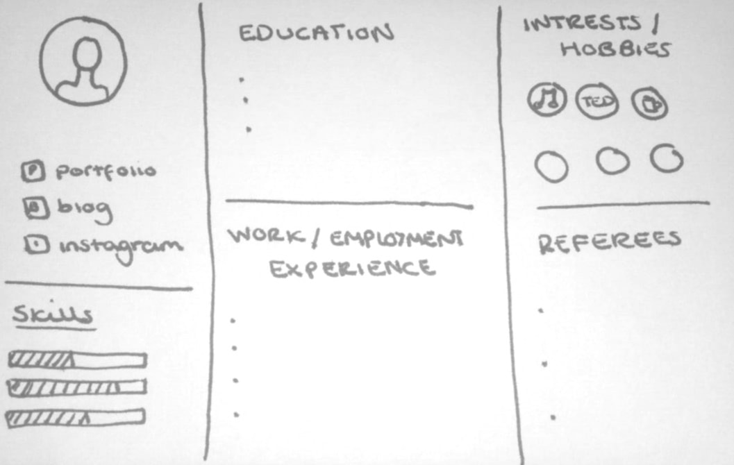
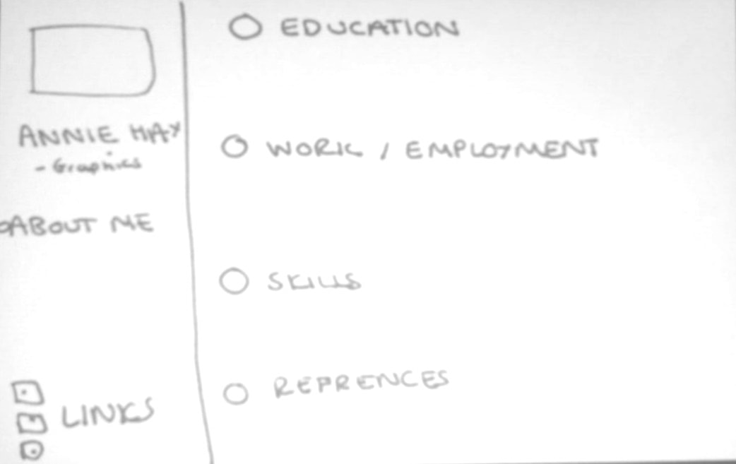
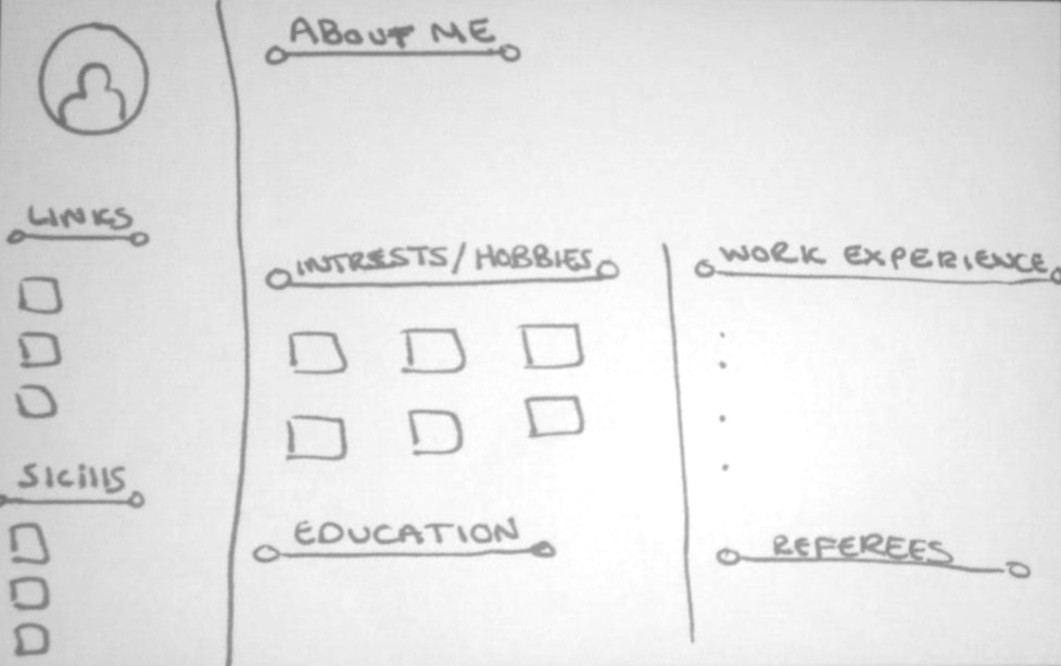
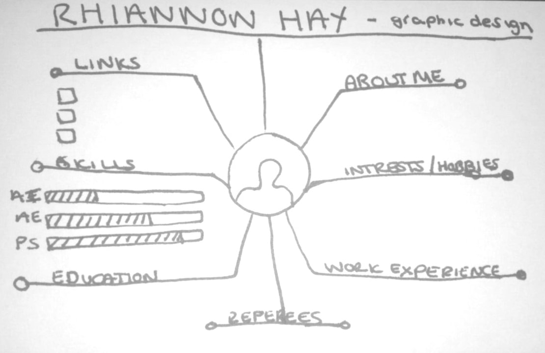
Once I had all of the content for my CV, I needed to design it in a way that represented me and my interests. One of the main things I struggled with was condensing down the content to fit into on A4 page (the original was 2 pages long!). I used Indesign to create it, despite not being too familiar with the programme, because it is the most appropriate software (it allows for margins and gutters to be used). I created 3 different versions of my CV, each with a different layout of the sections and added different colours to them to make them stand out. I chose to use blue because it is a calming colour and I feel it represents my personality the best.
Something which I have noticed is that when adding colour to these designs I used CYMK, for print, which means the colours of the above images are lighter than the original. Out of the above designs and colour combinations I feel that the ones that work the best are:
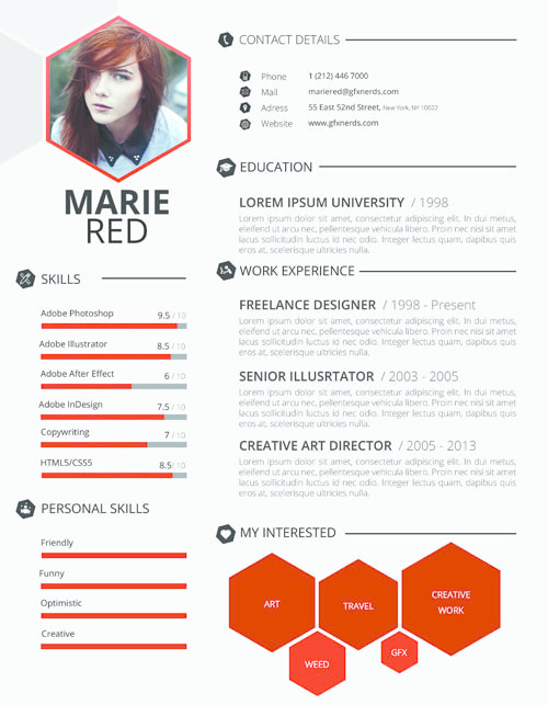
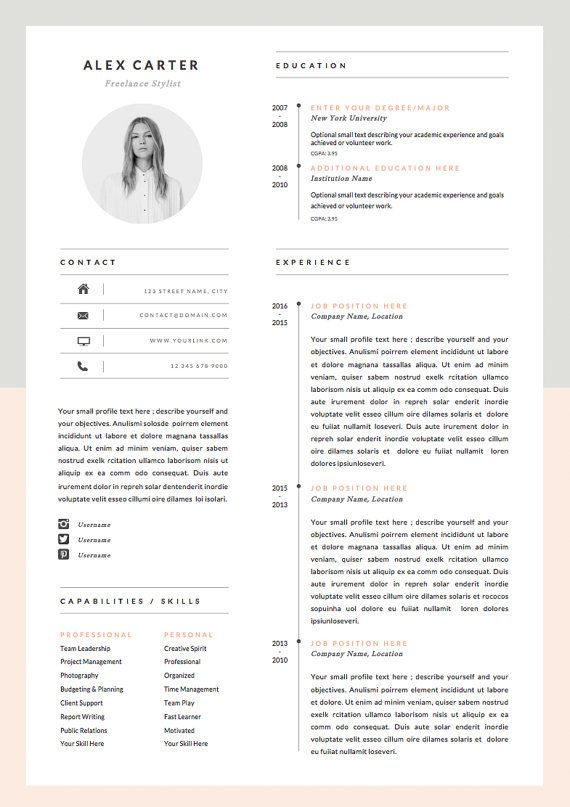
As a continuation of the work we were doing with Boo, we were given a talk about how to design a CV so that it showcased our strengths as designers. We began by going through the basic layout (How we should categorise the sections with headings and the type of information we should include). I had already written all of the content for my CV and it was reassuring to see that I had all of the basic elements already completed and in the right format. The next step was to look at examples of other designer's CV's. We talked about the spacing that they had used and how there should be wide margins and a gutter of about 4mm. She also mentioned that the colours we use should be compatible with both colour and black and white, as it might not always be viewed digitally. Looking at some examples of other peoples CV's I noticed that a lot of them used 2/3 column grids. This could be a useful way for me to ensure that mine doesn't exceed 1 page.
All of the above images are good examples of CV's. They show the personality and skill levels of the designer and give a hint as to what area of design they are good at (just by the design itself). By looking at these examples I was able to come up with some sketches of designs that I could use.
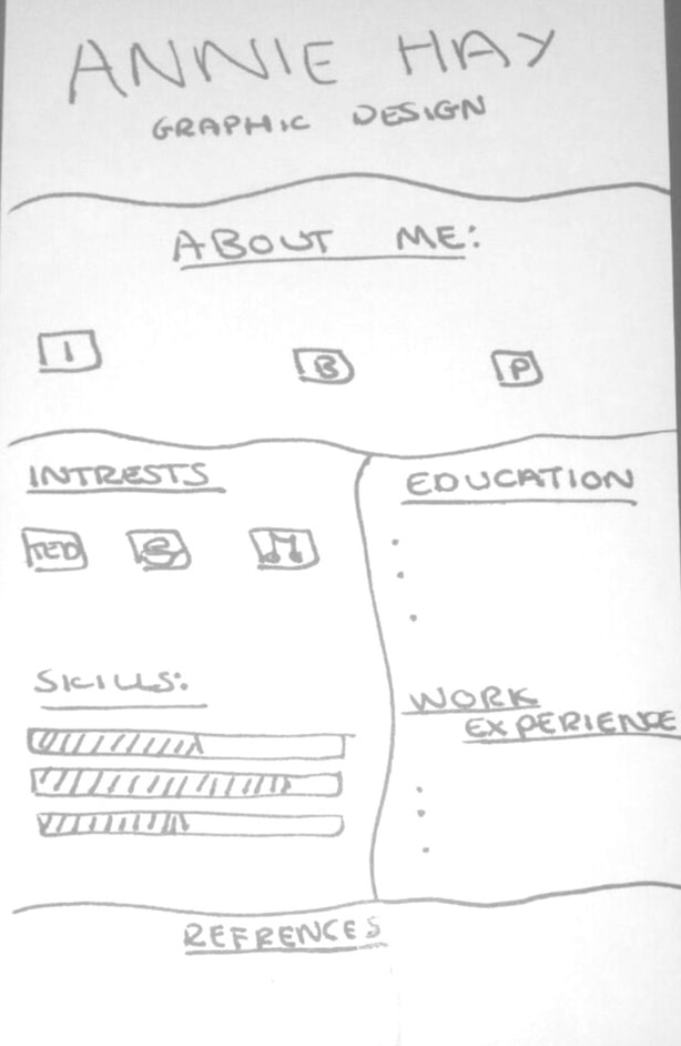
I came up with 10 initial sketches and drew them up on postcard sized pieces of paper. By doing this I was able to ensure that the scale was the same as that of an A4 piece of paper. I used the headings from my actual CV to indicate where the information would be placed. I think that some of these designs would not work well as CV's as they would limit the amount of information that I could display due to layout. Although they do not look very clean now, when digitalised I will pay closer attention to the spacing and fonts used. The next step is to make some of these designs to scale and put all of the information in to see what the finished thing could look like. I will then need to look at adding colour to certain aspects to make my CV stand out.
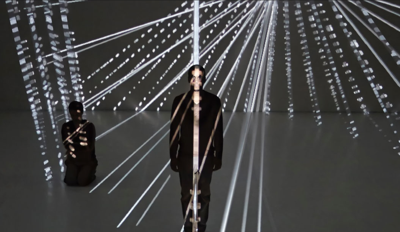
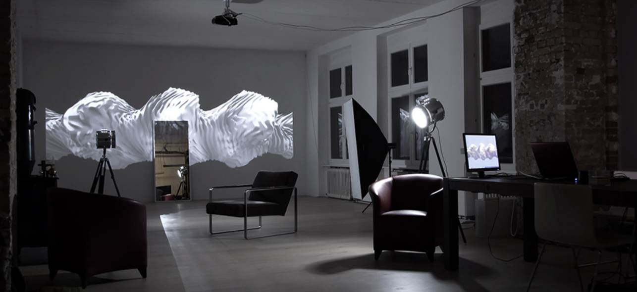
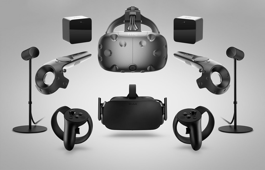
We were visited by Philip Hausmeier, a designer from Berlin who works a lot with VR. He talked to us about some of the projects that he has worked on, including one called 'Nausea' in which 6 artist collaborated to produce art that exists within a 3D space. Going through the process of how this exhibition was made was interesting. He mentioned that a lot of the artists involved had not explored virtual reality before which meant that the things they came up with were not limited by what they could and couldn't do. In this exhibition 2 cameras track the controller and the headset, allowing you to move around in realtime and have completer creative freedom. All of this is done using the HTC Vive.
We then went onto discuss the progression of VR in recent years. He talked about how before 2015 it was really expensive to use so not many people had access to using it, which is why it was not very popular. Then in 2015 Facebook invested and other companies followed suit (HTC and Sony), injecting money into the development of VR. When Vr was first starting to become available there was an experience called 'The Plank' (shown in the video below), in which the user would walk along a plank on the floor but through the VR headset they would see themselves doing it over the top of a city. Many of the people that used this were visibly shaking because of how lifelike it felt to them. This was a precursor to the development of lifelike VR as we know it today. We were informed about a website called RadianceVR.com, a platform for artist and designers to share their VR creations. So far there is about 50 active artists using the site but he hopes that in the future this number will increase dramatically as VR becomes more readily available.
There are two main steps to creating VR content:
We were also told about some more great programmes that can be used to create VR:
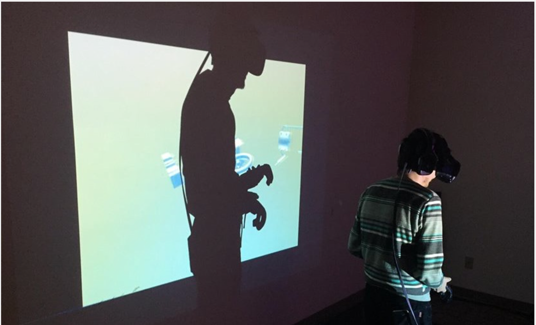
I really liked being given the opportunity to have a go at using VR, although I had used it on my phone previously, I had never been able to actually create something using it. I found it surprisingly easy to get used to and the controls weren't as difficult to use as I had imagined. I would defiantly like to try out creating in VR again as it brings your work to life, especially seeing as you can view it from multiple angles and distances. The De La Warr Pavilion were running a competition to design a short film showing what our idea of a pier was. I decided to base this project off of memories and both myself and my family and friend have great memories of visiting various piers as children. A lot of those memories were of Hastings pier so I decided to bas my project on that. After researching into the timeline of Hastings pier and visiting the museum, as well as taking photographs of the location so I could see what aspects could be incorporated into the environment I needed to create a storyboard. 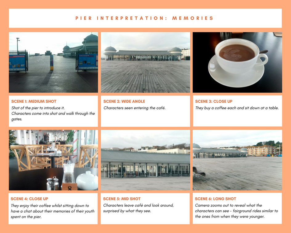 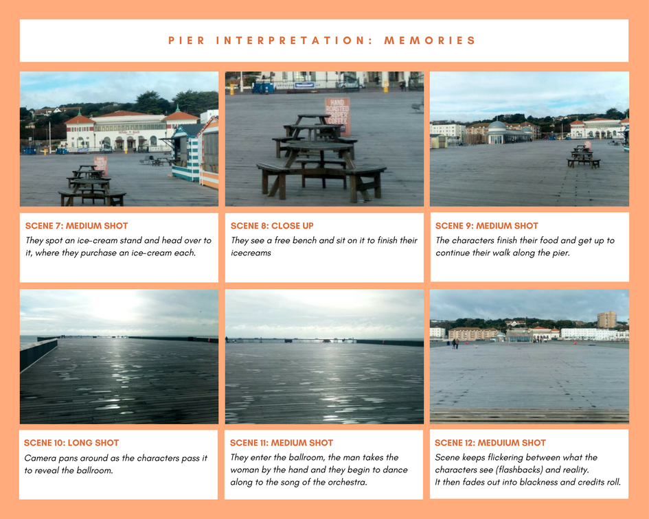 Using These photos I created a background sequence for which to animate onto. I think this worked well because it was clear what aspects were real and which ones were memories. Below is the final animation. Evaluation
I approached this project in a structured way, which enabled me to be able to develop a clear idea of the final theme quite early on, giving me more time to research and create my final outcome. I feel this approach is best for projects with a short time frame. However I do feel that using a bit more time to develop and refine my narrative could have been useful. If I had planned ahead with regards to the filming I may have been able to create the animation that I wanted to originally do, which is something that I will consider in future projects. Overall I am pleased with the outcome of this project. I think the animation is fitting to the brief and the narrative is engaging. One of the things that I was worried about with my storyboard was the ending. I wasn't quite sure how to bring the animation to an end. However I think that the fading out of the image as well as the music works well and brings the film nicely to an end. We were given another opportunity to be part of Hastings Illustration festival. This year we had the option of crating animations, doing the window murals, or providing work for or helping out on the stall which we were given on the Sunday. I decided to help out with the stall. As a class we were making a zine featuring work from everyone on the course. It would also contain our contact information. It was interesting to see the whole process of making a zine, from the initial collection of the artwork to the printing and binding. As we did not have very long to make the zine, everyone got involved which brought us closer together and allowed us to get the task completed on time. One of the ways in which I got involved was to attach the covers to the zine. 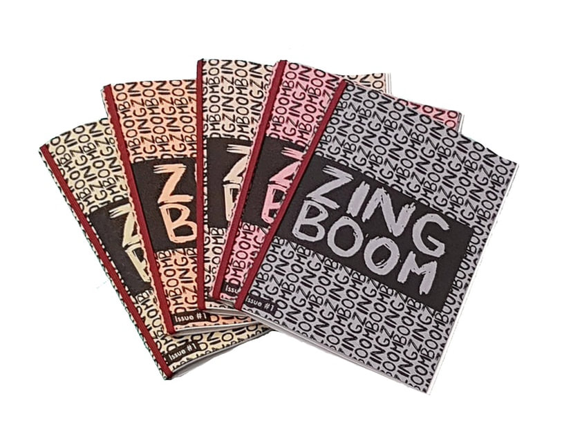 I also wanted to create some postcards to sell. Due to the short time span of this project I decided to use a design that I had made during the summer project. I then put it into illustrator and traced the lines, so that I could get a good quality print. After doing this I brought some 300gsm card and printed, then trimmed my design so that they were A6 size. The final postcard is shown below. 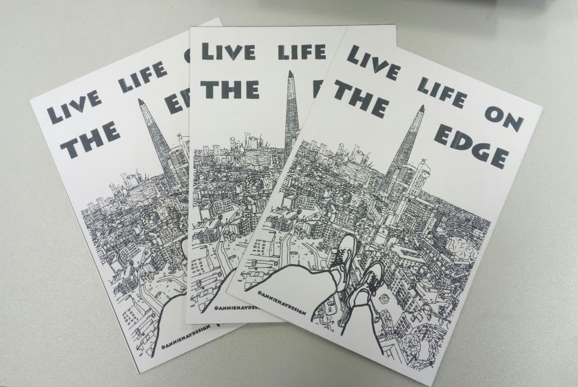 Overall I enjoyed being a part of Hifest this year and being able to visit on the Saturday and seeing the window murals being illustrated as well as seeing all of the other illustrators and creators that were there was amazing. I would have liked to create an animation, but unfortunately didn't get the chance to with all of the other projects I was working on. 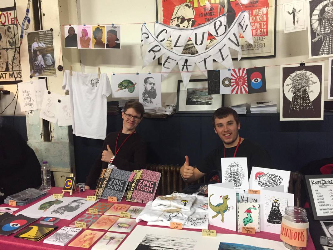 1st Visit: During this visit we went over what our hopes and fears were for a work placement and began looking at what information should go on our CV's. We were first asked to get into small groups and list our fears and hopes, below are the things my group came up with: Hopes:
Fears:
After going through all of these points with Boo, it was explained how the process of getting a placement works and the things we could do to ensure that these things don't happen. We were also given a template for a CV that outlined all of the information we had to include, and asked to draft a CV for the next session. She also asked us to find some examples of creative websites that could be used to find both inspiration and jobs, allowing us to keep up to date with the latest design trends. Below are the websites that I found:
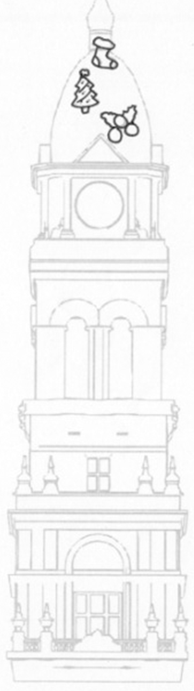
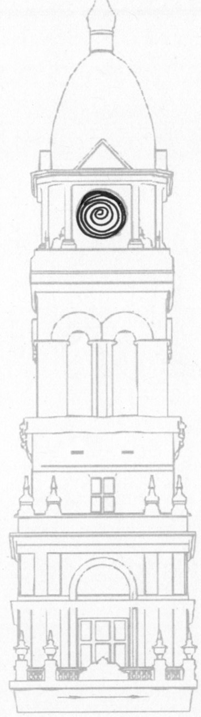
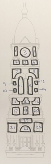
2nd Visit: After filling out the template and drafting up a CV, I met with Boo to go through it. She told me which bits were strong and which bits were not, giving me some corrections to do before her next visit. We also talked about what areas of design I wanted to have a placement in, and talked through a job application that I had found, which is the type of thing I would apply for if I had finished uni. We went through the skills required for the job and I was happy to find out how many I could check off.  We were given a brief to create a short animation for a projection mapping on Eastbourne's Town Hall Tower. The theme was based around the poem 'The night before christmas' and involved the characters travelling through different worlds. I began this project by researching into projection mapping and attending a session lead by Jim Hobbs who explained what works well and what doesn't with this type of project. Presenting to the Client I began storyboarding my ideas ready to present the next time the client came in. When presenting my idea I explained my storyboard and asked which of the two he preferred. The one that was chosen was the one in which particles fall out of the clock and the characters appear to float through space.
Once I had done this I needed to create a short animation to show the client, so that he could get a better understanding of my idea. This is shown below. I began putting my drawings into after effects. The part of the storyboard that I decided to mock up was the portal opening and some toys falling out. As I don’t have very much experience using aster effects I did this by key-framing them. I also added a wiggle to the images to make it look like they were in space and not just sitting on the building. The feedback that I received was to look in to adding particles as a way to bring my idea to life in the most effective way. This is something that I had never heard of before, so was unsure as to how difficult it would be. The client liked my idea and I was asked to come into West End Studios to work on and finish my animation. Day 1 I spent my first morning at West End Studios, illustrating my characters, which I then scanned in and traced in Illustrator. I also drew some space related assets that would be more focused on than the assets I had already drawn (done by key framing them instead of adding them to the particle system), to bring attention to the fact that the characters were in space. 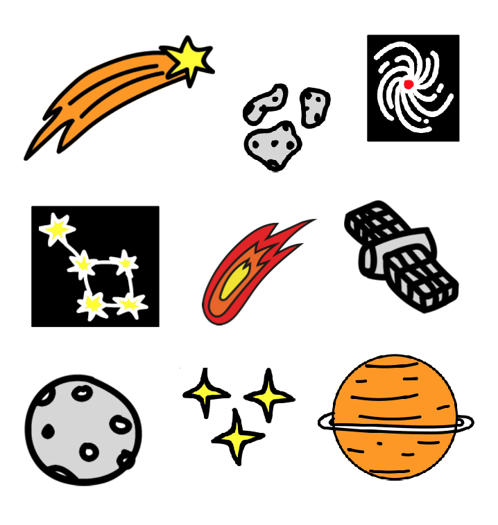 I also learnt how to create a particle system in after effects, adding my assets to make them seem as if they were coming towards the camera. The results of which are shown below. Day 2 My goal for day two was to animate my characters so that when they were seen moving through space it brought them to life. I began by brainstorming all of the possible ways I could get each character to move. Once I had done this I went into after effects and added pins to each joint and the main body of my characters. This enabled me to use the puppet tool to keyframe where I wanted the character to move to. One of the main issues that I encountered was that some of the movements looked unnatural because I was using a 2D image. To get around this I had to go back and add in more pins to increase the accuracy of the movement. Despite having never used this method of animation before, I found it relatively easy to get my head around. It is definatly something that I will take forward and use in future projects.
The next thing that I had to do was keyframe the characters into the sequence so that it looked like they were moving through space and into the portal. I found getting the timings right a bit challenging because I had to ensure that the movement of the characters could be seen but also that the scene did not drag on for too long. Day 3 I started off the day by adding the finishing touches to my animation and ensuring that all of the timings worked well together. The next step was to render out my video. Once I had done this I needed to add in the transitions form my scene to the next person's scene. I then rendered out the transitions, ready to be used.
We were given a brief to design a logo for an organisation called Lighthouse. The logo was specifically for one go their branches, Guiding Lights. I began this project by reading over the brief and picking out the key information (the brief was detailed so I wanted to just get the key points). I have listed these key points below; Final logo needed to be an Illusrator file
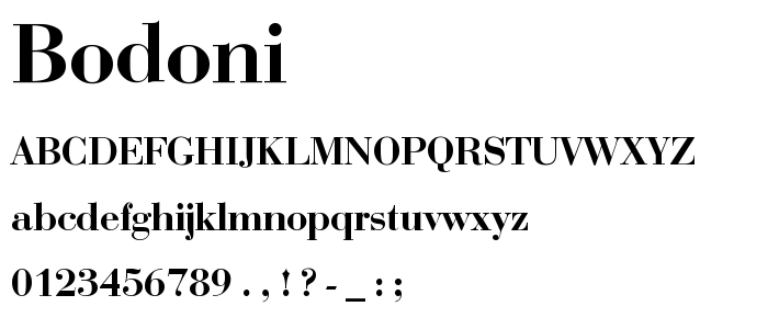
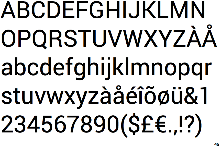
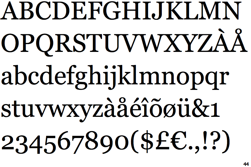
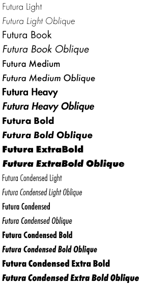
Research: I then looked into fonts that were compatible with Futura (a lot of which were serif fonts). I did this by creating a mind map with Futura in the middle and putting various fonts with it, as well as looking for articles on websites such as creative review, that talked about the subject. Below are images of the fonts that I thought worked well. One thing I did find out was that Futura has a big family of fonts, meaning any of these fonts could be a potential candidate for my logo design.
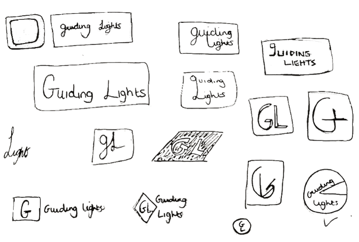
I then began researching into logo design and what the do’s and don’ts were. Whilst doing this research I specifically looked for (but did not limit it to) examples of text based logos, as that is what the client wanted. I also looked into their current website and logo design for Lighthouse (as well as some of their competitors), as this could give me an idea of what direction the brand was going in, and their target audience. Thus enabling me to create a mood board that I felt was fitting to the breif.   Initial Ideas: Now it was time to begin making some thumbnail sketches of my initial ideas. I started off by doing this playfully and finding different ways to connect the words. I then moved onto just using the initials GL as this had been mentioned in the brief as something that they might be interested in. Once I had a couple of pages of sketches I moved onto Illustrator and recreated some of them.
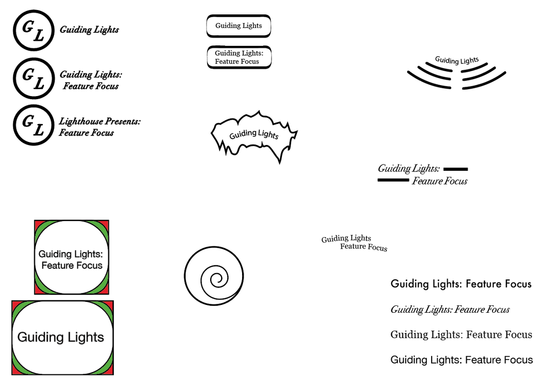
After showing my sketches and illustrator files to my peers and tutors I was given feedback about which ideas they think worked the best and which ones I should develop further. It was suggested that it would be good to play around with the letterforms of the word to create a more playful design. Development: Once I had received the feedback, I wanted to transfer the suggested sketches into illustrator so that I was able to play around with them easily. I took forward two of my designs and tried out some different ways to manipulate them. Below are the results. Of these designs I think some work better than others. When drawing the thumbnail sketches I initially liked the one on the left the best, however after developing it further I realised that despite it working well as the Guiding Lights logo, when trying to make a Feature Focus and Lighthouse presents version, it did not work well. I also changes the font in this design from serif to sans serif, as it made the whole design look softer. The next logo that I had to develop was the one on the right. It initially started out as a circle with a chunk missing (shown earlier in this post). When developing this logo I isolated the letter G and moved its anchor points to make it resemble the shapes shown in the above image. I think that this worked well for some of the forms I tried but I found it difficult to get the rest of the text to fit in, whilst still looking good. We were visited by Lestyn, one of the designers who helped to rebrand Wales. He spoke about how the whole idea behind this rebrand was for Wales to get a stronger sense of identity and to help increase tourism. He mentioned how when wales became independent his generation of designers wanted to rebrand, but were told no by the government and to come back when they were older. Which led onto the point of not giving up and that if I really want to achieve something, then I can. One of the main things he talked about was how very early on they had to decide on there core values and stick to them. As well as defining a colour palette, fonts, logo spacing and colour usage.
One of the main things that I took away from this lecture was how if I am passionate about an idea, it is good to gently lead the client into it rather than initially shocking them. And I shouldn't be judgemental about my work and just keep putting things out there. In order to succeed I need to pave my own path and not follow the older generation of designers, however drawing inspiration from them is key. Also that if I am pitching for work, it is helpful to mock up a video to help the client visualise my idea.
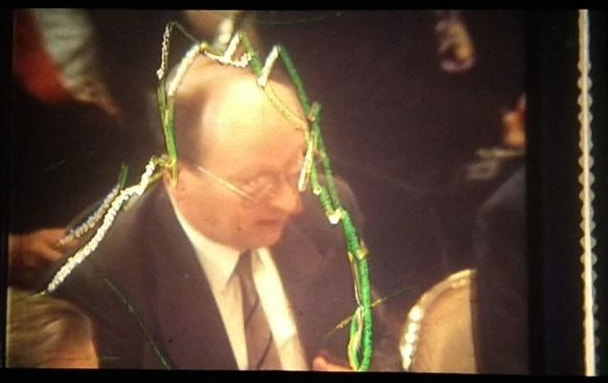
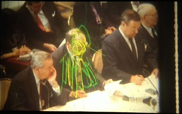
 The Long Drawn Out Trip, painted film strips. Gerald Scarfe. The Long Drawn Out Trip, painted film strips. Gerald Scarfe. Gerald Scarfe is a political cartoonist. Before visiting this exhibition I had little idea about his work and what to expect. Upon arrival at the House of Illustration I quickly realised that I had seen his work in Disney's Hercules and The Nutcracker. I liked visiting this exhibition because it gave me an invite into Scarfe's creative process, showing his storyboards along with some of his finished illustrations and physical props. I think that this variation in what was shown was what made the exhibition more engaging as I found a lot of his sketches to be similar. Within this gallery there was also an exhibition about Quentin Blake. I was looking forward to seeing this because his illustrations were a big part of my childhood (featured in the books i read). When looking around this gallery I found that one piece would lead quite nicely onto the next, with various drawings from different books, a wide range of his work was on display.
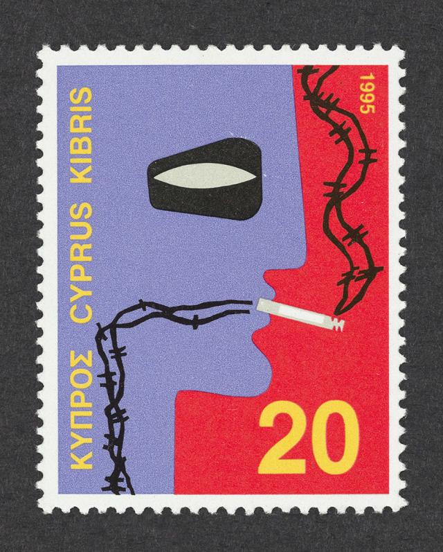
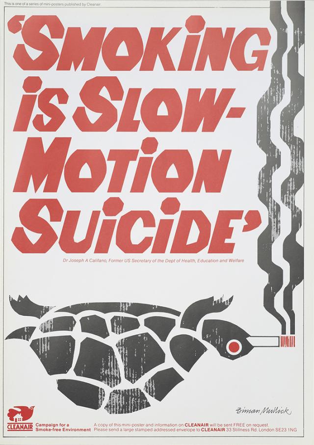
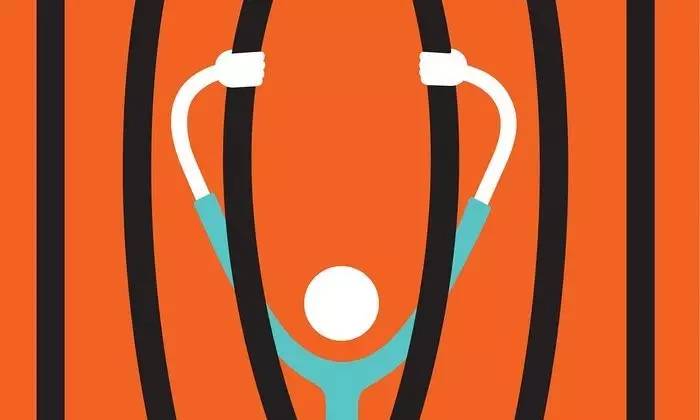
Overall I liked both of the exhibitions at this gallery and think that they offered an insight into the way in which these illustrators work. However I feel like the Gerald Scarfe exhibition was a bit crammed in which meant, when walking round it was easy to miss things. We were visited again by Gary Neill, but this time he spoke to us about the design process. First we recapped the previous talk and looked at how some brands such as Marmite use a weakness in the product as a unique selling point (you either love it or hate it). Another example of this is the Lemon ads by Volkswagen. Pointing out that the car was not the best and considered ugly. 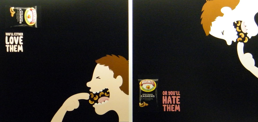 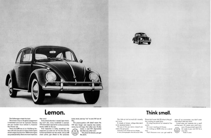 We then went on to talk about Saatchi and Saatchi, a London based advertising agency. We watched a film called 'Inside Saatchi & Saatchi - A Spirited Case Study'. In this film we learnt about the creative process that they went through to create an ad campaign for a Brazilian spirit called Sagatiba. One of the things that surprised me the most was the amount of people working on the one project, with everyone from creative directors and casting agents to models and copywriters. At the beginning we saw how they first learnt about the product and how it was made, then about the culture and stereotypes of Brazil (so they knew what to avoid), right the way though to presenting the ideas to the client and brining the idea to life in the actual shoot. It was an interesting insight into how the advertising industry works and reinforced all of the things that we learnt in Gary's last visit. From this I took away that in order to get an amazing finished project it takes a lot of time and effort (not a lightbulb moment), despite already knowing that I was able to see it on a much larger scale than I ever have before. Can Graphic Design Save Your Life? Is an exhibition showing at the Wellcome Collection in London. It showcases various pieces of graphic design in relation to health and how these pieces have evolved over time. One of the pieces that was shown was the evolution of cigarette packets and adverts for them. It showed how smoking was once seen as a good thing but now adverts and even the packets themselves have to display warnings about the harm that it can cause.
Another thing that I found interesting within this exhibition was the medicine section, it showed the evolution of signs and directions in hospitals and how the different symbols and colours on the medicine bottles mean different things, enabling them to be easily identified. It also brought attention to the fact painkillers and other capsuled medicine that we take was not always in a capsule. In fact this revolutionised the medicine industry by helping to regulate the amount of each medicine that could be taken.
It was fascinating to see how graphic design has shaped things like medicine, something that we rarely (if ever) think about, and how this has impacted peoples lives for the better. I would defiantly go back to this exhibition as it makes you think differently about how you look at the things around you. We were visited by Gary Neill, an Illustrator based in Hastings. He talked about idea generation and how anything can provide inspiration for designs. We looked at the Honda's 'The Cog' advert and how it was based off of the game mousetrap. At the time this advert came out it showcased the car in a way that had not previously been done in adverts up until that point. It brought attention to all of the small parts that make up the car and how they all work perfectly together. We then went on to look at advertising and the four main categories that are present in the majority of adverts.
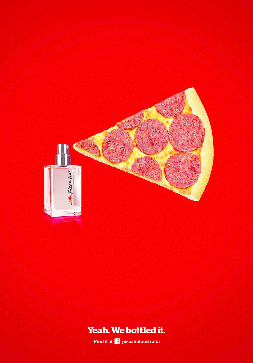
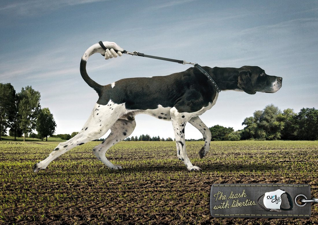
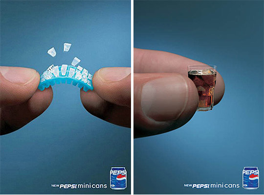
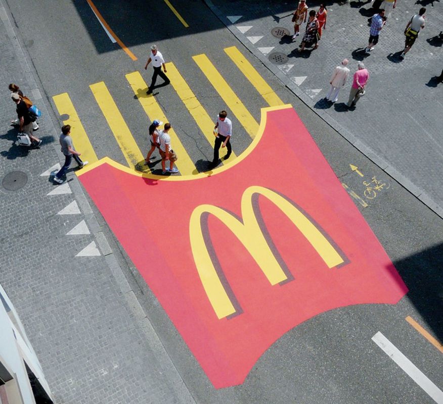
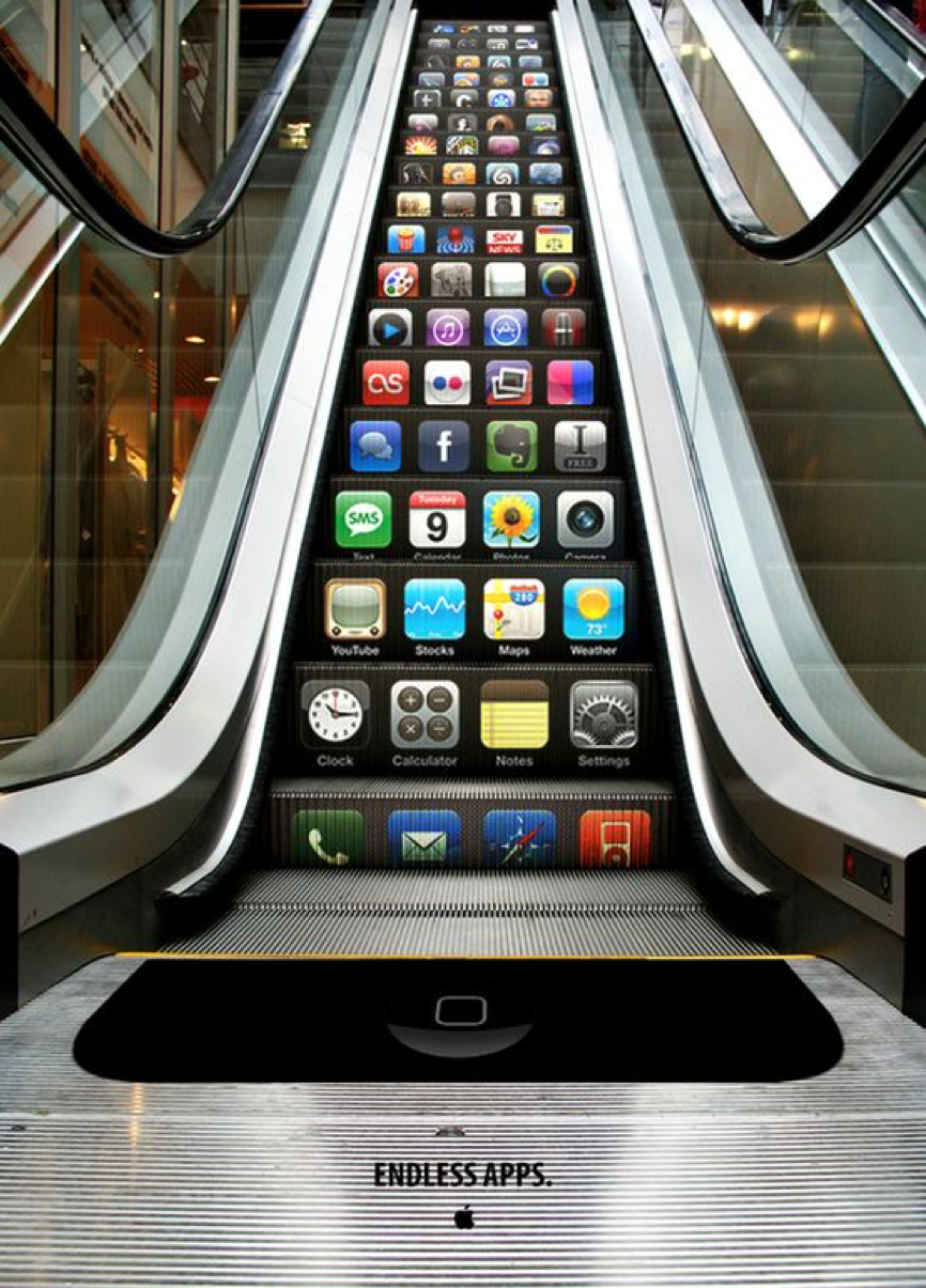
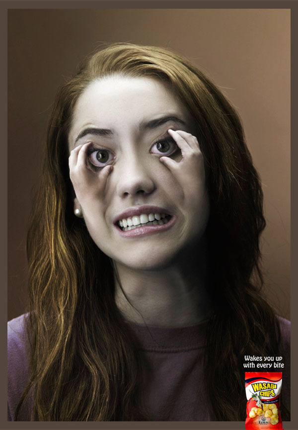
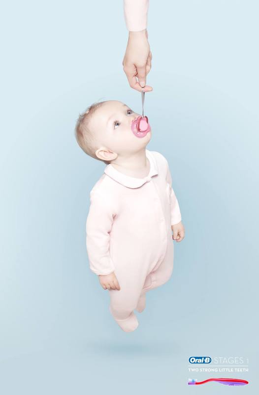
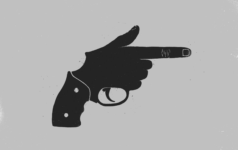
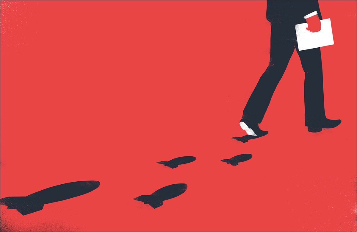
The above four points are all showcased in 'The Cog' advert. For example substitution in the form of the mousetrap game parts being substituted for the car parts. Inversion because all car adverts previous to this one were of idealistic families and country roads. Surrealism because it was playful and some elements of the car like the tyres seemed to defy gravity. The unique selling point was about the reliability of the car, in that everything had to work together perfectly to make the car go. I found some examples that I feel illustrated the four points above. Although a lot of the images I found fit into more than one of the categories I have put them under the one that I feel is most prominent within the advert. Substitution:
Inversion:
Surrealism:
Unique Selling Point:
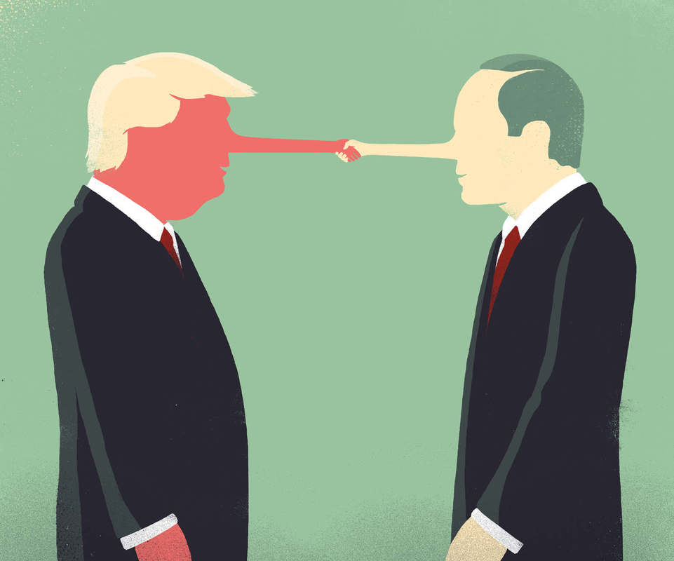
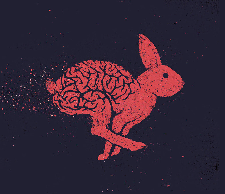
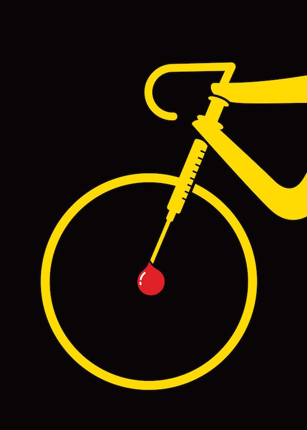
By finding examples of advertisements that contain these points, I was able to get a better understanding of how they work and just how effective they are. It showed me that I could be playful when creating designs and drawing on peoples emotions and making them feel something helps to make a design successful. Another thing I noticed was that a lot of these images would work just as well without the text and often the audience is given the text just to back up what the image is telling them. One of the other things that Gary mentioned was that by drawing loads of thumbnail sketches it can make it easier to find combinations that work well together (similar shape, size, colour). Sebastien Thibault is an illustrator based in Quebec that does a lot of work involving substitution and inversion. In his design he uses shape similarity and sometimes colour to make the substation fit perfectly. Below are some of his illustrations that I think are particularly strong in the message that they are trying to communicate.
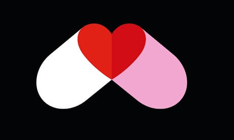
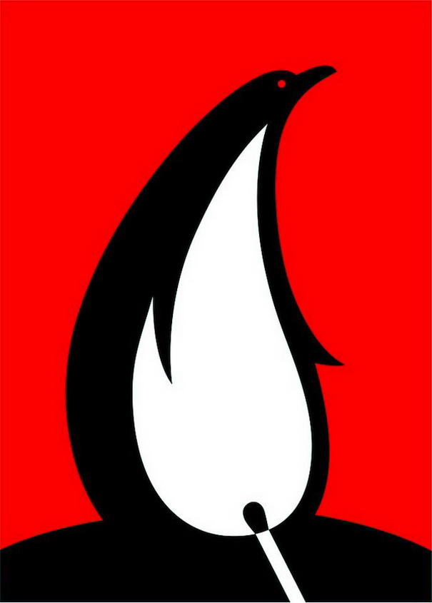
I also looked into a graphic designer called Noma Bar. In his work he uses negative space as a way of giving the image a new meaning. Helping to get the point across that he is trying to make.
|
AuthorWrite something about yourself. No need to be fancy, just an overview. Archives
May 2018
Categories |


 RSS Feed
