|
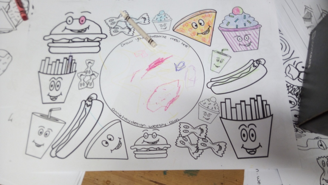
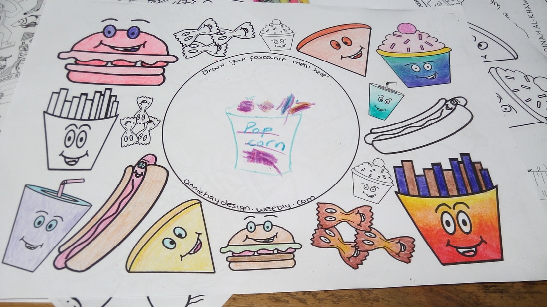
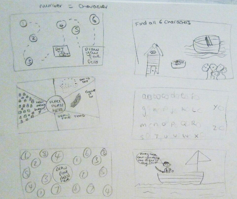
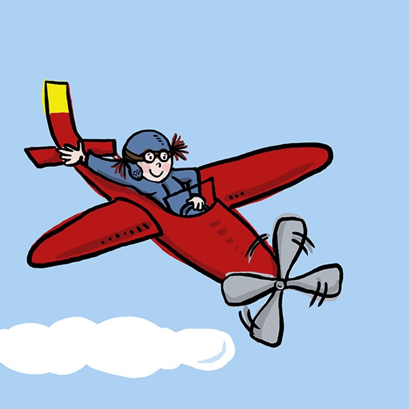
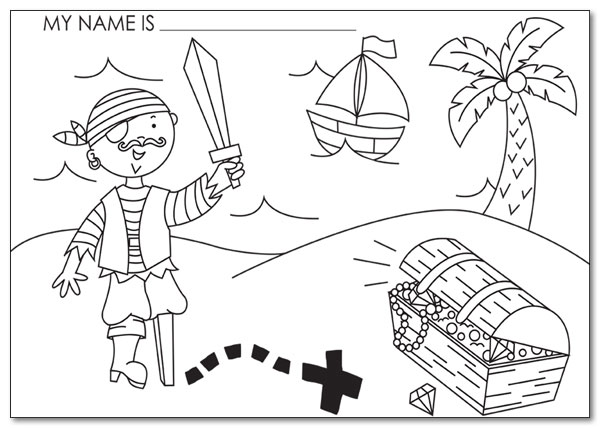
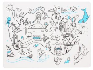
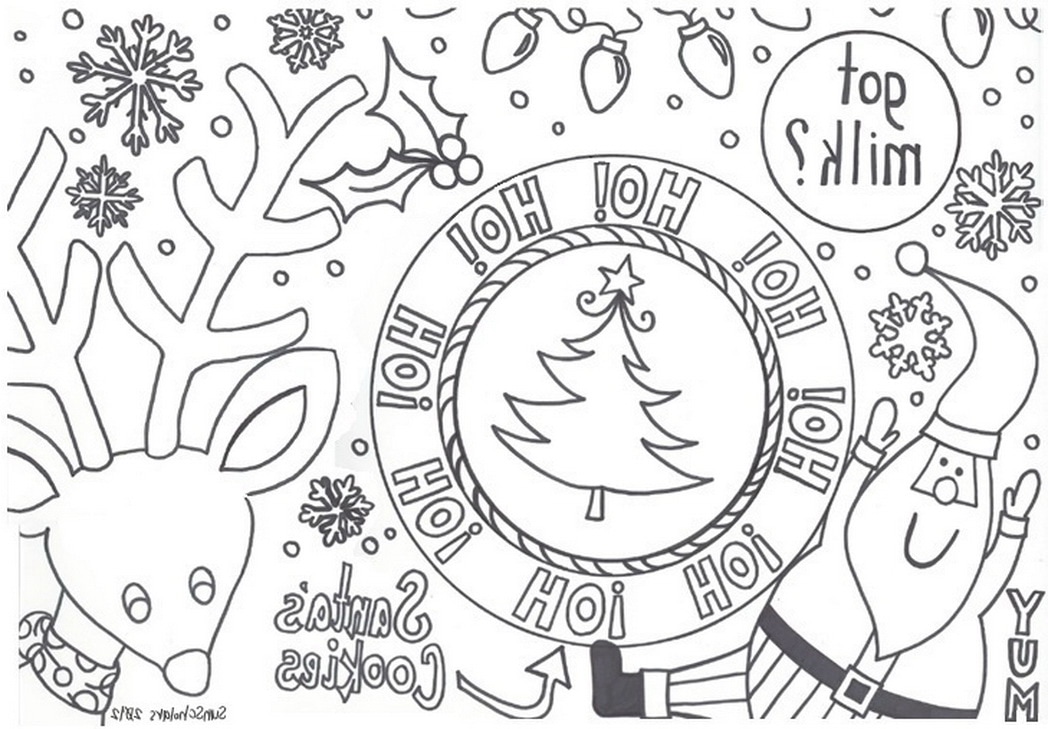
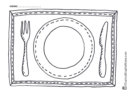
I wanted to make my final designs engaging. To do this I placed a circle (the size of a plate) in the middle of one design so that the child could draw their favourite meal, and made the other into a treasure hunt, where they have to follow the characters to reach the cake. 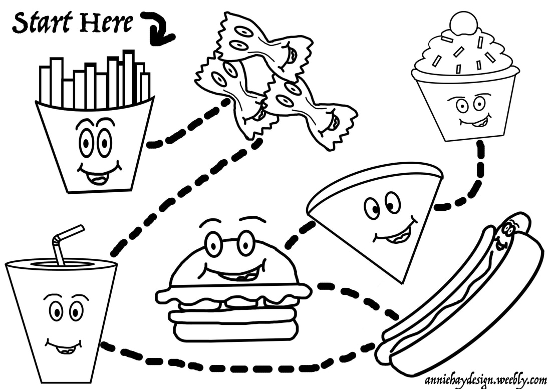 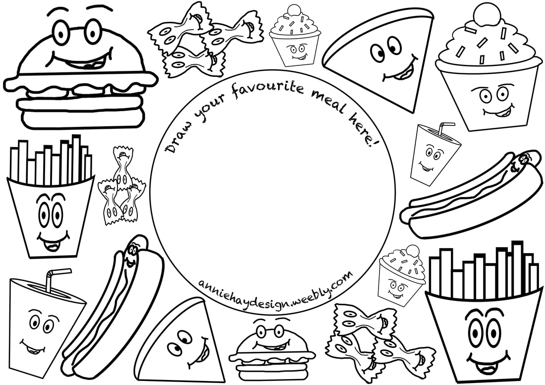 Out of the two designs I think that the second one works the best, it was interesting to look at the style of each design and trying to match up which font I would use. 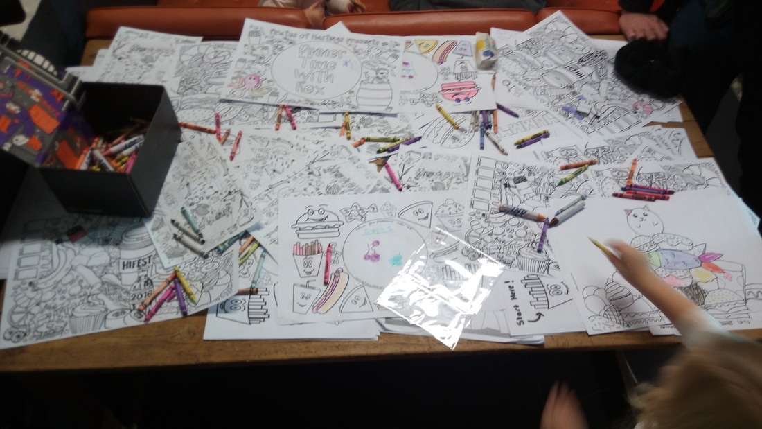
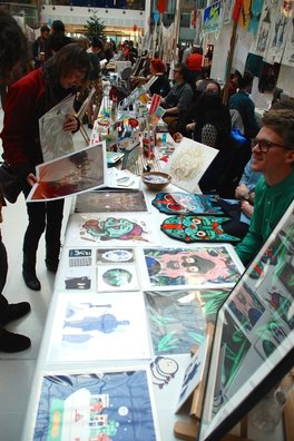
This project was the first opportunity that I had to interact with the public. Being able to see people using my placemats and enjoying interacting with them was something that was new to me, and is something that I would love to do again.
0 Comments
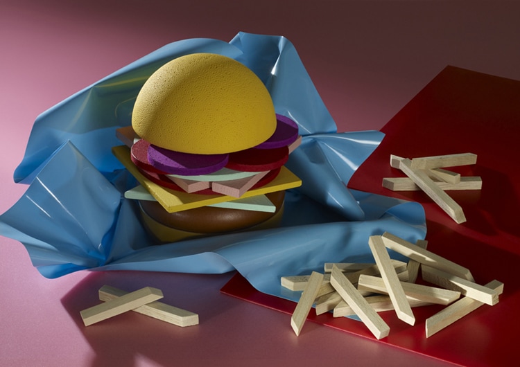
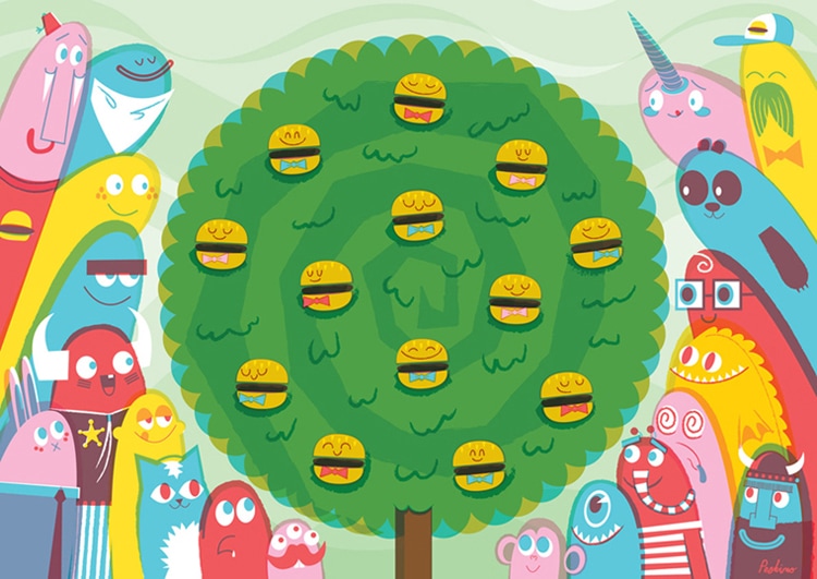
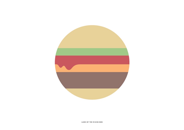
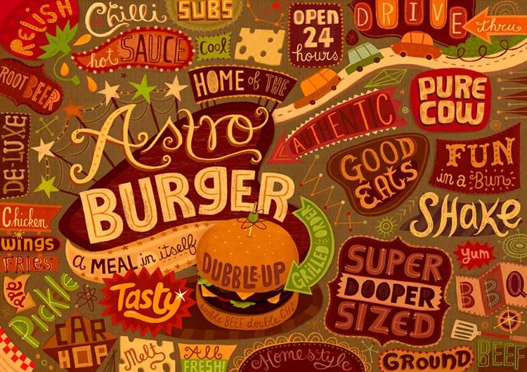
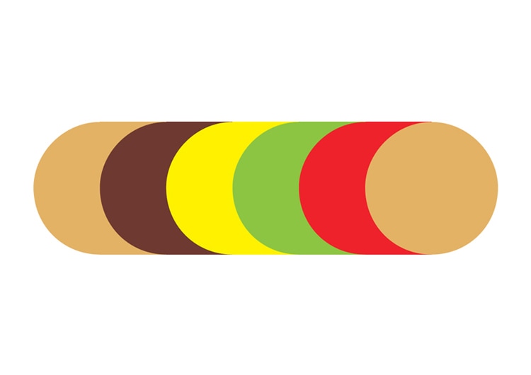
We got together to discuss what would be on our final design for the window mural. We decided that the final design would be the winter forest for the front window and the christmas tree with animals for the side window. Unfortunately I was unable to attend on the day of the drawing but being a part of the designing process and seeing the design transform from a sketch to a full scale drawing on the window was amazing. Below are some images of the final design. 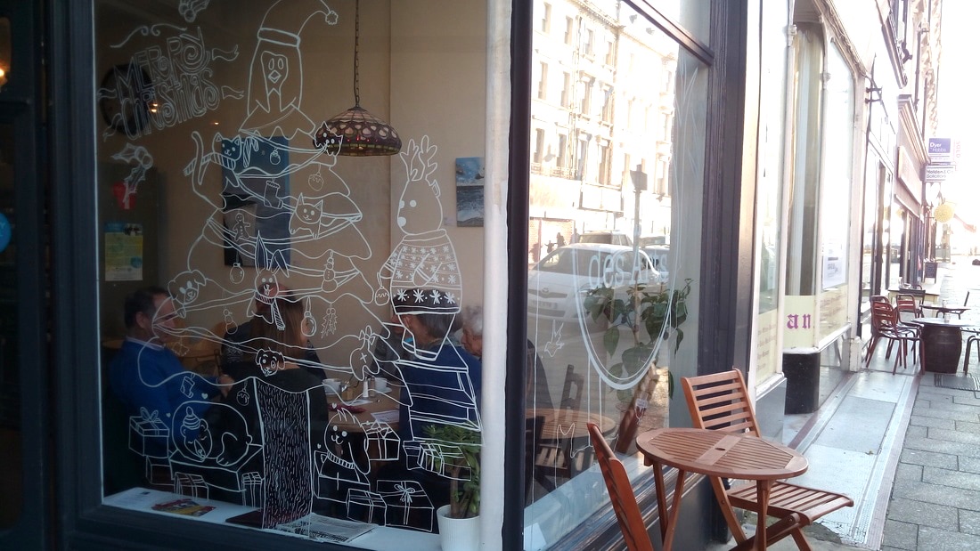 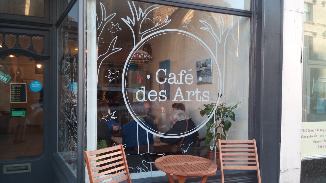 The BurgerMat show features 24 pieces of art (each by a different designer) and seeks to celebrate the burger. By looking through the different designs it was clear that the brief was very loose. Each artist was able to interpret the subject freely, leading to a wide variety of different designs. Some artists chose to focus on imagery while others created more typographic based designs. Some of the designs were really simplistic and others included a lot of detail.
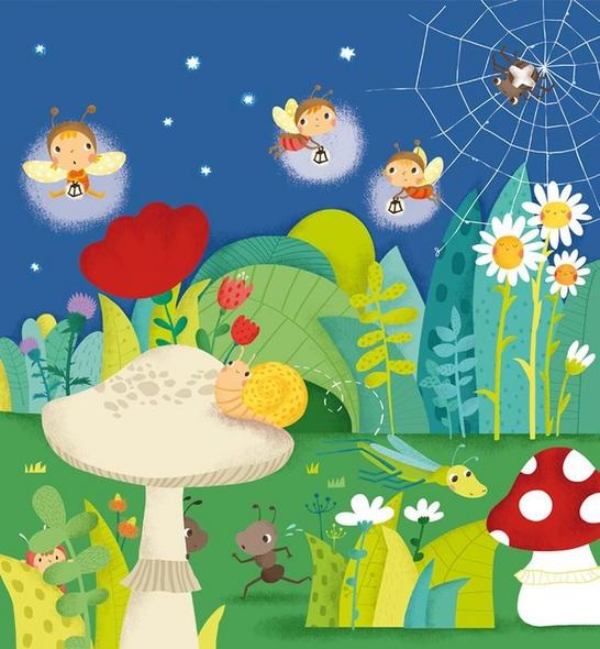
 Made by Chrissie Macdonald I wanted to look into some popular children's illustrators to see what styles they have in their designs. Oliver Latyk:
Nelle Davis:
Maria Neradaua:
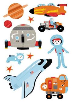
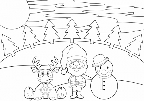
I particularly liked the above designs because the cartoon and youthful feel that they have. I also feel that all of their illustrations would work as colouring pages. I really like the use of playful characters within their illustrations and the way that although their illustrations are similar, each artist has a unique style to their designs, making them easily identifiable to that artist. Before I went on to design my placemat I wanted to look at some that already existed. I found that the most popular ones had little characters featured on them and some sort of theme, whether that be pirates, monsters or cars.
I then wanted to talk to some children and find out what they thought of colour-in placemats. I spoke to 5 children from the ages of 3 - 9 and of mixed genders. Below is a copy of the answers they gave. By talking to people within the target audience of my placemat, I was able to gain information about what interests them and what aspects I should include within my design. 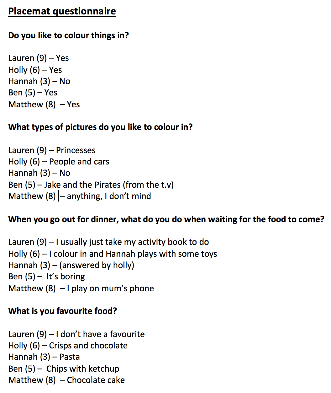 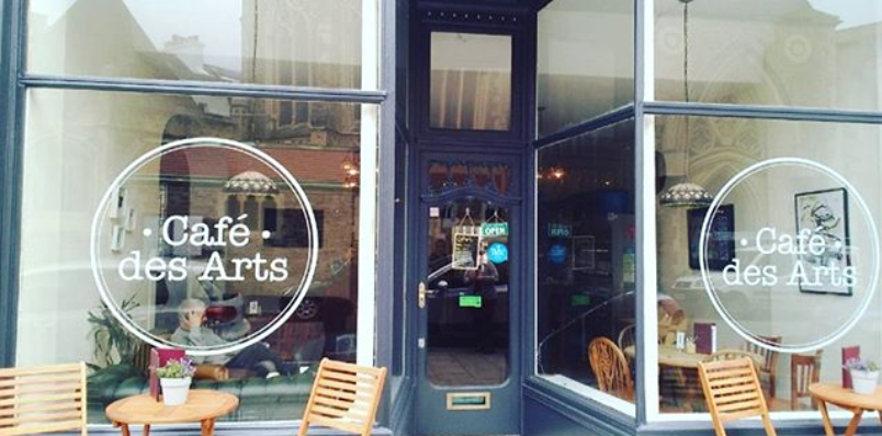 This is the café window that we will be illustrating on (the one on the right). The first thing we did was to take a tape measure and work out the dimensions of the window. This would allow us to plan out our designs for the window more accurately. 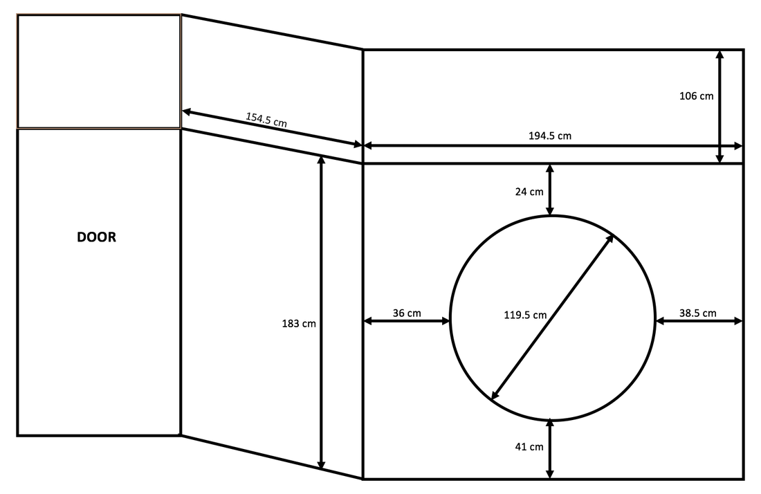 One of the things that we had to take into consideration was the logo in the centre of the front window. Our design had to work around this as it could not be removed. Originally we planned to use the top windows to hold the typography, but for health and safety reasons we were not allowed to use this window. We overcame this problem by placing the type on one of the lower windows, next to the illustration. We also had the idea of using the logo as the focal point and having different drawings emerging from it. However after visiting the café and taking the measurements we decided this would not be appropriate. I found looking at the designs of other artists that have created window murals interesting. One of the artists that I found was Emma Block. I like her style of illustration because it is simplistic and elegant. When designing an illustration for a window, she always relates it to the shop / company. Below are some examples of that. 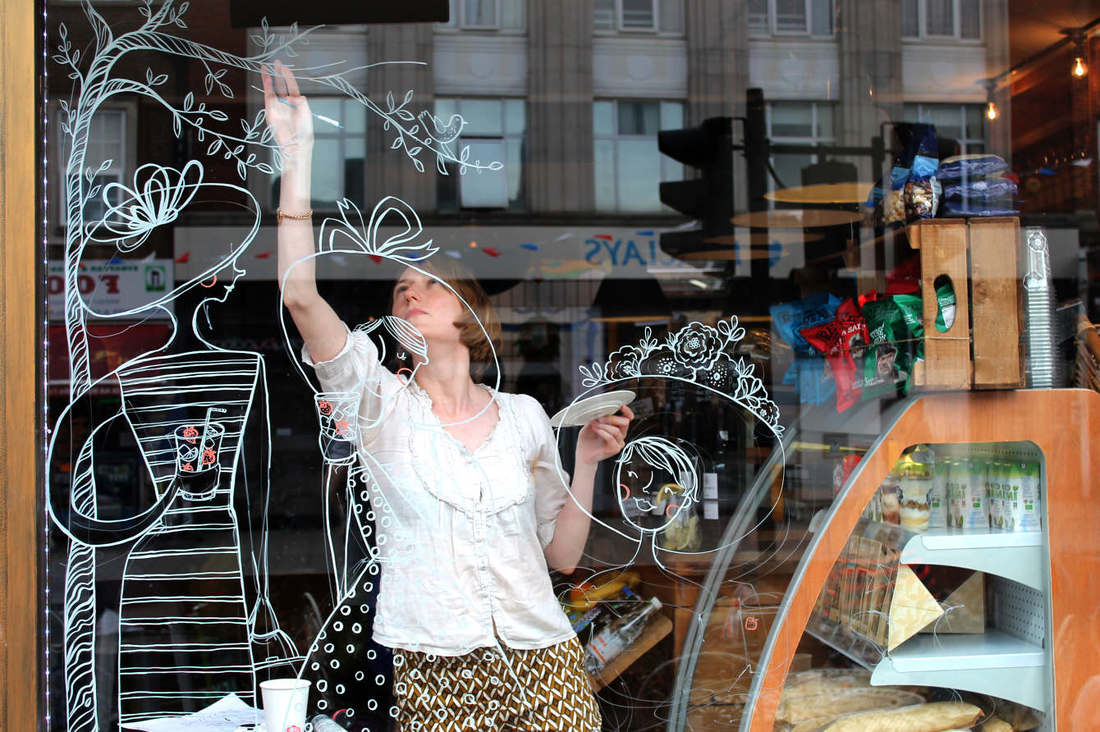 I also looked at Ashley Willerton who creates typographic designs by hand. I thought it was important to look at typography as there is a strong possibility that it will be used in the final design. Ashley can create designs in a range of fonts and styles, two of which I have included below. 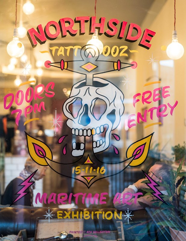 Hastings Illustration Festival (HI-Fest) is an event that takes place annually. It seeks to both promote and celebrate illustration in a fun and interactive way and draws in illustrators from all over.
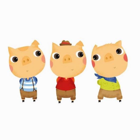
We have been given the opportunity to take part in this festival, helping out with the workshops and contributing artwork. For my project I decided to work on a window mural with a few other students and some colour-in placemat designs. I think the main difference between a good and bad placemat is that a good placemat will encourage the children to engage with it, whereas a not so good placemat will not. Characters are often used to appeal to children and can make a design come to life. If a design is too simple it will be completed quickly and can look plain. However if a design is bursting with images it can distract from the main theme. This is why it is important to find middle ground.
|
ArchivesCategories |
 RSS Feed
