|
The aim of this project was to create a series of posters depicting different fears and to convey just how common these fears are. I think that all of these designs work well as a series because of the common layout and type.
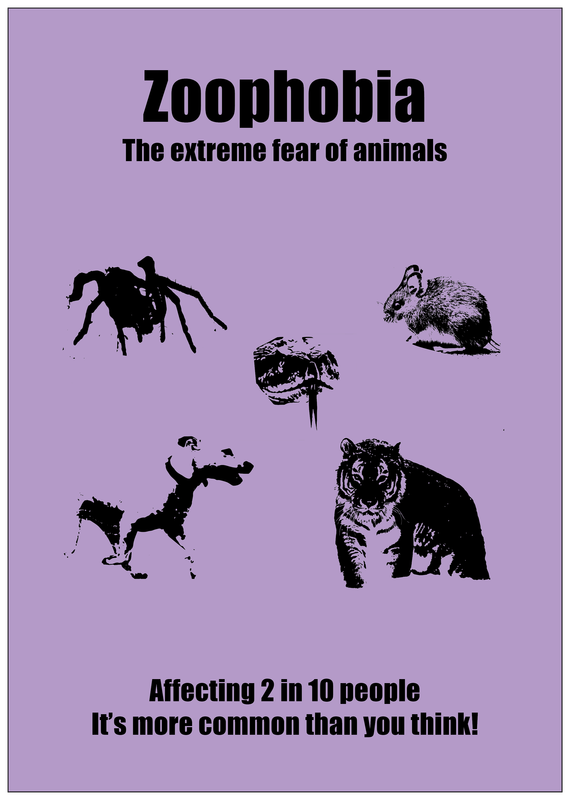
By trying out a range of techniques earlier on inn the project, I was able to narrow down the ones that would be most appropriate for each poster, allowing me more time to spend on creating the designs. This led me to create posters that didn't necessarily have the same style imagery but work cohesively together. However, if I were to redo this project I think that I would design all of the posters in the same style as the 'zoophobia' one. Visually this is the strongest design and looks the most comprehensive out of all of the designs.
I do believe that I answered the brief that I created, talking about common phobias and showing just how common they are. I did initially want the images to be a lot scarier however they still show the fears in a way that shows a non-sufferer what they are afraid of.
0 Comments
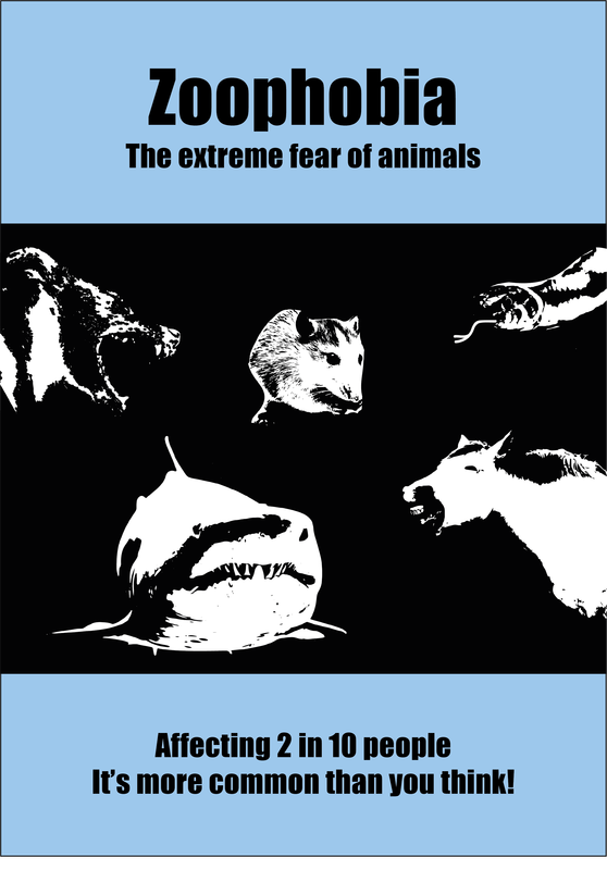
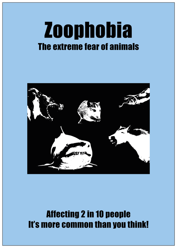
The final poster that I will make for this project is based on Zoophobia. The reason for me choosing this phobia was because it encompasses all fears of animals and will therefore have a much larger target audience than if I was to choose a specific phobia. For this design I made two different versions which are shown below. I chose which animals to use by looking at which ones people were the most feared, these included spiders, snakes, mice and dogs, along with many others.
Despite having to alter the colour of the background for both of these images, I wanted to keep it blue as this is associated with the sky and sea so is the most appropriate colour choice for this poster.
Whilst researching for this project I came across a poster series by Sara Christensen. In these posters she uses the idea of fears to raise awareness of homophobia. This is done by using imagery and information about the fears to draw the attention of the viewer and then adding in information about homophobia. I think this concept works well because people are more likely to read an informational poster if they can relate to it and it illustrates that even though homophobia has 'phobia' in the name it is not one.  I also like the unity that these posters have. They all have the same layout with the only thing changing being the information and colour. The minimalistic approach that she has taken within this poster series further draws attention and allows you to easily identify the subject of each design. The pale colours used for the backgrounds enable the text to be seen clearly which is something that I feel is important for both the discussion point of this series and impact of the posters themselves.
In terms of my poster series I defiantly think that this approach is one which would be effective in allowing me to get the information across in a way that is not too overbearing. It will also be important that my designs are not too information heavy as this could prevent people from wanting to interact with them. |
AuthorWrite something about yourself. No need to be fancy, just an overview. ArchivesCategories |


 RSS Feed
