|
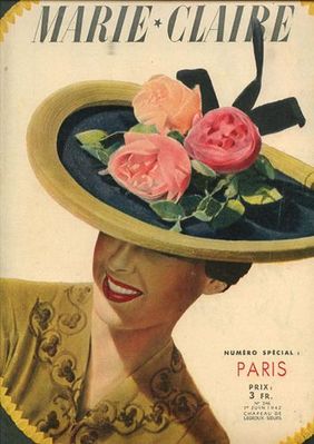
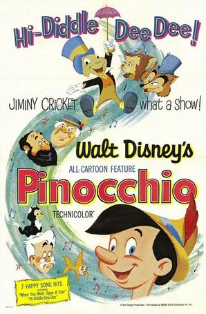
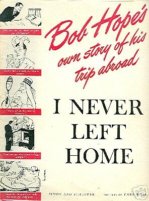
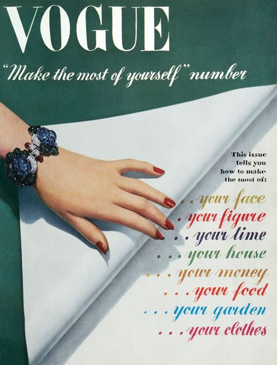
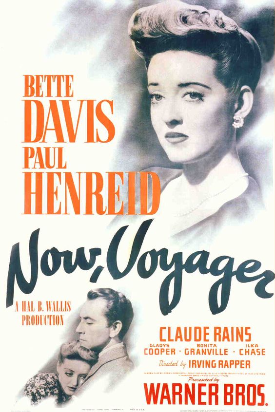
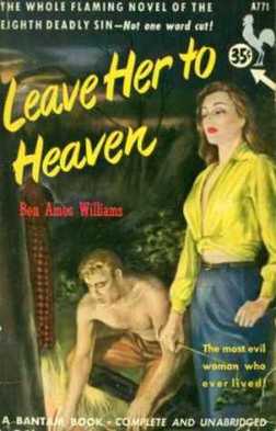
With the film being set in the 1940's I felt that it would be best if I used a typeface that was popular in that period. To do this I looked at different forma of media such as magazines, film posters and pieces of art from that decade.
From my research I have found that the typography used included a lot of block capitals and bold text, but at the same time there was also a lot of fluent cursive. The subject matter of the piece of design defiantly had an impact on the font used and often multiple typefaces were used within a piece. I wanted to try and recreate some of the fonts that I had seen to allow me to think more in depth about which font would be ideal for the movie poster. Below are some of my trials. 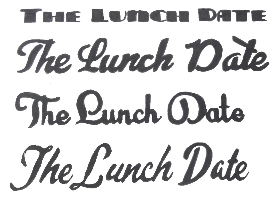
0 Comments
Leave a Reply. |
Archives
February 2017
Categories |
 RSS Feed
