|
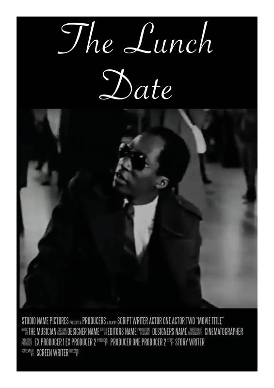
Creating a billing block is something that I have never done before, and was not really sure how to go about it. I began by researching what information should be included and in what order. One of the ways in which I did this was by looking up existing film posters. I also read an article by Ben Schott that gives a breakdown of all aspects of a billing block. I found this really useful as it explained in more detail exactly what needed to be included. I also needed to find out which fonts were typically used for this aspect of a poster. I found out that this was a font called Universal Accreditation. 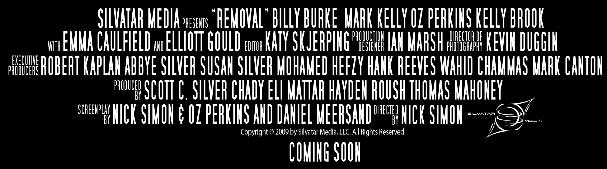  The next step was to find out all of the information that would make up the block. I was able to find The Lunch Date on IMDB which gave me most of the necessary information (such as the director, writer, cinematographer and actors).
My Billing Block:
4 Comments
During this project I wanted to look at different styles, in particular that of Saul Bass and Paul Rand. Both of whom have created very simplistic yet effective posters. One of the things that I like about their work is that they use collage and all of their pieces have a very childlike and playful feel to them. Below are some example of their work. Saul Bass:
 Paul Rand: 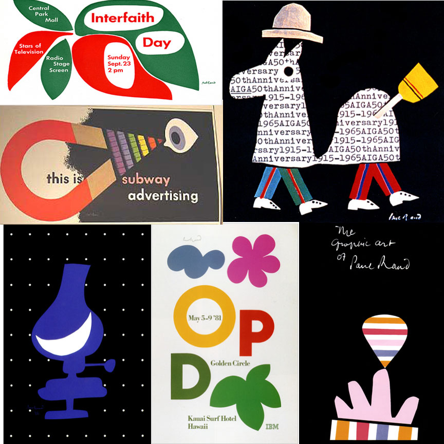 I wanted to try making a poster in the style of these artists. I had already created some still posters so I wanted to try making an animated poster. To do this I took a picture of a train, cut it out and created a gif in photoshop. I think that the gif works well because it shows one of the main aspects of the film (that she had missed her train). However it does not show that the main message of this film is about racism and discrimination. When making this poster I initially just had the train moving across the screen. But when looking back at it I thought that it looked too plain and there was too much blank space. To overcome this problem I decided to add in the steam. 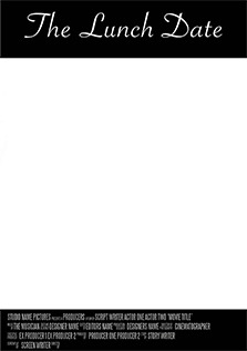
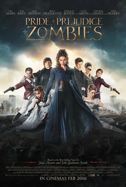
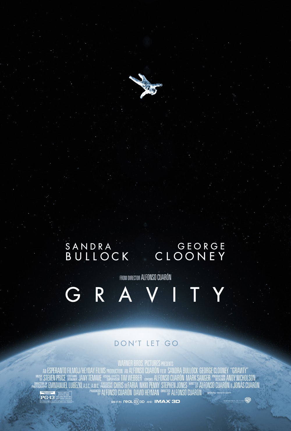
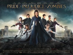
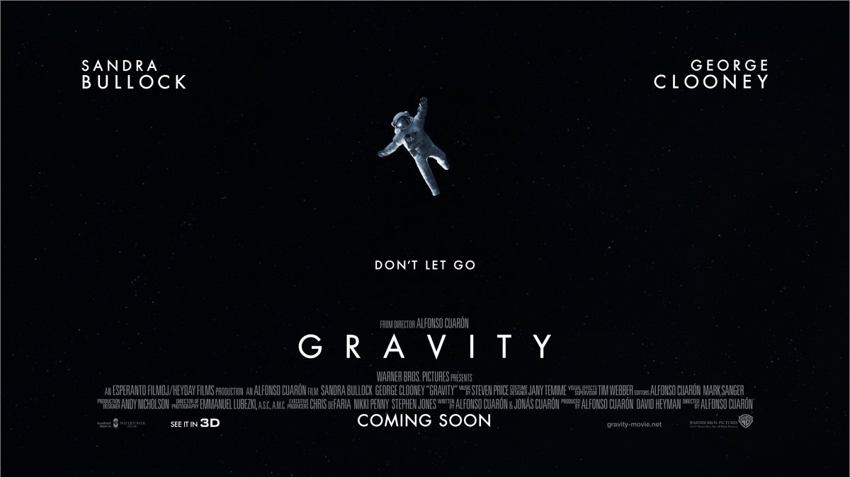
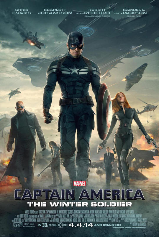
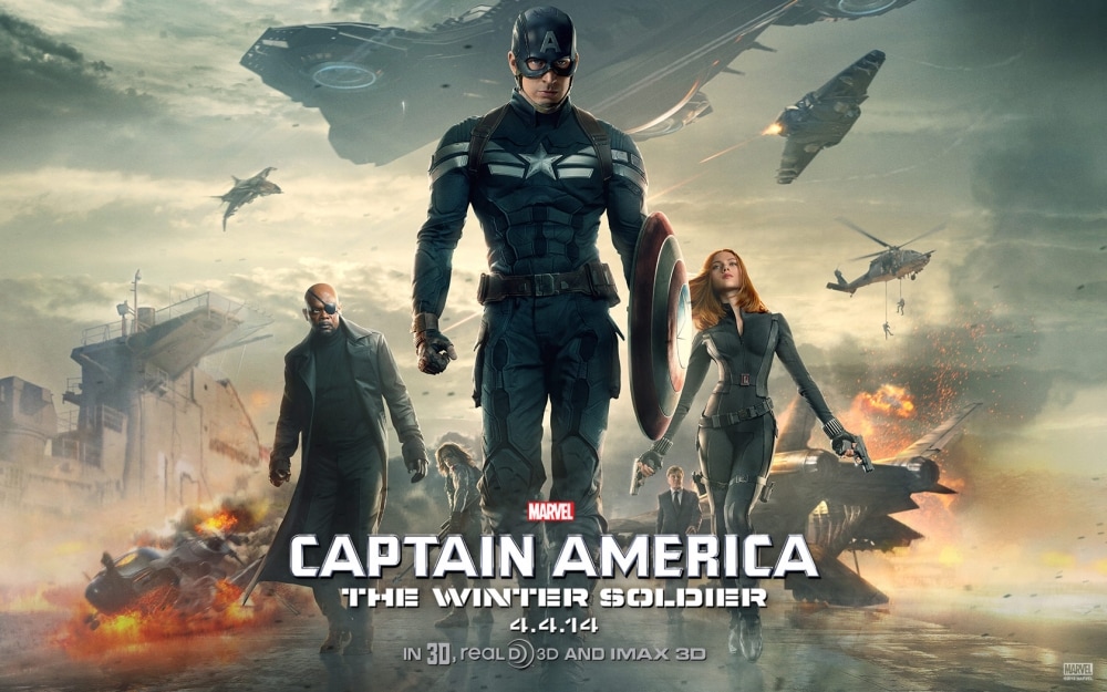
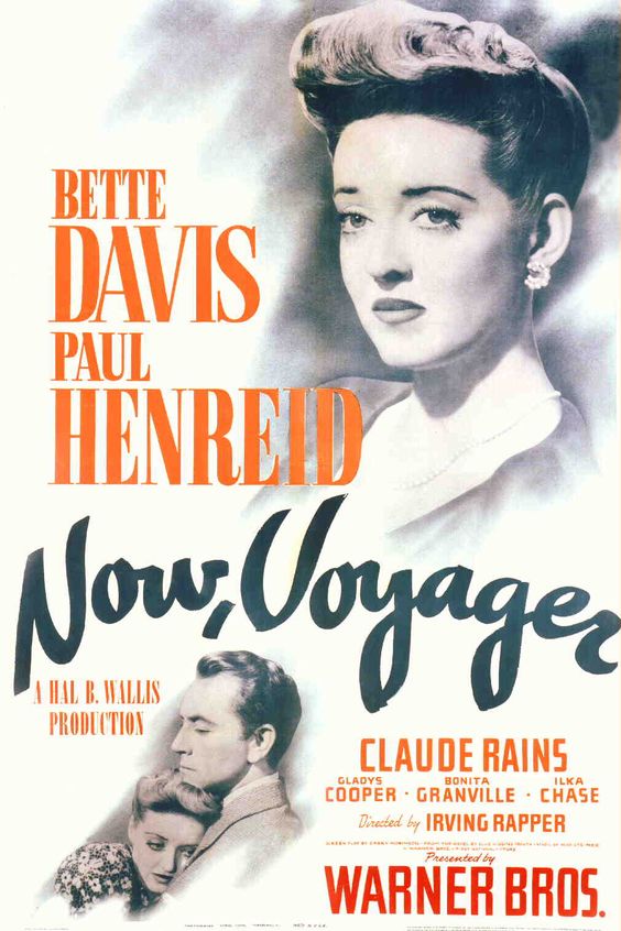
Almost all of the film posters that I have seen advertising films have been portrait. I wanted to explore the idea of using a landscape poster. Looking into some popular films I soon realised that they have both a landscape and portrait poster. With the main difference being the landscape poster having little information on and focusing primarily on the image used. In certain designs such as the 'Captain America' and 'Pride + Prejudice + Zombies' poster the image appears to have much more from to breathe on the page, and I feel the film titles are not as prominent as that of the portrait posters. However on the landscape 'Gravity' poster the image has been simplified, with the earth and stars being removed. I feel this is because on the portrait poster, just having the astronaut would make the poster seem really plain and non-eyecatching. The simplistic image works better on the landscape poster because they were able to move the cast names to fill some of the side space.
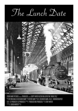
Below are some of the test posters that I created. By doing this I was able to work out what the best layout for my final poster would be.
After talking to my peers and tutors I realised that although the above posters give a hint at the subject matter of the film they don't really illustrate what the film is all about.
 'A packet of biscuits' is an urban legend about a man who had some time to kill before his flight home so he decided to buy some of his favourite biscuits. He sat down on a bench and took his coat off ready to read his paper and noticed a woman who had come to sit next to him. He soon realised that she was reaching over and taking the biscuits from the bench. Not wanting to directly confront the woman he reached over and took a biscuit to confirm that they were his. The lady gave him a strange look but continued to eat the biscuits. In his anger he snatched the last biscuit and got up to throw away the rubbish. It was only when he stood up to put his coat back on that he realised his biscuits were under his coat the whole time.
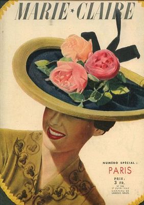
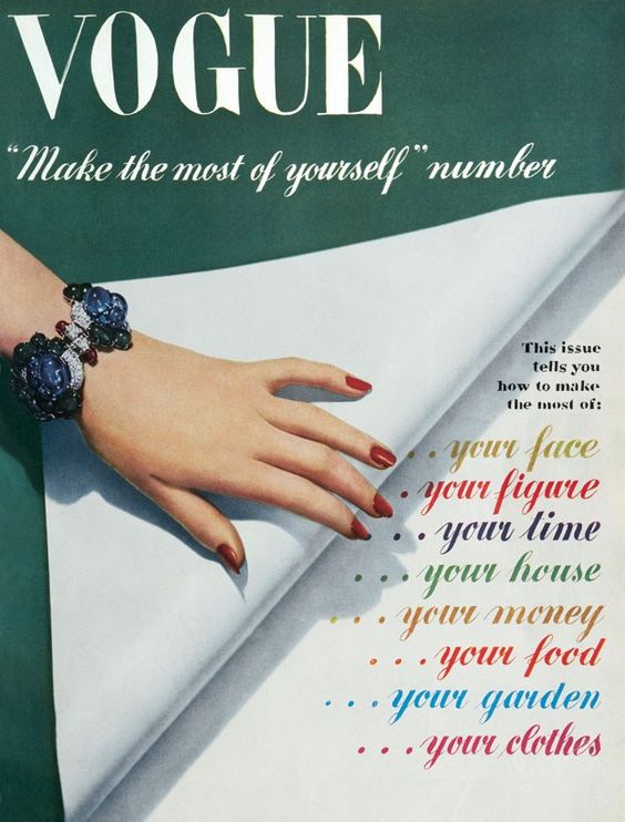
This legend is significant to my project because The Lunch Date was derived from it. With the film being set in the 1940's I felt that it would be best if I used a typeface that was popular in that period. To do this I looked at different forma of media such as magazines, film posters and pieces of art from that decade.
From my research I have found that the typography used included a lot of block capitals and bold text, but at the same time there was also a lot of fluent cursive. The subject matter of the piece of design defiantly had an impact on the font used and often multiple typefaces were used within a piece. I wanted to try and recreate some of the fonts that I had seen to allow me to think more in depth about which font would be ideal for the movie poster. Below are some of my trials. 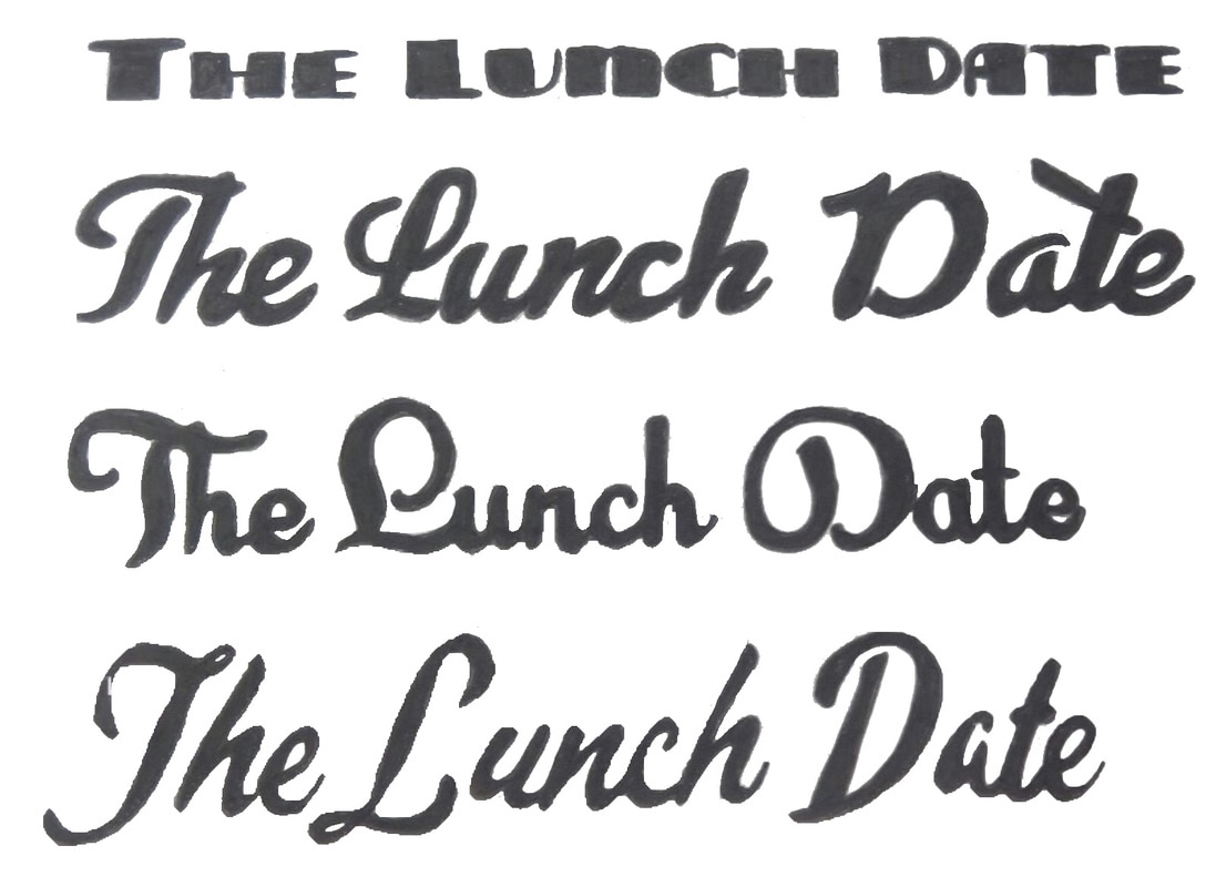 The main theme of this short theme is segregation and discrimination. I wanted to look further into this topic and came across a song by Billie Holiday about lynching. The song was based on a poem originally written by Abel Abel Meeropol to expose racism within america. I feel that this poem illustrates just what people, particually in America had to go through. Although The Lunch Date was created in 1989 it touches on the segregation that was experienced in the 1930's and 40's. Some of the way I feel that the film did this are listed below:
|
Archives
February 2017
Categories |
 RSS Feed
