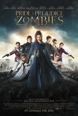
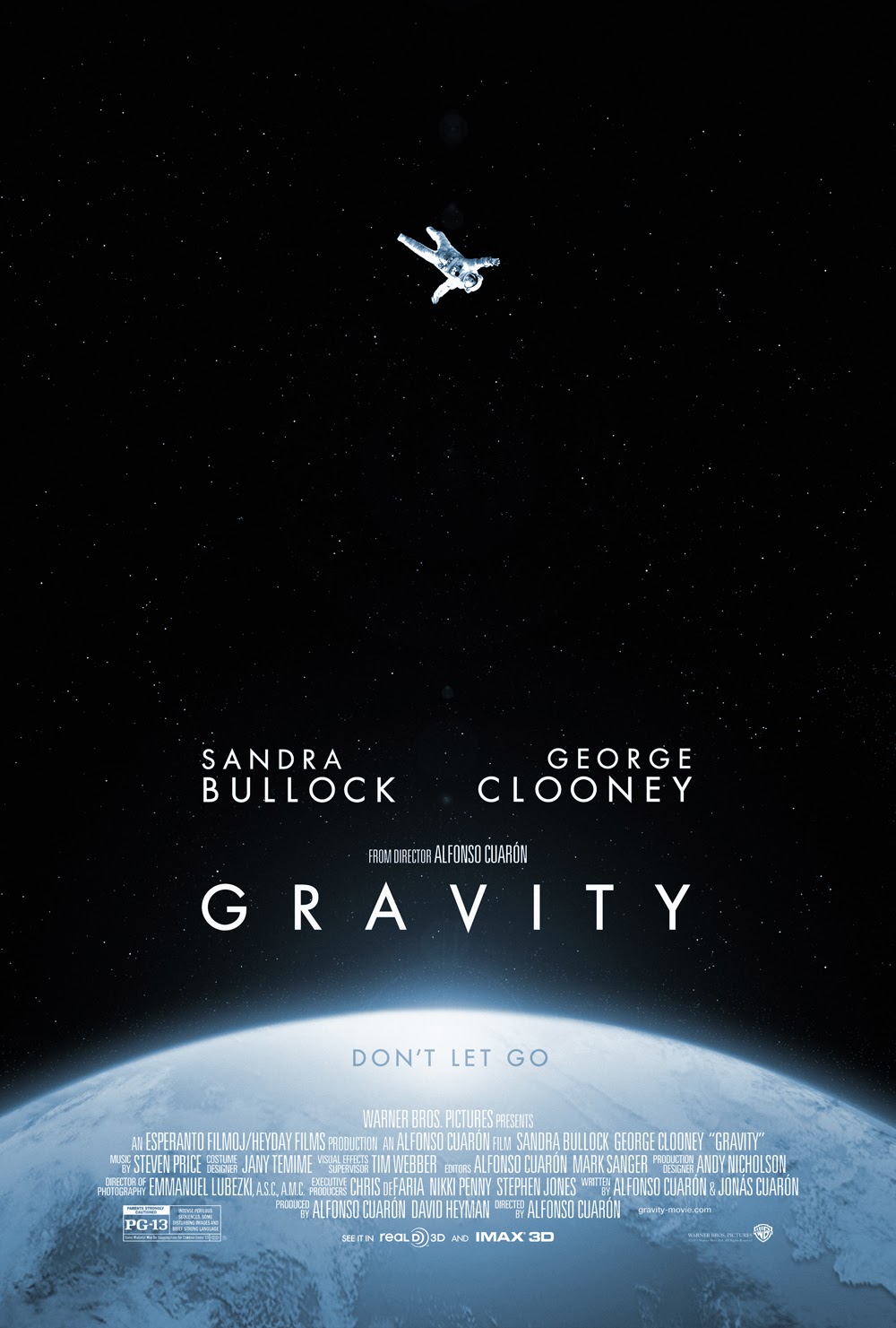
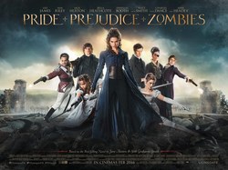
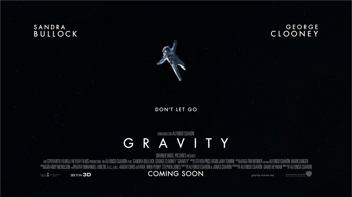
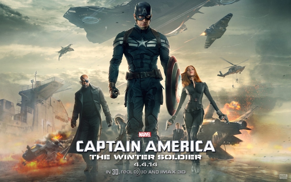
Almost all of the film posters that I have seen advertising films have been portrait. I wanted to explore the idea of using a landscape poster. Looking into some popular films I soon realised that they have both a landscape and portrait poster. With the main difference being the landscape poster having little information on and focusing primarily on the image used. In certain designs such as the 'Captain America' and 'Pride + Prejudice + Zombies' poster the image appears to have much more from to breathe on the page, and I feel the film titles are not as prominent as that of the portrait posters. However on the landscape 'Gravity' poster the image has been simplified, with the earth and stars being removed. I feel this is because on the portrait poster, just having the astronaut would make the poster seem really plain and non-eyecatching. The simplistic image works better on the landscape poster because they were able to move the cast names to fill some of the side space.
0 Comments
Leave a Reply. |
Archives
February 2017
Categories |

 RSS Feed
