|
I now needed to present my final idea. I decided to do this using Powerpoint as it allowed me to show each of the 5 main screens of my app whilst adding in annotations about the main features. Presenting my app went well and the feedback that I received was that it worked well as a concept and tied together nicely. It was also mentioned that a colour palette that contained brighter colours might work well with this design, however when I had tried this out when choosing a colour palette I felt that it was too distracting and made the design look a bit incohesive.
0 Comments
As part of this project we had to write an App Definition Statement (ADS). This outlines the purpose of the app and the intended audience. Before I began to write mine, I wanted to have a look t some examples so that I could get a feel for the style and tone that they are written in. The examples below are some that I particularly liked. 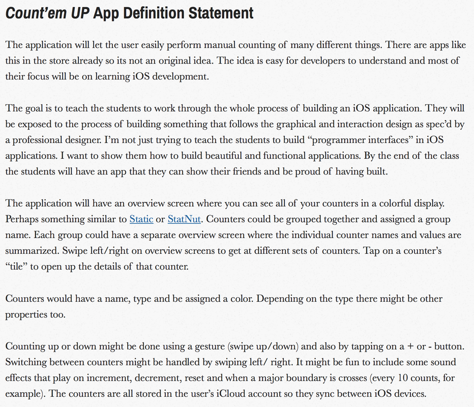 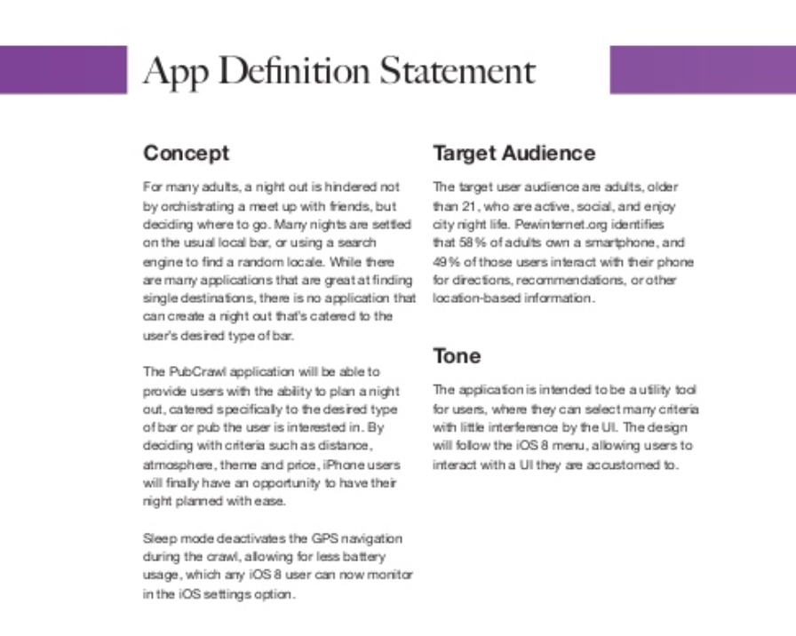 Now it was time for me to begin writing my ADS. 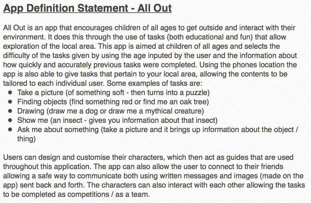 Overall I am happy with the way my ADS turned out. It explains what the function of the app is and gives some examples of what the app might suggest as tasks, allowing anyone to read it to fully understand what the app is about. I thought it was important to also talk about the social aspect of All Out as it is a big part of the design of the app.
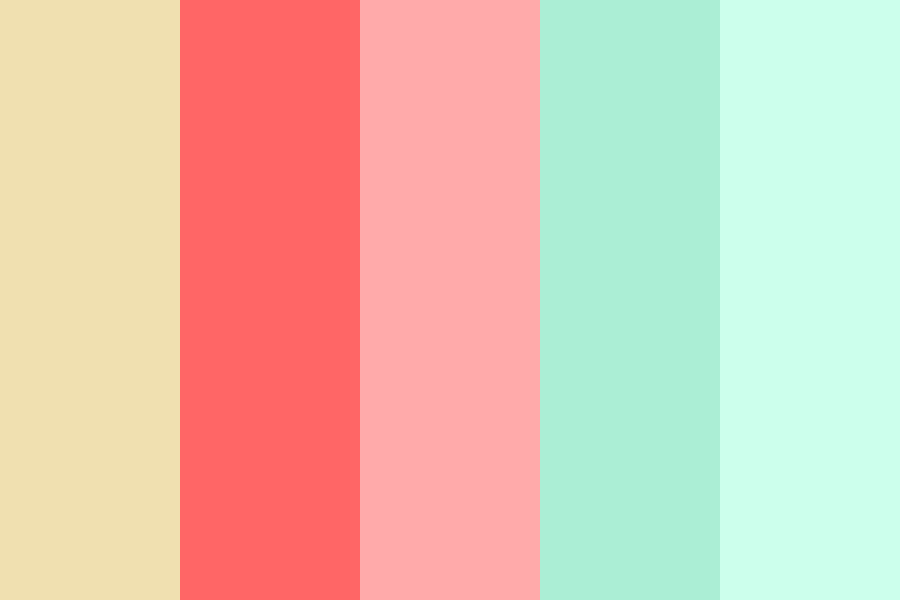
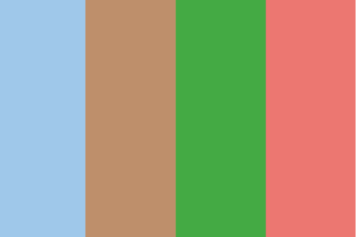
As my app is aimed at children I wanted a somewhat bright colour scheme. Both because it is more captivating and I feel it encourages interaction. However I still wanted to keep the colour palette to a maximum of 4 colours as having to many can be distracting and make it seem like there is no continuity / coherence throughout the app. After trying out some different colour palettes I narrowed down the options to these four. d
All of these colour schemes could work well within my app, however the one that I like the most is the last one. It has a range of colours that are bright, compliment each other, and fits with the outside theme.
The name of an app is important in making it stand out in the app store. After looking at various articles written on this topic, there are three main points that I feel need to be addressed when deciding on a name;
I then wanted to find examples of apps that both follow (bottom row) and don't follow (top row) the points I have made.
The apps that i found that didn't follow the points I had made above still work as app names however they are not as clear with regards to the function of the app and I don't think they would stand out as much in the market.
The next step was to begin brainstorming some possible names. I wanted to focus on the fact that it would encourage children to get outside and interact with their environments. Below are the ideas that I came up with:
After getting some feedback from my family and friends and going over the pros and cons of each name, I think the best one for my app is All Out. This is short and to the point, gives some indication of the apps function and easy to remember. I then did a search on the apple app store to see if there were any apps with a similar name and the search didn't return any results so I know that it will stand out from other similar apps.  After looking into icon design I came across a website that talks about the main features / attributes of an effective icon:
Part of the brief was that the icon had to work at multiple sizes. As I had not really worked with this kind of design before I wanted to see if it was best to design small and scale up or if it was best to design big and then scale down. I wanted to get peoples opinions on this so I visited multiple forums where people had previously asked this question. The general consensus was that it was better to design small and scale up because when scaling down details can be lost. Below are some examples that I found that I believe are great example of icon design and can provide inspiration for my design.
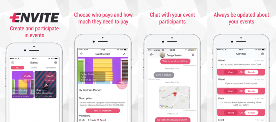
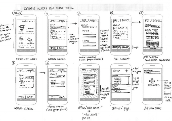
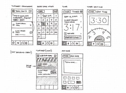
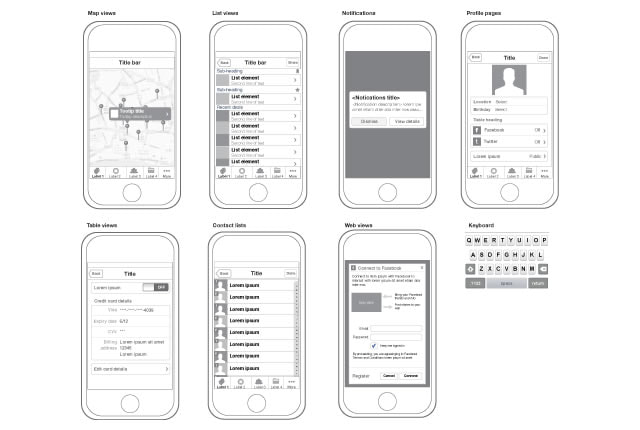
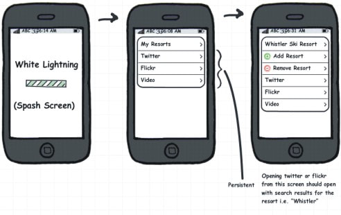
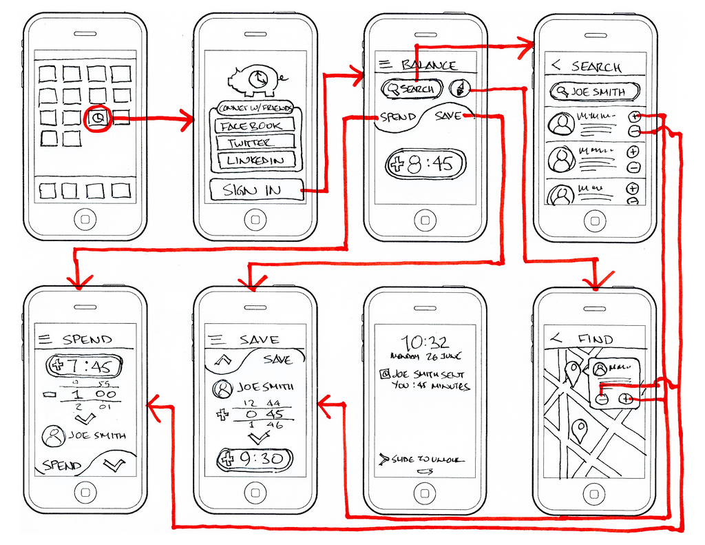
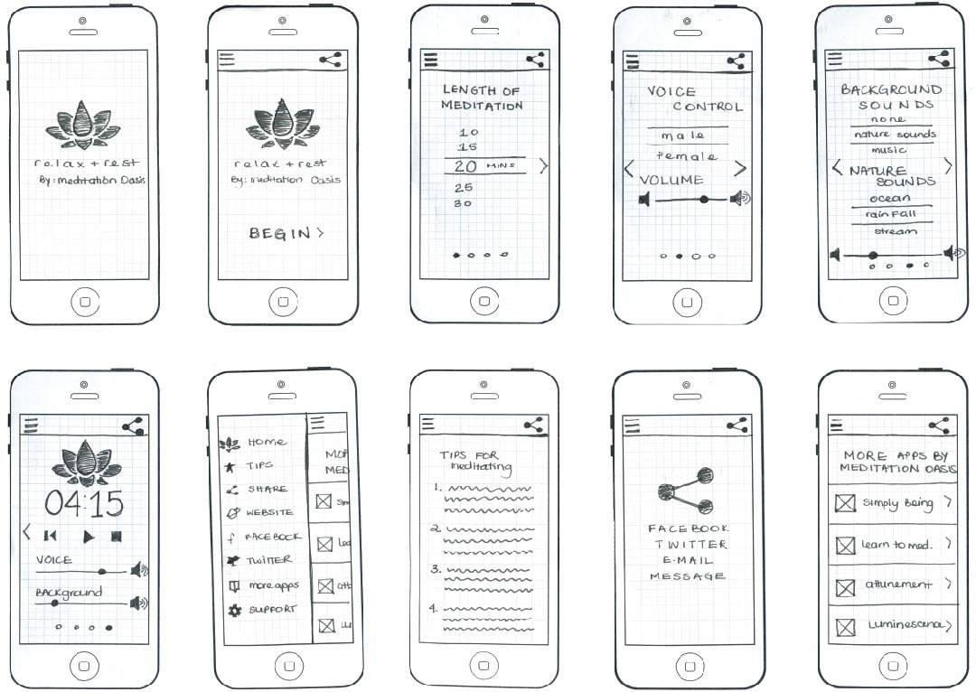
Now I know what topic my app will be on I needed to create some rough sketches of what the possible pages could look like. After brainstorming all of the possible features of my app I came up with the ideas below, and more. 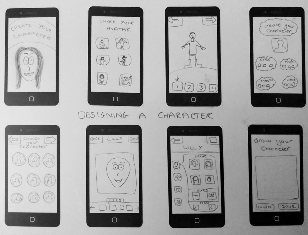 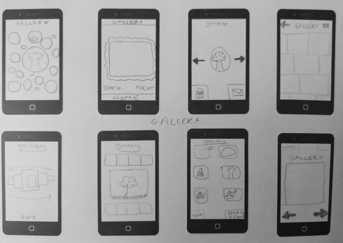 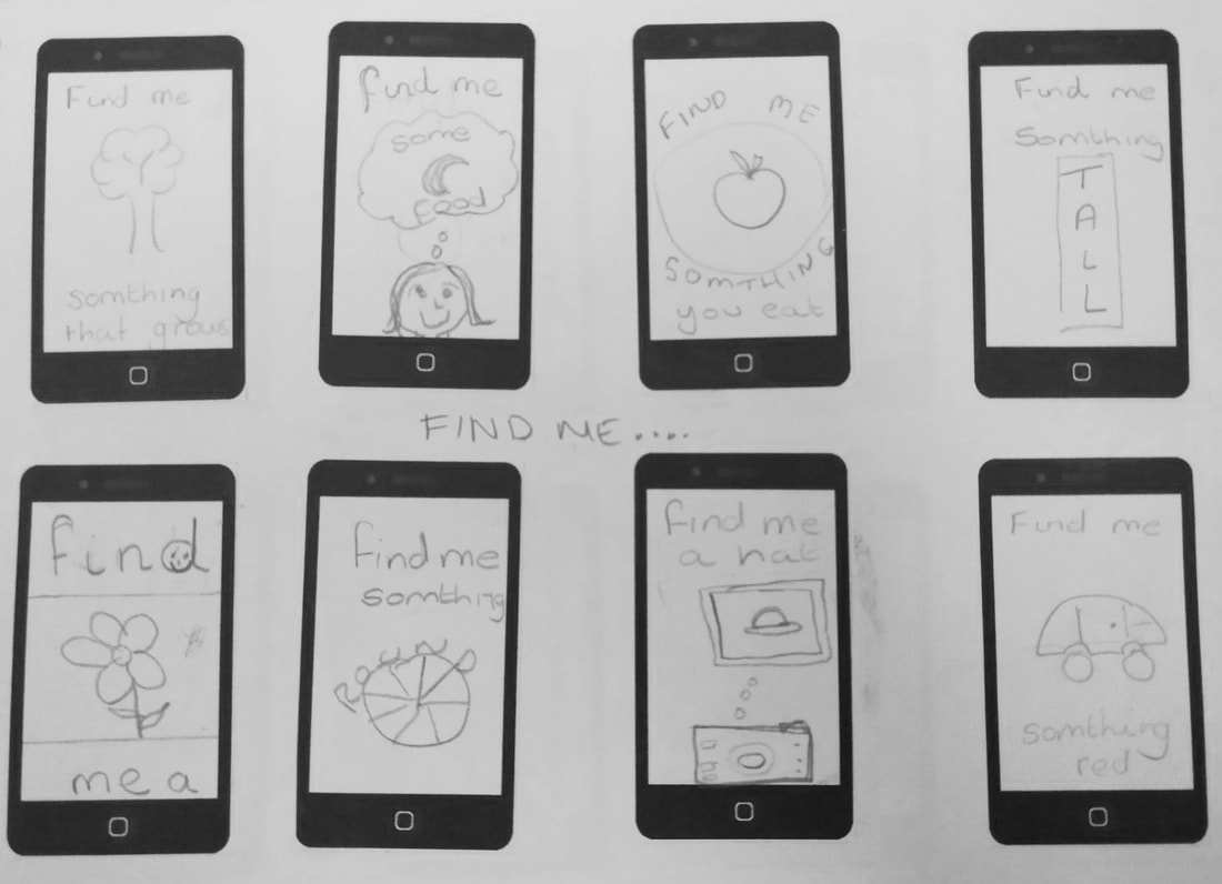 The next step I needed to take was to storyboard my idea. I had no idea how to make a storyboard for an app as I had never done it before. I thought the best way to learn how to do this would be to look at examples of other apps storyboards. Below are some of the best ones I found.
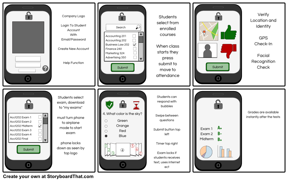
From these examples you can see a clear theme that runs throughout each app. With all of the screenshots showing a different aspect of the app whilst still sticking to the aesthetic theme of the overall design. From looking at examples and researching into storyboarding for an app I have discovered that the storyboard should show the main screens and functions of the app, whilst giving an idea of the look and feel of the design. 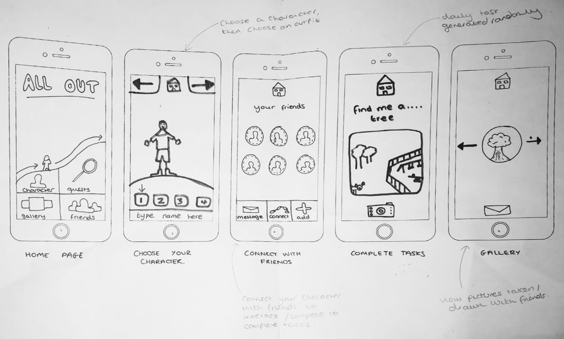 For my storyboard I decided to focus on the 5 main screens, which I felt showcased what my app does and the aesthetics of it. For my user interface I have used a mixture of Menu Driven and Graphical user interfaces as these are the easiest for my target audience to navigate using. I wanted to make my app look quite simple, so as not to confuse the users and to allow them to focus on the tasks and interactions that the app encourages them to partake in.
When getting feedback on this storyboard it was discussed how it is fit for purpose and you can see a clear idea of what the finished app might look like. However some people said that it might be useful to show another example of a task to illustrate two different difficulty levels for two different age groups, which I also feel could be beneficial to showing the full potential of my app.
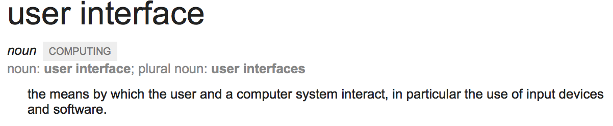
User Interface and User Experience are two factors that go into creating an app. UI focuses on the way in which we interact with the apps on our phones. After looking into user interface I discovered that there are three main types.
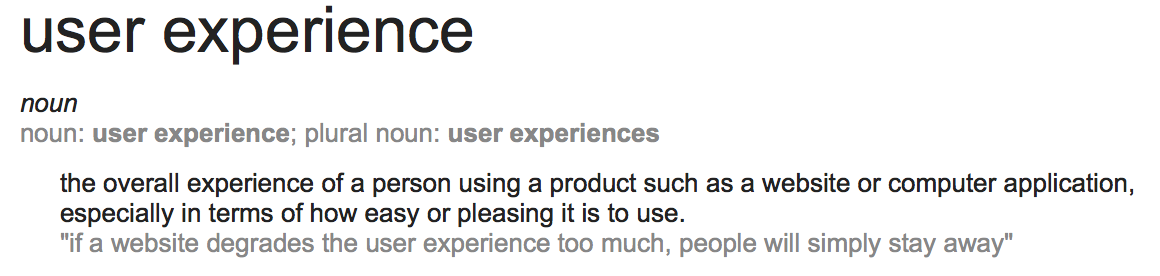
User Experience focuses on how easy to use the product is and the enjoyment or displeasure that the user feels when interacting with it. This is arguably one of the most important aspects to think about when designing an app as it can be the difference between a good and bad app. To ensure that the UX of my design is as good as possible I will refer back to the target groups needs and wants through out the designing process. Whilst looking into this subject I came across a Tedx talk by Adam Argyle that I thought was interesting. It outlined the importance of UI being simple and how the fact that it is becoming simpler is encouraging more people to interact with apps and socialise through them.
I found a great article by Nick Babich, in which he outlined some of the ways to make an app that has an optimised user experience. Some of the topics that he touched on were the fact that the visuals should be clutter free and easy to navigate, how the buttons should be big enough to click on easily but still not overly large and how there should be some form of personalisation (to allow users to connect with the app better).
Reading this article has defiantly helped me to gain a better understanding of the things I need to consider in my final outcome of this project and has offered a great insight into the things that make an app stand out and improve user experience. I had to make a decision as to whether I wanted my app to be created to look digital or if I wanted the visuals to look illustrated. After referring back to the function of my design and the experience / interactions that I want the people using my app to have with it. I decided that because my app was aimed at children and has a focus on educating them in a fun and interactive way that it would be best to use an illustrated approach. Part of the basis for this decision was a paper called 'Reading Horizons' which talks about the importance of illustrated pictures within children books. I feel that a digitally made design, although it may look cleaner, would not be fitting to my app because it is harder to connect to.
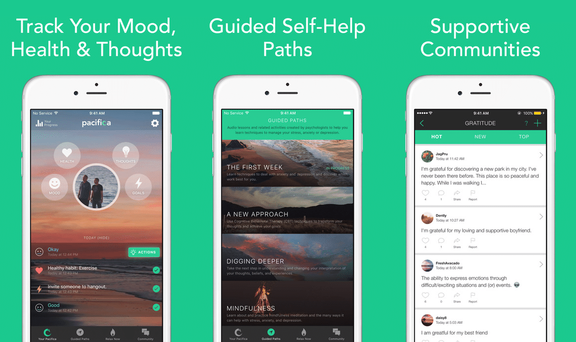
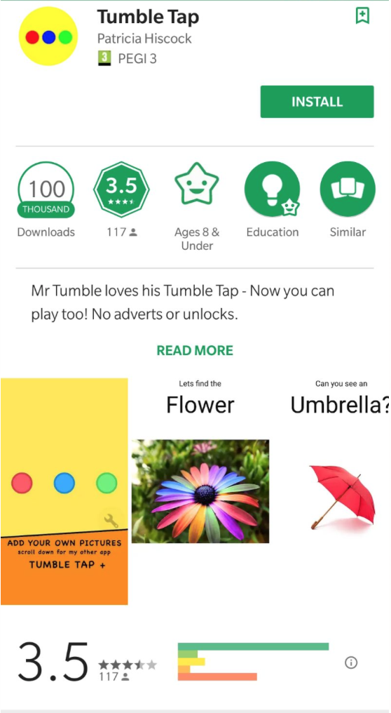
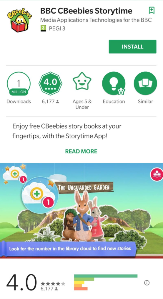
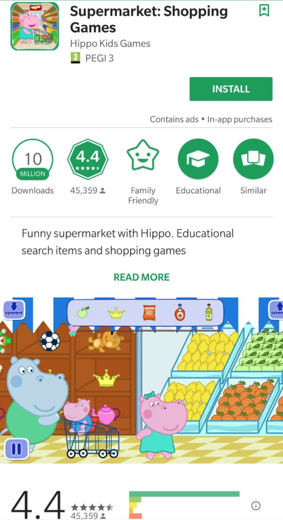
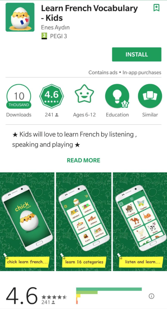
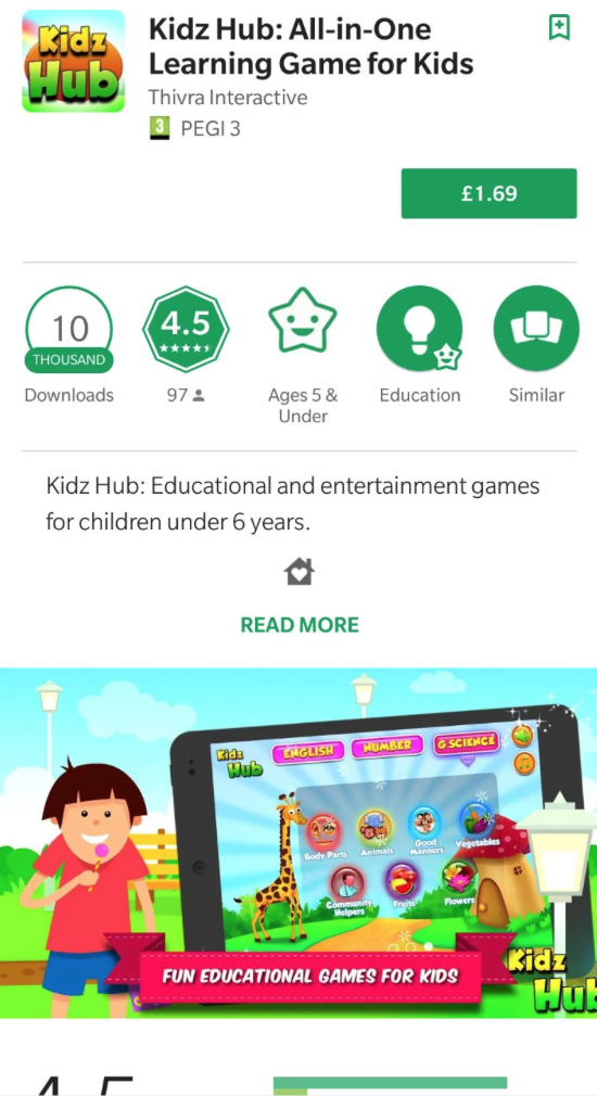
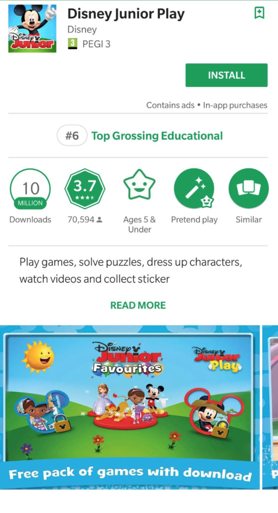
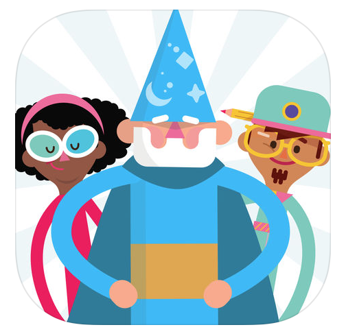
I wanted to get an idea of the type of things people looked for when choosing which app to download from the app store. Because my app is aimed at children and encouraging them to get outside, I wanted to ask some parents. To get a well rounded response I asked a 10 parents from all over the UK, and created a questionnaire that enabled me to get as much information as possible. This is the questionnaire and the responses given (in brackets). 1) How old is your child / children? 0 - 3 (1) 4 - 6 (5) 7 - 9 (2) 10+ (2) 2) How often do you let your children play on your electronic devices in a one week period? 0 - 3 hours (3) 4 - 7 hours (6) 8 - 10 hours (1) 11+hours (0) 3) What type of games do they mostly play during this time? Educational (3) Entertainment (7) Other (0) 4) Are there any educational games that they currently play / interact with, if so which ones? No (5) Yes: Tumble Tap (1) BBC CBeebies Storytime (4) Supermarket: Shopping Games (1) Learn French Vocabulary - Kids (1) Kids Hub (4) Disney Junior Play (3) 5) What are the two main things that you look for when downloading an app for your children? That is is safe to use / privacy settings (8) That there are no pop up adds / in app purchases available (3) That it is educational (4) That it is fun and engaging (5) Other (0) 6) Would you use an app that encourages your children to explore their environments? Yes (9) No (1) From this questionnaire I was able to see the type of games that people let their children play on and what they look for in an app. I decided to look up some of the apps that they named in question 4 to see what features and styles they use.
All of these apps use bright colours and the most successful ones use a range of activities and some sort of reward / collectibles that encourage the user to engage with the app. The styles of imagery use tend to be illustrated in a cartoon style. This seems to be a common theme with apps that ar marketed as being for children. It is also common to see some sort of avatar of character that is seen at various points throughout the app, this may be a way to bring the games together or to add an aspect of familiarity for the user.
This project focuses on the social side of app design, so before going any further into my research I wanted to look at some examples of popular social media sites to see why people used them to the extent that they do. But before I did this I wanted to look up the definition of social media to see exactly what I was looking for. Below is that definition. 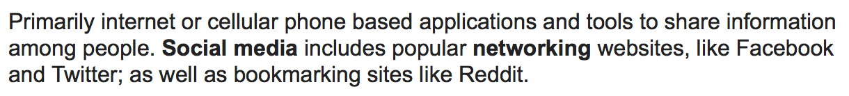 I found an article written by Anita Whiting called 'Why people use social media: a uses and gratifications approach' which explores the main reasons why people use social media and what keeps them coming back. She explored this by interviewing people and using previous studies that had been conducted in this area. Some of the top reasons that she identified were social interaction, information seeking, time passing and entertainment. All of which are aspects that I can incorporate into my app to make it as engaging as possible.
The above three social media sites are the most frequented by active users (according to a study conducted by Statista). I found this interesting because I did not expect the order of this list to be as it was. I believed that Instagram would be a higher ranking site and expected WhatsApp to be lower down on the list. However the study that these results were based off of was conducted worldwide, and different cultures / societies may look for and use different aspects of social media, which may affect the results.
I want my app to be unique and to stand out from other apps on the market. Many available apps serve a purpose and fill a need that people have, wether that be for entertainment or to help them achieve a goal (learning to cook or to remember birthdays / events, etc.). But one thing that I noticed was that there were also a few educational apps for children. This is an area that I think could be interesting to explore within this project.
After looking into various educational apps and the reviews that users had written on them I have a better understanding of what makes this genre of apps successful (incorporating the educational aspects into something fun, allowing progression, and having some form of interaction - with friends / other users). I also have a better understanding of some of the things that might not necessarily work within these apps (being to complex for the intended audience - to many options / sub menus, and general issues with ads within the app).
Before getting too much further into this project I wanted to research into apps that are currently on the market and the reasons why they are successful / unsuccessful. Even though my app will not actually be created I want to approach this project as if it was as I feel it will enable me to push my ideas to accomplish the best possible outcome. To begin my research into existing apps I went to the app store and looked at what the mose popular apps were. These are shown below. 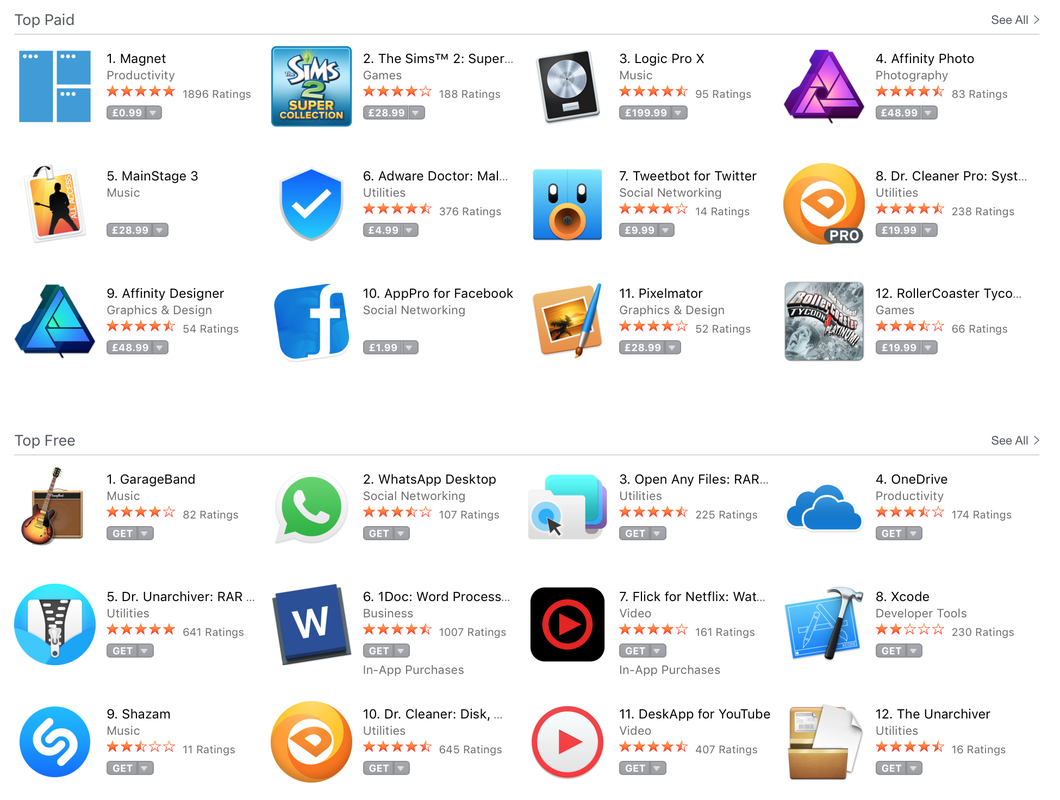 Something which I noticed the majority of these apps have in common is that they have icons which visually show what the app is about, they have simple colour palettes (one or two colours) and they all have a clear purpose. By this I mean that they are either for entertainment or messaging or to aid the user in a specific area / with a specific need, which enables the user to quickly identify what the app is used for and make a quick assumption on if that is something they will require.
I then looked into what makes a successful app and found an article that outlined the main characteristics of a successful app. The main points that it highlighted were:
By incorporating all of these key points and comparing successful apps I will be able to create an app that is fitting for the market. I started off this project by brainstorming ideas for the app. Making the main branches and then going into more detail from there. Some of the ideas I came up with included:
   The brief for this project was to create an App that had some element of social interaction. The outcome was to be 4-6 screenshots, a storyboard, an icon and an app definition statement (ADS). When first going over this brief I was a bit apprehensive as I had never done anything like this before. However after looking into the subject some more I am looking forward to producing an outcome that is fitting to the brief. Before starting this project we were given a lecture by Jon Higham outlining what works and doesn't work within app design, and some of the possible routes that we could take this project. Below are my notes. 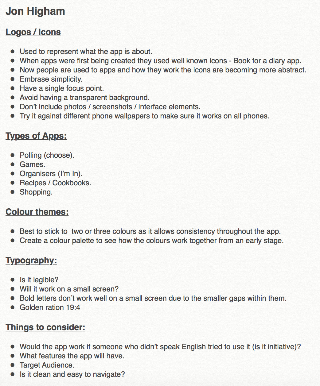
|
AuthorWrite something about yourself. No need to be fancy, just an overview. ArchivesCategories |


 RSS Feed
