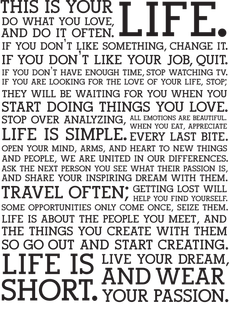
 A manifesto is a statement of one's beliefs, opinions, motives, and intentions. For this project I wanted to create my own manifesto. By looking at other peoples manifestos I was able to see what things people included. Some were specific to the writer and some were more general statements that could be applied to anyone. My Manifesto:
0 Comments
I wanted my final gif to be a bit more playful than the other gifs. The concept behind it is that we all have a bit of crazy within us and sometimes it is good just to let go and act a bit crazy. I went to Giphy to find inspiration for my design. Below are some of the gifs that I particularly like.
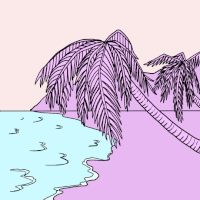
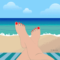
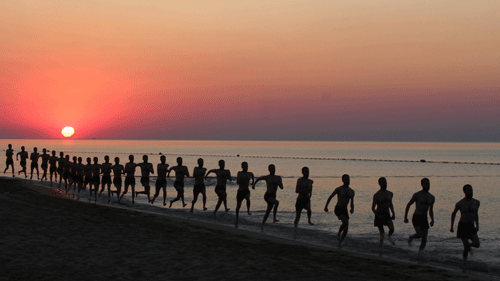
I went into making this gif with a rough idea of what the final outcome would be but I wanted to approach it in a way that allowed me to express the message. 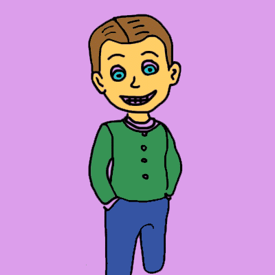 The intention behind their gif was to show how everyone tries to fit in and hide the 'crazy'. This shouldn't be the case, people should be allowed to express who they are. For the font choice I wanted to use a more confirmative font and then a more unconventional font for the word crazy. I feel this tied in the whole gif and reinforced the original message. The idea of enjoying and making the most of life is a common topic when it comes to manifestos. I wanted to choose a topic that was more uplifting than some of my other gifs. I wanted to use the idea of a beach as it is a place where many people have happy memories.
I also wanted to try using a different technique, so for this gif I used collage. By cutting up pieces of paper and moving them slightly for each frame and then putting them in photoshop to touch up.
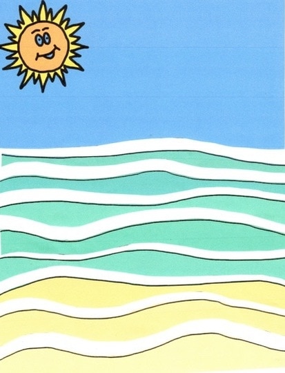
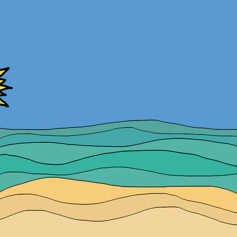
Although I was happy with the above gif, it didn't really portray the message that I wanted to get across. Drawing inspiration from the children's tv show 'Come outside' I decided to add in a plane that drags a banner across the sky. This will enable me to convey my message clearly. 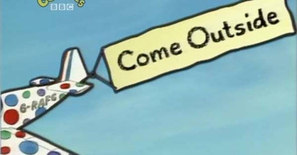 By doing this I am able to clearly communicate my intended message. I decided to handwrite the font on the banner as it gives a more personal effect. In order for the plane to cross the sky unobstructed I had to remove the sun from the image. Although I would have liked to keep both, the gif looked to cluttered with it still in. After creating my gif and watching it back, it looked a bit plain. I wanted to add something in so that it wasn't just a plane moving across the sky. To combat this I put in a fish jumping out of the water. 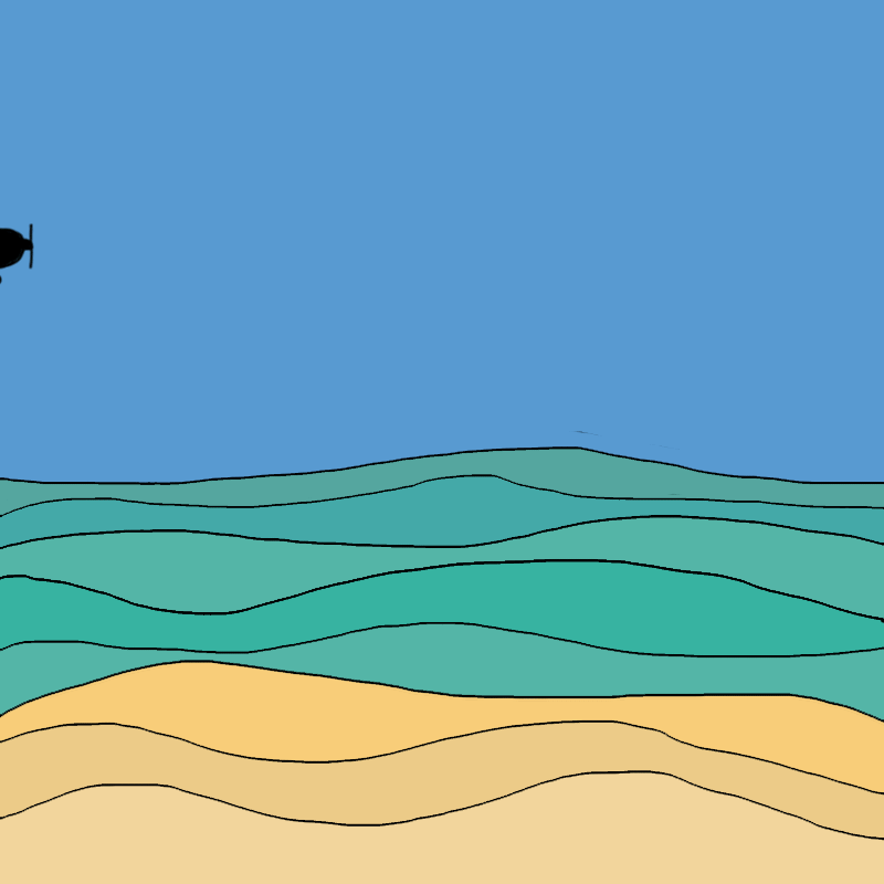 I wanted to make a gif about this topic because it is one that can affect anyone at any stage of their life. While researching for this project I came across a video by the British Forces Broadcasting forces. 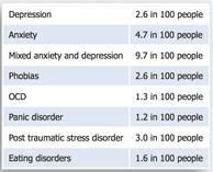 I also looked at some statistics regarding this subject. Mind, a mental health charity have published reports that 1 in 4 people experience a mental health problem each year. Considering these statistics it is astonishing that there is still a stigma surrounding mental health. I wanted to make a gif that addresses the problem of 'bottling things up' and what will happen if you keep doing this. I decided to do this using a wine bottle as alcohol is one of the things people turn to when they are struggling to cope. I originally just had the bottle getting bigger and bursting, then I thought about having some liquid pouring into the bottle to show it filling up. However I did not feel that these ideas portrayed my message accurately. In the end I decided to add in pieces of paper showing some of the emotions that people bottle up. 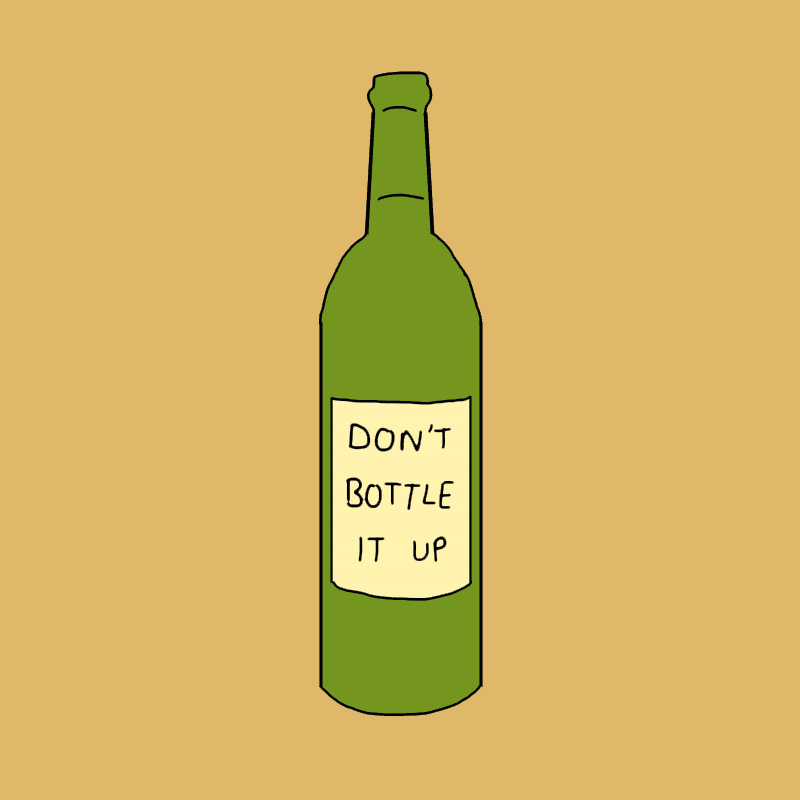 I wanted to highlight the issue of child labour within our retail industry. Many people go shopping without even realising the cost that it has on children all over the world. Before making my gif I first wanted to get a better understanding of where this was happening and what areas of retail had the highest rate of child labour. Below is an image published by Maplecroft, an organisation that helps companies to identify any risks and problems with supply chains. 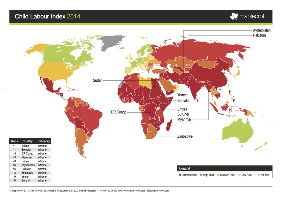 I I wanted to highlight that this was an issue prominent in fashion. With the majority of child labour being within the textiles industry. I drew up some sketches and compiled them into the gif below. 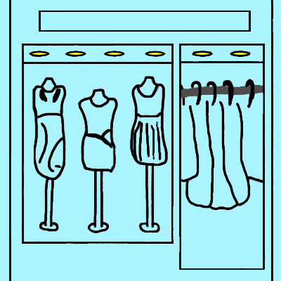 The main piece of feedback that I received with regards to this gif was the type would be more effective if it was handwritten. This would allow a stronger link between the type and imagery. I also wanted to add more detail to certain aspects of the design so I decided to add in a shop name. This makes the shop more identifiable. 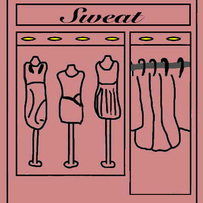 For the final gif I also looked into colour theory. I found out that the colour blue is typically associated with trust and responsibility. I did not feel that this was the right message to portray. I looked into the other possible colour options and found red to be the most appropriate. It is the international colour for stop as well as the colour of blood. Red is a very strong and intense colour. |
Archives
February 2017
Categories |
 RSS Feed
