|
I wanted to highlight the issue of child labour within our retail industry. Many people go shopping without even realising the cost that it has on children all over the world. Before making my gif I first wanted to get a better understanding of where this was happening and what areas of retail had the highest rate of child labour. Below is an image published by Maplecroft, an organisation that helps companies to identify any risks and problems with supply chains. 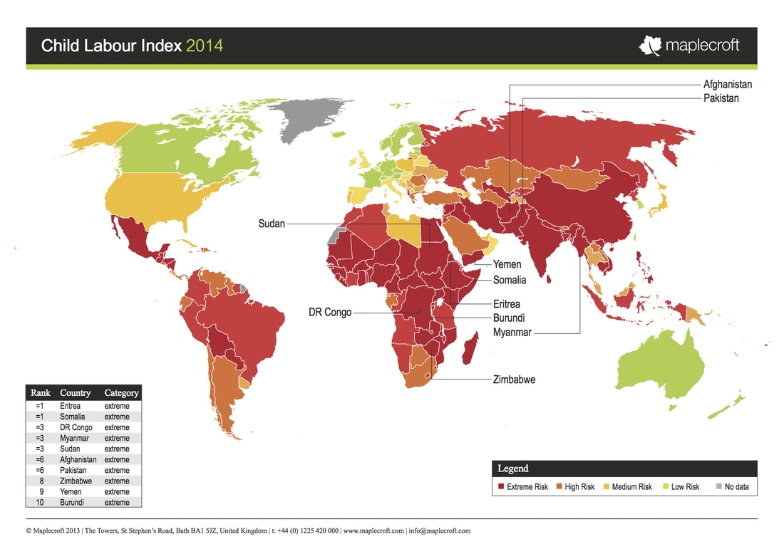 I I wanted to highlight that this was an issue prominent in fashion. With the majority of child labour being within the textiles industry. I drew up some sketches and compiled them into the gif below. 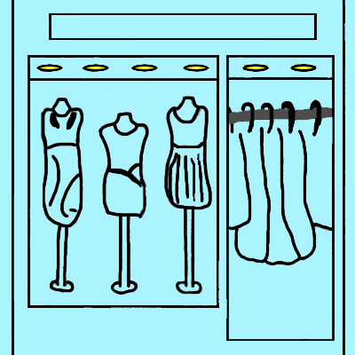 The main piece of feedback that I received with regards to this gif was the type would be more effective if it was handwritten. This would allow a stronger link between the type and imagery. I also wanted to add more detail to certain aspects of the design so I decided to add in a shop name. This makes the shop more identifiable. 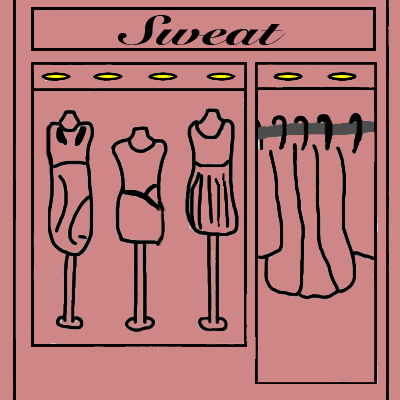 For the final gif I also looked into colour theory. I found out that the colour blue is typically associated with trust and responsibility. I did not feel that this was the right message to portray. I looked into the other possible colour options and found red to be the most appropriate. It is the international colour for stop as well as the colour of blood. Red is a very strong and intense colour.
0 Comments
Leave a Reply. |
Archives
February 2017
Categories |
 RSS Feed
