|
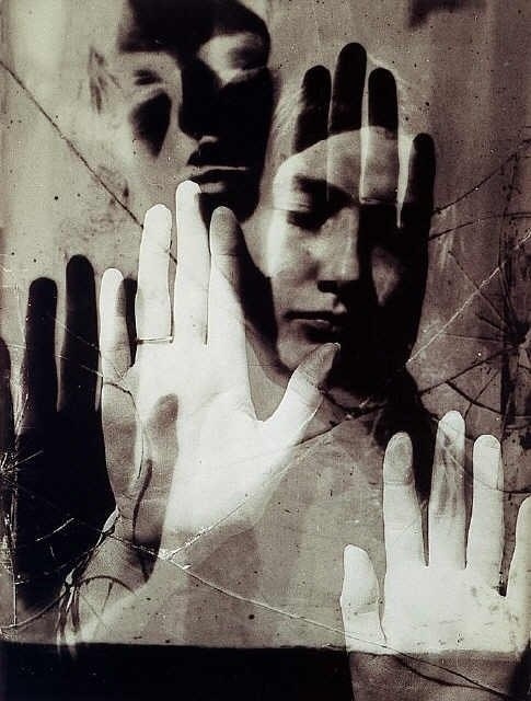
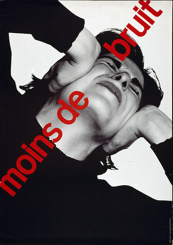
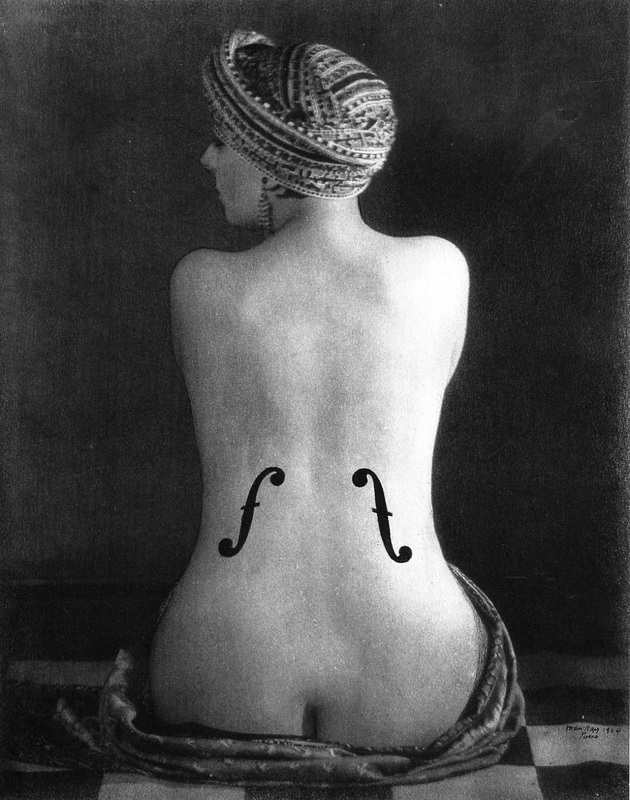
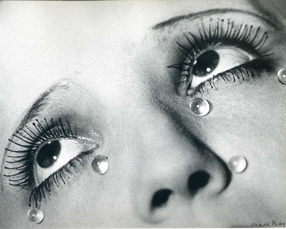
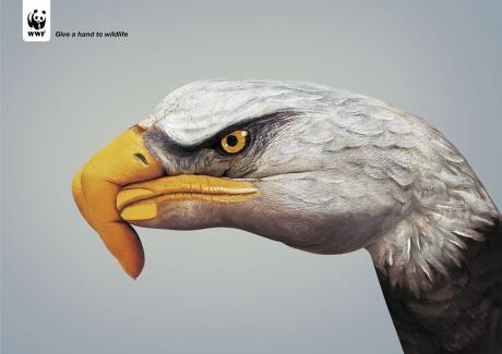
The topic that I chose to write about for my essay was about gendered robots and whether AI and robots should be assigned a gender. Through researching around this topic I found various experiments such as the one conducted by F. Eyssel and F. Hegel in which it was concluded that gender is a social construct. One of the things that I had never really noticed before completing this essay is just how much gender is used within AI to make us interact with it in a certain way. Even something as simple as using gendered voices on busses and trains can have an impact on us. One of the thing I touched on within this essay is how a female voice is used as it can be identified and heard more easily one the voices of commuters due to its higher pitch. I also discovered that the reason behind AI assistants such as Cortana, Siri, Alexis and Google Assistant all having female voices was because they come across as friendlier and encourage more user interaction.  I also talked about the television show 'Humans' and how this depicts a society in which Robots and humans live side by side. It raises many ethical and moral questions about whether it is right to create robots and Ai for our own gain and what happens if those robots start to develop a conscience. 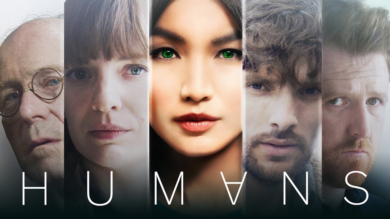 In relation to the various design movements of the past, I feel it related most to surrealism. Though the connection may not be immediately obvious I have made this link because surrealism is all about imagination and expressing dream, something which I feel the show Humans does. Man Ray is a surrealist artist and his pieces 'Glass Tears' (1932) and 'Dora Marr' (1936) both illustrate the struggles that some of the synths within this show go through, especially the ones who have consciousness.
During the process of writing my essay I also watched some TED Talks about gender and the development of AI. One of these talks was by Martine Rothblatt in which she talks about her transition from male to female. One of the things she said was that her 5 year old daughter would say 'I love my dad and she loves me'. A statement which makes shows how gender is a taught concept. I also watched a talk by David Hanson called 'Robots that show emotion' in which he talked about how robots care evolving to be able to develop emotion, leading them to become more human like. Although it is not directly linked to the topic of my essay I found it interesting because it talked about the developmental aspects of robots and AI. The video linked below is a talk by Maurice Conti about AI and how it had developed from being passive to becoming more intuitive. In it he talks about how Ai is becoming more intelligent and how in the future it could be used to help solve issues such as climate change. It brings up the question whether AI should be used for personal gain or if using AI to make the world a better place is a positive or negative thing?
0 Comments
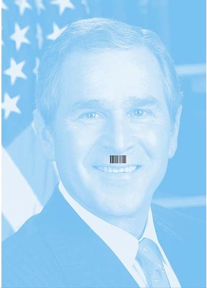
Many artists have been inspired by and commented on the fact that we are constantly being watched within their work. For example Monty Python. Flying Circus featured a comedy sketch about 'How Not to be Seen'. It showed various people being blown up because of their location being known. It could be interpreted as a comment on how the government is always watching and can easily find out where you are at any given moment. The Society of the Spectacle is a book written by Guy Debord in 1967. It outlines what Guy feels the future of our society is, commenting on many aspects of modern culture, including celebrity culture and consumerism. He also mentions about how it has become almost impossible to be original and unique and how we are always seen.
Hunted is another example of this. It is a television show that first aired in 2015. It follows a group of people who are trying to go off grid. They have to evade a team of intelligence officers for 28 days who's only goal is to capture them. Very few people have managed to evade capture, and it's not really surprising with the hunters being able to track things such as phone use, card use, social media use as well as talking to members of their family and hacking into CCTV. Hito Steyerl is a german designer who creates a lot of work around society and social media. One of the pieces that she has created entitled 'Being Invisible can be Deadly' in which she shows various ways to make yourself invisible. It is done in a comedic way and brings attention to how as a society we are constantly being watched and recorded for both crime prevention and safety. Chris Marker is a french filmmaker. In 1953 he crated a film entitled 'Statues Also Die' which commented on how French colonialism had an impact on African art and how the meaning of art changes when that art is removed from the culture in which it was made. Music is used within this film to enhance it.  Camera Obscura uses an optical device that uses the basic principle of light to form a temporary image on a screen. The above image shows the basic principle of how this works. The projected image is upside down and only appears for a short space of time. Below are some examples of what the image will look like once projected.
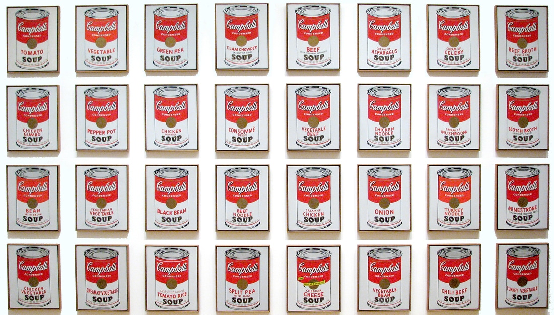
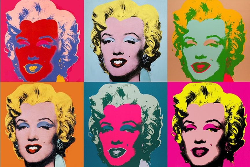
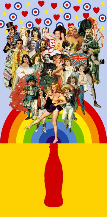
 Pop art challenged the traditions of fine art by including various imagery from popular culture. There are many famous artists and designers who have influenced and become household names through this movement. Andy Worhol: He took capitalist materials and created mass produced art based on them, many interpret this to be a comment on the mass produced world of the 1950's and 60's. Warhol blurred the boundaries between high are and low culture by borrowing imagery from any source and creating his artwork out of it.
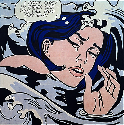
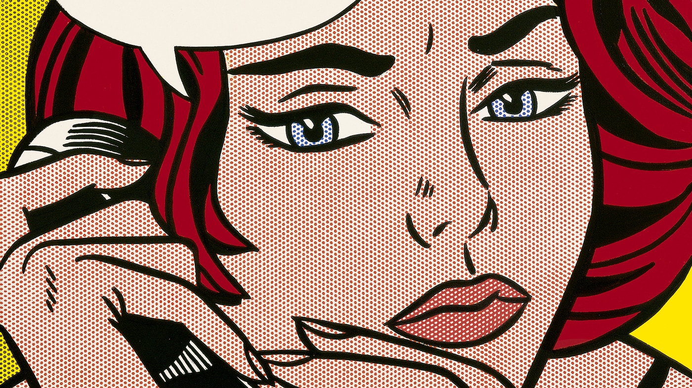
Roy Lichtenstein: In his work Lichtenstein would use bright, bold and energetic colours but only a small colour palette. Although the colours that he used were very limited he considered his choice carefully, unlike Warhol who used colours very loosely.
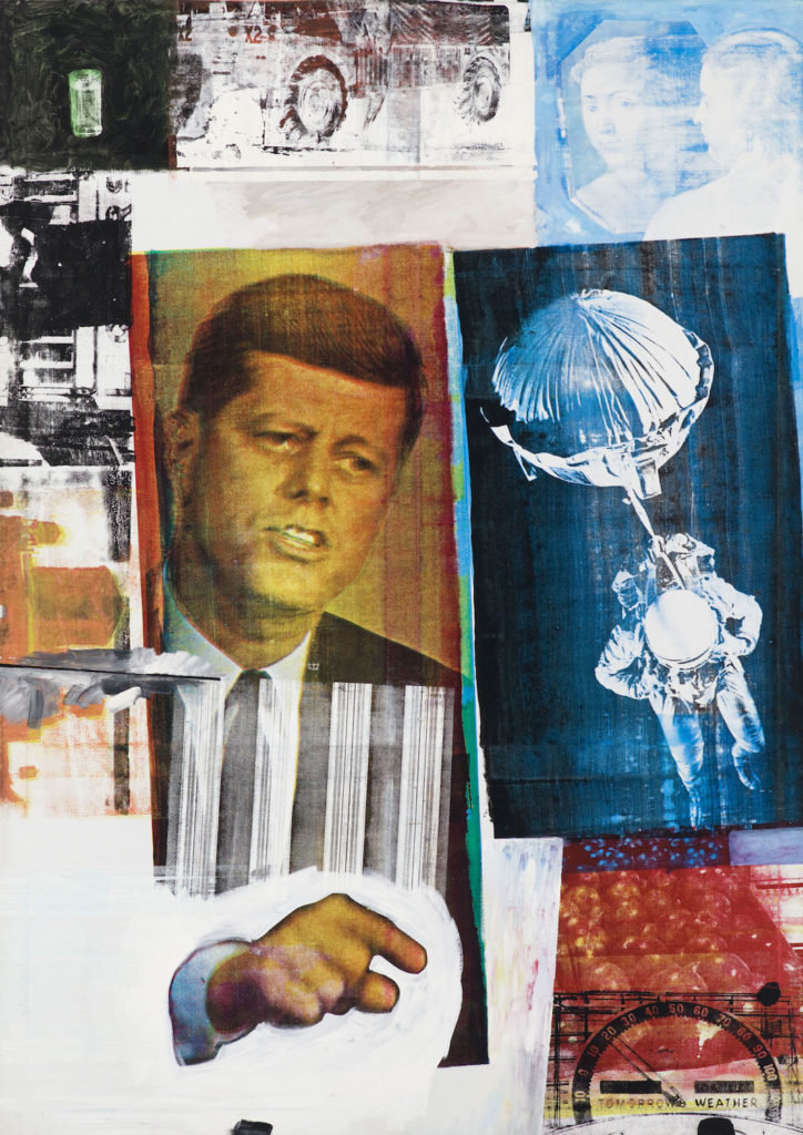
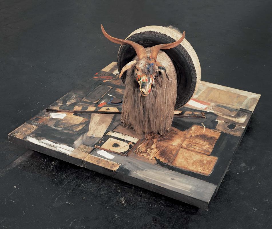
Robert Rauschenberg: Had a more chaotic composition within his pieces and used a much wider range of elements and focal points, with one image having multiple focal points. I like the work of Rauschenberg because it is very much surreal and makes use of collage.
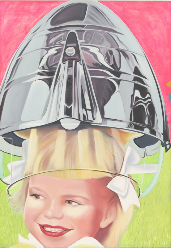
James Rosenquist: The approach that he takes to creating a design is similar to that of Rauschenburg's, his designs are chaotic and hyper real, allowing for everyone to interpret them differently. The main difference between Rosenquist's work and Rauschenburgs work is that the work of Rosenquist is much cleaner.
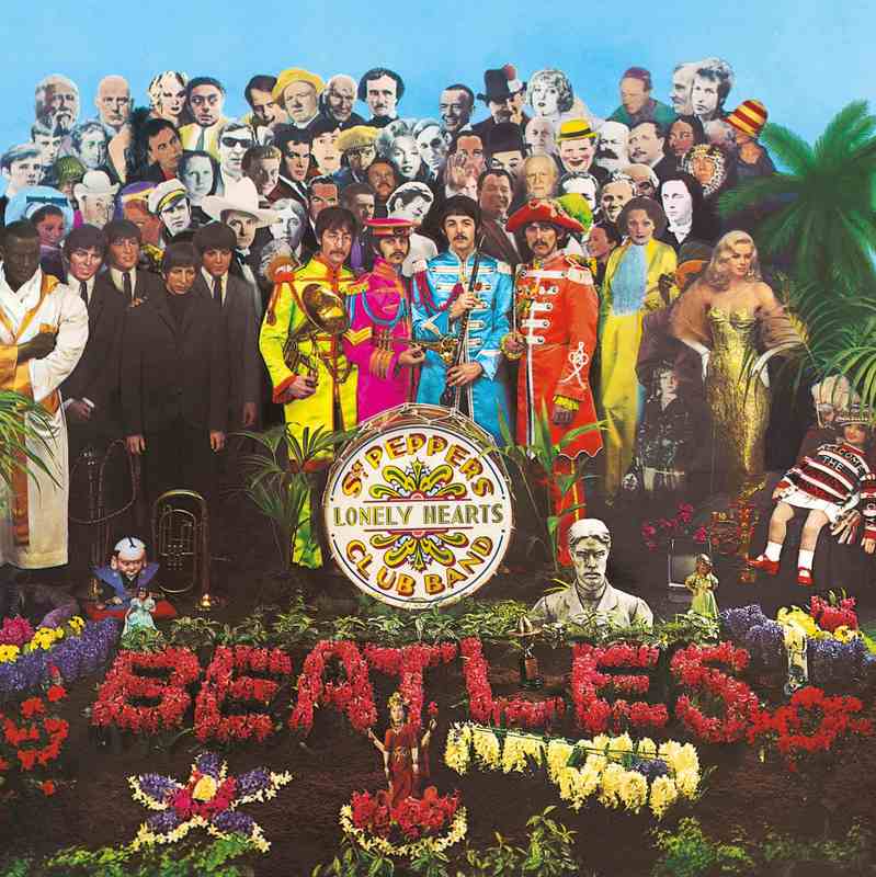
Peter Blake: Blake was inspired and very much fascinated by American culture. Within his designs he used flat and bold graphic shapes and colours. One of his most well known designs is the Beetles album cover for Lonely Hearts.
Pop art was such an influential movement because it allowed the notion that anyone could be an artist to flourish. It provided inspiration for many contemporary artists, and it is clear to see that the styles, type of imagery and colours that these artists have used have all been influenced by Pop Art. Below is a list of some of those artists:
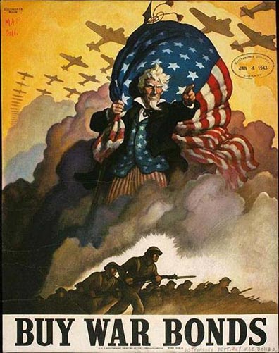
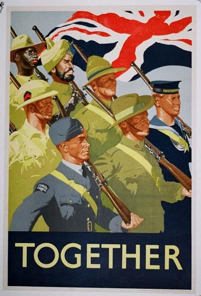
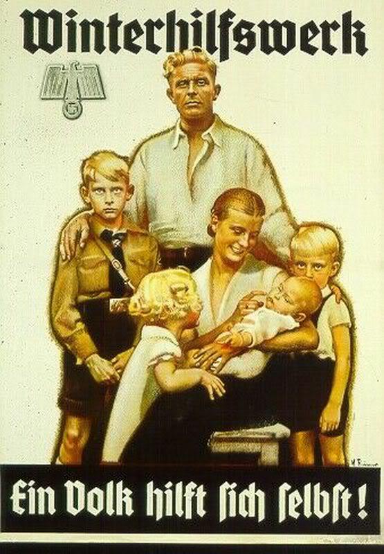
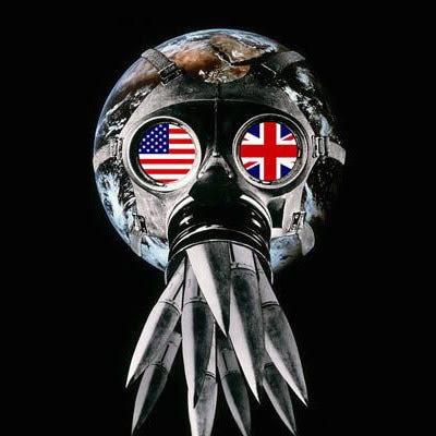
Propaganda is a type of design that is biased or misleading in nature. It is aimed at influencing a population towards a cause a cause, it is used to enfoce a set of belief values. American PropagandaMakes use of informal language to allow the ausience to connect. Is fear mongering. Makes you feel guilty. Uses black and red, capital letters and bold fonts.
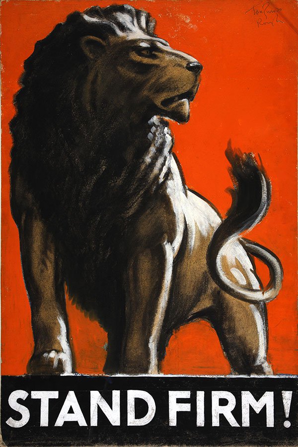
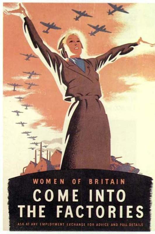
Allied Propaganda (British)More positive than American Propaganda. Some provoke the feeling of guilt within the viewer. Use humour to get the message across.
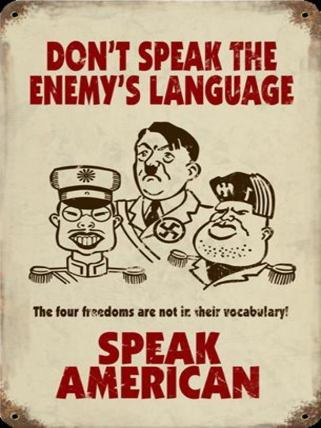
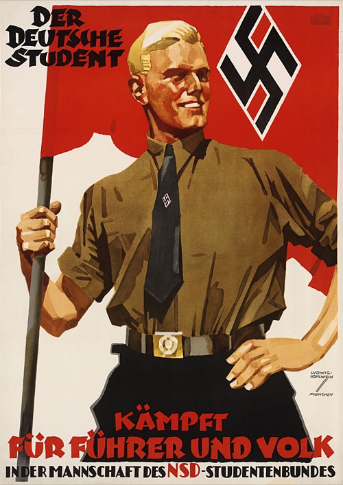
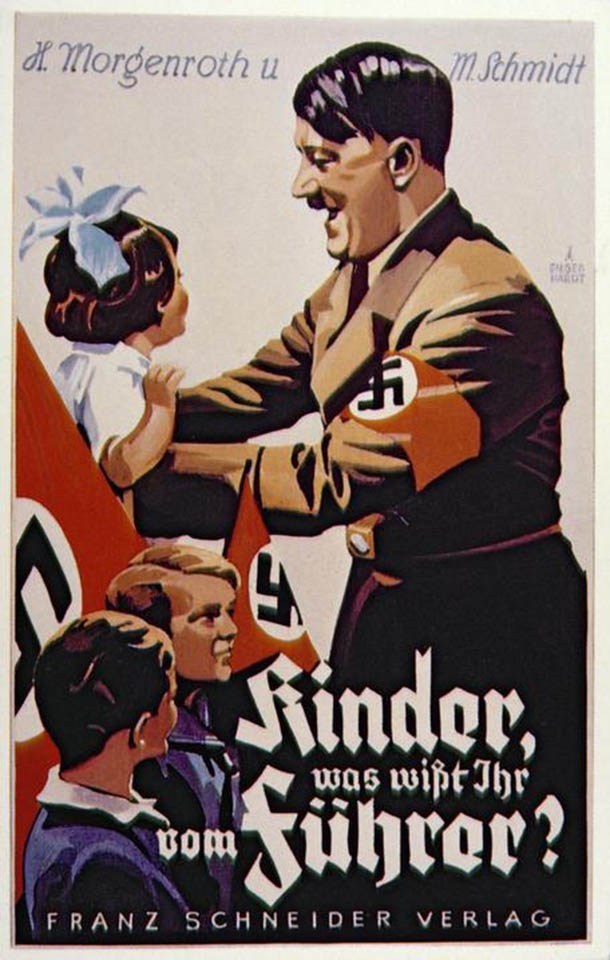
German PropagandaLow camera angles to show power and superiority. Use dark colours and harsh shaddows. Very sculptural (little emotion within the featured figures).
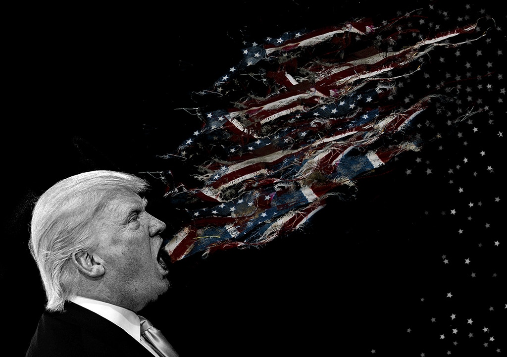
Challenging Propaganda!The best way to challenge propaganda is to be just as shocking, for example editing body parts, similar to that of the German Expressionism era. Modern PropagandaModern propaganda is much more image based than the propaganda that was produced during the war. It twists established visual reality to create a new message. Peter Kennard is a good example of someone who uses this technique.
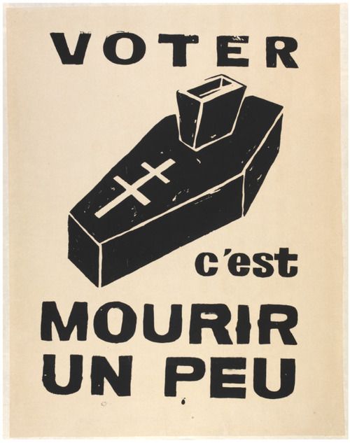
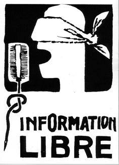
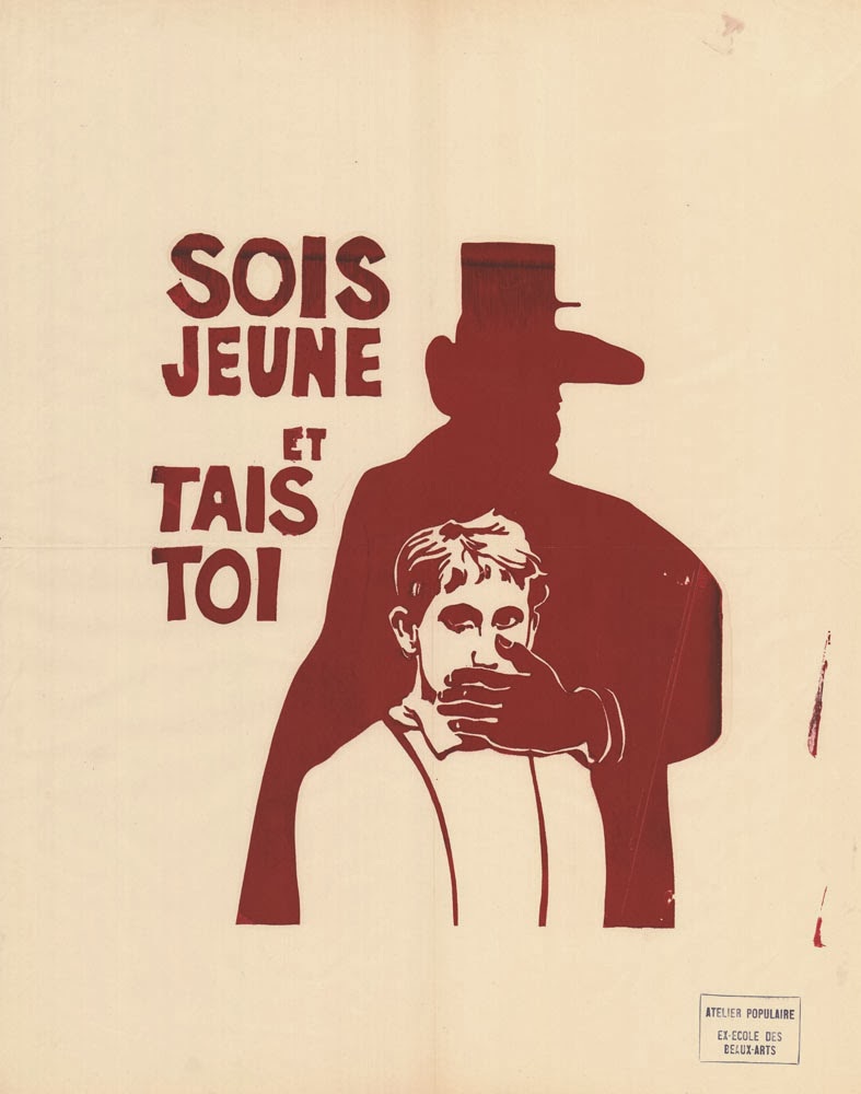
French (Paris) Propaganda Atelier Populair (Wake up! See what's going on) These posters were mass produced by screen printing (single colour). They were anti-perissiment (establishment).
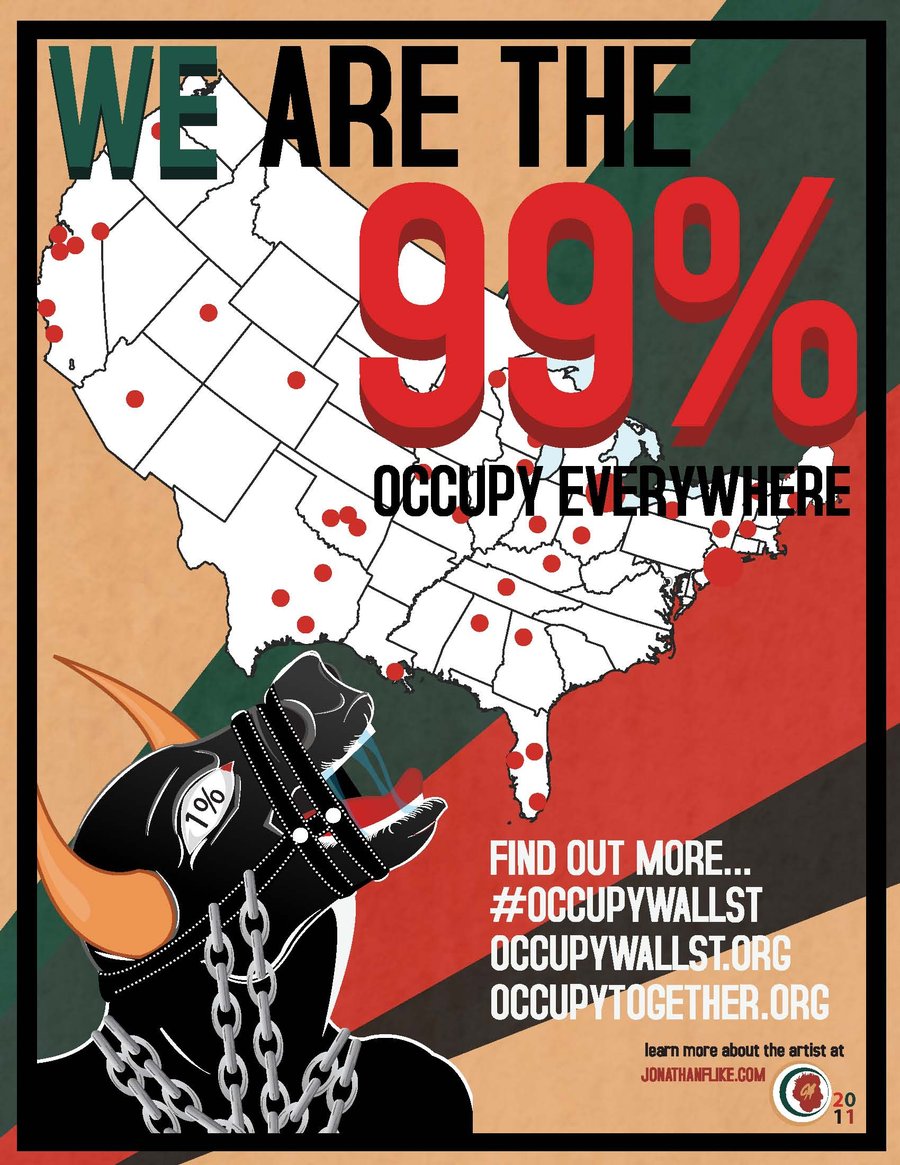
Propaganda isn't just for countries or individuals. It can be used by coorporations to promote their cause, a few examples of this are shown below.
 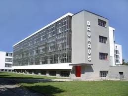 Bauhaus came about when many artists decided that they wanted to experiment readically within their work, a concept that had previously been surpressed. Taking inspirations from the ideals of movements from revolutionary periods (early 20th century). One of the main characteristics of this movement was that FORM FOLLOWS FUNCTION, meaning that the visual aesthetics of a design are affected by the function of the piece. This movement led to major developments within architecture, paving the way for simplistic designs. The designs that came out of this movement consisted of mostly sans-serif fonts, did not mix uppercase and lowercase type, made use of tilted angles to create angular compositions, were primarily typographic and were geometric / simple. Another key feature was that they used colour to control the visual communication of the work for example to highlight key information. Designers Influenced by BauhausJoseph Müller Brockmann (1960's)
Robert Brownjohn (1960's)
8VO - Octavo (design group)  Otl Aicher  Jonathan Barnbrook
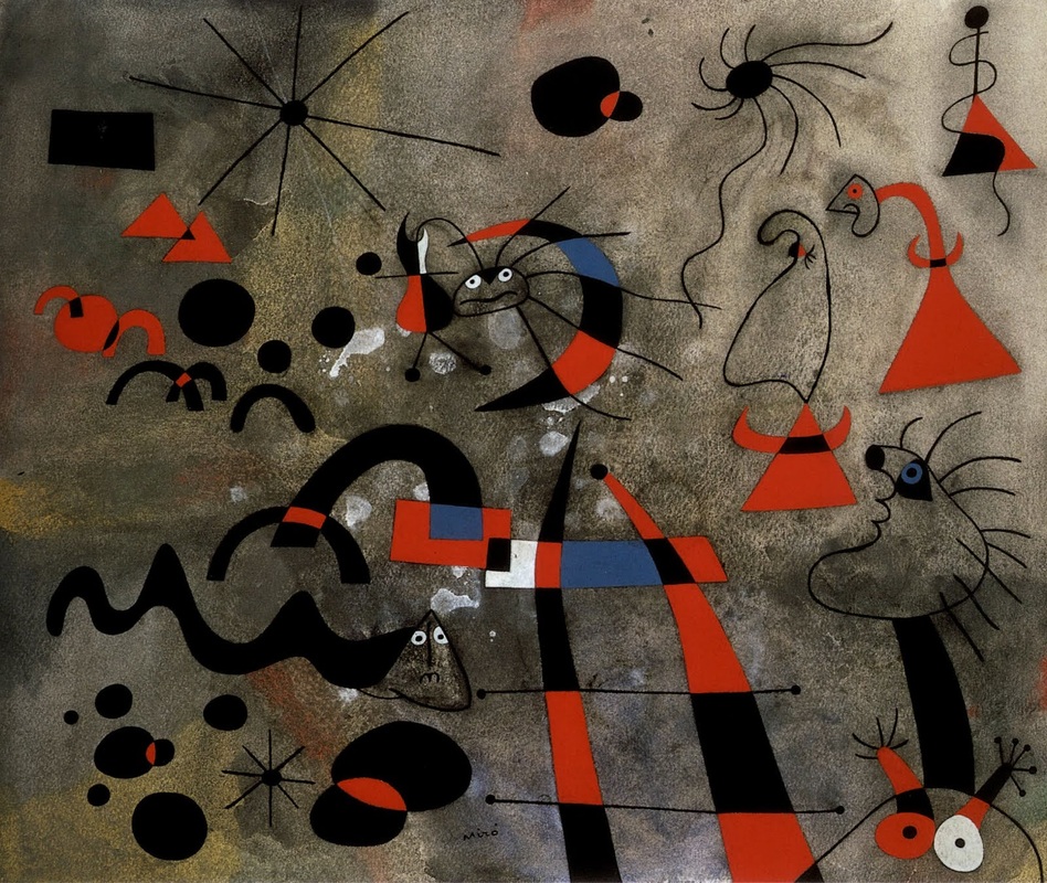
This movement is all about expressing imagination as seen in dreams, free from the grips of conscious control. It uses anti-rationalist sensibility to question the preception of reality. One of the most iconic designers to come out of this movement is Salvador Dali. He plays with the physical form of objects, often set within a landscape (painting impossible world in a realistic way). Most of his work is based around the place that he grew up in North East Spain. Dali also played around with singular Juxtapositions. One of his most famous paintings is clocks (pictured below). He was a very lonely and anxious artist and this is reflected in his work, often showing lone figures on the beach and drawing on the environment where he grew up for inspiration. 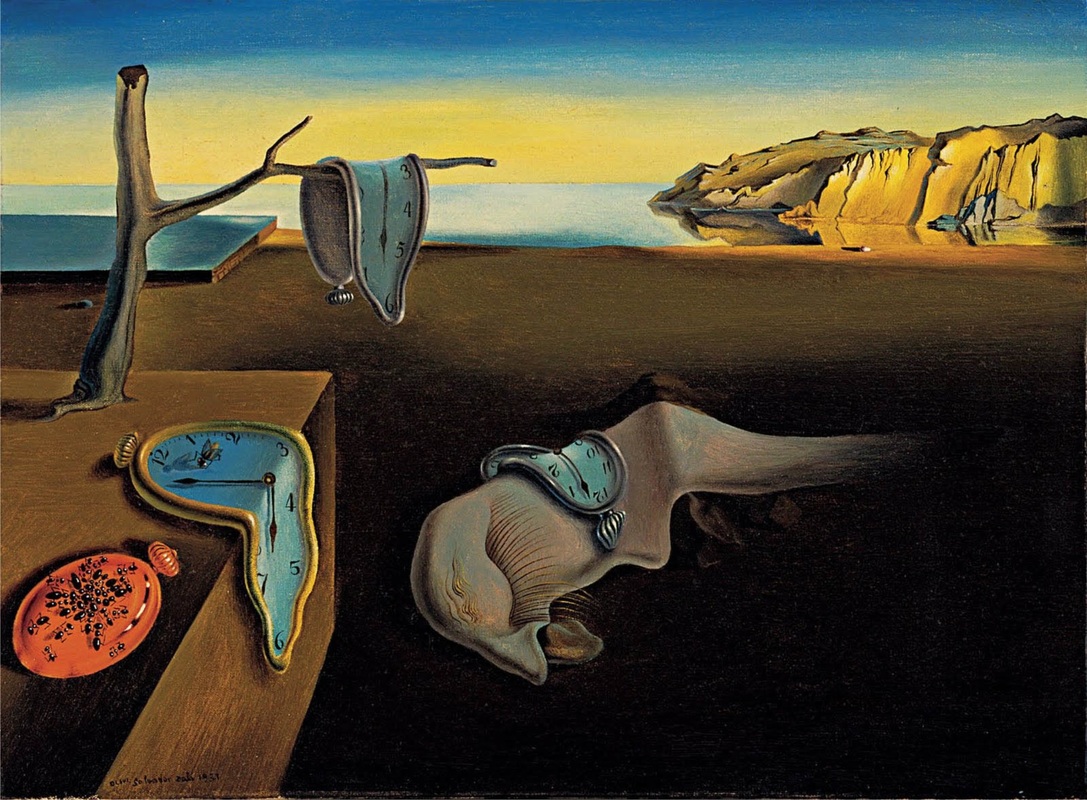 Joan Miro is another famous artist to be a part of this movement. Miro's work is also heavily influenced by dreams and pulls on abstract themes and make you question reality. The way in which he produced his work gave it a freeing and youthful feel. There is a museum in Barcelona dedicated to Miro's work. Proving just how important he was to this movement. The two examples that I have chosen below capture the essence of his work.
Not all artists wihtin this movement approached design in the same way. Man Ray used awkward juxtapositions such as the iron with spikes (as pictured below) to suggest reality as a question. He was also fascinated by the idea of duality of objects, famously taking the human form and suggeesting it to look like a guitar (perhaps a suggestion of the objectification of people). His designs are intriguing not only because they make you think but because they capture you attention and are subtle at the same time.
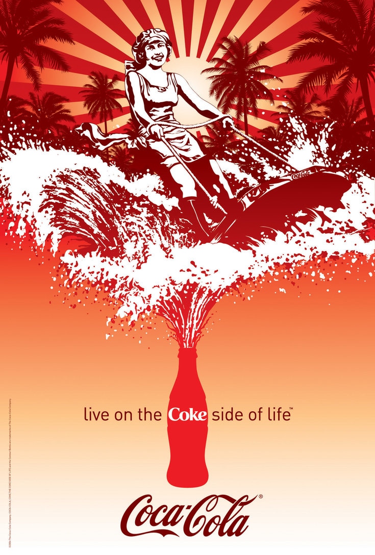
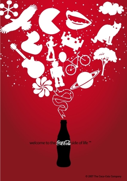
Surrealism in AdvertisingSurrealism is a common feature in modern day advertising, with so many companies competing four our attention it is no wonder that many have turened to surrealism as a way of getting it. Using images that shock us and capture our attention, ones that wouldn't necessarily make sense on their own. Making us seek conformation of thieir meaning, which is then often given to us by the tagline. Playing with established physical metaphors and making objects from other objects are just a couple of examples of how they achieve this.
Surrealism in Film and FashionNoel Fielding's 'The Mighty Boosh' is just one example of how surrealism is prominent in the film industry. Using the idea of being in a dream like state, one that makes you question everything you know.
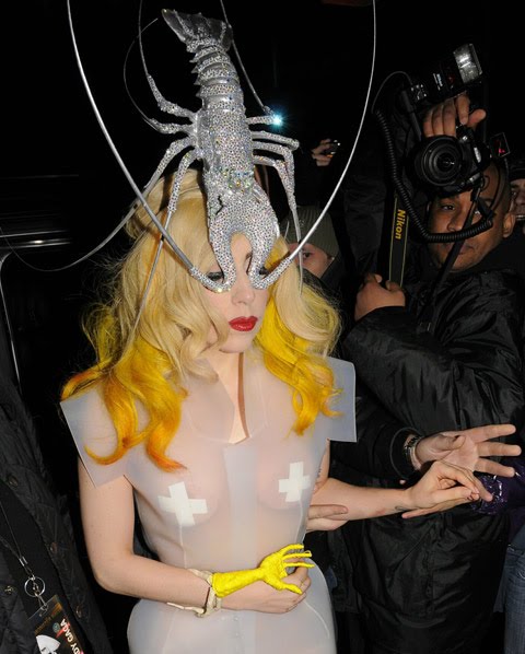
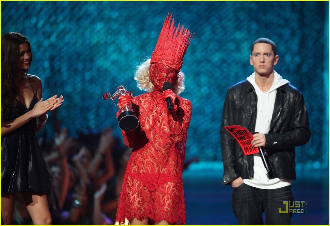
 Surrealism has been influencing fashion for decades, with many of the designs putting form over function. One of the most famous examples of how fashion is influenced by this movement is Lady Gaga. Her surreal outfits drawing attention as well as promoting this movement. It is evedent that she has been heavily influenced by surrealism.
Dada began in Zurich during WW1 and was a battle against reason, challenging the normal ways of society. This was a movement that made art out of the ordinary. The thing that I was drawn to most about this movement was that it doesn't have to make sense, the more absurd the better. Dada artists uses any media/materials that they could get their hands on. Newspapers, everyday objects, collage and assembling, film reels, photography, poems and fashion. There really wasn't a piece of society and culture that they didn't get to. Some of the main characteristics of this movement include: Abserdity, Seterical humour, Anger, Chaos, Awkwardness, Angular compositions, Nonsensical. Marcel Duchamp, Rauhl Hausmann and Hannah Hoch were in my opinion some of the best designers and creators to come out of this movement. Each had a slighltly different approach to the movement. Duchamp famously drawing over the picture of the Monalisa, Hausmann working mainly with collage and Hoch also using collage but playing with type aswell. Some contemoprary examples of design inspired by dada include the work of Jamie Reid, David Carson and Stefan Sagmeister. Examples of their work are below in order.
 This was in my opinion, by far one of the most iconic design movements of all time. Even inspiring modern music videos such as the video for 'Take Me Out' by Franz Ferdinand and 'Flying Circus' by Monty Python. There is even a fake news channel called 'Day Today' to show just how gullible people really are and how you can not always believe what you see and hear from the media. One example of a story they covered was a fake drug 'cake'. There is is also a youtube channel called CasseteBoy which sows that you shouldn't take everything at face value. They do this by taking videos of speeches by politicians and remicing them to make the plitician sing a song. These are some example of dada inspired creations that take the characteristics of the movement and combine them with modern technology to create something new.
German Expressionism refers to multiple movements in German before the outbreak of WW1. Artists within this movement wanted to express meaning within their designs as opped to its predessesing movements which portrayed physical reality. The typical trates of this movement included portraying the world from a subjective perspective, which often included reality being distorted for emotional effect. This was often done to induce certain moods, emotions or ideas withing the audience.
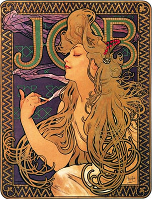
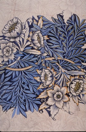
There are many contemporary designers that have been influenced by German Expressionism. One example is Sue Coe who uses satirical visuals to poke fun at leaders. SOme of her main focuses are on issues regarding animal rights and politics. Ian Pollac is another example, exaggerating the heads of the figures within his designs, using angular perspectives and expressive use of colour. David Hughes uses mixed media (e.g. collage and paint) on pieces that often focus on a singular head. In my opinion his design take the key features of German Expressionism and bring them in to the current time using more modern techniques to create his designs. In addition to the above mentioned designers and illustrators Jordan Isip is also inspired by this movement creating melancholy pieces featuring a singular figure with the abscence of a visual gaze. He creates his work using found images and painting over the top. A method which I feel enhances his message. The syles of German Exressionism are also used in modern day film. Tim Burton is a great example of a director insired by this movement. Using candid angles, distorted camera views and making use of shoddows. All of which allow the viewer to see the world as the artist does! 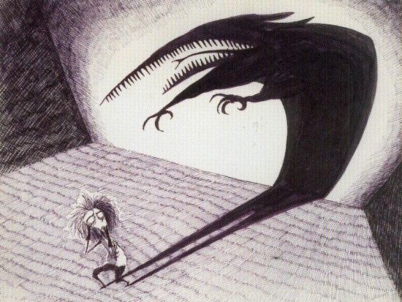 This movement didn't reject machines but instead used them to it's advantage, much unlike the Arts and Crafts movement that came before it. Below are some of the most well known artists and designers from this movement and some of the characteristics that I feel run throughout their work. Alphonse Mucha: Focuses on the female form, Uses handdrawn images, Is inspired by nature.
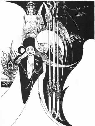
Aubrey Beardsley: Inspired by Nature, Made use of floral elements, Used alot of peacock feathers within his designs.
Charles Rennie Mackintosh: Used organic forms, Fascinated by symmetry.
I then went on to look at some of the contemoprary designers that have been inspired by the Art Nouveau movement. Below are some examples of their work.
 Ray Smith (illustrator) This movement began in the industrial revolution in the 18th/19th century, where once rural sociaties became industrialised. This was the beginning of advertising and use of typography within design. Many people were concerned about the effects of industrialisation on design. Some of the common features of work produced wihtin this time include the use of serif fonts, usually capitalised, limiting designs to only two colours (also due to the screen printing process making it difficult to use multiple colours) and using multiple typefaces of various sizes within one piece of design. Many of the designs created within this period are also inspired by nature and natural forms, portyrayed in styalised representations.
In this weeks session we talked about influences and who inspired us as designers. There were some well known people that came up such as Andy Warhol, David Carson and Paul Rand. It was interesting to see the link between the style of work that my peers produced and who inspired them. There were two main categories of how poeple were inspired. It was either by the designers method of thinking or creating. Some examples are below, accompanied by designers which I feel use these methods. Thinking: Simplicity (Alan Fletcher). Substitution of visual elements (René Magritte). Juxtapositions (Salvador Dali). Duality (Norma Bar). Making: Colour (Andy Warhol). Textures (Helen Frankenthaler). Graphic and bold (Saul Bass). Variety of media (David Hockney).  Alan Fletcher
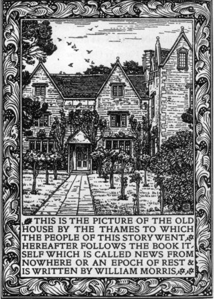
Looking at the film 'Everything is a Remix' was interesting. It explored the idea that everything that is created is copied, transformed and combined. A concept which I had never really thought of before. Looking deeper into this topic I realised very quickly that this was true and can be seen evedently in everyday design and advertising. We then watched a film called 'The Machine That Made Us' which featured Steven Fry. This documentary explored the work of Johannes Gutenburg and his use/creation of the printing press (a machine that is still used 500 years after it's creation). It was interesting to see how Gutenburg's work could be applied to the principle of design presented by the everything is a remix video. Below are some of the ways in which I feel that Gutenburg used this theory: Copy: The design of the wine press and its use of the screw thread. Making paper using the chineese method of cloth making. The idea of mass production, origianally by handwritten methods. Combine: Cloth paper making with metal type creation. Metal type creation with the press system from the wine maker. He used his experiene working with metal as a goldsmith to create metal type and combined it with the press system. Transform: He made the process of mass producing the Bible, a time and labour efficient process. He found an alternative to vellum (paper made from calf skin), where prevously each bible would have been made using 140 cows.  Johannes Gutenberg |
Archives
May 2017
Categories |


 RSS Feed
