Parasol MediaA motion graphics company that does a lot of work with making logos move. I like their work because of the strong transitions between scenes and the way they flow seamlessly. This is something which I aim to achieve within my own work. All of the screenshots below were taken from the video 'Fourteen' which is a showreel of some of their most successful logo work.
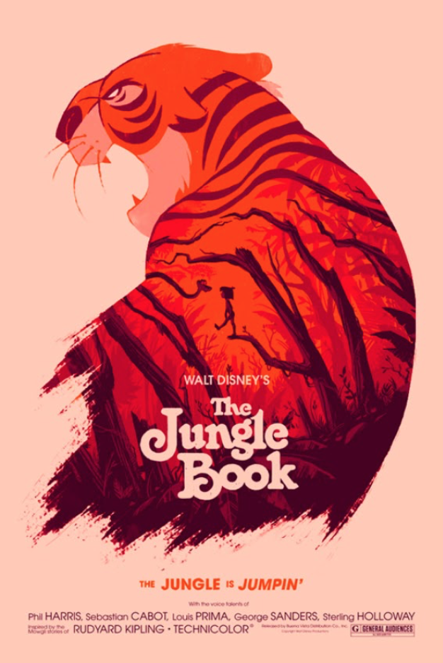
Olly MossAn artist that is most famous for his work in reinventing movie posters, using screen printing. His work particularly appeals to me because of how striking and bold the images are (due to the colour palettes used) as well as the playful approach that he seems to take.
Owen GlidersleeveAn illustrator and set designer that uses cut out pieces of card collaged together to make stunning pieces of artwork. I love how clean his designs are and the complementary use of colour.
0 Comments
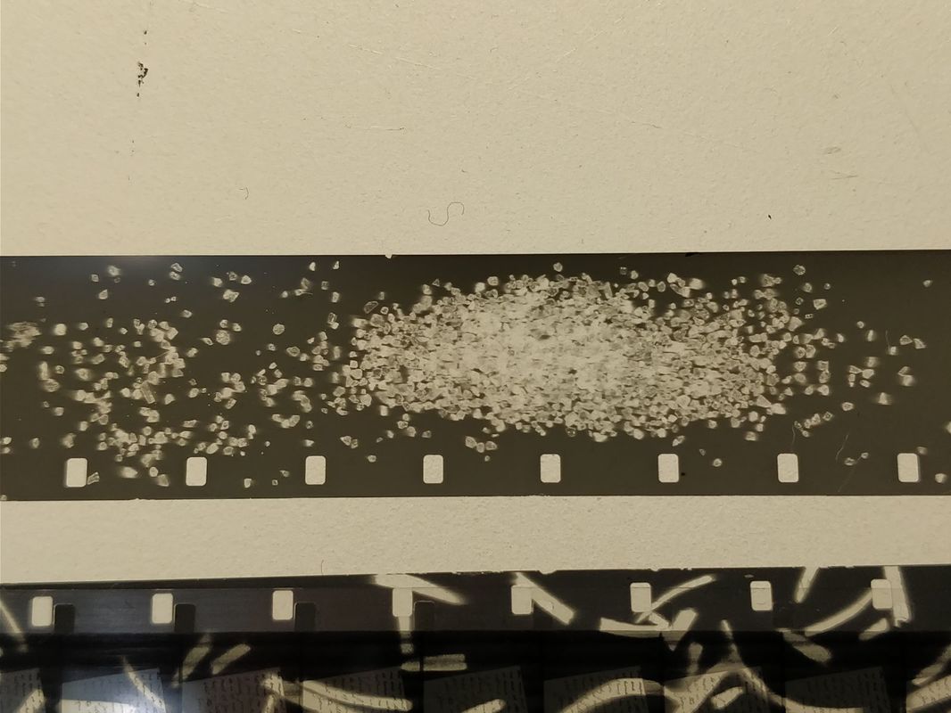
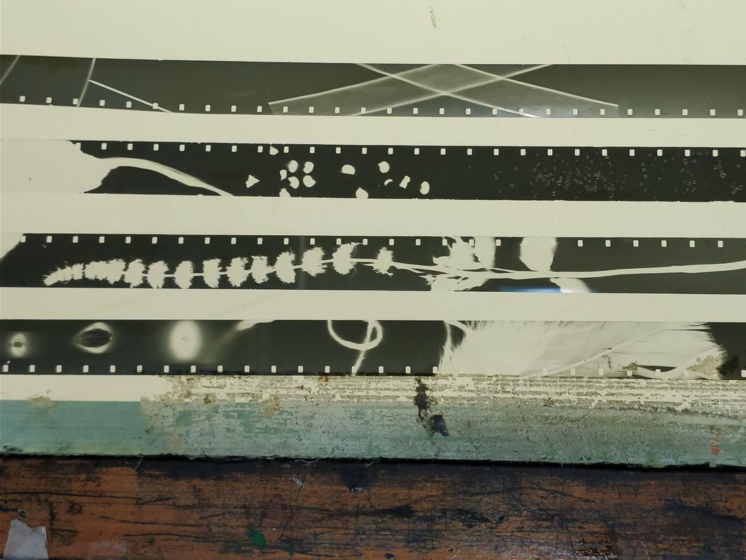
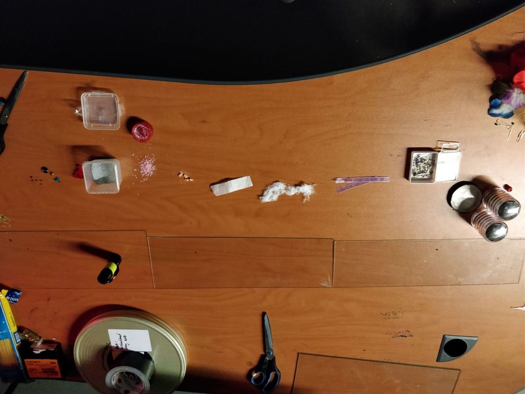
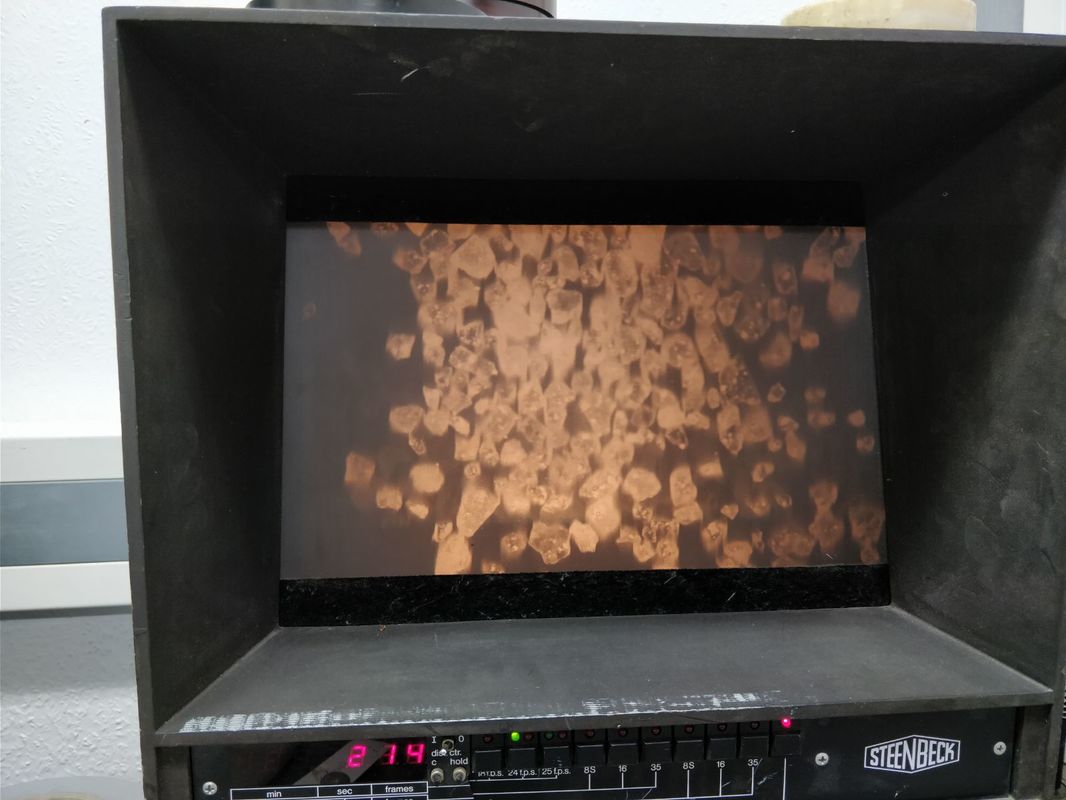
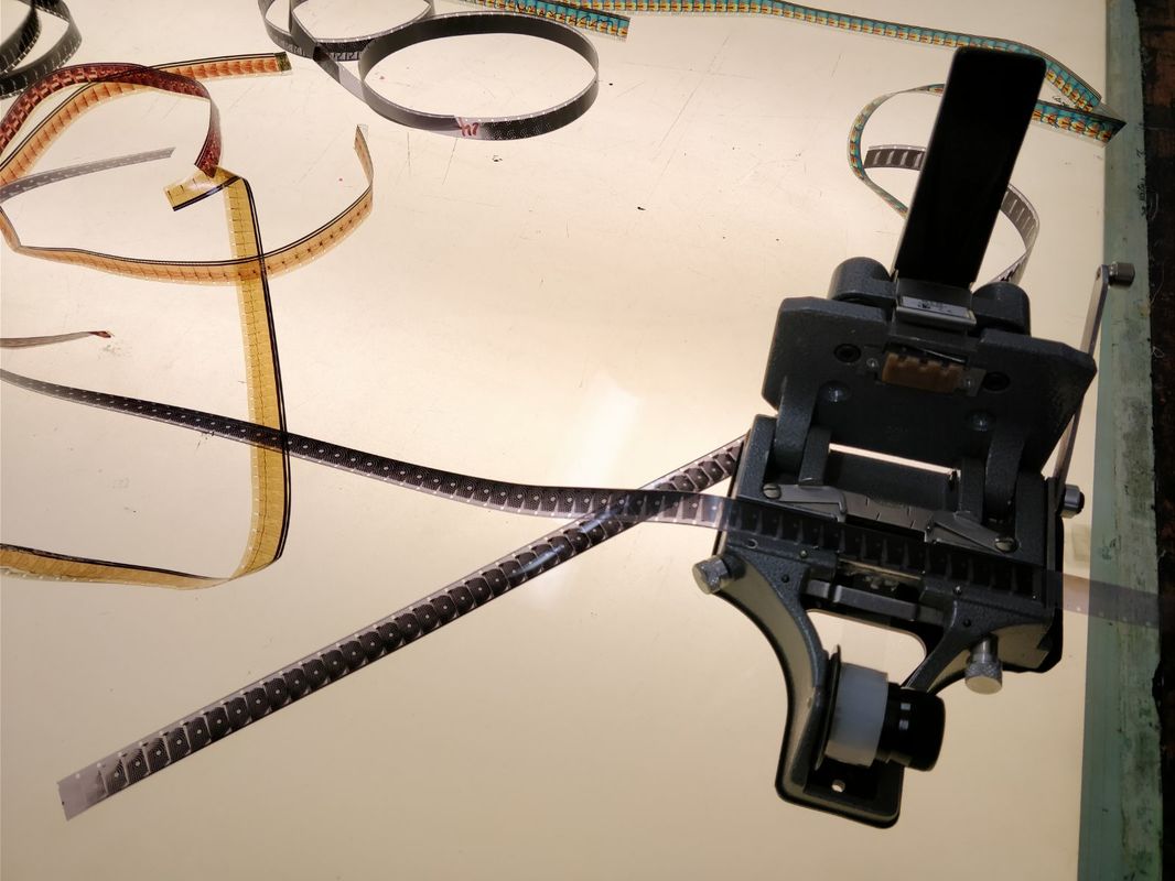
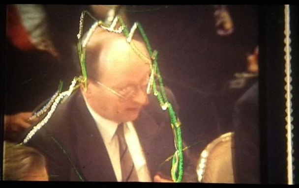
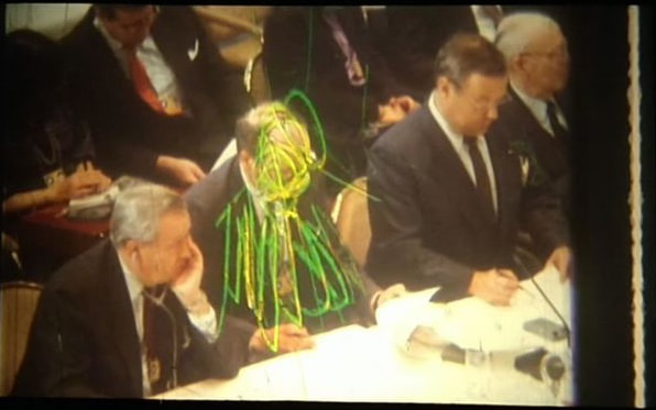
We were given the opportunity to take part in a photogram workshop in London. We would be making images on a strip of film by placing things on top of it in a darkened room and exposing the film to light. The objects block the light leaving marks and images on the film strip. 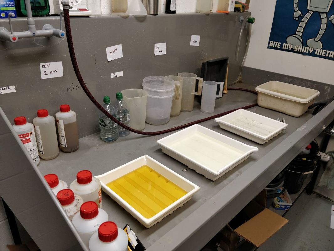
I then used some found footage (by Nick Nenov) and spliced it into my film.
I enjoyed this workshop and it was a great opportunity for me to learn how to do something that I have never tried before. Overall I think it went well and would defiantly lie to try something like this again in the future.
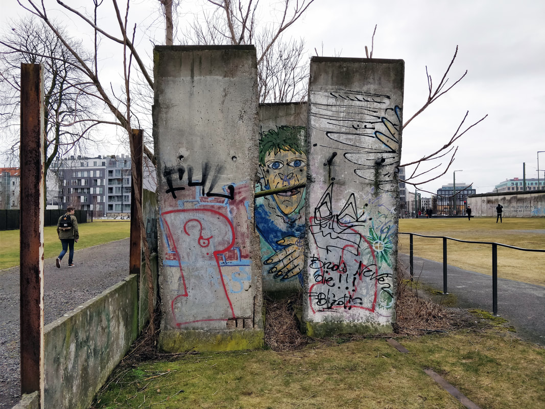
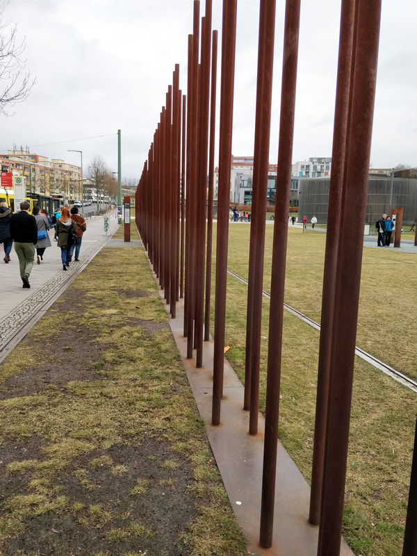
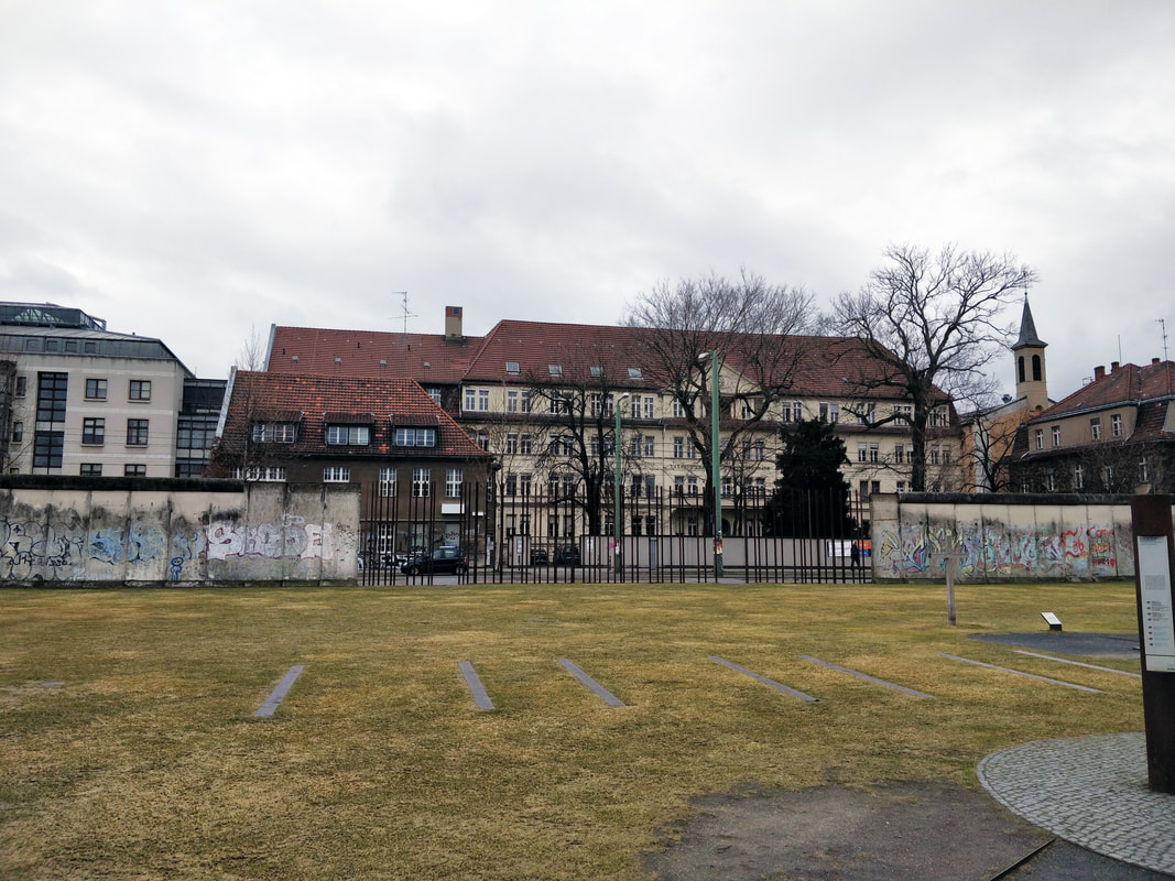
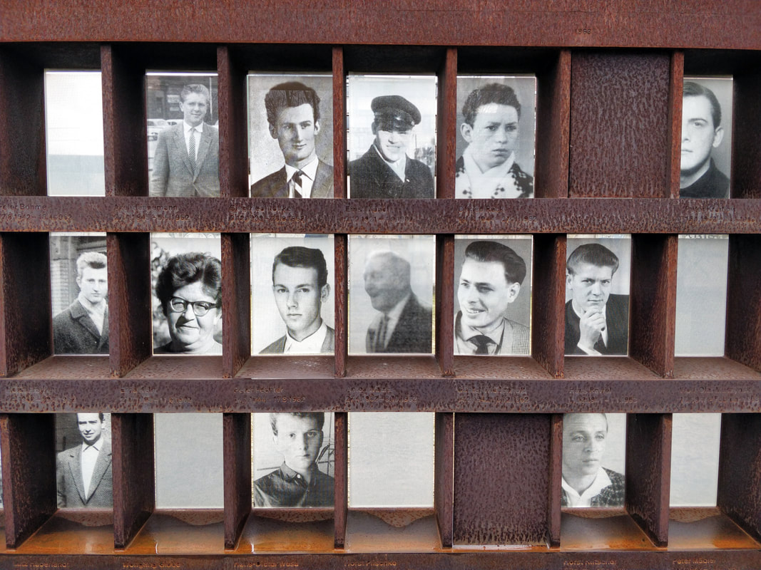
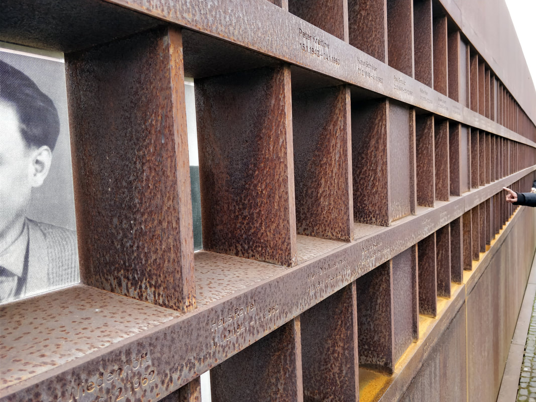
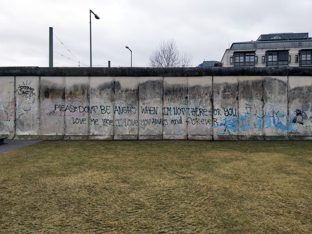
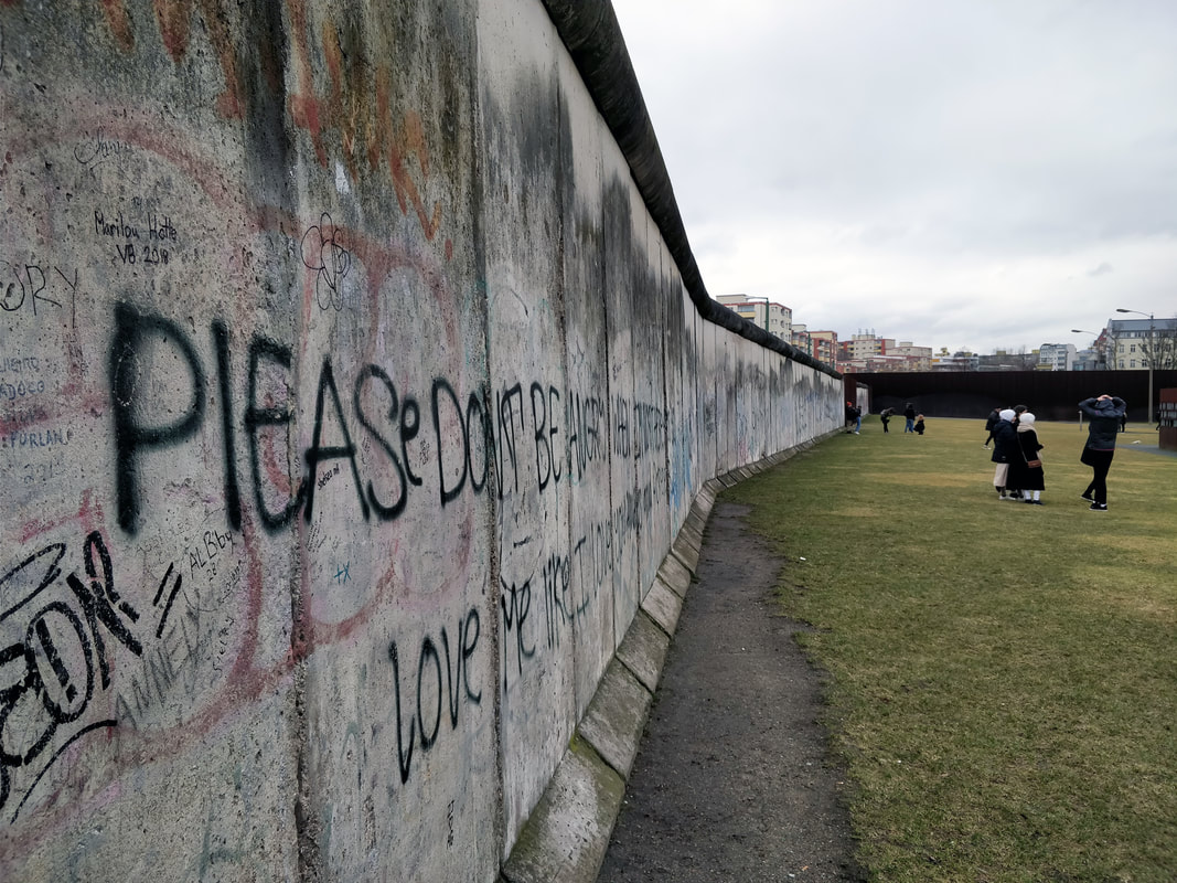
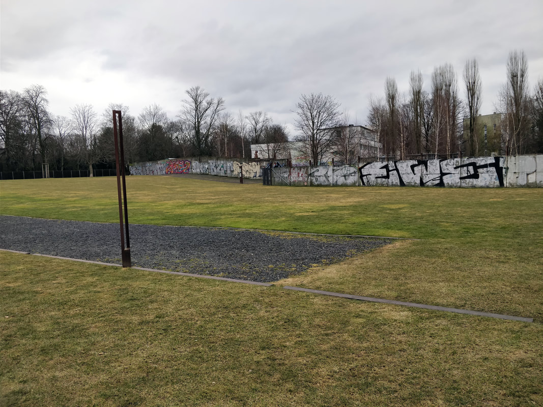
We were given the opportunity to go to Berlin on a study trip to see various galleries and have talks by designers / illustrators. Some of which are below. The Berlin WallWe went to visit the Berlin Wall, which separated Western Berlin and Eastern Germany from 1961until 1989. It was interesting to see all of the graffiti and artwork that now covers the remains, especially as the majority of it gives a positive message. Tina BerningWe then visited the studio of Tina Berning, where she talked to us about the history of the area, her techniques and workflow, pricing and showed us some of her inspiration along with the drawing that came from that inspiration. Whilst she was talking I took some notes about what she said.
Patrick ThomasWe also visited the studio of Patrick Thomas, where he gave a talk on his career development and how it is important to find a way to simplify messages to get them across more easily. He also talked about how he set up his studio, making sure that there was enough room for print making. One thing that he mentioned that I thought was interesting was that Abby Road Studios commissioned him to create some designs after seeing a personal project his Instagram.  Jack SachsFor the third talk we were visited by Jack Sachs. He spoke about his career development and what it's like to be a young creative living in Berlin (how it is a creative and welcoming environment compared to London which is competitive and industry focused). He also mentioned about how important it is to have your own website and domain name as it makes it easier for clients to find you and how you shouldn't work from home as it is more motivating to work from an office or somewhere separate to where you live. Following along these line he mentioned how it is easy to work 24, 7 but it is important to have a break and time away from your work to allow you to be more creative. The final thing that Jack talked about was not to be afraid of emailing clients / agencies / studios that you want to work for as even if they don't need you now, they may contact you back at some point in the future.
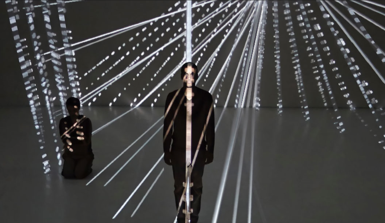
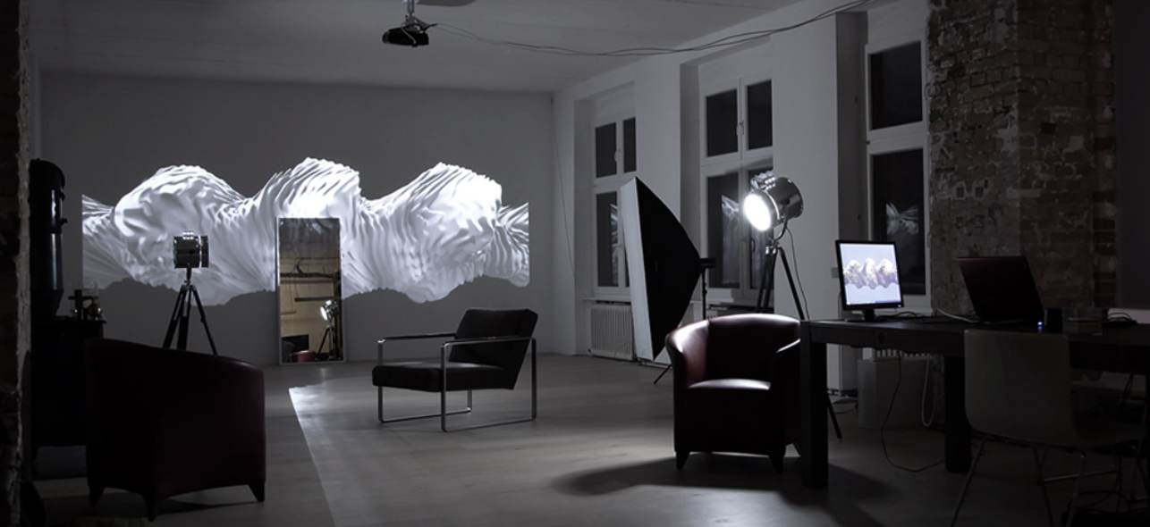
Urban Nation GalleryThis was one of the galleries that we visited on this trip that I found the most interesting. It showcased a range of urban art and digitally made designs.
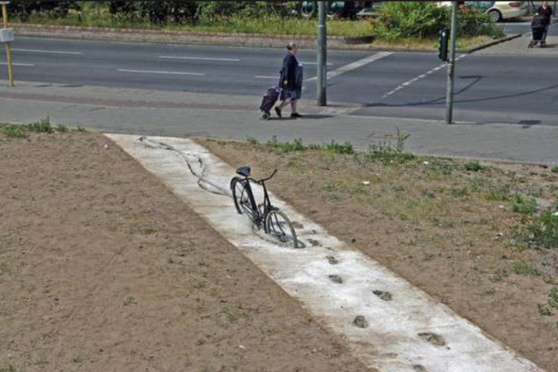
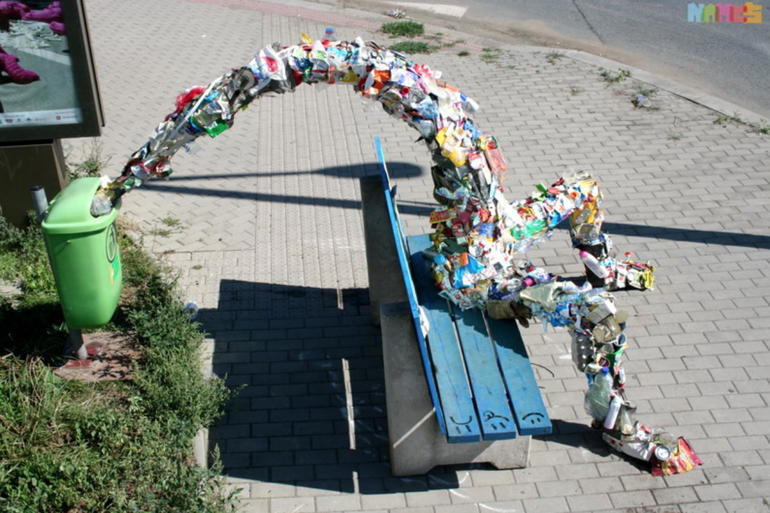
Brad DowneyBrad Downey is an Urban Artist who incorporates existing situations into designs. Some examples of which are below. I think his designs work well and make positive statements about society and the way we take things for granted.
Waltz BinaireHe talked about technology as a reflection of humanities desires and ego and how AI is learning and how it will be able to make art in the future. He also mention Narcis, an Ai machine that attempts to recognise itself.
Secret 7" is a competition where you submit record sleeve designs for a selection of songs and the best ones get auctioned off for charity. The idea behind it is that you don't know who designed the sleeve so you could be getting a design from a famous artist. I wanted to enter this competition especially since I enjoyed the workshop we had just had with Chris Aaron. I then began listening to the songs. Whilst listening to them I created some designs on Illustrator. I wanted to take an experimental approach, and for my designs to be as closely related to the music as possible, so I went straight into designing.
I have not uploaded the album cover that I have submitted to the competition, as they asked not to post them anywhere. However I will add in the design when the competition has finished.
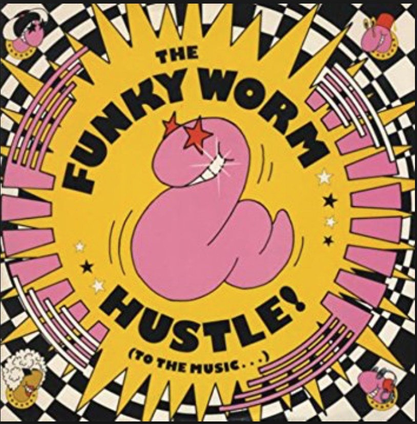
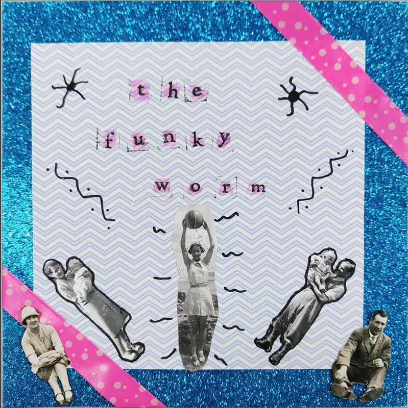
We were visited by Chris Aaron who came in to do a workshop with us about creating record scenes for 7" singles. We were asked to bring in our own records which we would then listen to and design a cover for based on the music. The single that I chose to use was 'The Funky Worm'. When I heard the name of the single and then listened to it, it sounded like the name of a dance. Using this I created an album cover that could reflect what that dance might be. Below is the original cover and the one that I created.
We then went round and gave feedback on each others designs. The feedback that I received was that the colours worked well together and the way the people form an arc was nice. I think that this was a good exercise to do and will be useful when designing a record sleeve for secret 7".
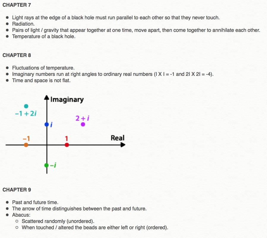
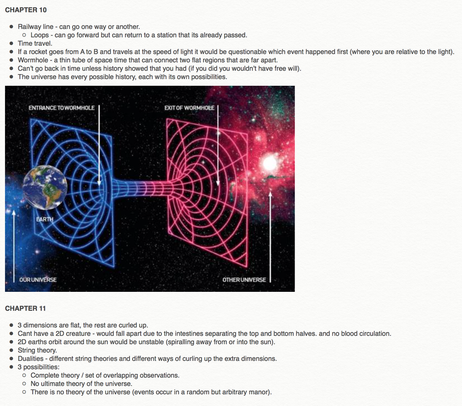
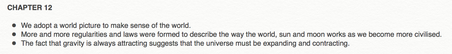
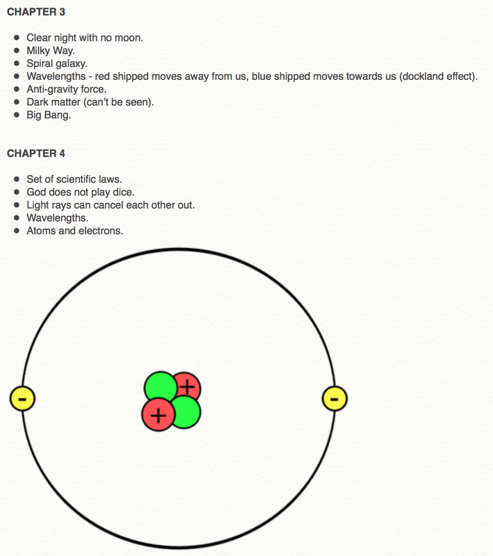
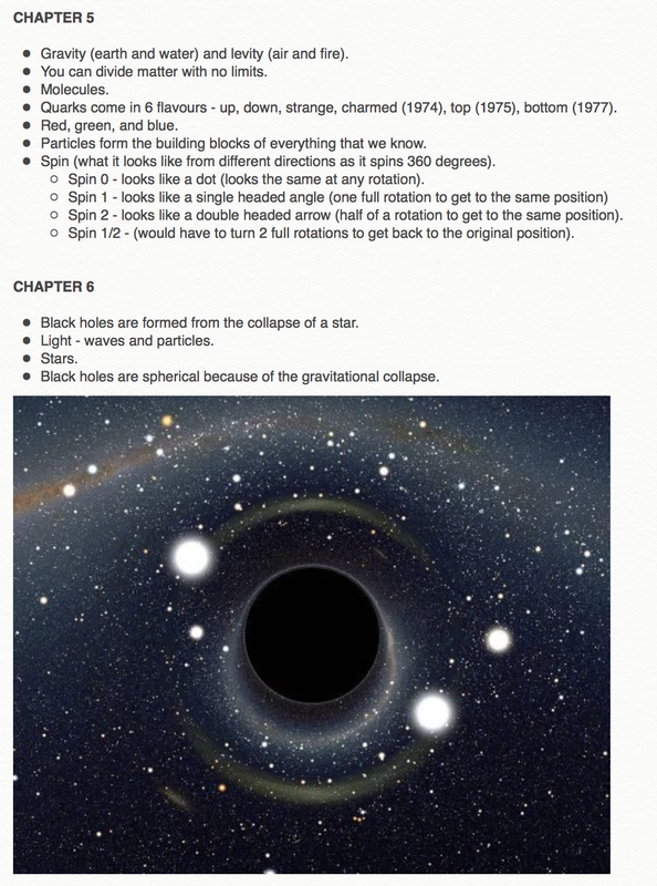
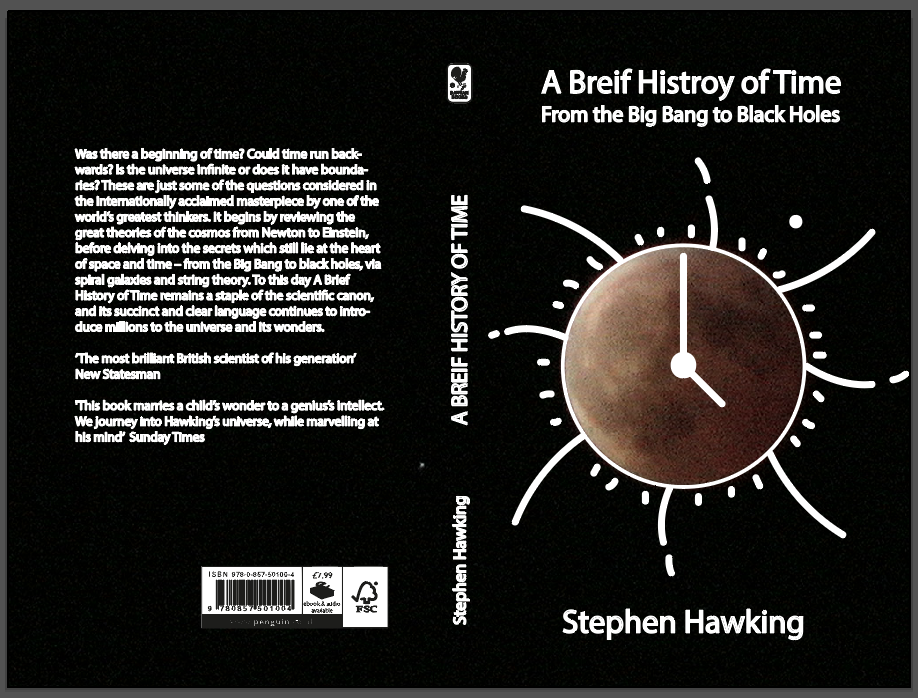
Being presented with the opportunity to design a book cover for Penguin’s Student competition was exciting and something that I wanted to get stuck into. As I had never designed a book cover before I wanted to research into what works and doesn’t work for these covers. I found a great article on 99 Designs that goes through the things that a successful book cover encompasses. Once I had chosen which book I was going to design a cover for I decided to read it to enable me to gain a better understanding of the content / subject. Whilst doing this I took out key points that could potentially be used within a design. Below are those notes. 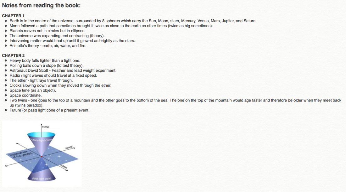
   I then moved onto creating some initial ideas (some of which I made digitally).
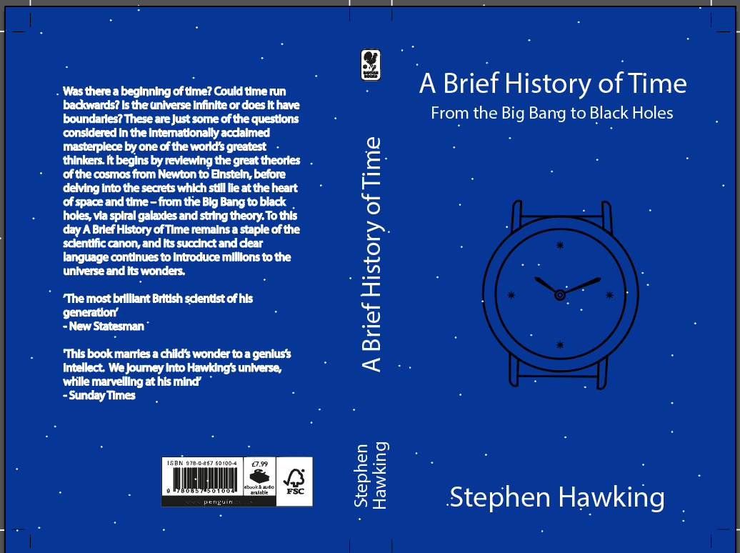
I then took one of my initial ideas and developed it further.
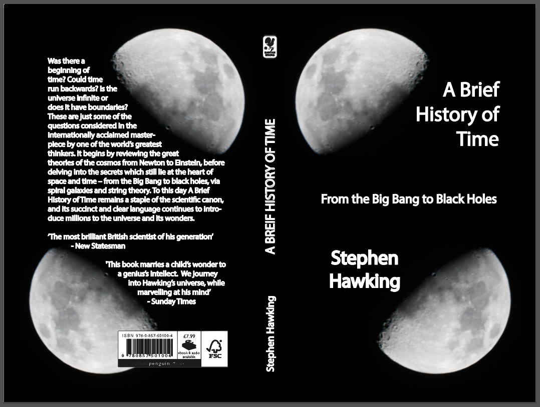
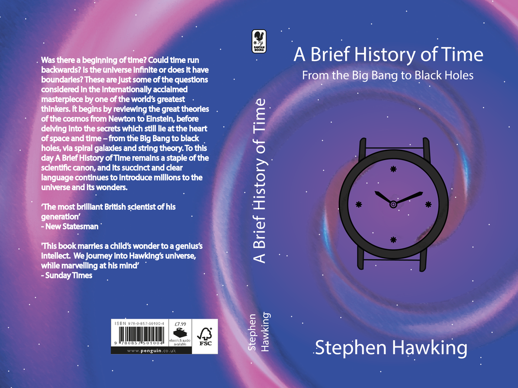
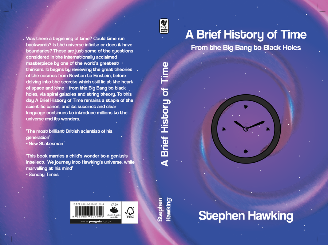 The design that I submitted is the one on the bottom. I think that this design encompasses the them of the book (exploring the universe and galaxies). The spiral was made using lens flares in photoshop and was then imported into illustrator where I added colour and resized it to fit into the rest of the design. The bright colours make this design interesting to look at. Initially I did try it without the spiral but I felt it look a bit dull and uninteresting so added it back in.
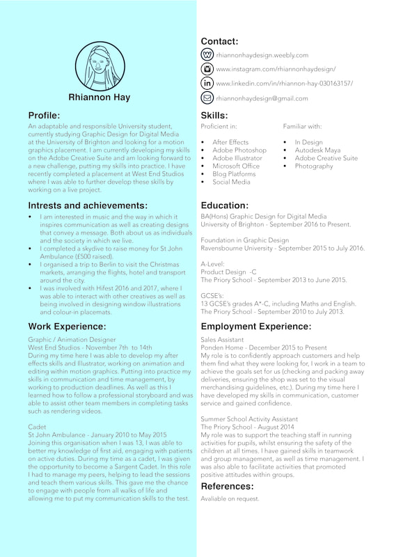
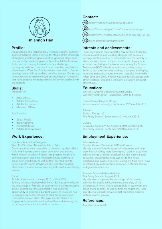
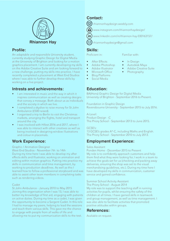
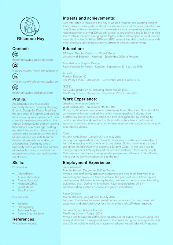
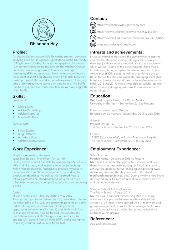
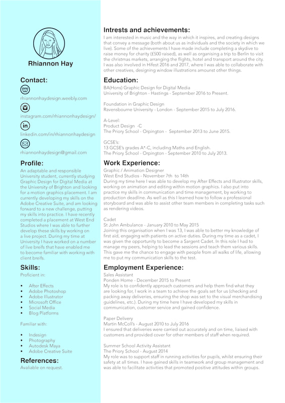
Once I had all of the content for my CV, I needed to design it in a way that represented me and my interests. One of the main things I struggled with was condensing down the content to fit into on A4 page (the original was 2 pages long!). I used Indesign to create it, despite not being too familiar with the programme, because it is the most appropriate software (it allows for margins and gutters to be used). I created 3 different versions of my CV, each with a different layout of the sections and added different colours to them to make them stand out. I chose to use blue because it is a calming colour and I feel it represents my personality the best.
Something which I have noticed is that when adding colour to these designs I used CYMK, for print, which means the colours of the above images are lighter than the original. Out of the above designs and colour combinations I feel that the ones that work the best are:
|
AuthorWrite something about yourself. No need to be fancy, just an overview. Archives
May 2018
Categories |


 RSS Feed
