|
We were given a brief to design a logo for an organisation called Lighthouse. The logo was specifically for one go their branches, Guiding Lights. I began this project by reading over the brief and picking out the key information (the brief was detailed so I wanted to just get the key points). I have listed these key points below; Final logo needed to be an Illusrator file
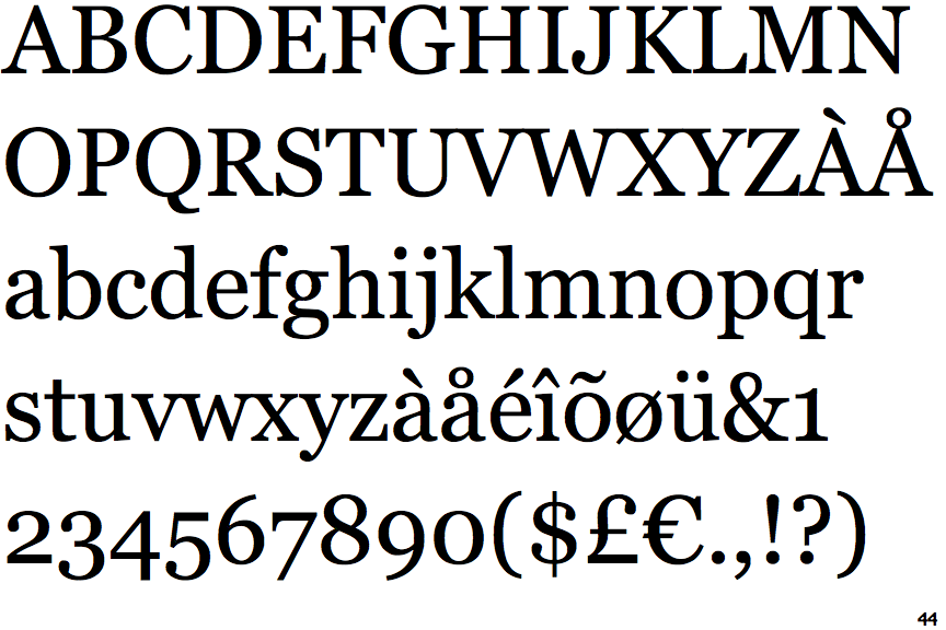
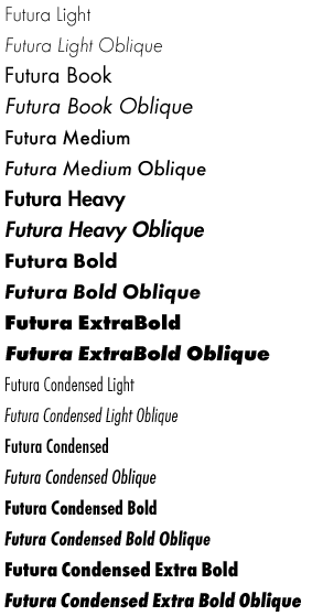
Research: I then looked into fonts that were compatible with Futura (a lot of which were serif fonts). I did this by creating a mind map with Futura in the middle and putting various fonts with it, as well as looking for articles on websites such as creative review, that talked about the subject. Below are images of the fonts that I thought worked well. One thing I did find out was that Futura has a big family of fonts, meaning any of these fonts could be a potential candidate for my logo design.
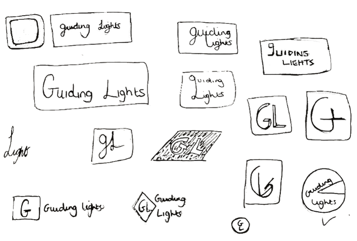
I then began researching into logo design and what the do’s and don’ts were. Whilst doing this research I specifically looked for (but did not limit it to) examples of text based logos, as that is what the client wanted. I also looked into their current website and logo design for Lighthouse (as well as some of their competitors), as this could give me an idea of what direction the brand was going in, and their target audience. Thus enabling me to create a mood board that I felt was fitting to the breif. 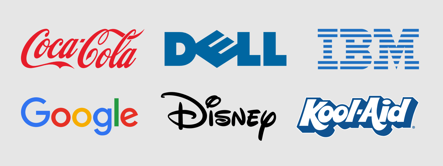 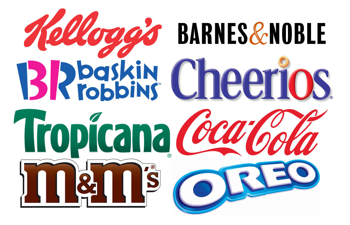 Initial Ideas: Now it was time to begin making some thumbnail sketches of my initial ideas. I started off by doing this playfully and finding different ways to connect the words. I then moved onto just using the initials GL as this had been mentioned in the brief as something that they might be interested in. Once I had a couple of pages of sketches I moved onto Illustrator and recreated some of them.
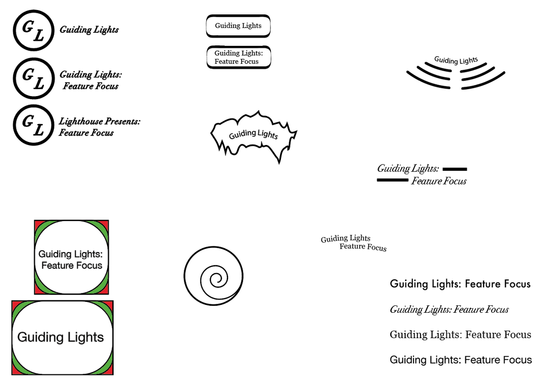
After showing my sketches and illustrator files to my peers and tutors I was given feedback about which ideas they think worked the best and which ones I should develop further. It was suggested that it would be good to play around with the letterforms of the word to create a more playful design. Development: Once I had received the feedback, I wanted to transfer the suggested sketches into illustrator so that I was able to play around with them easily. I took forward two of my designs and tried out some different ways to manipulate them. Below are the results. Of these designs I think some work better than others. When drawing the thumbnail sketches I initially liked the one on the left the best, however after developing it further I realised that despite it working well as the Guiding Lights logo, when trying to make a Feature Focus and Lighthouse presents version, it did not work well. I also changes the font in this design from serif to sans serif, as it made the whole design look softer. The next logo that I had to develop was the one on the right. It initially started out as a circle with a chunk missing (shown earlier in this post). When developing this logo I isolated the letter G and moved its anchor points to make it resemble the shapes shown in the above image. I think that this worked well for some of the forms I tried but I found it difficult to get the rest of the text to fit in, whilst still looking good.
0 Comments
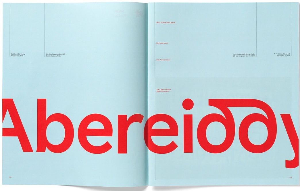
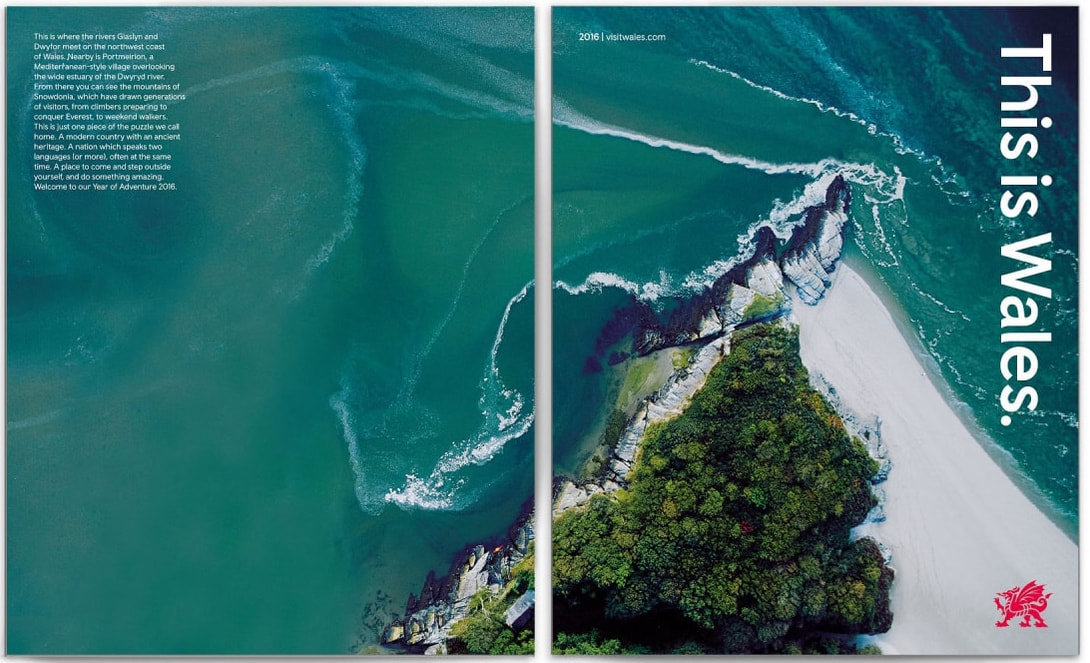
We were visited by Lestyn, one of the designers who helped to rebrand Wales. He spoke about how the whole idea behind this rebrand was for Wales to get a stronger sense of identity and to help increase tourism. He mentioned how when wales became independent his generation of designers wanted to rebrand, but were told no by the government and to come back when they were older. Which led onto the point of not giving up and that if I really want to achieve something, then I can. One of the main things he talked about was how very early on they had to decide on there core values and stick to them. As well as defining a colour palette, fonts, logo spacing and colour usage.
One of the main things that I took away from this lecture was how if I am passionate about an idea, it is good to gently lead the client into it rather than initially shocking them. And I shouldn't be judgemental about my work and just keep putting things out there. In order to succeed I need to pave my own path and not follow the older generation of designers, however drawing inspiration from them is key. Also that if I am pitching for work, it is helpful to mock up a video to help the client visualise my idea.
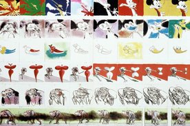 The Long Drawn Out Trip, painted film strips. Gerald Scarfe. The Long Drawn Out Trip, painted film strips. Gerald Scarfe. Gerald Scarfe is a political cartoonist. Before visiting this exhibition I had little idea about his work and what to expect. Upon arrival at the House of Illustration I quickly realised that I had seen his work in Disney's Hercules and The Nutcracker. I liked visiting this exhibition because it gave me an invite into Scarfe's creative process, showing his storyboards along with some of his finished illustrations and physical props. I think that this variation in what was shown was what made the exhibition more engaging as I found a lot of his sketches to be similar. Within this gallery there was also an exhibition about Quentin Blake. I was looking forward to seeing this because his illustrations were a big part of my childhood (featured in the books i read). When looking around this gallery I found that one piece would lead quite nicely onto the next, with various drawings from different books, a wide range of his work was on display.
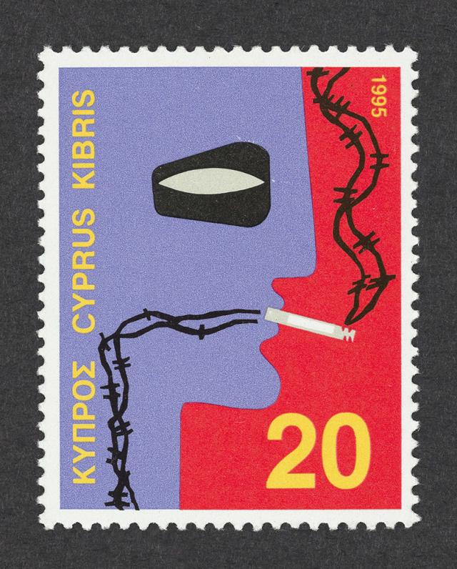
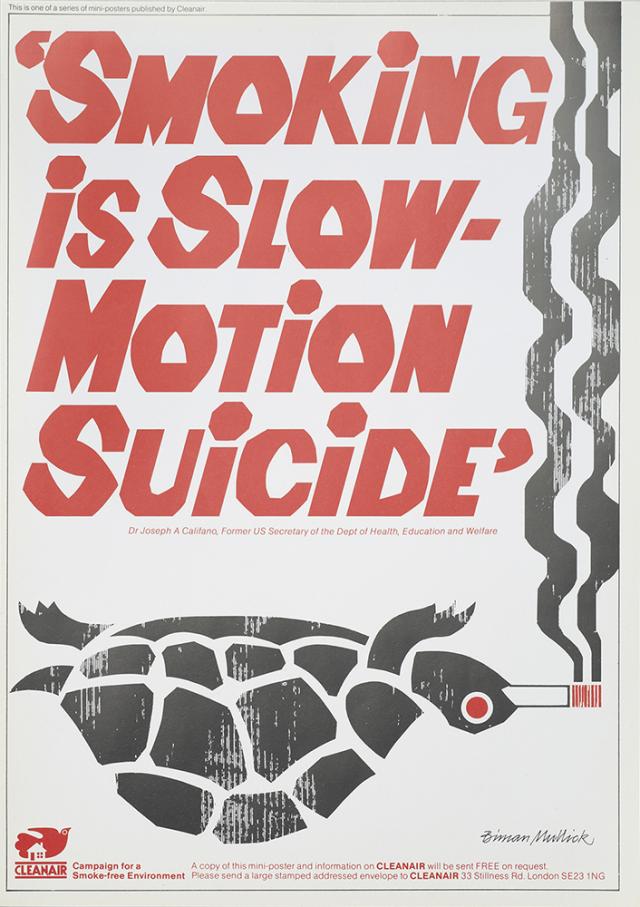
Overall I liked both of the exhibitions at this gallery and think that they offered an insight into the way in which these illustrators work. However I feel like the Gerald Scarfe exhibition was a bit crammed in which meant, when walking round it was easy to miss things. We were visited again by Gary Neill, but this time he spoke to us about the design process. First we recapped the previous talk and looked at how some brands such as Marmite use a weakness in the product as a unique selling point (you either love it or hate it). Another example of this is the Lemon ads by Volkswagen. Pointing out that the car was not the best and considered ugly. 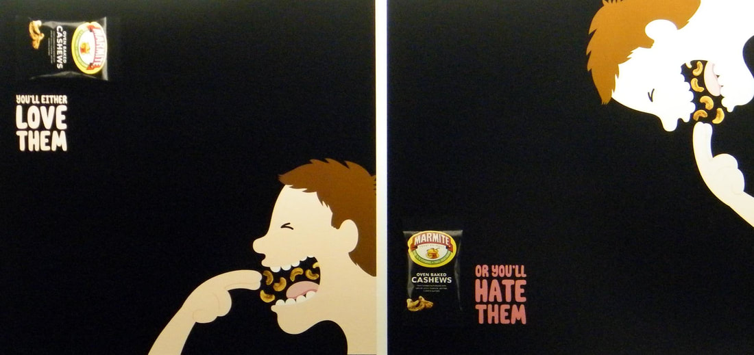 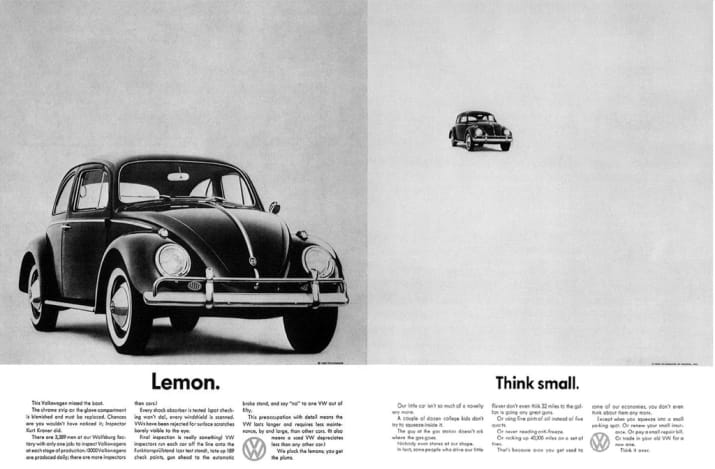 We then went on to talk about Saatchi and Saatchi, a London based advertising agency. We watched a film called 'Inside Saatchi & Saatchi - A Spirited Case Study'. In this film we learnt about the creative process that they went through to create an ad campaign for a Brazilian spirit called Sagatiba. One of the things that surprised me the most was the amount of people working on the one project, with everyone from creative directors and casting agents to models and copywriters. At the beginning we saw how they first learnt about the product and how it was made, then about the culture and stereotypes of Brazil (so they knew what to avoid), right the way though to presenting the ideas to the client and brining the idea to life in the actual shoot. It was an interesting insight into how the advertising industry works and reinforced all of the things that we learnt in Gary's last visit. From this I took away that in order to get an amazing finished project it takes a lot of time and effort (not a lightbulb moment), despite already knowing that I was able to see it on a much larger scale than I ever have before. Can Graphic Design Save Your Life? Is an exhibition showing at the Wellcome Collection in London. It showcases various pieces of graphic design in relation to health and how these pieces have evolved over time. One of the pieces that was shown was the evolution of cigarette packets and adverts for them. It showed how smoking was once seen as a good thing but now adverts and even the packets themselves have to display warnings about the harm that it can cause.
Another thing that I found interesting within this exhibition was the medicine section, it showed the evolution of signs and directions in hospitals and how the different symbols and colours on the medicine bottles mean different things, enabling them to be easily identified. It also brought attention to the fact painkillers and other capsuled medicine that we take was not always in a capsule. In fact this revolutionised the medicine industry by helping to regulate the amount of each medicine that could be taken.
It was fascinating to see how graphic design has shaped things like medicine, something that we rarely (if ever) think about, and how this has impacted peoples lives for the better. I would defiantly go back to this exhibition as it makes you think differently about how you look at the things around you. We were visited by Gary Neill, an Illustrator based in Hastings. He talked about idea generation and how anything can provide inspiration for designs. We looked at the Honda's 'The Cog' advert and how it was based off of the game mousetrap. At the time this advert came out it showcased the car in a way that had not previously been done in adverts up until that point. It brought attention to all of the small parts that make up the car and how they all work perfectly together. We then went on to look at advertising and the four main categories that are present in the majority of adverts.
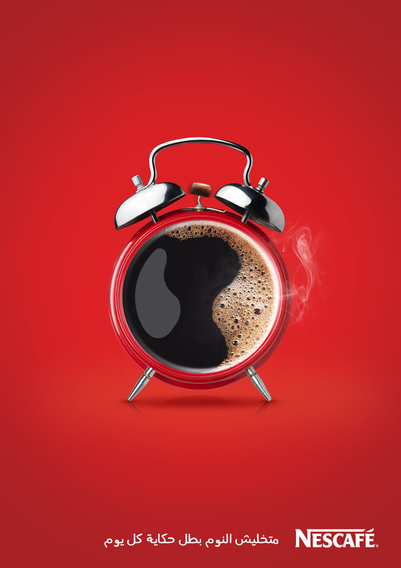
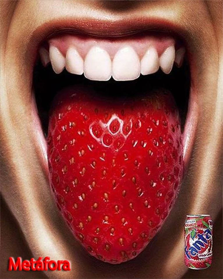
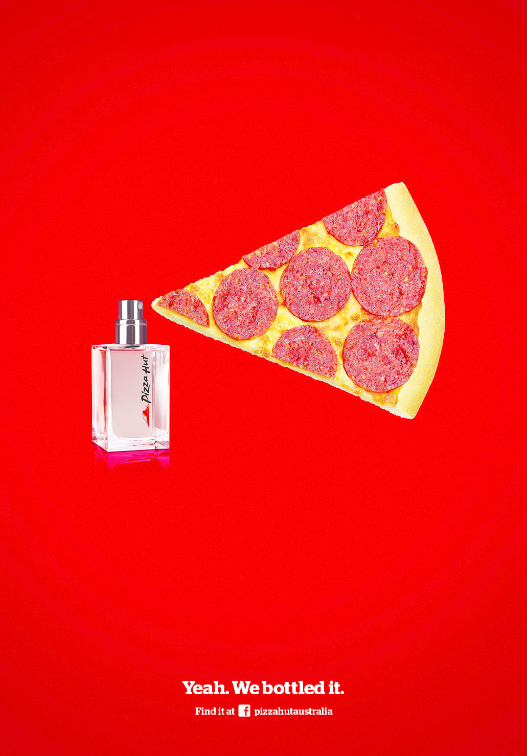
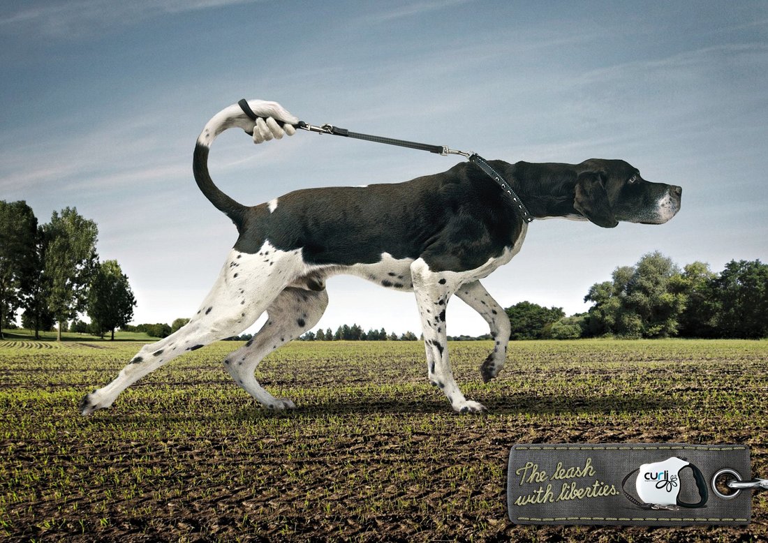
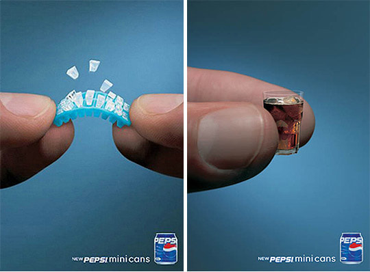
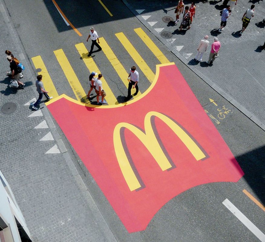
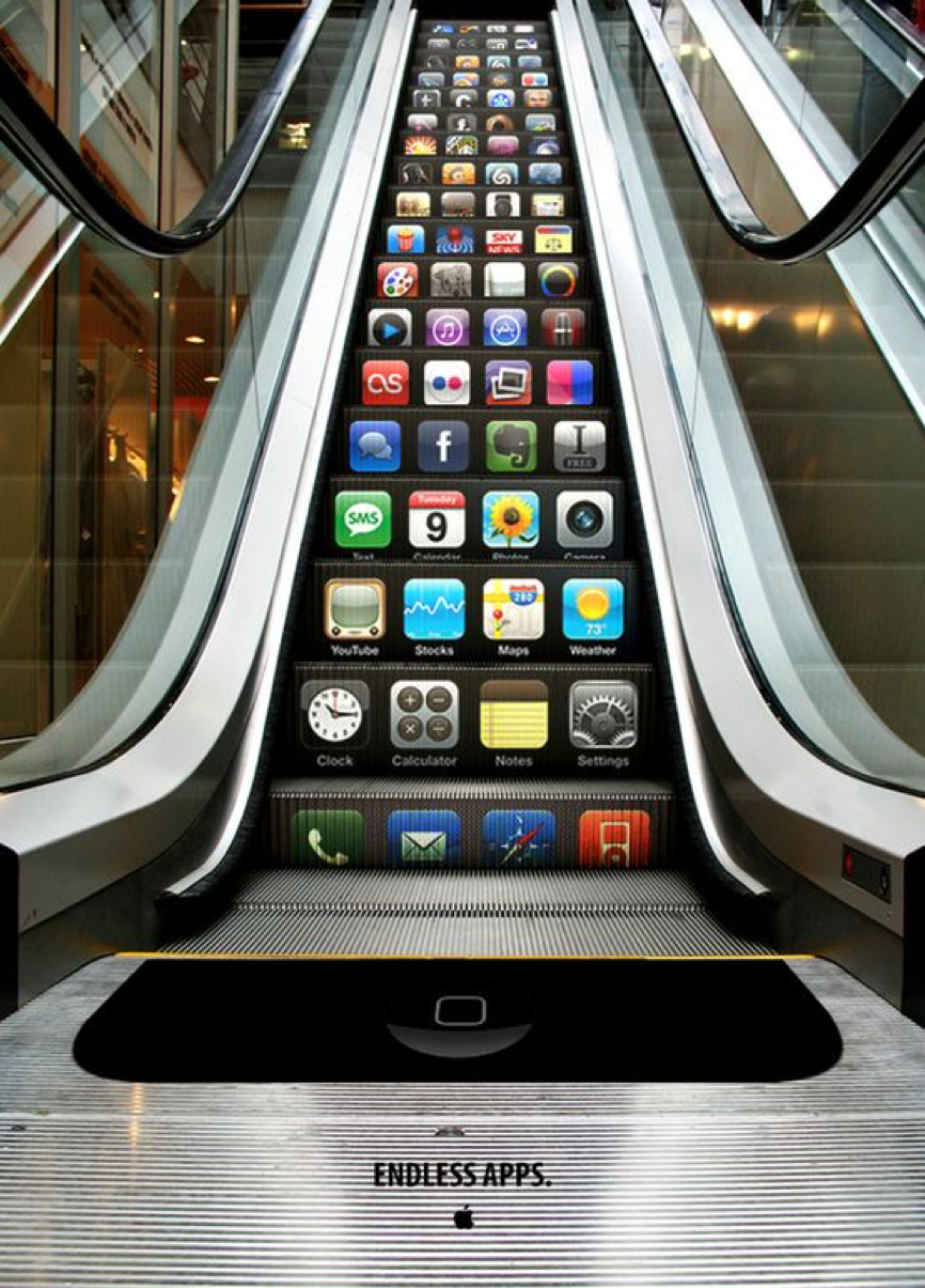
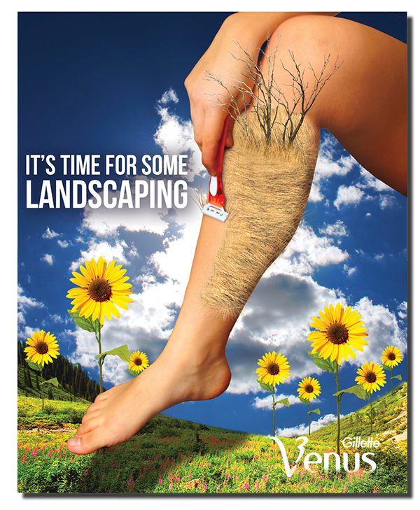
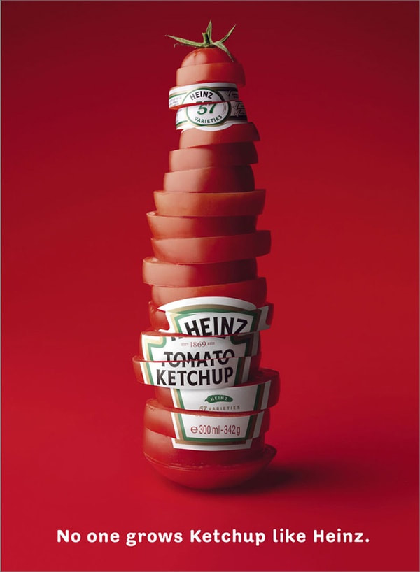
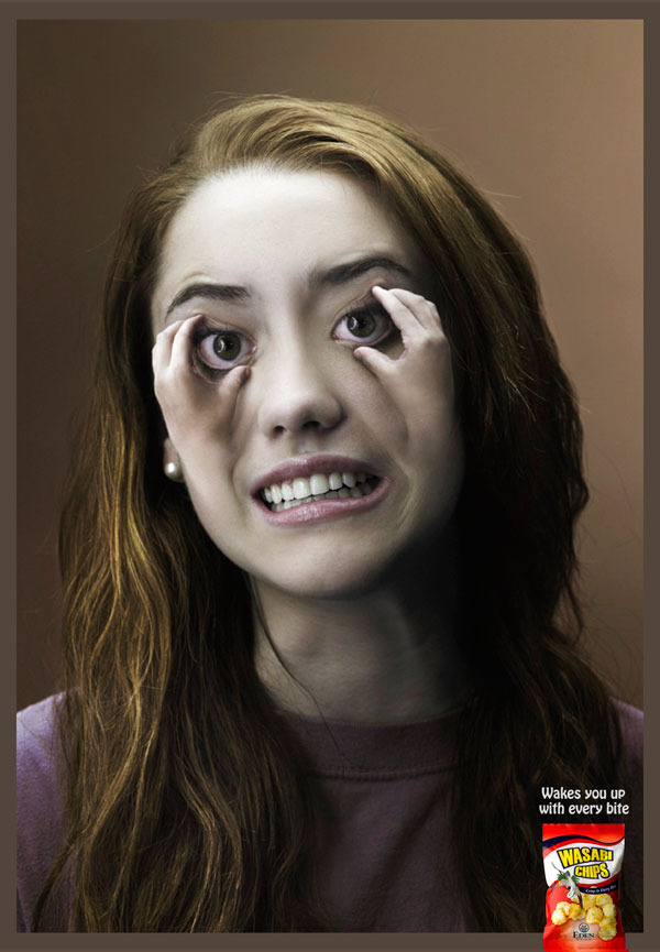
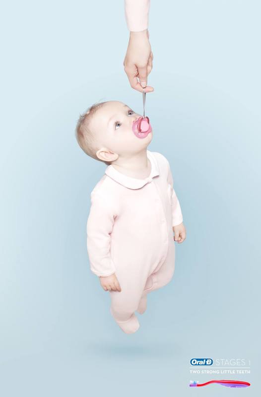
The above four points are all showcased in 'The Cog' advert. For example substitution in the form of the mousetrap game parts being substituted for the car parts. Inversion because all car adverts previous to this one were of idealistic families and country roads. Surrealism because it was playful and some elements of the car like the tyres seemed to defy gravity. The unique selling point was about the reliability of the car, in that everything had to work together perfectly to make the car go. I found some examples that I feel illustrated the four points above. Although a lot of the images I found fit into more than one of the categories I have put them under the one that I feel is most prominent within the advert. Substitution:
Inversion:
Surrealism:
Unique Selling Point:
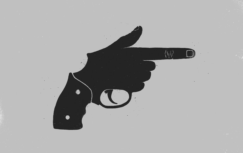
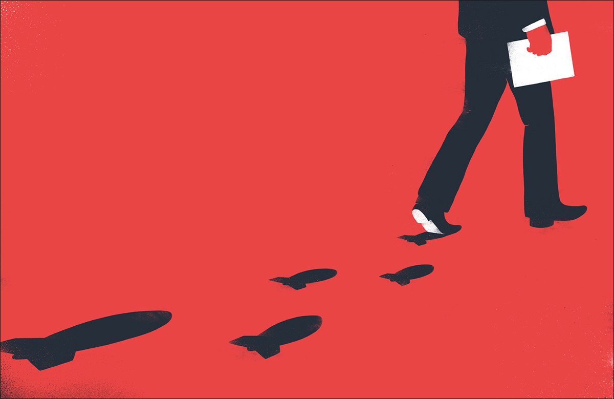
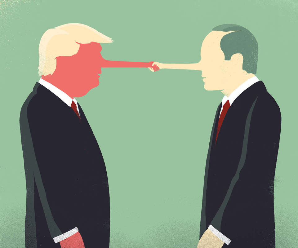
By finding examples of advertisements that contain these points, I was able to get a better understanding of how they work and just how effective they are. It showed me that I could be playful when creating designs and drawing on peoples emotions and making them feel something helps to make a design successful. Another thing I noticed was that a lot of these images would work just as well without the text and often the audience is given the text just to back up what the image is telling them. One of the other things that Gary mentioned was that by drawing loads of thumbnail sketches it can make it easier to find combinations that work well together (similar shape, size, colour). Sebastien Thibault is an illustrator based in Quebec that does a lot of work involving substitution and inversion. In his design he uses shape similarity and sometimes colour to make the substation fit perfectly. Below are some of his illustrations that I think are particularly strong in the message that they are trying to communicate.
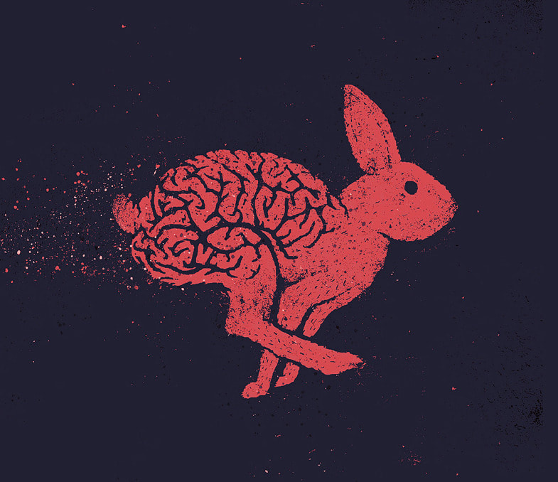
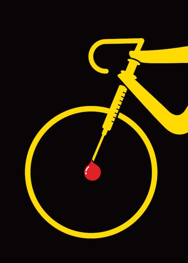
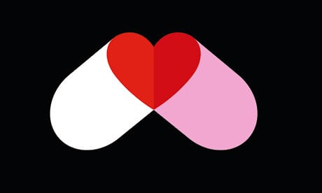
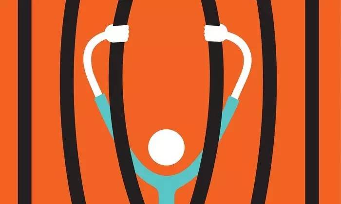
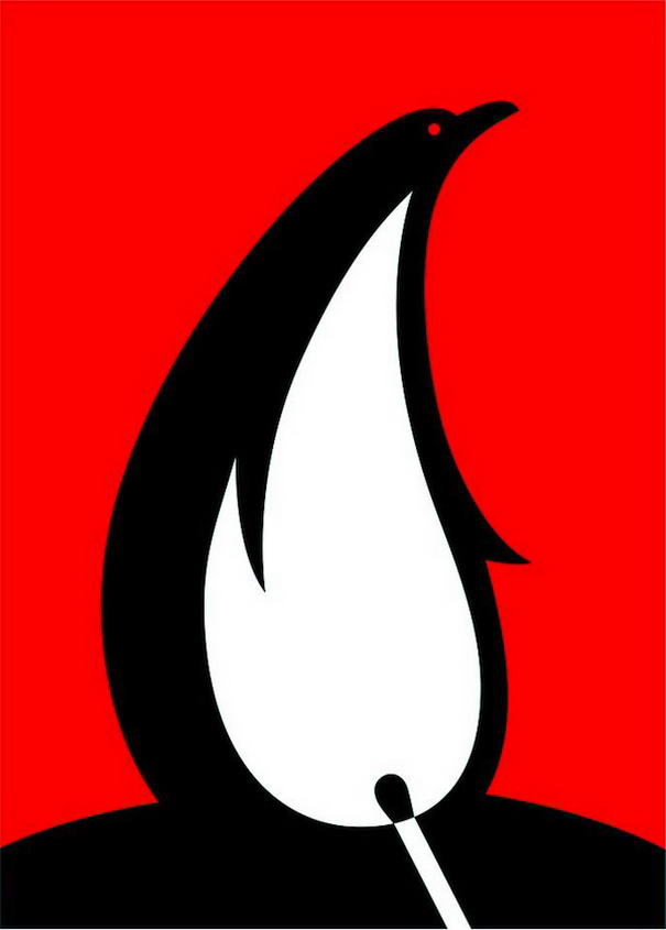
I also looked into a graphic designer called Noma Bar. In his work he uses negative space as a way of giving the image a new meaning. Helping to get the point across that he is trying to make.
|
AuthorWrite something about yourself. No need to be fancy, just an overview. Archives
May 2018
Categories |
 RSS Feed
