|
We were visited by Gary Neill, an Illustrator based in Hastings. He talked about idea generation and how anything can provide inspiration for designs. We looked at the Honda's 'The Cog' advert and how it was based off of the game mousetrap. At the time this advert came out it showcased the car in a way that had not previously been done in adverts up until that point. It brought attention to all of the small parts that make up the car and how they all work perfectly together. We then went on to look at advertising and the four main categories that are present in the majority of adverts.
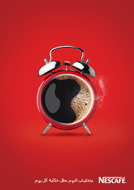
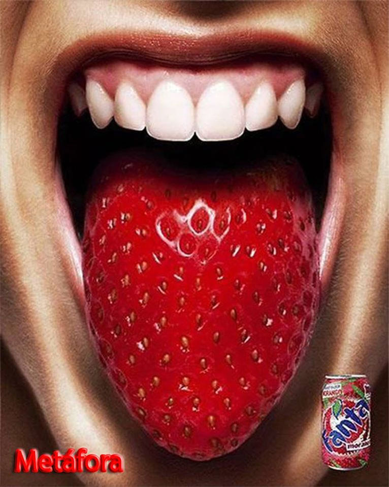
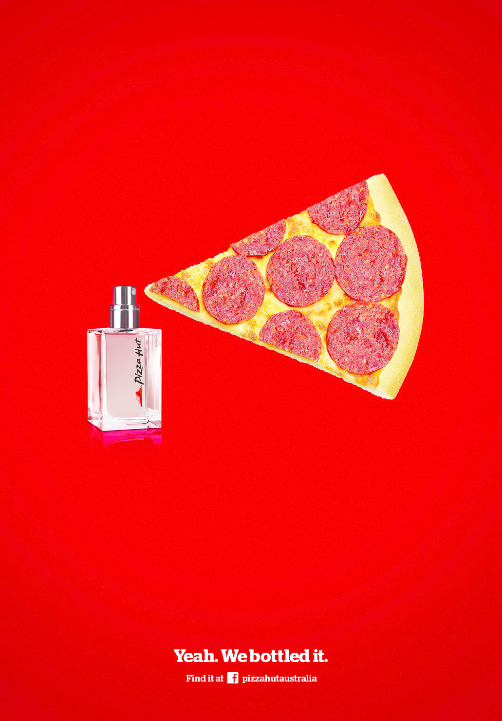
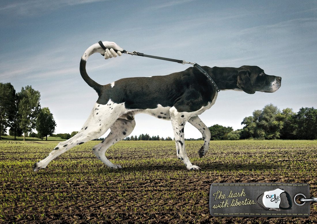
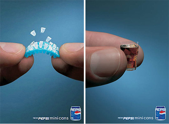
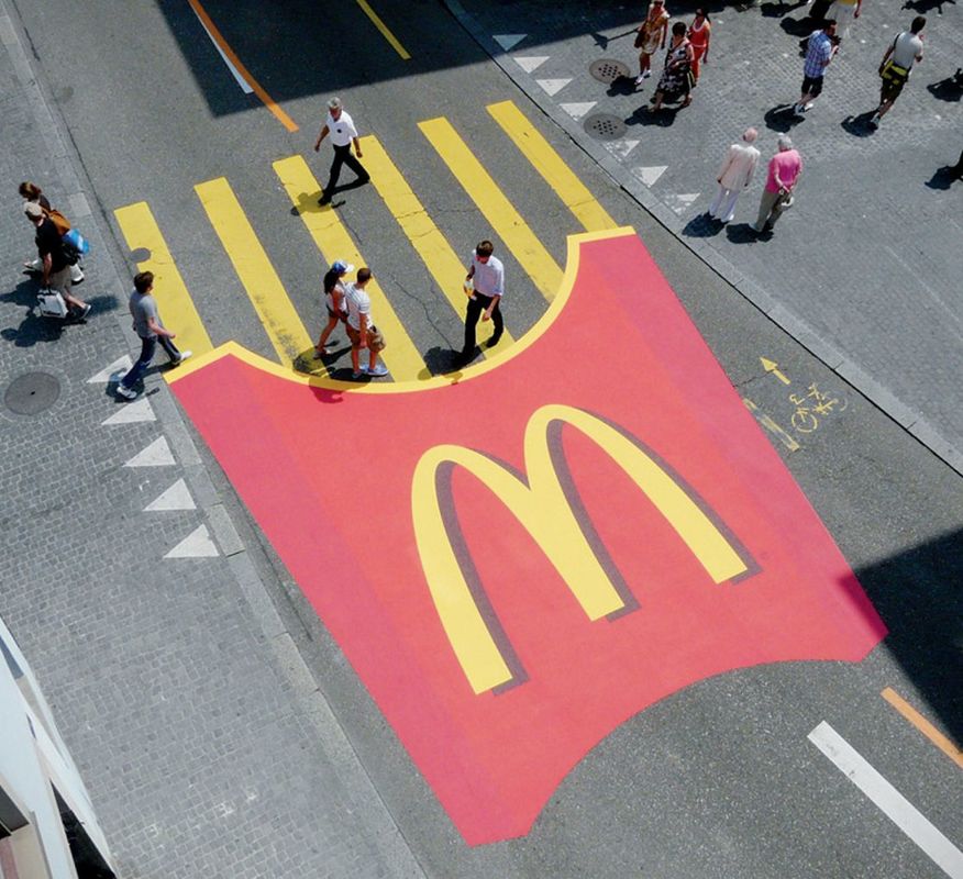
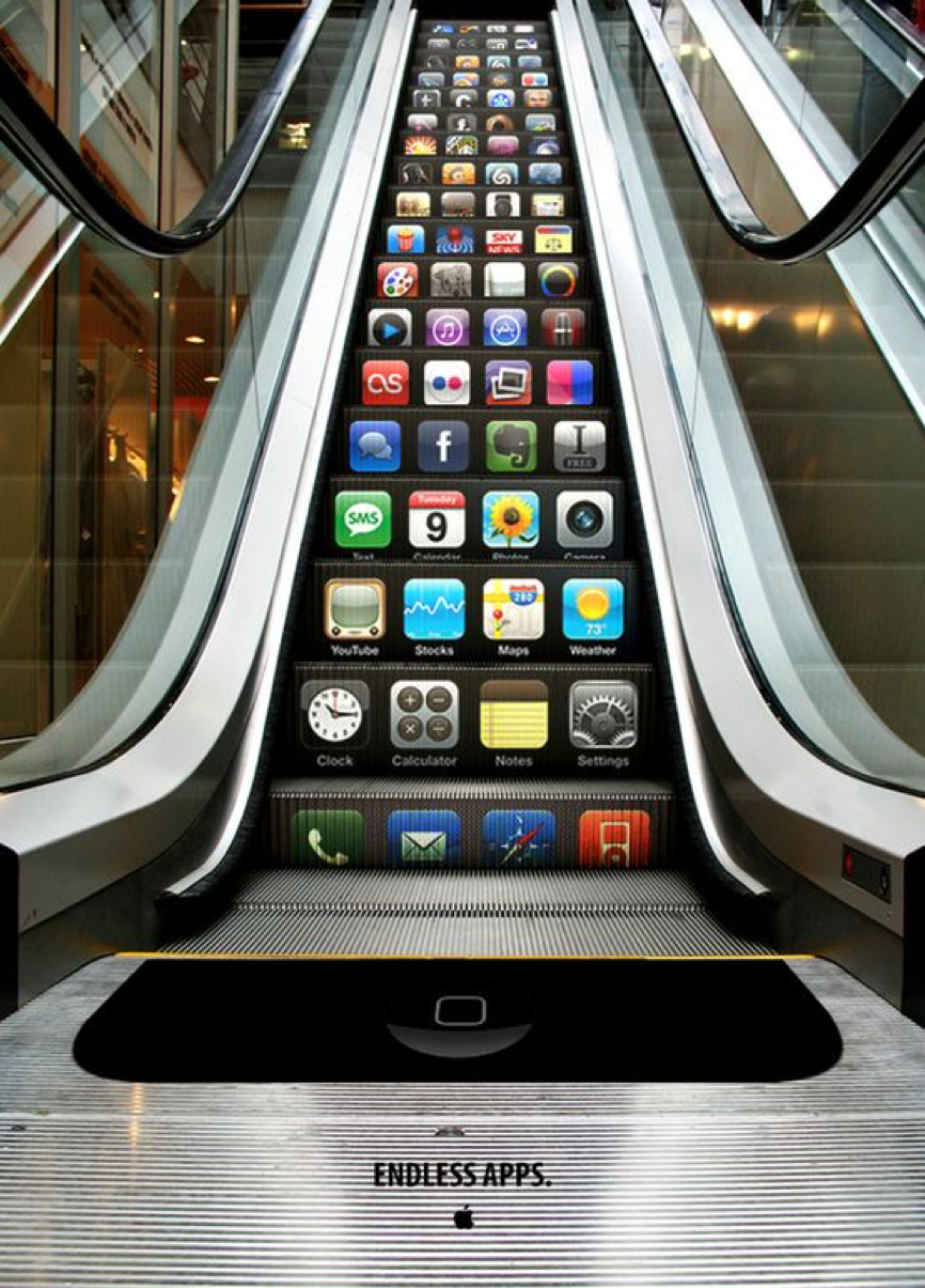
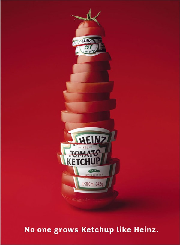
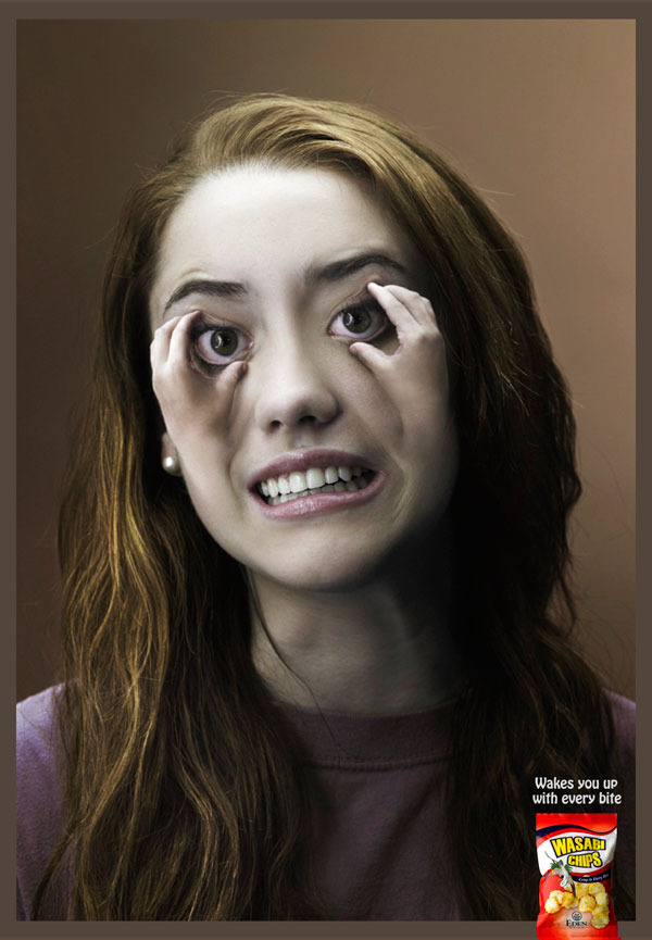
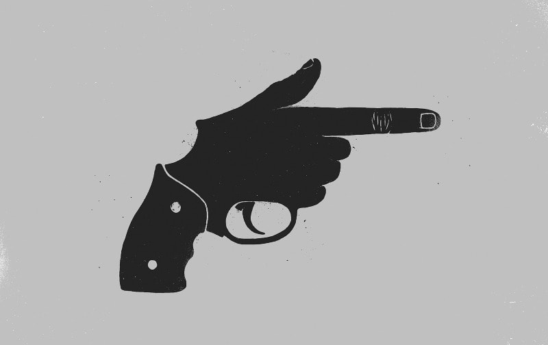
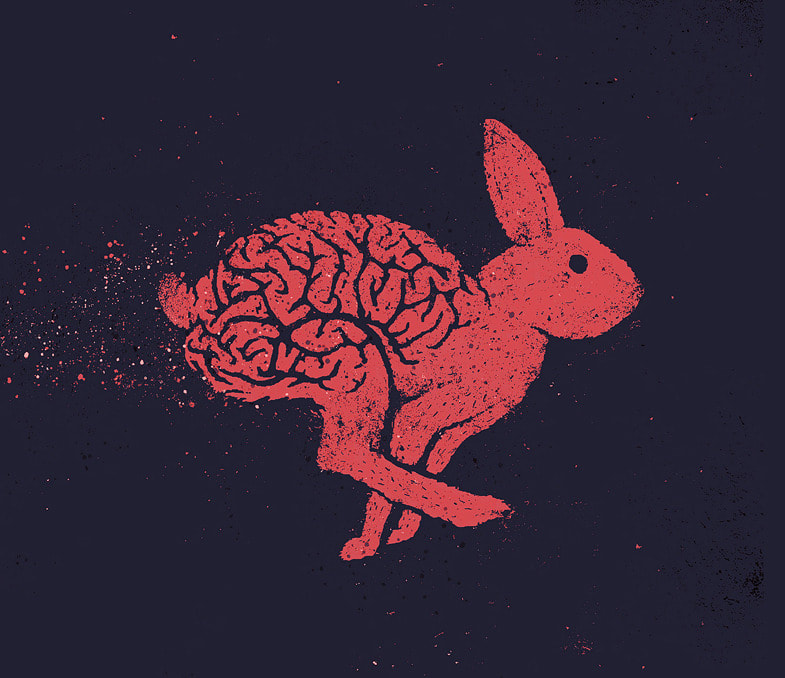
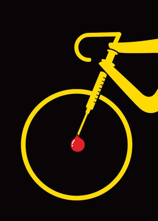
The above four points are all showcased in 'The Cog' advert. For example substitution in the form of the mousetrap game parts being substituted for the car parts. Inversion because all car adverts previous to this one were of idealistic families and country roads. Surrealism because it was playful and some elements of the car like the tyres seemed to defy gravity. The unique selling point was about the reliability of the car, in that everything had to work together perfectly to make the car go. I found some examples that I feel illustrated the four points above. Although a lot of the images I found fit into more than one of the categories I have put them under the one that I feel is most prominent within the advert. Substitution:
Inversion:
Surrealism:
Unique Selling Point:
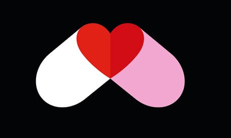
By finding examples of advertisements that contain these points, I was able to get a better understanding of how they work and just how effective they are. It showed me that I could be playful when creating designs and drawing on peoples emotions and making them feel something helps to make a design successful. Another thing I noticed was that a lot of these images would work just as well without the text and often the audience is given the text just to back up what the image is telling them. One of the other things that Gary mentioned was that by drawing loads of thumbnail sketches it can make it easier to find combinations that work well together (similar shape, size, colour). Sebastien Thibault is an illustrator based in Quebec that does a lot of work involving substitution and inversion. In his design he uses shape similarity and sometimes colour to make the substation fit perfectly. Below are some of his illustrations that I think are particularly strong in the message that they are trying to communicate.
I also looked into a graphic designer called Noma Bar. In his work he uses negative space as a way of giving the image a new meaning. Helping to get the point across that he is trying to make.
0 Comments
Leave a Reply. |
AuthorWrite something about yourself. No need to be fancy, just an overview. Archives
May 2018
Categories |


 RSS Feed
