|
We were given a brief to design a logo for an organisation called Lighthouse. The logo was specifically for one go their branches, Guiding Lights. I began this project by reading over the brief and picking out the key information (the brief was detailed so I wanted to just get the key points). I have listed these key points below; Final logo needed to be an Illusrator file
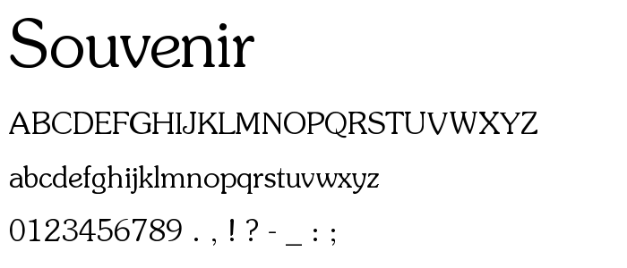
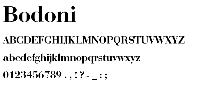
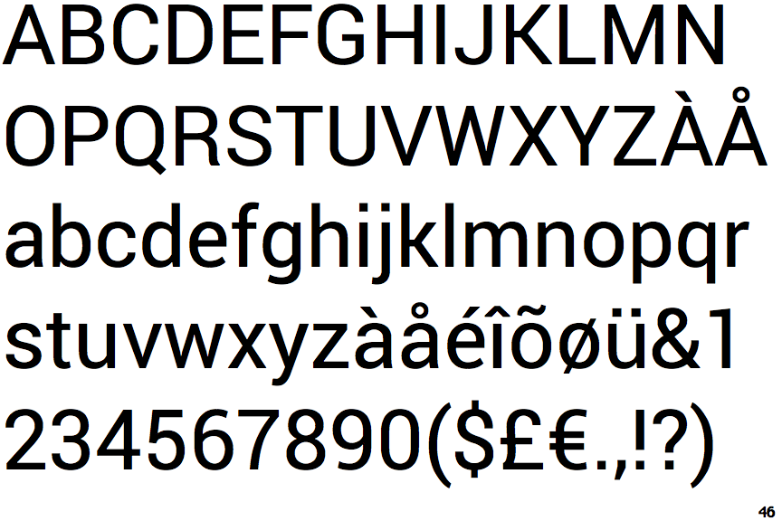
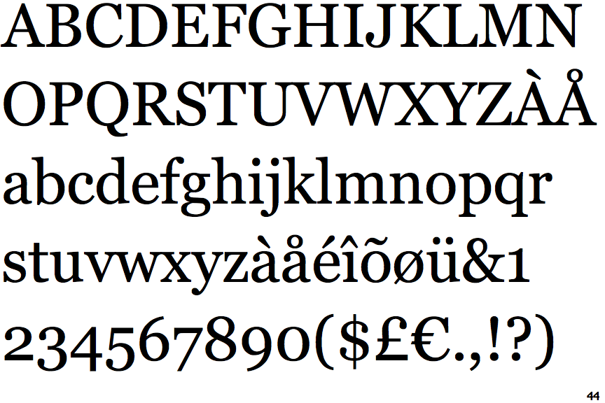
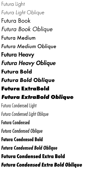
Research: I then looked into fonts that were compatible with Futura (a lot of which were serif fonts). I did this by creating a mind map with Futura in the middle and putting various fonts with it, as well as looking for articles on websites such as creative review, that talked about the subject. Below are images of the fonts that I thought worked well. One thing I did find out was that Futura has a big family of fonts, meaning any of these fonts could be a potential candidate for my logo design.
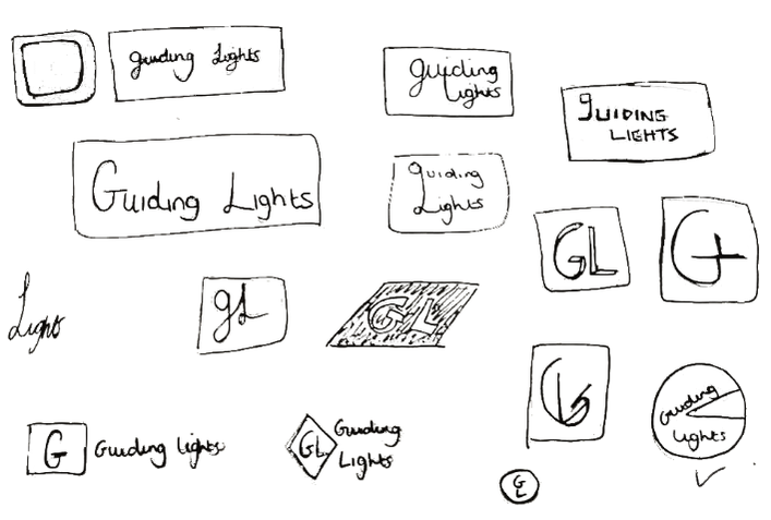
I then began researching into logo design and what the do’s and don’ts were. Whilst doing this research I specifically looked for (but did not limit it to) examples of text based logos, as that is what the client wanted. I also looked into their current website and logo design for Lighthouse (as well as some of their competitors), as this could give me an idea of what direction the brand was going in, and their target audience. Thus enabling me to create a mood board that I felt was fitting to the breif.   Initial Ideas: Now it was time to begin making some thumbnail sketches of my initial ideas. I started off by doing this playfully and finding different ways to connect the words. I then moved onto just using the initials GL as this had been mentioned in the brief as something that they might be interested in. Once I had a couple of pages of sketches I moved onto Illustrator and recreated some of them.
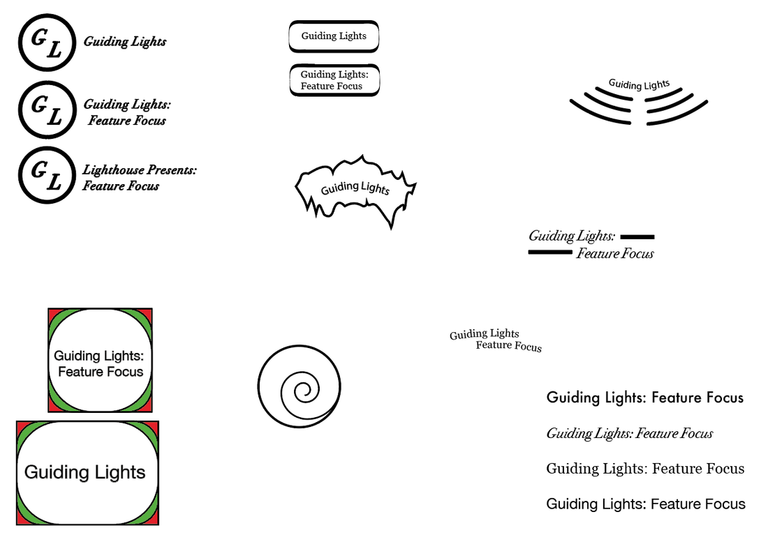
After showing my sketches and illustrator files to my peers and tutors I was given feedback about which ideas they think worked the best and which ones I should develop further. It was suggested that it would be good to play around with the letterforms of the word to create a more playful design. Development: Once I had received the feedback, I wanted to transfer the suggested sketches into illustrator so that I was able to play around with them easily. I took forward two of my designs and tried out some different ways to manipulate them. Below are the results. Of these designs I think some work better than others. When drawing the thumbnail sketches I initially liked the one on the left the best, however after developing it further I realised that despite it working well as the Guiding Lights logo, when trying to make a Feature Focus and Lighthouse presents version, it did not work well. I also changes the font in this design from serif to sans serif, as it made the whole design look softer. The next logo that I had to develop was the one on the right. It initially started out as a circle with a chunk missing (shown earlier in this post). When developing this logo I isolated the letter G and moved its anchor points to make it resemble the shapes shown in the above image. I think that this worked well for some of the forms I tried but I found it difficult to get the rest of the text to fit in, whilst still looking good.
0 Comments
Leave a Reply. |
AuthorWrite something about yourself. No need to be fancy, just an overview. Archives
May 2018
Categories |
 RSS Feed
